Dr Wilkinson S Backyard Resort Mineral Springs
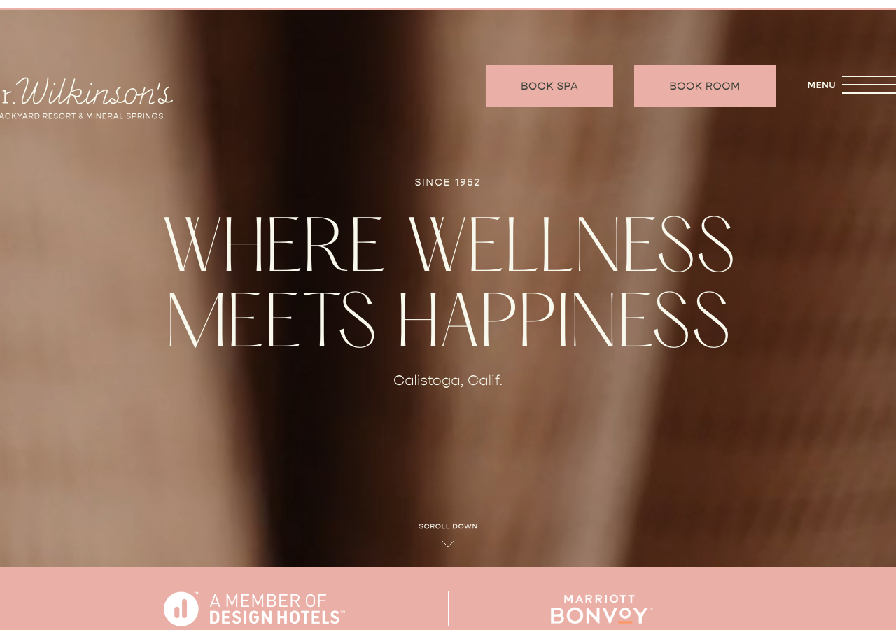
drwilkinson.com/The reference for warm retro-wellness hospitality: an airy Hatton ultralight display headline set huge over a soft-focus warm-brown photo, grounded by a cream-and-forest-green palette (#f8f8ed / #394038) with a single blush accent (#eaafa6).
Hospitality flagship
Design tokens
background
surface
text
textMuted
accent
tone1
tone2
- display
- Gopher-
- body
- gopher-light
- mono
Do / Don't
Reference it for
- Hatton ultralight display serif (hatton-ultralight/hatton-light) run at 52-96px for editorial hero headlines with airy, wide-set letterforms
- The pairing: elegant Hatton serif for headings against Gopher (gopher-light/regular/bold) and Open Sans body at a calm 18px/30px
- Cream paper background #f8f8ed (rgb 248,248,237) as the dominant surface, not white, for warmth
- Forest-green ink #394038 (rgb 57,64,56) as the primary dark instead of pure black
- A single blush-pink accent #eaafa6 (rgb 234,175,166) reserved for the top CTA buttons (BOOK SPA / BOOK ROOM) and the footer bar
- Full-bleed soft-focus warm-tone hero photo with the headline centred and overlaid, no scrim box
- Small all-caps establishing kicker (SINCE 1952) in wide letter-spacing above the display headline
- Twin pill CTA buttons top-right paired with a stacked-line hamburger MENU affordance
Do not copy
- The Dr. Wilkinson's script signature wordmark and BACKYARD RESORT & MINERAL SPRINGS lockup
- The exact blush/cream/forest-green palette as a set
- SINCE 1952 and the Calistoga, Calif. location copy
- Brand voice lines like 'Where Wellness Meets Happiness', 'The Works' mud bath, 'House of Better', 'Doc Knows Best'
- The specific hero mud-bath / spa photography and Instagram feed imagery
- Design Hotels and Marriott Bonvoy partner logos
- The mineral-pool temperature list (85/95/104 F) as a layout gimmick