Dig Dig Inn
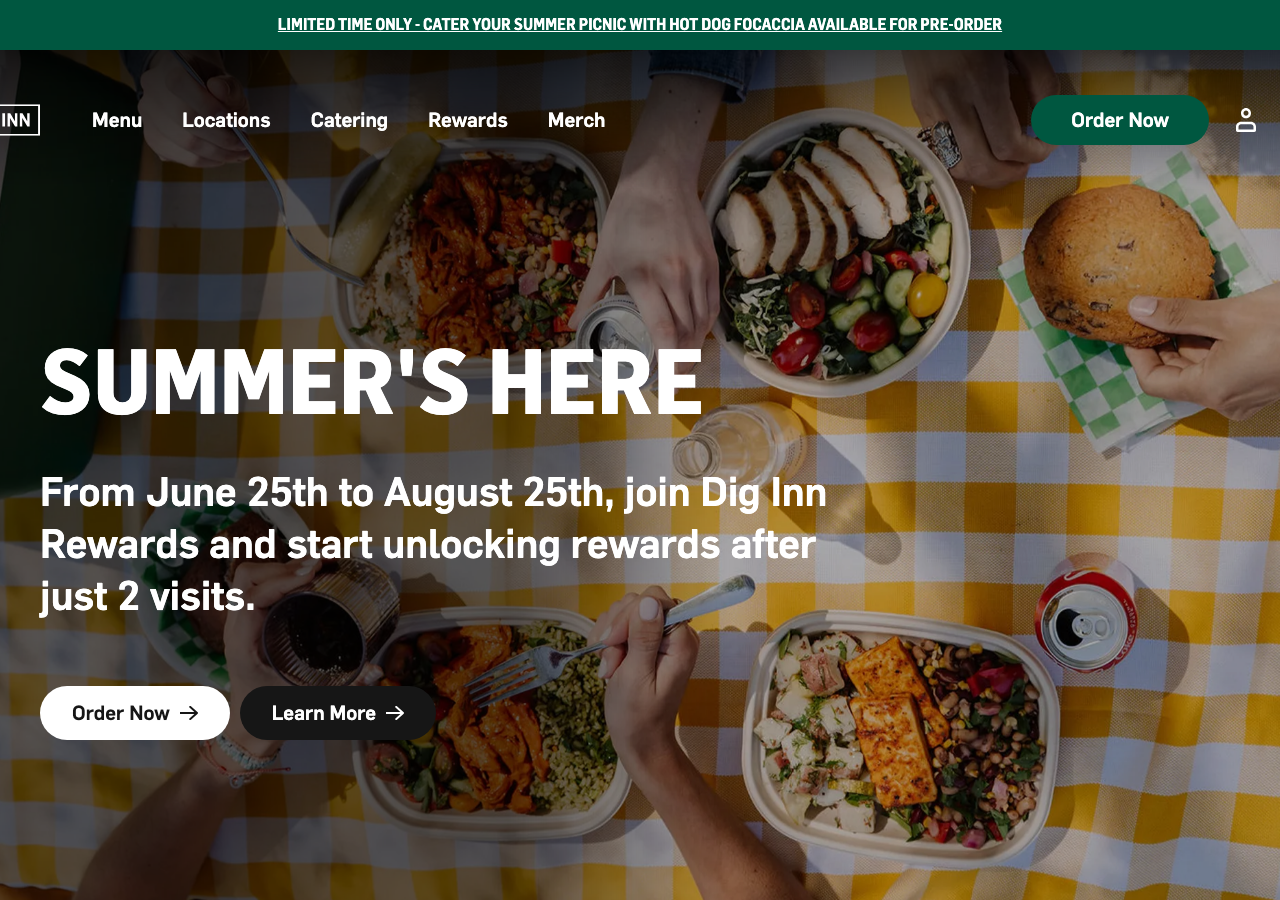
www.diginn.com/The reference for a fast-casual food brand that leads with an edge-to-edge food photo and a huge condensed Flama headline in #005740 forest green, letting appetite carry the layout instead of decoration.
Hospitality flagship
Design tokens
background
surface
text
textMuted
accent
border
tone1
tone2
- display
- Flama
- body
- Flama
- mono
Do / Don't
Reference it for
- Full-bleed overhead-food hero photo with a giant uppercase headline (Flama Semibold condensed, 90px/120px) set bottom-left over the image, white on the busy photo
- The signature forest green #005740 (rgb 0,87,64) as the brand anchor: top promo banner, primary pill buttons, section backgrounds
- Pill-shaped CTA buttons with 32px+ radius (borderRadius 32px, up to 60px) and an inline arrow, paired white primary + dark secondary
- Flama sans-serif at 14px/18px body (weight 500) across the whole site, with 750-weight condensed reserved only for display headlines
- Menu-item cards that pair a dish name with a small calorie tag (800 cal) and a scratch-cooking description, appetite-first merchandising
- Cream #f9f6eb and mint #a8d6ae as warm secondary section grounds against the near-black #161616 text
- A scrolling marquee strip repeating a playful line (SO CHEFFING GOOD SO CHEFFING GOOD...) as a texture break between sections
- Neighbourhood testimonial trio with an all-caps headline per quote and a first-name + initial byline (Sophie M.)
Do not copy
- The DIG INN wordmark and its outlined-box logo lockup
- The exact forest-green + mint palette as a set (it reads unmistakably as Dig Inn)
- Licensed Flama typeface (self-hosted OTF, not free) unless you have the licence
- The real menu items, calorie counts and dish descriptions (Classic Dig, Spicy Salmon Bowl)
- The specific food photography and picnic-table imagery
- Brand copy voice like 'SO CHEFFING GOOD' and 'scratch-made food, done right'
- The named customer testimonials (Sophie M., Tom W., Carla J.)