Daylesford Organic
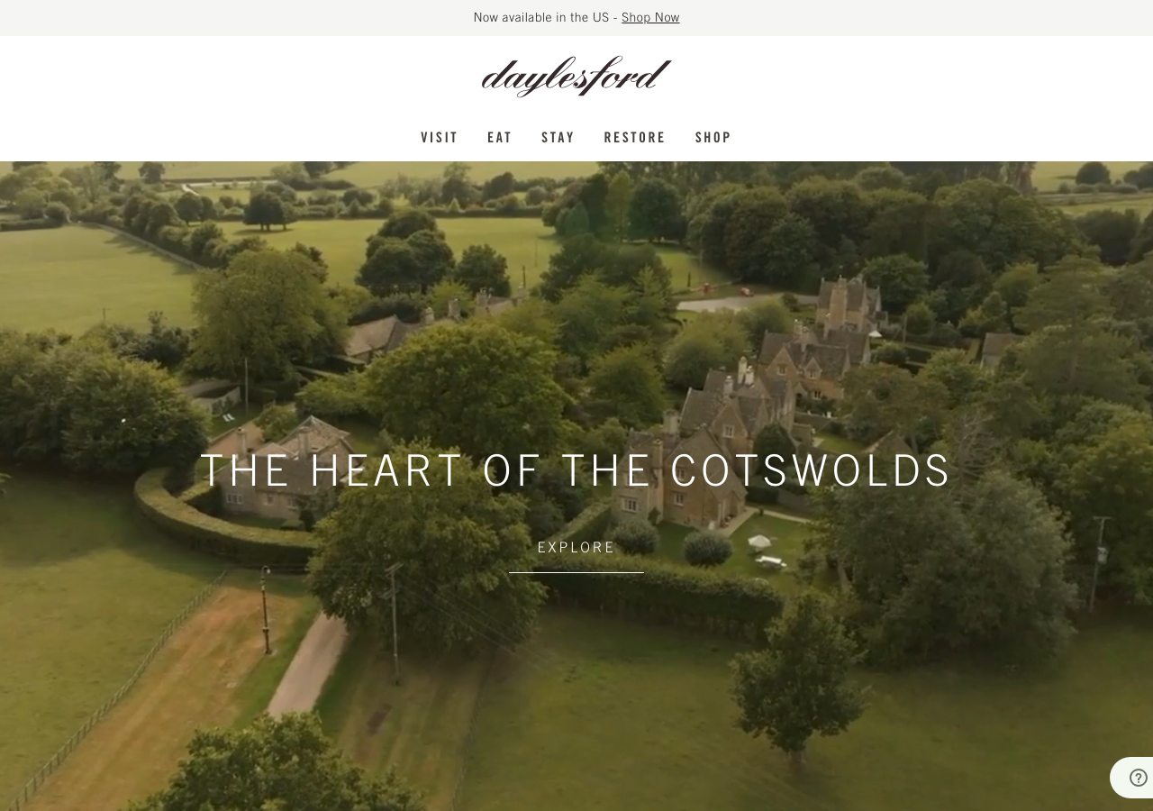
www.daylesford.comThe reference for a heritage farm-estate lifestyle brand: full-bleed aerial film hero with wide-tracked Trade Gothic caps in white, a script wordmark, and a warm near-neutral palette (#35292b ink on #fafaf9 paper) that lets seasonal photography carry the whole page.
Hospitality flagship
Design tokens
background
surface
text
textMuted
accent
border
tone1
tone2
- display
- Trade-Gothic-Lt
- body
- trade-gothic-lt
- mono
Do / Don't
Reference it for
- Full-bleed video hero with a single wide-letterspaced caps headline centred over it (THE HEART OF THE COTSWOLDS) plus a thin underlined EXPLORE cue below
- Trade Gothic LT condensed for everything: nav, headings and body, weights 400/700, so the type reads as one confident industrial voice against soft imagery
- Small 15px body copy at 24px line-height with tight 0.1px tracking, and labels pushed to 2px/2.5px tracking for the EAT / STAY / RESTORE / SHOP nav
- Warm paper neutrals: #ffffff and #fafaf9 / #f5f5f4 surfaces with #35292b warm-brown ink instead of pure black
- Muted grey #6a6a6a for secondary text and captions, keeping the page quiet under big photography
- Editorial section rhythm: a headline, one calm paragraph, one text link (DISCOVER, BOOK YOUR STAY, READ MORE), each section owning a full photographic band
- A running marquee of category words (EAT RESTORE LEARN GATHER STAY) as a kinetic divider between sections
- Trust row of certification badges (Soil Association, Green Michelin Star, B Corp) each with a short one-sentence justification
Do not copy
- The daylesford cursive script wordmark
- The exact aerial Cotswolds farm and village film footage
- The Bamford sub-brand and Soil Association / Michelin Green Star / B Corp certification marks
- Brand copy lines like THE HEART OF THE COTSWOLDS and DISCOVER DAYLESFORD
- The specific event listings, prices and named suppers
- Trade Gothic LT Std as a literal font choice if you cannot licence it (source a comparable condensed grotesque)