Comfers
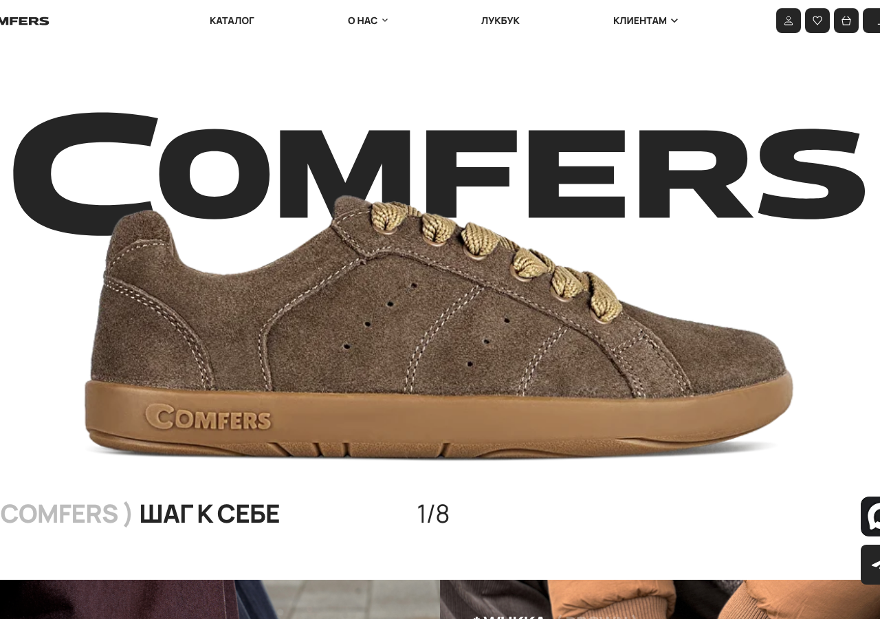
comfers.co/The reference for anchoring a footwear storefront on one wall-to-wall black wordmark set in Hauora 800 (#000000) that the hero shoe physically overlaps, with a warm #FF8562 accent doing all the colour work.
Retail flagship
Design tokens
background
surface
text
textMuted
accent
border
tone1
tone2
- display
- Hauora
- body
- Hauora
- mono
Do / Don't
Reference it for
- Oversized full-bleed wordmark hero: COMFERS in Hauora 800 at display scale, letters running edge-to-edge so the product image crosses in front of the type
- Product-crossing-type layering: cut-out shoe sits over the giant headline, a depth trick that beats a flat centred hero
- The single warm accent #FF8562 (peach-coral) against an otherwise black #000000 / white #FFFFFF / off-white #F5F5F5 system, so one colour reads as the brand
- Hauora grotesque as the whole type voice (800 for display, 400 for body, 300 for light captions) with no serif except an occasional Times italic flourish
- Tight negative letter-spacing on headings (-0.7px and -0.5px) that makes the caps feel packed and confident
- Numbered section index pattern: ( 1 ) ХИТЫ ПРОДАЖ, ( 2 ), through ( 8 ) as an editorial spine down a long single-column story page
- Carousel counter as UI ornament: a plain 1/8 pager plus left/right chevrons flanking the hero, no dots
- Product-card labels in the STYLE ( COLOUR ) convention, e.g. IMPRA BLACK ( GRAY ), CHUKKA ( GAMBOGE ), asterisk-prefixed
Do not copy
- The COMFERS wordmark and its serif-capital C logo lockup
- The exact peach-coral accent #FF8562 as your brand colour
- The photographed suede shoes and lifestyle model shots
- Cyrillic body copy and the specific product names (CHUKKA, KEDDA, IZA, SIMPLA)
- The 'ШАГ К СЕБЕ' mantra and the broad-toe health-technology claims
- The Lumory studio credit and the Meta extremist-org legal footnote
- Ruble pricing and the Russian retail nav (КАТАЛОГ / ЛУКБУК / КЛИЕНТАМ)