Claude
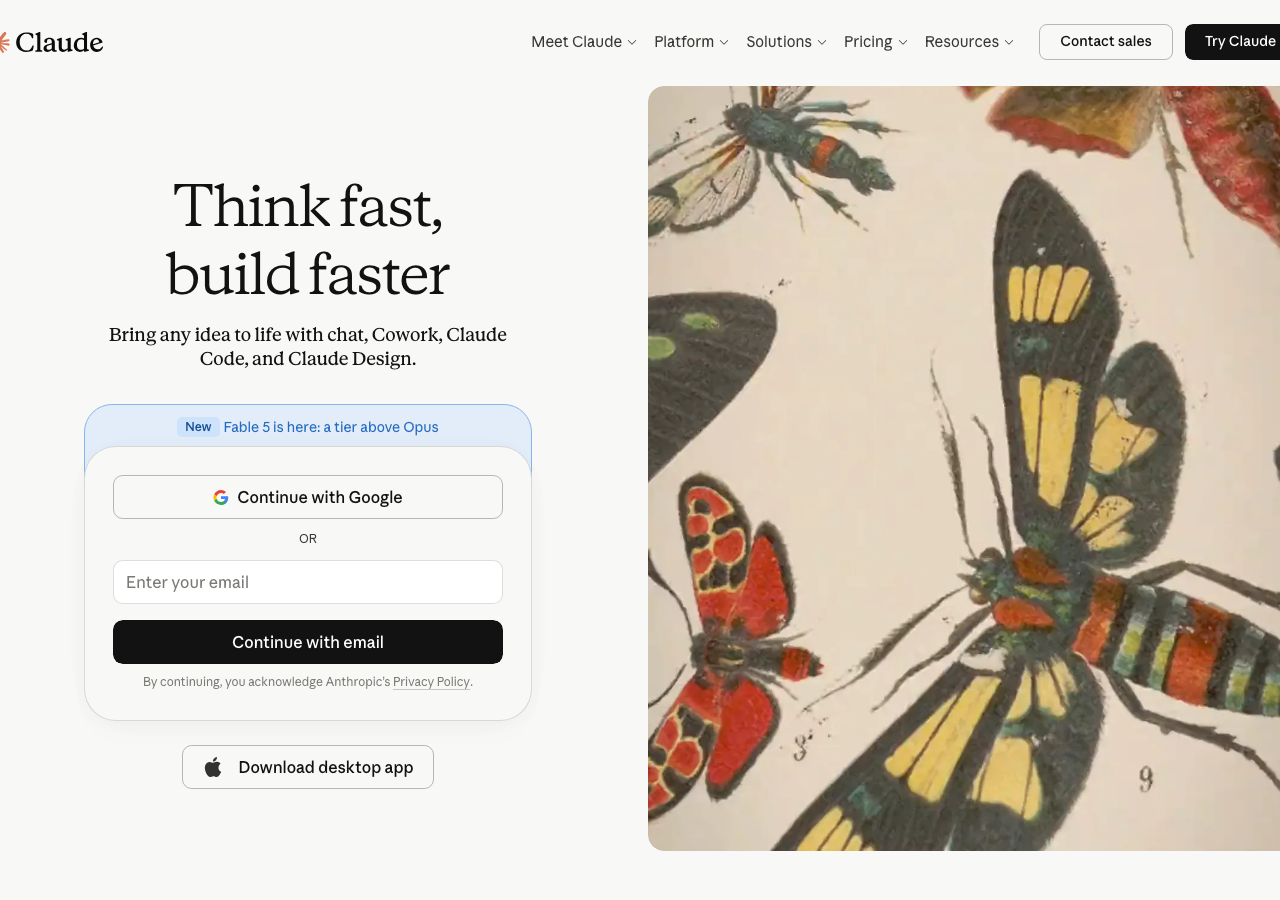
claude.aiThe reference for making an AI product feel like a literary press: ink-black serif headlines on a warm ivory canvas (#faf9f5), colour rationed to a single persimmon mark, depth built from hairline borders instead of shadows.
Developer Tool flagship
Design tokens
background
surface
text
textMuted
accent
border
tone1
tone2
- display
- Anthropic Serif
- body
- Anthropic Sans
- mono
Do / Don't
Reference it for
- Warm ivory page canvas (#faf9f5) instead of pure white, so the whole site reads as paper stock rather than a screen
- Literary serif for headlines (Anthropic Serif here; sub any humanist book-weight serif) paired with a neutral humanist sans for body and nav
- Near-black ink text (#141413) rather than true black, holding the warm-paper feel even in the type
- Shadowless elevation: define every card and frame with a 1px linen border (#dedcd1) plus a background shift between ivory, white (#ffffff) and parchment (#f0eee6)
- Gently rounded geometry on a tight radius (about 10px on nav/inputs/buttons, 16px cards, 24-32px hero panels)
- Centred editorial section headers (Frequently asked questions, Explore plans) set large in the serif, generous whitespace above and below
- Border-only FAQ rows with a plain + glyph affordance, no fills or chevrons
- Pill segmented toggle (Individual / Team and Enterprise) with a soft white active chip on a parchment track
Do not copy
- The persimmon starburst Claude logomark and the Claude / Anthropic wordmark
- The Anthropic Serif and Anthropic Sans proprietary house faces
- Product nouns and plan names (Free, Max, Pro, Try Claude, Meet Claude)
- The exact persimmon accent hue used on the brand mark
- The line-art botanical plan icons specific to Anthropic's identity
- The FAQ copy and pricing figures ($0, From $100)