Cassandra Ladru
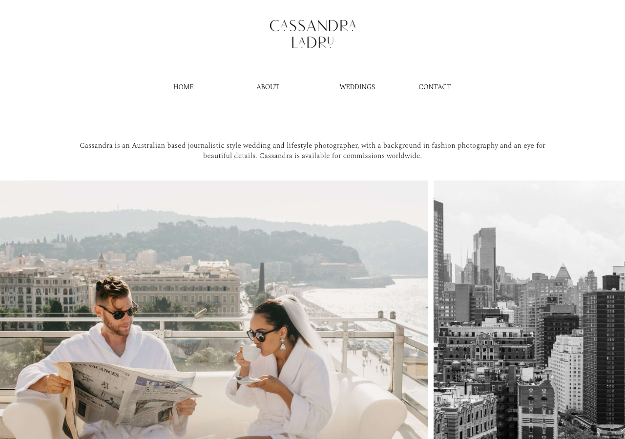
www.cassandraladru.com/The reference for a wedding photographer's editorial portfolio where a full-bleed masonry image mosaic carries everything on a pure white ground, framed by wide-tracked Spectral Light caps and a nearly-black rgb(58,52,49) ink.
Photography flagship
Design tokens
tone1
tone2
- display
- Spectral
- body
- Spectral
- mono
Do / Don't
Reference it for
- Full-bleed, gutterless image mosaic as the primary content: tall portrait plates and wide landscape plates packed edge-to-edge with only a 3px seam (gap 3px in tokens), letting the photography be the design
- Near-monochrome palette: white rgb(255,255,255) ground, warm near-black ink rgb(58,52,49) for text with true black rgb(0,0,0) for headings, no accent colour at all
- Spectral at weight 200 (Light) for body and intro paragraphs, set at 25px / 37.5px line-height with tight -0.25px tracking, a delicate high-contrast serif that reads as fashion editorial
- Wide letter-spacing on the nav caps (1px+) and section eyebrows (ABOUT / FEATURED IN) to signal luxury restraint
- Centred single-line hero intro sentence as the only above-the-fold copy, floated in whitespace between the logo lockup and the first image row
- Custom drawn wordmark logo (amoret sans web font) stacked CASSANDRA / LADRU with irregular baseline letterforms as the brand signature
- Cormorant Garamond used sparingly for accent display moments alongside Spectral, a two-serif pairing
- A quiet 'FEATURED IN' press strip (Vogue, Bazaar, Brides, Lane) as greyscale logotypes on white for social proof
Do not copy
- The stacked CASSANDRA LADRU custom wordmark and amoret sans logotype
- The actual wedding, portrait and travel photographs of real couples and the photographer
- The press mastheads (Vogue, Bazaar, Brides, The Bridal Journey, Lane)
- The named client testimonial copy and 'Hannah & Luke' attribution
- The @CASSANDRALADRU handle and 'Design By The Bright Edit' credit
- The biography prose about Cassandra's 15-year journalistic style