Design tokens
background
surface
text
textMuted
accent
border
tone1
tone2
- display
- Inter
- body
- inter
- mono
Do / Don't
Reference it for
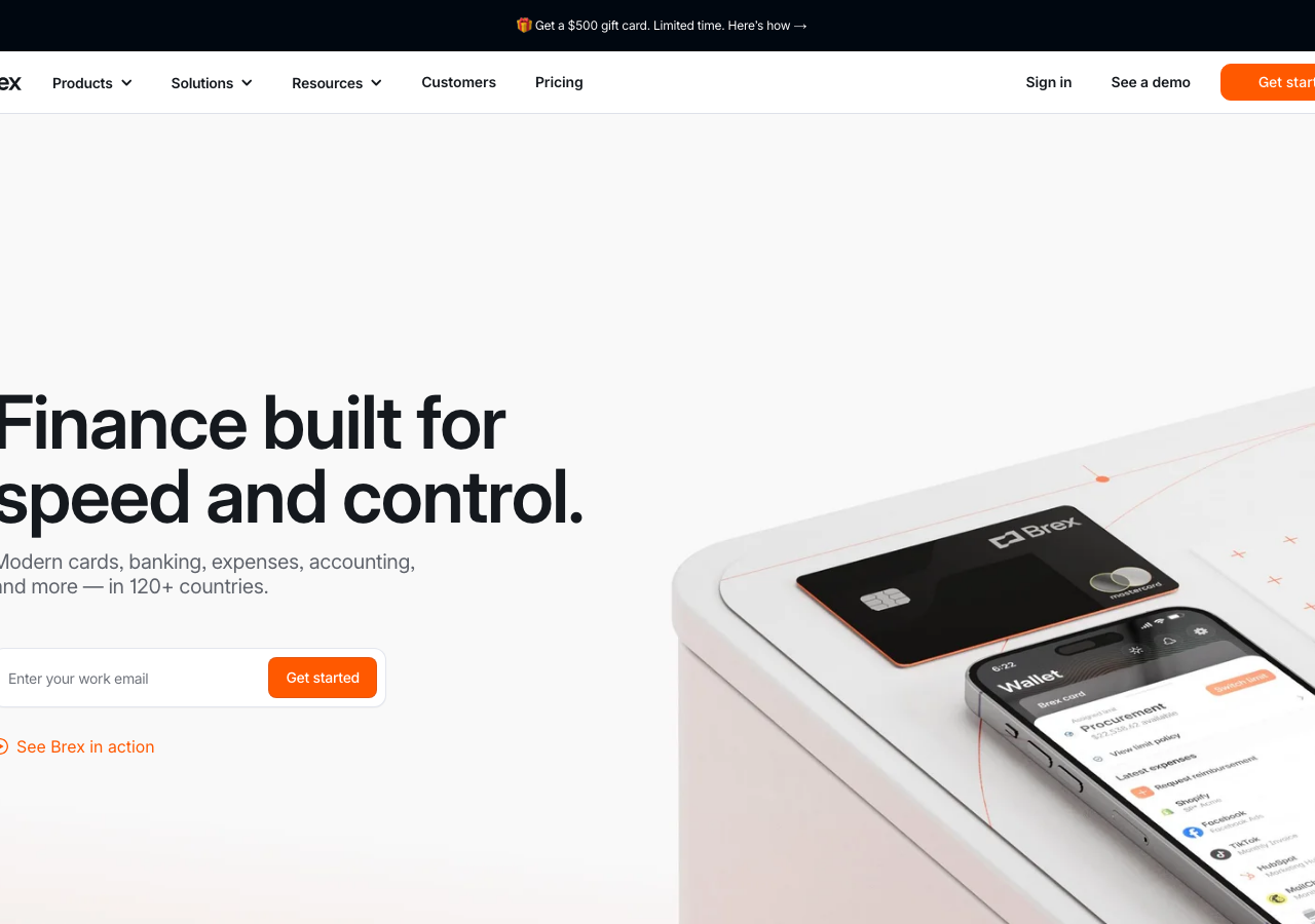
- Single-accent restraint: one ember #ff5900 for the Get started button, the inline 'See Brex in action' play link, and tab/active indicators, nothing else chromatic
- Near-white layered canvas: page sits on #f3f3f7 fog with #ffffff paper sections, no gradient, depth from contrast not shadow
- Heavy compressed display headline (Flecha-style face) at ~72px, two short lines, tight leading, near-black #000 ink, left-aligned in the left half
- Muted grey subhead (#8b8d98 / pewter) at ~20px directly under the headline, capped to two lines
- Inline email-capture: a 12px-radius outlined field with the solid ember button butted to its right edge, as the hero's single conversion unit
- Hairline-border component language: 1px Mist #b9bbc6 borders and a 12px radius on inputs, cards and buttons, no drop shadows
- Slim white top nav with a left wordmark, centre dropdown groups (Products / Solutions / Resources), and a Sign in / See a demo / solid Get started cluster right
- Product-shot hero: a real photographed card plus a phone UI bleeding off the right edge over a soft pink-cream surface with faint orange wireframe traces
Do not copy
- The Brex wordmark and the bracket-card glyph logo
- The exact ember-and-abyss palette as a set (#ff5900 + #000710 reads unmistakably as Brex)
- The Flecha custom display face (licensed bespoke type)
- The photographed Brex card and Wallet app product render
- Headline copy 'Finance built for speed and control.' and the '120+ countries' line
- The black Brex Mastercard with mastercard mark