Bourke Street Bakery
www.bourkestreetbakery.com.au/The reference for a warm, editorial neighbourhood-bakery site: walnut-brown ink (#5b4126) on a cream ground (#faf4e6), all-caps condensed Neue Haas Grotesk Display headings over full-bleed documentary photography, with a hand-drawn script logotype as the one soft note.
Hospitality flagship
Design tokens
background
surface
text
textMuted
accent
border
- display
- DM Sans
- body
- neue-haas-grotesk-display
- mono
Do / Don't
Reference it for
- The walnut-brown-on-cream palette: body and headings in #5b4126, page ground alternating white #ffffff and warm cream #faf4e6, near-black #000000 reserved for the footer
- All-caps condensed display headings in neue-haas-grotesk-display 600 (hero at ~86px) that read as confident but grocery-honest, not luxury
- Body copy set in DM Sans at 16-18px with a generous ~27px line-height for the warm, plain-spoken paragraphs
- A hand-drawn cursive script logotype as the single decorative element against an otherwise industrial sans system
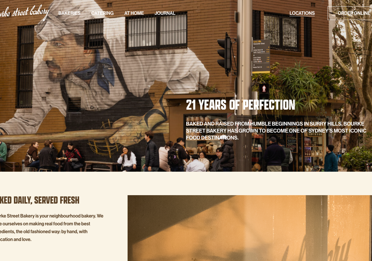
- Full-bleed documentary hero photography (real shopfront, real crowd) with the headline dropped low-right over the image, not centred
- Overline metadata labels (SUPPLIER / FLOUR, NEW PRODUCT, SEASONAL) in tiny 12-13px caps above each card title
- Horizontally scrolling product/recipe/journal rails (catering items, At Home pantry, suppliers) as the core browse pattern
- Price treatment: FROM label, big number, small $ glyph stacked as a compositional unit on product cards
Do not copy
- The hand-drawn 'bourke street bakery' script logotype
- The exact walnut-brown #5b4126 + cream #faf4e6 pairing as a whole identity
- The Surry Hills mural / shopfront hero photograph and any Alan Benson imagery
- Product and supplier names (Wagyu sliders, Wholegrain Milling, Murray River Salt, Coppertree Farms)
- The '21 years of perfection' / 'Sydney's O.G bakery' heritage copy
- The store-location list and NSW addresses
- NONFICTION Studios' specific section-stacking layout as a template