Design tokens
background
surface
text
accent
- display
- studioPro
- body
- studioPro
- mono
Do / Don't
Reference it for
- Warm off-white paper background #F6F4EE against pure #000 text, the whole site's calm base
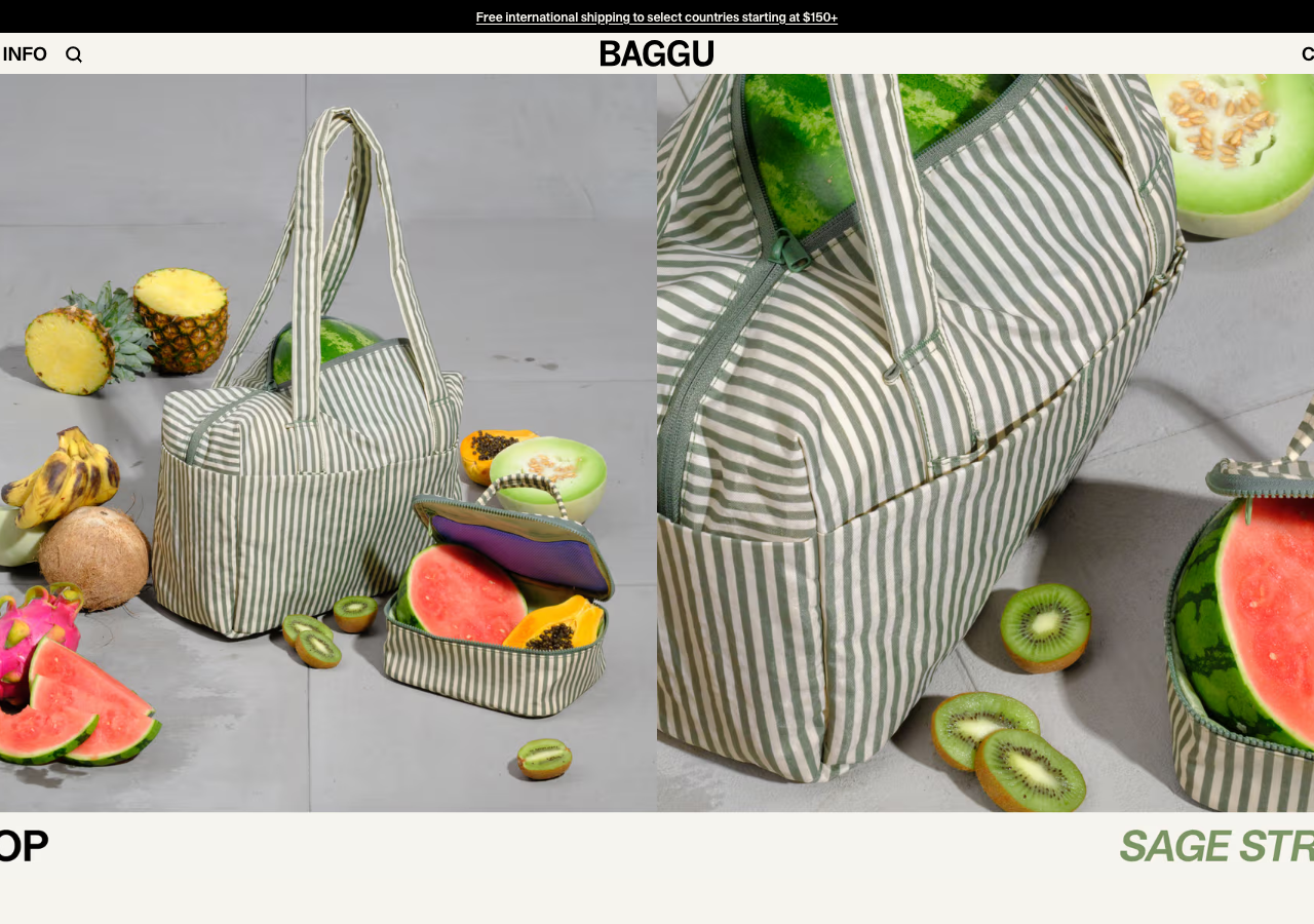
- Edge-to-edge two-up product photography as the hero, zero copy overlaid on the image, headline sits below
- All-caps StudioPro (Bold 700) navigation and labels: tight nav (SHOP / INFO / search) flanking a centred wordmark, CART (0) hard right
- Section footer band pairing an upright all-caps label (SHOP) with an oversized italic colourway name (SAGE STRIPE) in the accent
- Muted mauve accent #9d587c (rgb 157,88,124) used sparingly, only for italic display moments and highlights
- Thin 40px sticky top notice bar (--header-h 40px, --notice-h 32px) with a single underlined shipping line, centred
- Tight negative letter-spacing across the type (-0.45px / -0.4px on body, -1% on display) for a compact editorial feel
- Pill geometry: 9999px fully-rounded chips and buttons alongside 8px soft-radius cards
Do not copy
- The BAGGU wordmark and centred logotype
- StudioPro / GT Alpina Typewriter, licensed foundry faces specific to the brand
- The exact fruit-and-bag styled product photography and the SAGE STRIPE colourway naming
- The mauve #9d587c as a signature, it reads as Baggu
- Brand copy voice fragments ("Let us send you pleasant things", @BAGGU / FOLLOW social wall)
- The specific product taxonomy (TOTES, POUCHES, CROSSBODY) and price points