Awwwards
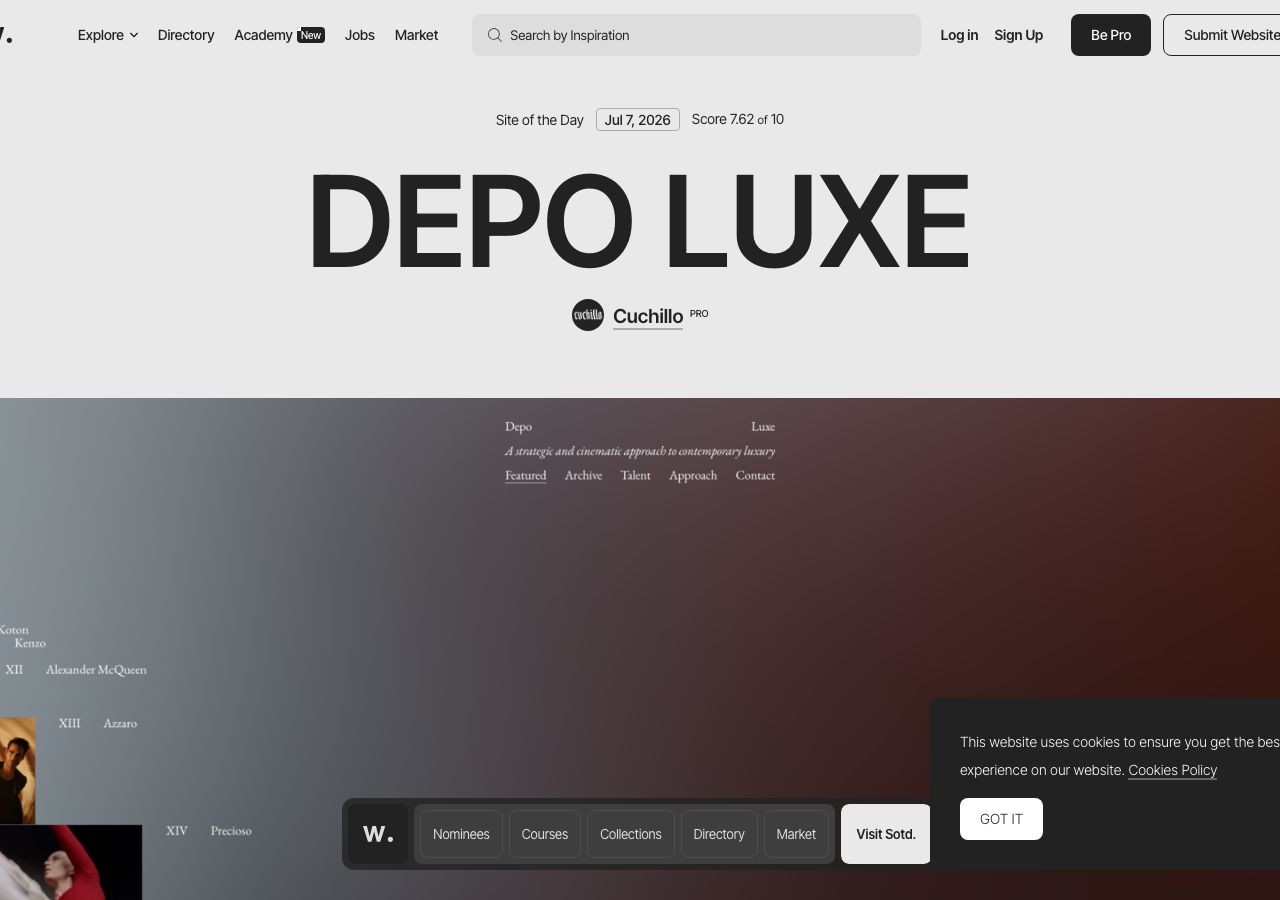
awwwards.comThe reference for a ruthlessly achromatic editorial gallery where one 120px+ ink-black display title (#222222 on a warm #e9e9e9 canvas) carries the whole page and a single floating dark tab bar is the only chrome over full-bleed hero photography.
Creative Studio flagship
Design tokens
background
surface
text
textMuted
accent
border
tone1
tone2
- display
- Inter Tight
- body
- Inter Tight
- mono
Do / Don't
Reference it for
- The oversized centred display title as the hero itself: ~120-140px, weight 300-400, tight tracking, black #222222, no supporting subhead competing with it
- Warm pale-gray page canvas #e9e9e9 instead of pure white, so full-bleed featured imagery reads as the brightest thing on the page
- Near-monochrome discipline: ink #222222, smoke #808080, graphite #4d4d4d, fog #dedede, and exactly one warm accent (ember #fa5d29) held in reserve
- A slim metadata ribbon above the title (label, date, a bordered score chip) at ~14px to frame the headline without decoration
- Pill nav actions that read as labels not buttons: one solid black pill (primary) beside one white hairline-outline pill, both flat with no shadow
- Floating dark tab bar centred over the hero image, elevation carried by colour contrast against the photo rather than any shadow
- Full-bleed hero photograph with an 8px radius and a single white-outline CTA pill anchored to a corner
- Small credit row under the title: circular avatar + name + tiny PRO tag, quiet 14-18px
Do not copy
- The Inter Tight typeface: it reads as a generic AI-build default; pick a face with more character for the same weighty-minimal effect
- The 'w.' Awwwards wordmark and the odd ritual featured brand marks
- The specific ember orange #fa5d29 as your accent; it is Awwwards' signature, choose your own single accent
- The literal Site of the Day / Score X.XX of 10 award chrome and PRO badges
- The Explore / Directory / Academy / Jobs / Market nav taxonomy, it is platform-specific
- The Be Pro / Submit Website commercial CTAs