Aucoot
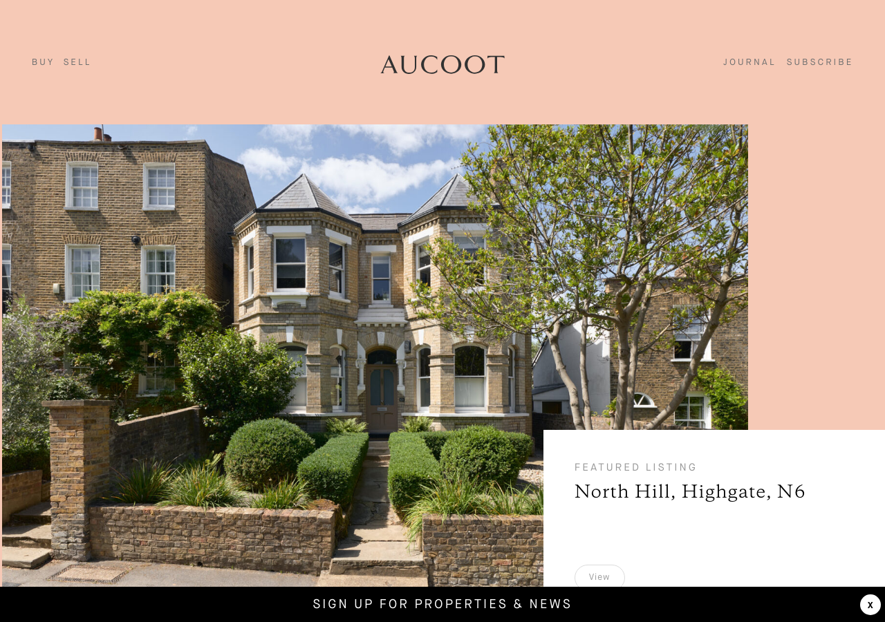
www.aucoot.com/The reference for a design-led estate agency: a full-bleed blush #F3C2B2 hero framing one architectural photograph, centred GalaxieCopernicus wordmark, and a floating white listing card that reads like a gallery caption.
Real Estate flagship
Design tokens
background
surface
text
textMuted
accent
border
tone1
tone2
- display
- GalaxieCopernicus
- body
- MaisonNeue
- mono
Do / Don't
Reference it for
- Blush-peach page field rgb(243,194,178) as the whole-page background behind editorial property photography, not just an accent
- Centred serif wordmark (GalaxieCopernicus, 400) flanked by widely letter-spaced MaisonNeue nav (BUY SELL left, JOURNAL SUBSCRIBE right) at ~12px, letter-spacing 1px, all-caps
- One large hero photograph inset with generous peach margin around it (max-width 1680px), image does the talking
- Floating white listing card overlapping the photo's lower-right, holding a 12px all-caps eyebrow (FEATURED LISTING) over a 24px serif place name (North Hill, Highgate, N6)
- Two-tier type system: serif GalaxieCopernicus for names/headlines, MaisonNeue-Book for all UI and body, single 400 weight throughout
- Tiny disciplined type scale 12/14/16/20/24px with 1-3px letter-spacing doing the hierarchy work instead of size jumps
- Pill controls at 25px border-radius (Previous/Next, View) for the carousels of previous sales and design directory
- Sticky bottom subscribe bar SIGN UP FOR PROPERTIES & NEWS with an X dismiss, black text on peach
Do not copy
- The AUCOOT serif wordmark and its exact letterform
- The specific blush #F3C2B2 as your brand colour if you are not selling warmth/character
- Real listing photography, addresses and guide prices (Devonia Road, North Hill)
- The proprietary MaisonNeue and GalaxieCopernicus licensed faces
- Named partners in the Design Directory (Studio Iro, Lucy Currell) and testimonial people
- The 'Selling homes with character' brand line and Aucoot copy voice verbatim