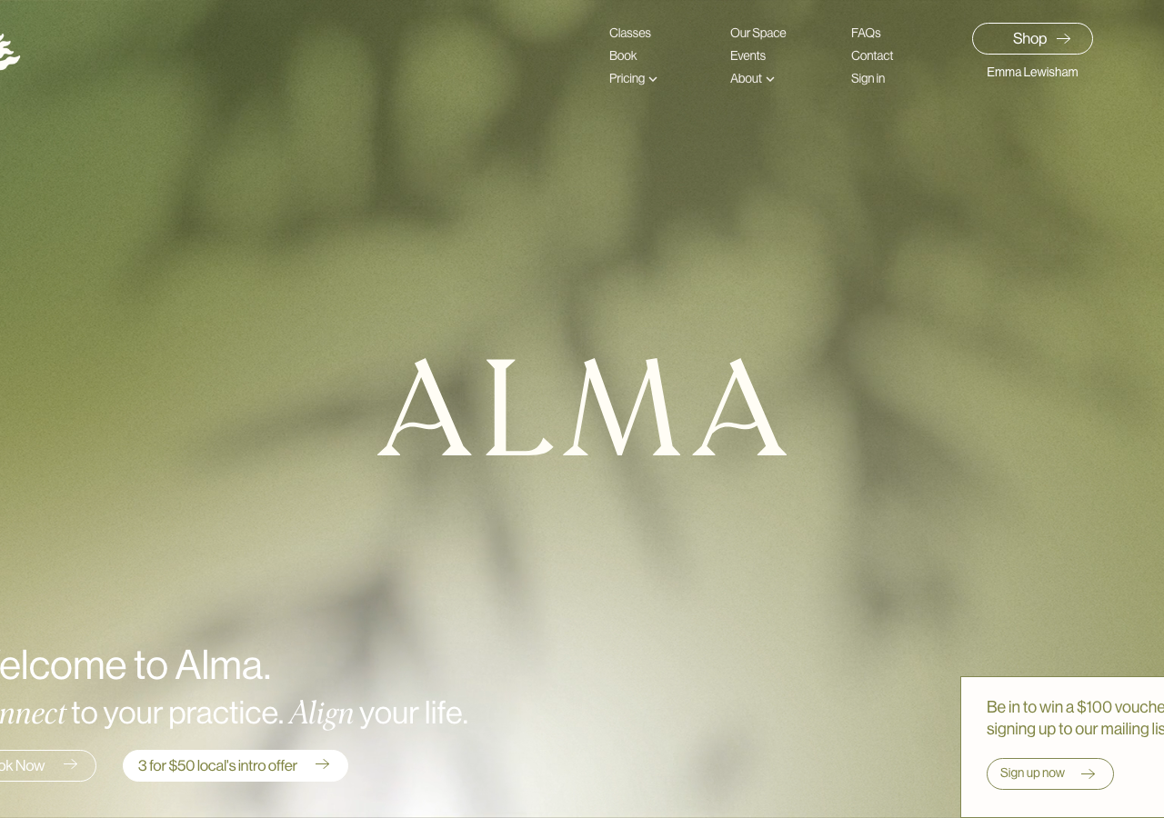
Alma Studio
almastudio.co.nz/The reference for a wellness-studio site that runs entirely in one olive tone (#7F8442 text on cream #F4F0EC), pairing a monumental Morion serif wordmark against Neue Haas Grotesk body for a calm, editorial feel.
Fitness flagship
Design tokens
background
surface
text
textMuted
accent
border
tone1
tone2
- display
- Morion
- body
- Neue Haas Grotesk Display Pro
- mono
Do / Don't
Reference it for
- Monochrome brand system: a single olive #7F8442 used for text, icons, borders and foreground over near-white, instead of a black-on-white default
- Giant centred display wordmark (Morion serif, ~cream #FFFDF8) floating over a soft, blurred green photographic backdrop as the hero focal point
- Serif-italic-in-a-sans-sentence trick: 'Connect to your practice. Align your life.' sets 'Connect' and 'Align' in Morion italic inside Neue Haas Grotesk running text
- Pill buttons at 21px / 40px radius with an inline arrow, outlined in the brand olive rather than filled
- Warm cream base palette: background #F4F0EC and #FFFDF8 instead of pure white, softening the whole page
- Numbered pricing index (01-06) as a plain-text stacked list with 'Get Started' repeated per row
- Vertical rotated side-tab CTA ('Download the Alma App') pinned to the right edge
- Tight negative letter-spacing (-0.24px to -0.6px) across the sans for a considered, close-set feel
Do not copy
- The ALMA lotus/open-book mark and the ALMA wordmark itself
- The exact olive #7F8442 + cream #F4F0EC + purple #826AAC palette as a lift
- The 'meaning nourish and soul' / 'House of Movement' brand copy
- Morion licensed as the display face on a brand that is not Alma
- The blurred green studio photography and interior shots
- '3 for $50 local's intro offer' and other Alma-specific pricing lines
- The Havelock North / Hawkes Bay location and contact details