Acne Studios
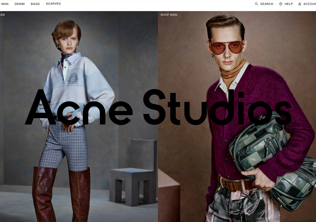
acnestudios.comThe reference for treating a storefront like an editorial spread: a massive black Helvetica-family wordmark laid straight over two full-height model photographs on a near-white ground, no chrome, no buttons, space doing all the structural work.
Retail flagship
Design tokens
background
surface
text
textMuted
accent
border
tone1
tone2
- display
- Helvetica Now Micro
- body
- Helvetica Now Text
- mono
Do / Don't
Reference it for
- Oversized black wordmark (~120px, tight tracking) centred over the hero imagery as the only display type, letting product photography carry the page
- Near-white paper ground (#ffffff to #f2f2f2) with pure black (#000000) text and a single electric cobalt (#0018a8) reserved for links, never for filled buttons
- Zero-radius everything: images, tags, containers all square-cornered, no rounded shapes anywhere
- No shadows and no card surfaces; separation comes entirely from generous whitespace, not elevation
- Two full-bleed model shots split left/right under quiet 'SHOP WOMAN' / 'SHOP MAN' labels as a dual-entry hero
- Tiny uppercase micro-labels with wide letter-spacing as the only secondary typographic voice (nav, section tags)
- Ultra-flat top bar: text-only nav (WOMAN / MAN / DENIM / BAGS) left, utility set (SEARCH / HELP / ACCOUNT / cart count) right, hairline divider
- Edge-to-edge photography in tight grids with minimal gutters, so imagery reads as one continuous magazine layout
Do not copy
- The 'Acne Studios' wordmark itself and its exact letterforms
- The specific electric cobalt #0018a8 as a brand-signature accent
- The literal WOMAN / MAN / DENIM / BAGS category taxonomy
- The Helvetica Monospaced Pro custom label face as-is
- The exact model art-direction and casting style of the hero photography