Ableton
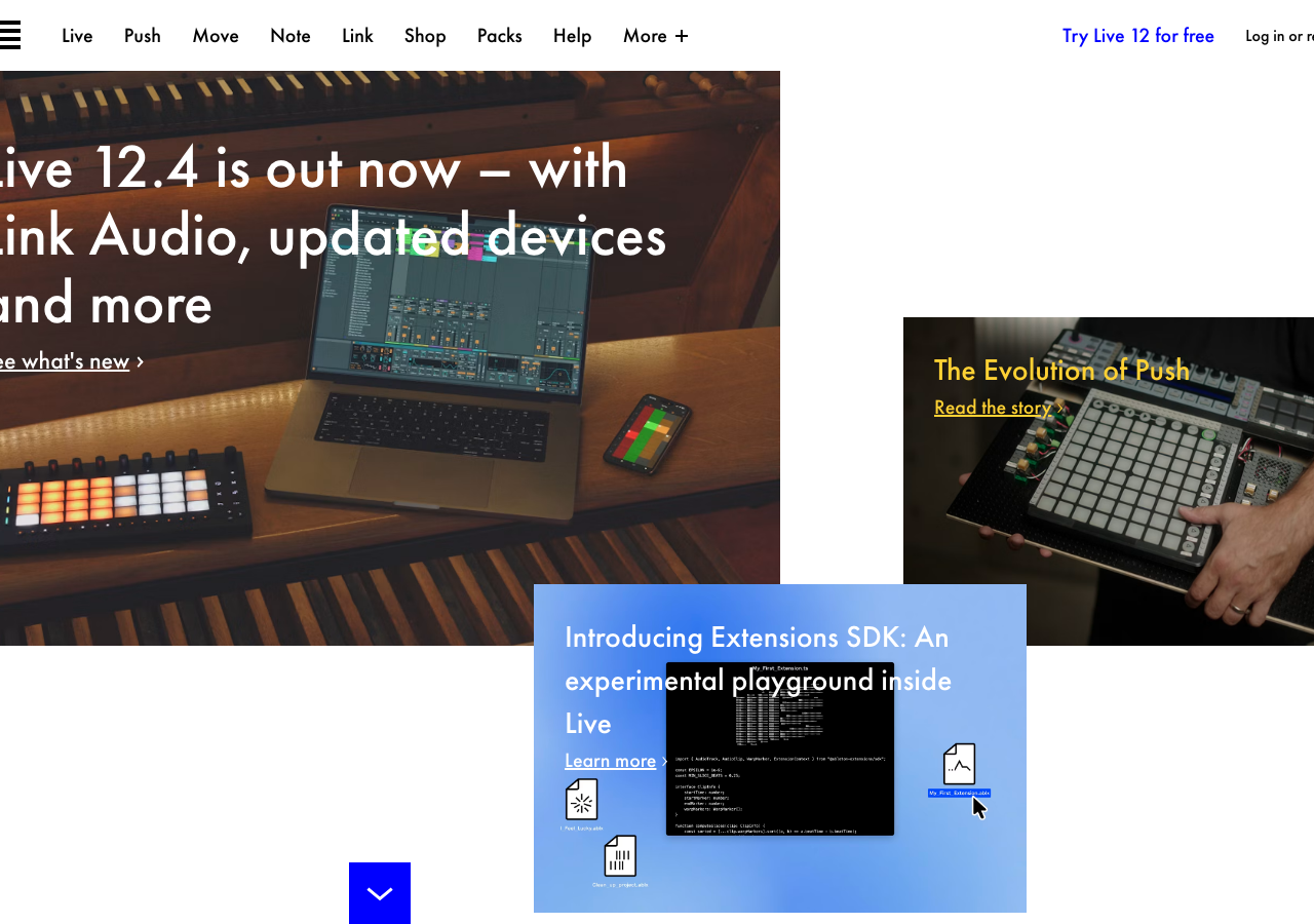
ableton.comThe reference for editorial-manual product design: stark white paper, oversized Futura PT geometry, and one signal blue (#0000ff) as the only interactive punctuation.
Creative Tool flagship
Design tokens
background
surface
text
textMuted
accent
border
tone1
- display
- Futura-Pt
- body
- futura-pt
- mono
Do / Don't
Reference it for
- Oversized Futura PT display headline (~90px) set in white over a flat colour field, wrapping across three lines with tight leading, no shadow.
- Signal blue #0000ff reserved strictly for interactive text (links, 'Learn more >', nav CTA) and nothing decorative.
- Thin top nav bar of short product names (Live, Push, Move, Note, Link) in ~16px Futura, no dividers, no pills.
- Zero-radius everything: tags, cards, inputs, buttons all at 0px corners for a technical-manual flatness.
- A blue-gradient hero field (~#5B7FE8) used sparingly as a break from the default white paper canvas.
- Product-as-object motif: skeuomorphic file icons (.ablx documents) scattered on the canvas with a real OS selection highlight and cursor.
- Inline chevron affordance ('Learn more >') instead of a filled button, keeping CTAs text-first.
- Functional colour coding via coral #ff8389 and teal #00d2be tag fills that categorise without softening the layout.
Do not copy
- The Ableton three-bar waveform logomark.
- Futura PT itself as a default display face (it is Ableton's signature; choose type to fit your brand).
- The literal #0000ff pure blue, which reads as an Ableton tell.
- The .ablx file-icon objects and 'Introducing Extensions SDK' product copy.
- The exact coral/teal tag palette as a content taxonomy.
- The 'Try Live 12 for free' product-specific nav CTA.