Retail Product Detail page examples
8 deeply-analysed retail product detail pages, 2 flagship-tier. Each carries the design tokens, the do and don't rules, the signature moves and the section anatomy, so your AI builder grounds a retail product detail page in how the best sites actually build it.
A product detail page for a retail brand is not a blank template. The best ones share a shape, and they diverge in exactly the places that make a brand feel considered. The 8 references here (Bellroy, Mejuri, Erewhon and Food52 among them) are read closely, not just screenshotted, so the patterns that carry a product detail page are on the table as structured data: the type scale, the one disciplined accent, the section order, the motion.
Take one specific: curated-catalogue hero into ordered product rows on Bellroy. A large catalogue feels curated via one bold hero, a quick-browse thumbnail filmstrip, then ordered product rows. That is the kind of concrete move a taste layer feeds your builder, instead of the generic product detail skeleton it defaults to with nothing to ground it.
Palate hands your AI builder these references over MCP with explicit borrow rules: what to take from each retail product detail page, what to leave, and how to re-skin it for your own brand. The point is not to copy one of them; it is to build a product detail page that is grounded in real craft and one-of-a-kind, not averaged. Browse the full set below, or open any reference for its tokens, do and don't rules and section anatomy.
Building a retail product detail page
Worth borrowing
- Making a large e-commerce catalogue feel curated: one bold hero, a quick-browse thumbnail filmstrip, then ordered product rows.
- A heavy uppercase display face for punchy three-line hero copy ("CARRY SMART. MOVE FREE. GO FAR."), balanced by a quiet body sans.
- A near-monochrome warm palette with one terracotta accent (#CD4C20) reserved for primary CTAs, so the buttons always read as the next action.
- A calm, consistent Material motion system (cubic-bezier(0.4,0,0.2,1), 0.15-0.3s) that keeps a busy shop feeling composed.
- Small, considered radii (5.25px cards, 9999px pills) and a grey ladder for tidy product UI.
- A values/mission-led opening that justifies premium pricing for a grocer or food shop.
Do not copy
- "Carry smart. Move free. Go far." and the Bellroy mark are brand-coded; borrow the heavy three-line hero device, not the words.
- GTUltra is a licensed display face; map to a comparable heavy grotesque, keep Lato (open-source) or an equivalent for body.
- The terracotta is Bellroy's signature; pick the client's own single accent and apply it with the same discipline.
- The Sharp Sans system and the exact warm palette are erewhon's identity; build the client's own.
- erewhon's cult positioning and price point are theirs; a local grocer should ground the premium in its real provenance and community, not imitate the hype.
- Scale the range and the smoothie/lifestyle extensions to what the client actually sells.
Distilled across these 8 references. Open any one for its full guidance.
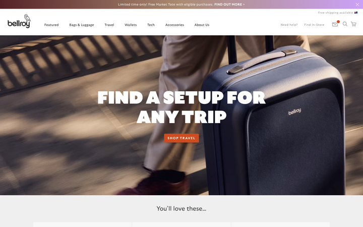
Bellroy
flagshipRetail
an accessories e-commerce site that fronts a deep catalogue with one bold, punchy hero, leading with heavy uppercase GTUltra type, a warm terracotta accent on a near-monochrome base, and a calm Material-style motion system that keeps a 40-section shop feeling composed.
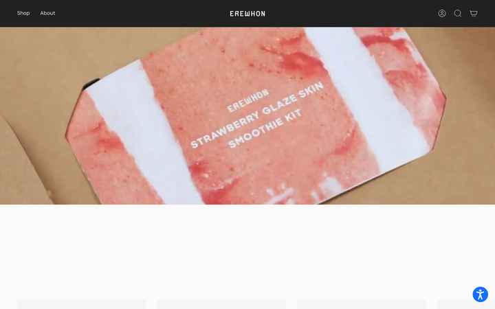
Erewhon
strongRetail
a cult premium grocer that turned organic groceries into a lifestyle brand, a warm off-white canvas, confident Sharp Sans, a category-led shop, and a strong mission-and-community story that justifies the premium.
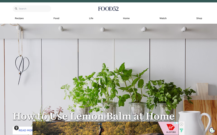
Food52
strongRetail
a food-and-home brand that fused editorial content with commerce, recipes and stories draw you in, a clean serif-and-sans system on white, and a shop (cookware, gifts, homewares) is always one tap away.
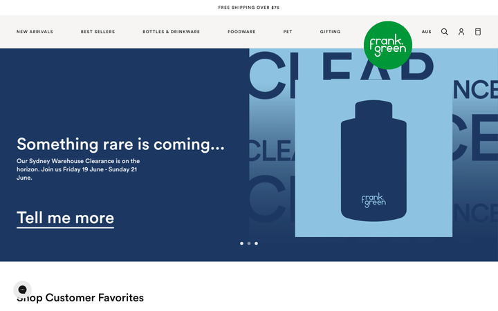
Frank Green
strongRetail
an Australian premium-drinkware brand whose Shopify store leads with a glossy product hero on warm cream, a confident brand green, the geometric Circular Std sans with a Victor serif accent, big rounded buttons, and a customisation-and-gifting story told through clean product photography.
Hay
strongRetail
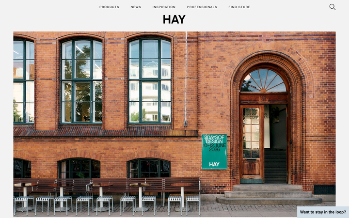
a Danish designer-furniture house whose store reads like a quiet gallery, near-black ink on a single light-grey field, Neue Helvetica paired with an ITC New Baskerville serif, almost no UI chrome, and a slow editorial scroll where the products and photography are the only colour.
Jardan
strongRetail
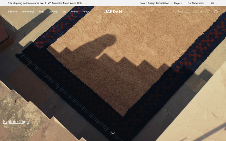
an Australian designer-furniture and homewares house whose homepage opens on a warm, cinematic golden-hour video of hands working raw timber and a rug being woven, set in a strictly greyscale, whitespace-led editorial system with the Neuzeit Grotesk sans doing nearly all the work and a BN Cicero serif for accents.
Mejuri
flagshipRetail
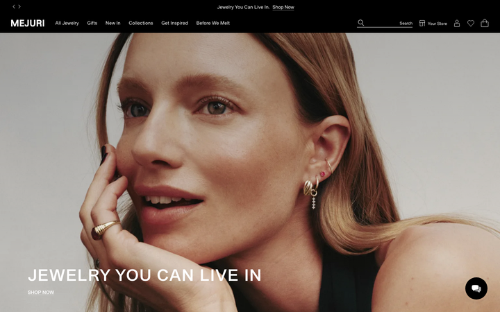
a flagship fine-jewellery shop that reads like an editorial magazine, full-bleed black hero portrait, an all-caps grotesque headline set against monospace body and warm-grey detail copy, near-zero radii and almost no shadow, with restraint doing all the luxury work.
Vrai
strongRetail
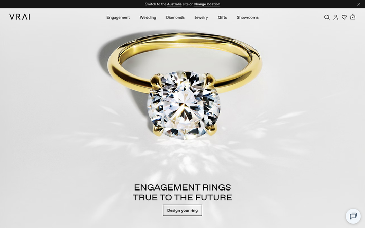
a lab-grown fine-jewellery house whose homepage is a near-empty white gallery, a single yellow-gold solitaire ring floating in bright caustic light above a quiet centred serif headline, set in a black-on-white system with metal-named gradient tokens (white-gold, yellow-gold, rose-gold, platinum) and slow, refined cubic-bezier transitions.