Developer Tool Product page examples
6 deeply-analysed developer tool product pages, 1 flagship-tier. Each carries the design tokens, the do and don't rules, the signature moves and the section anatomy, so your AI builder grounds a developer tool product page in how the best sites actually build it.
A product page for a developer tool brand is not a blank template. The best ones share a shape, and they diverge in exactly the places that make a brand feel considered. The 6 references here (Vercel, Adaline, Arc and Cal Com among them) are read closely, not just screenshotted, so the patterns that carry a product page are on the table as structured data: the type scale, the one disciplined accent, the section order, the motion.
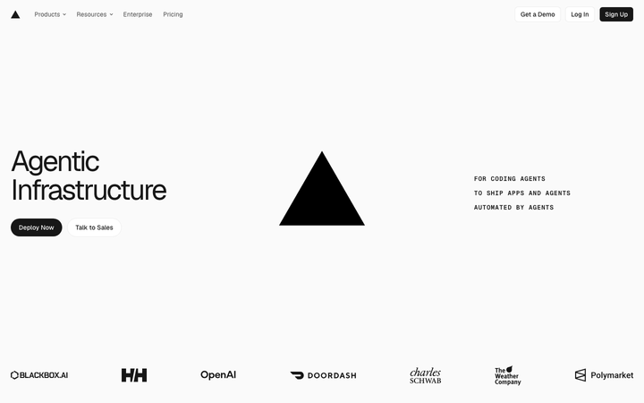
Take one specific: visible-grid with crosshair markers on Vercel. A geometric grid is treated as a visible design element, with a + crosshair intersection marker as the signature device, on a near-monochrome canvas (black, white, #fafafa, one blue #0070f3). That is the kind of concrete move a taste layer feeds your builder, instead of the generic product skeleton it defaults to with nothing to ground it.
Palate hands your AI builder these references over MCP with explicit borrow rules: what to take from each developer tool product page, what to leave, and how to re-skin it for your own brand. The point is not to copy one of them; it is to build a product page that is grounded in real craft and one-of-a-kind, not averaged. Browse the full set below, or open any reference for its tokens, do and don't rules and section anatomy.
Building a developer tool product page
Worth borrowing
- Defying a category's visual defaults on purpose: a warm, natural-world build in a space that expects dark-neon. The single most borrowable idea here.
- A grotesque + mono type pairing where mono carries every label, button and number, giving "machine precision" without a dark theme.
- An earthy, low-chroma palette (forest ink #0A1D08 on paper #FBFDF6, with sage and espresso) that still passes as a serious B2B tool.
- Recurring art direction: the same illustrated world at the top and bottom of the page, bookending the scroll.
- Odometer number counters and a numbered, auto-advancing product tab sequence as proof-of-capability motion.
- A brand-announce homepage structure: hero leads with the new product name, customer-quote in larger type below, browser-screenshot mock, then features. Different cadence from "features-first" pages and more honest for products in transition.
Do not copy
- The garden render itself. It is the brand. Borrow the *strategy* (build a coherent world that defies the category), not the imagery.
- akkurat and fragmentMono are licensed brand faces; map to a similar grotesque + mono pair, do not source these.
- The ~24,750px page length suits a venture-funded launch site with a lot to prove; most client briefs want a third of it.
- The Marlin / Marlin Soft SQ bespoke type system - The Browser Company's commissioned faces, not licensable.
- The exact electric blue #3139fb and deeper indigo #2702c2 - strongly Arc-coded.
- The peach-cream wash specifically - distinctive to Arc's brand at this stage.
Distilled across these 6 references. Open any one for its full guidance.
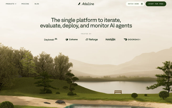
Adaline
strongDeveloper Tool
an AI-infra product site that swaps the genre's default dark-neon for a hand-built 3D Japanese-garden world, then runs warm earth tones, a grotesque/mono type pair and patient scroll-reveal motion over the top so a developer tool feels like a calm place.
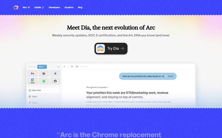
Arc
strongDeveloper Tool
a Next.js product site that turns electric ultramarine (`#3139fb`), a peach-cream wash (`#fffcec`), and the bespoke Marlin display face into a confident brand-announce moment - "Meet Dia" - where every other site decision exists to give the colour and the new product name room to land.
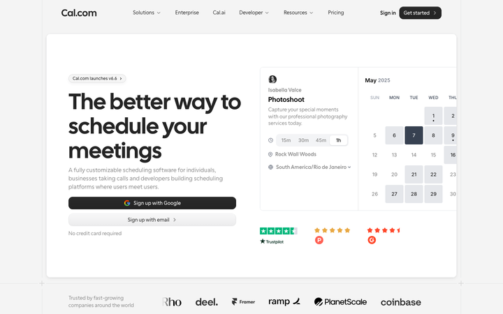
Cal Com
strongDeveloper Tool
The reference for open-source dev-tools brand at peak typographic confidence - Cal Sans 64px H1 on pure white, real booking widget in hero, prestige customer logos.
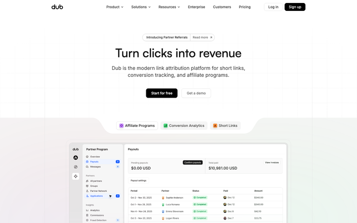
Dub
strongDeveloper Tool
The reference for open-source link-attribution platform - pure black/white monochrome with Satoshi + Inter, real dashboard hero, dotted-grid integration map, 48-keyframe motion library.
Gsap
strongDeveloper Tool
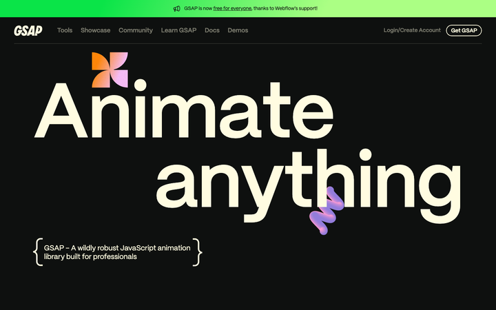
a near-black product site where a 101px "Animate anything" headline in the bespoke Mori sans on creamy off-white (`#fffce1`) and 3D liquid-form objects animated by GSAP itself make the homepage the most credible product demonstration in the JavaScript-animation category.
Vercel
flagshipDeveloper Tool
engineered minimalism - a near-monochrome light site where a geometric grid, the in-house Geist typeface and tightly-tracked bold headings make "developer tool" feel like precision hardware.