Yerba Buena Engineering And Construction
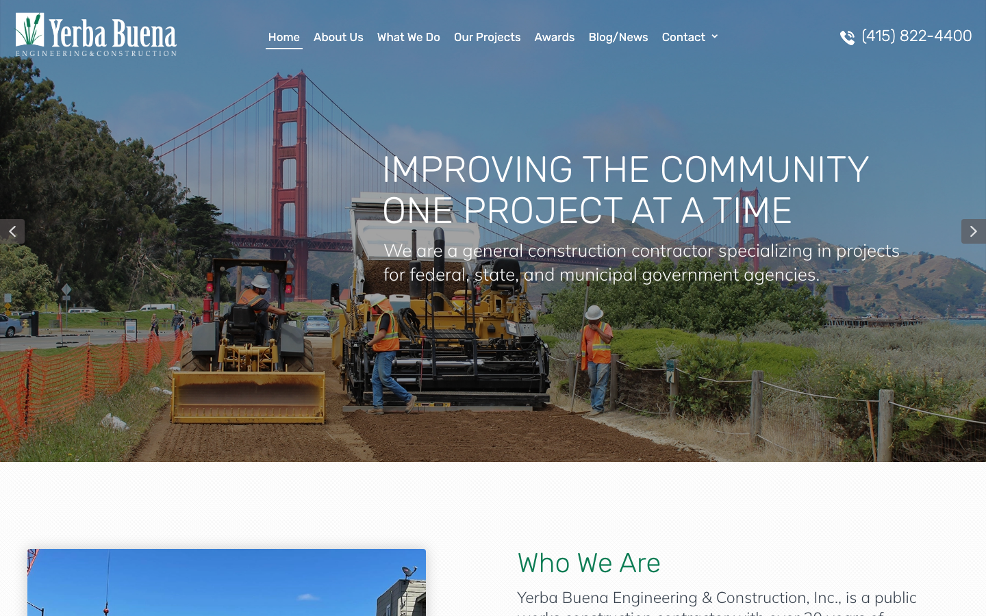
yerba-buena.net/A San Francisco civil/heavy construction contractor that wins federal, state and municipal trust by showing the hard jobs it has handled - a green-and-gold canvas over Golden Gate / Bay infrastructure photography, a "Challenges We've Overcome" checklist, a public-works project grid and a Caltrans engineer's testimonial.
Design tokens
- display
- Rubik
- body
- Mulish
- mono
Do / Don't
Reference it for
- B2G / public-works trust architecture: capability cards, a "challenges overcome" checklist, a named-project grid, awards, and an agency testimonial - competence over warmth.
- The "carried timeline" device: enumerating the hard conditions handled (sensitive sites, remote, 24/7, secure) so each risk reads as a proof of capability.
- A disciplined construction palette: one green plus a single safety-gold accent (the literal language of hi-vis and caution signage) on white.
- A named-project portfolio grid where real civic projects ARE the credibility (Bayview Gateway, Hunters Point Seawall, etc.).
- A direct, low-friction "Get In Touch" band built around a phone number - the right conversion for a contract-bid buyer.
Do not copy
- The exact green #0c7c54 + gold #ffd700 palette and the Golden Gate / Bay imagery (re-skin to the client's palette and region).
- The real project names, awards and the Caltrans testimonial - these are Yerba Buena's genuine credentials. A rebuild must use the client's OWN projects, awards and references.
- The WordPress/CG-Child/Swiper DOM. Rebuild lean on Astro.
Signature moves
challenges-overcome carried timeline
instead of claiming reliability, a 'Challenges We've Overcome' band enumerates the genuinely hard conditions the firm has handled (environmentally and archaeologically sensitive sites, remote locations, rugged terrain, mission-critical 24/7 facilities, secure facilities), turning a list of risks into a list of proofs.
named-project portfolio wall
a 3-up grid of named real civic projects (Bayview Gateway, Hunters Point Seawall, Funston Retaining Wall) with photos makes the actual completed public works the credibility, not adjectives.
green-plus-safety-gold civil palette
one construction green (#0c7c54) with a single safety-gold accent (#ffd700 - the colour of hi-vis and caution signage) over slate-blue ink on white reads as serious, civic and on-site without decoration.
Related references
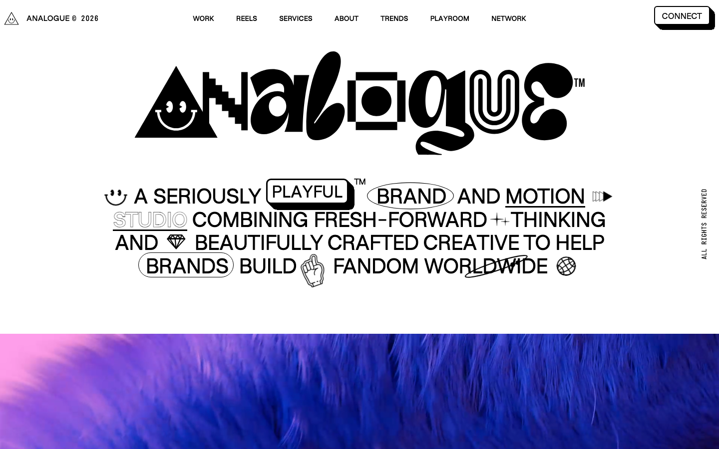
Analogue
strongCreative Studio
a "seriously playful" brand-and-motion studio that wears its personality as type, a wonky multi-alternate ANALOGUE wordmark, emoji and icon glyphs set inline in the copy, a candy-pink accent on white, and a GSAP-driven box of tricks (mexican-wave letters, glitches, bounce, float) kept just on the right side of chaos.
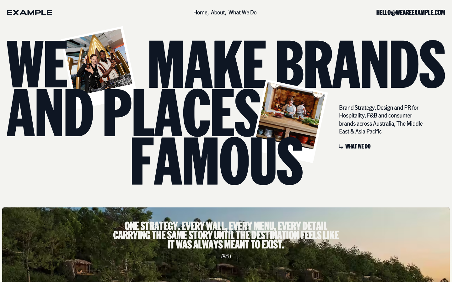
We Are Example
nicheCreative Studio
The reference for boutique hospitality-PR agencies — warm off-white canvas with deep navy ink, oversized American Grotesk Compressed display headlines, polaroid-style photo collage hero, and a soft Lenis-smoothed editorial rhythm.
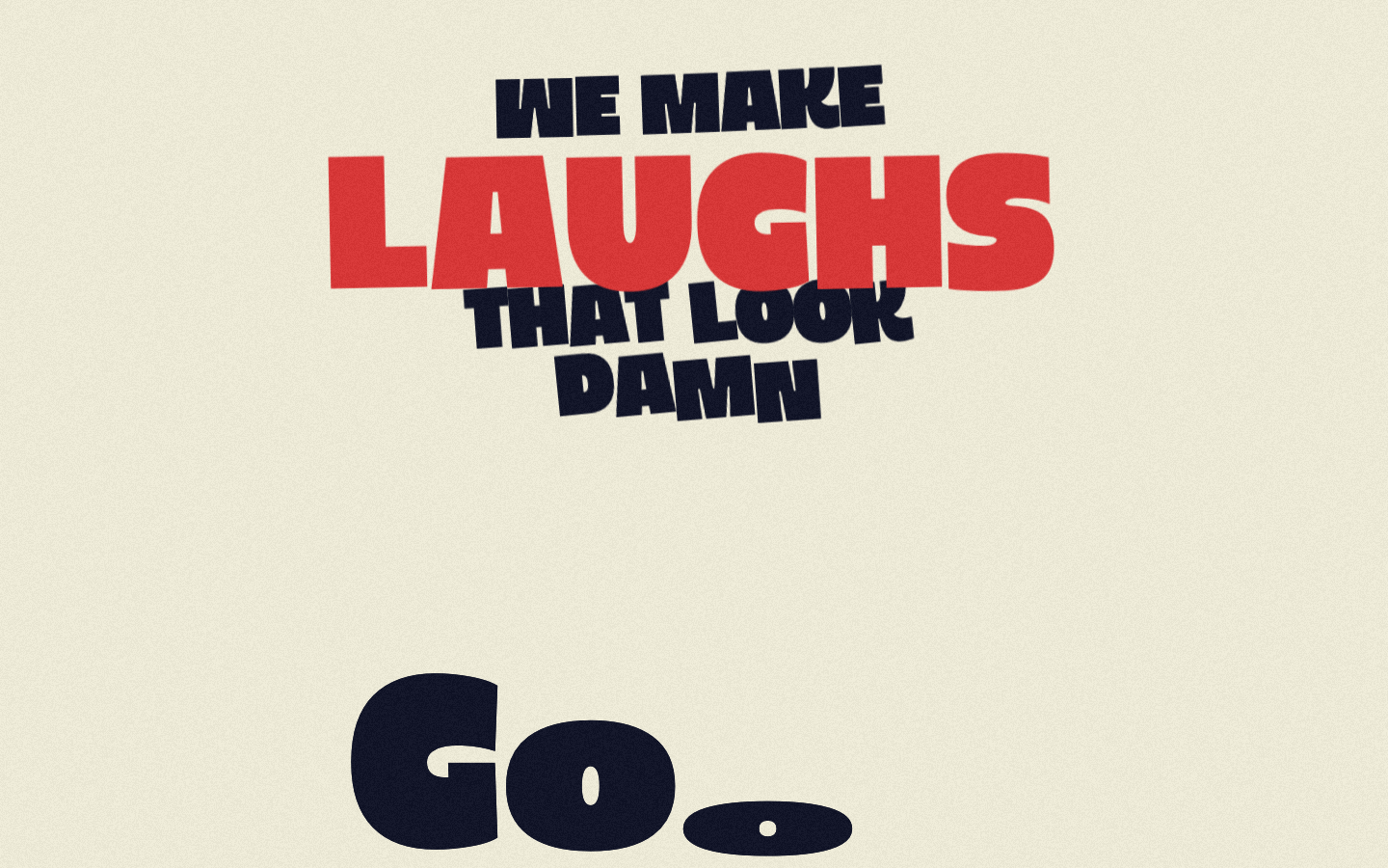
Working Stiff Films
nicheFilm Production
Comedy film production company portfolio — cream paper + slate-blue near-black + red accent, GSAP+ScrollTrigger, 270px hero, "noise" film-grain keyframe.

Alche
strongCreative Studio
The reference for Japanese virtual-character + immersive experience studios — Astro v5 build, neon yellow-green accent, 5-font multi-language system, KizunaAI case study.