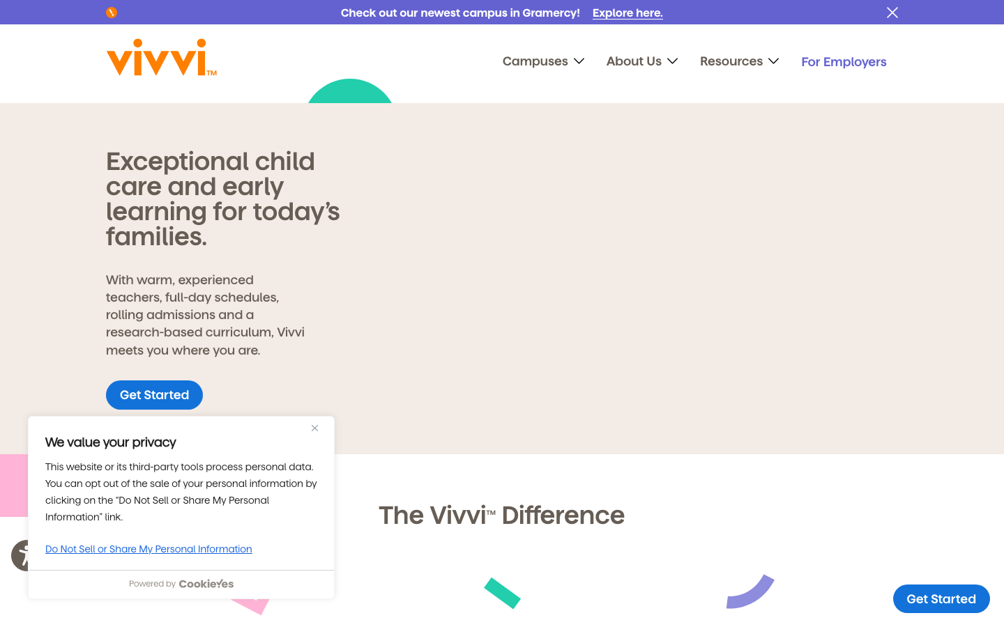
Vivvi
vivvi.com/a premium childcare brand that turns a warm putty background, a playful orange dotted-i wordmark and a bright primary-blue button into a calm, trustworthy, parent-facing system, big friendly semibold headlines, rounded geometry, and small confetti-shaped accents in teal, pink and purple.
Design tokens
- display
- MatterVivvi (Matter)
- body
- MatterVivvi Regular
- mono
- none
Do / Don't
Reference it for
- A childcare centre, preschool or family-services brand that wants to look warm and premium at once, not garish primary-colour daycare.
- The putty/sand neutral (#F3EBE5) as a softer, more grown-up alternative to white, with warm-brown body text instead of grey.
- A disciplined accent strategy: a playful orange wordmark, a single bright-blue action colour, and confetti accents used sparingly.
- Rounded, friendly geometry (pill buttons at 50px, 8px card radii) that signals approachability without childishness.
- For a Jiffi childcare or family-services client, this is the reference for trustworthy warmth: how a local centre should look top-tier to parents.
Do not copy
- The Matter (MatterVivvi) family is licensed and self-hosted; map to a similar humanist geometric sans (Matter alternative, or Hanken Grotesk / General Sans).
- The dotted-i orange wordmark is Vivvi's identity; recreate the playful-mark idea with the client's own logo.
- The confetti shapes are brand-specific; use the technique (a few drifting geometric accents) with the client's own palette, sparingly.
Signature moves
warm putty premium-childcare palette
a putty/sand neutral (#F3EBE5) with warm-brown body text (not grey) and a single bright-blue action colour (#1272d9) reads premium and trustworthy rather than garish primary-colour daycare.
rounded-friendly geometry
pill buttons at 50px and 8px card radii signal approachability without childishness.
sparing drifting confetti accents
small confetti-shaped accents in teal, pink and purple drift in sparingly as a few geometric flourishes, not a busy field.
Related references
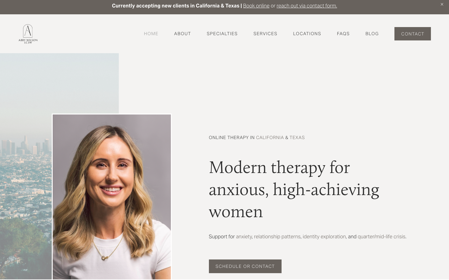
Abby Wilson Therapy
strongOther
A boutique therapist for "anxious, high-achieving women" who reassures by being polished and specific - a warm sand-and-charcoal editorial system, a Calluna serif voice, named specialties and a clearly walked process that says "I understand exactly who you are and how this works".

Alche
strongCreative Studio
The reference for Japanese virtual-character + immersive experience studios — Astro v5 build, neon yellow-green accent, 5-font multi-language system, KizunaAI case study.
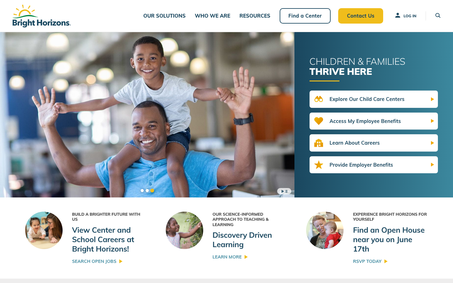
Bright Horizons
strongChildcare Education
a large early-education and childcare provider whose site leads with a warm deep-teal and sunshine-yellow palette over happy children's photography, the rounded Mulish sans throughout, a tabbed audience-routing hero, and a clear, trust-led grid of pathways for parents and employers.
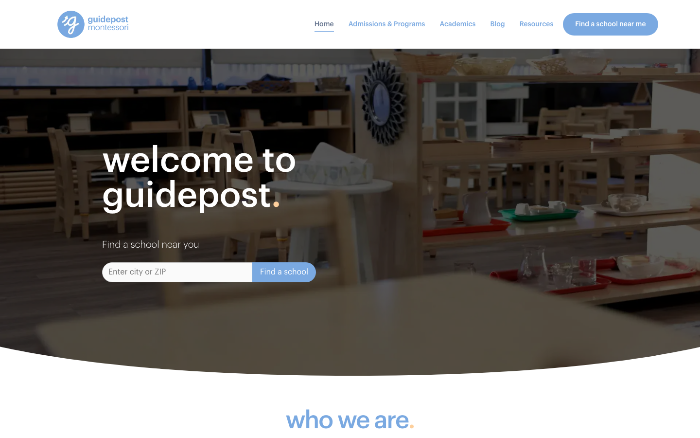
Guidepost Montessori
strongChildcare Education
a warm, parent-facing Montessori network site built in WordPress and Elementor, lowercase Graphik headings each ending in a coloured full-stop, a soft cornflower-blue (#7AA9E1) and coral (#ED4944) palette on slate-blue body text, pill buttons and rounded-bottom image cards, gentle and trustworthy rather than clever.