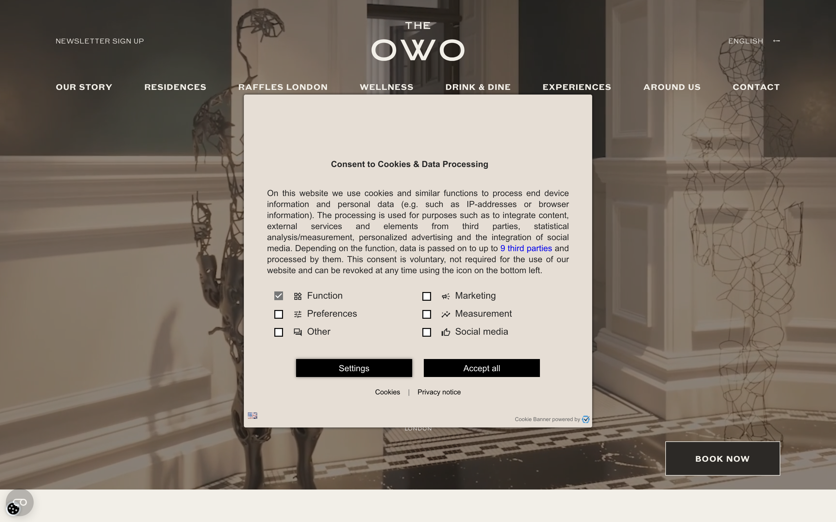
The Owo Residences
www.theowo.london/a Raffles-branded luxury residence in the restored Old War Office, selling heritage through grand marble photography, a Caslon-serif-plus-1906-sans pairing in warm taupe and cream, centred wordmark navigation, and quiet GSAP/ScrollTrigger parallax with a persistent "Book Now".
Design tokens
- display
- 1906
- serif-companion
- Caslon 540
- body
- 1906
- fallback-serif
- Times
- mono
- none
Do / Don't
Reference it for
- A warm neutral palette (taupe ink #2C2926, cream #F2EFE8, white) where architectural photography is the colour.
- A Caslon-style display serif paired with a humanist sans, with positive letterspaced caps on labels.
- Centred-wordmark navigation with a multi-language switch and a persistent "Book Now" pill.
- GSAP + ScrollTrigger parallax on hero and section imagery, used for slow depth, not bounce.
- Restrained, decorous transitions (0.15s colour, 0.3-1s opacity) and a custom cursor as a luxury cue.
Do not copy
- "THE OWO" wordmark, the Raffles co-brand and the Old War Office imagery are this development's identity; borrow the posture, not the marks.
- Caslon 540 and 1906 are licensed; map to a Caslon/Garamond-class serif plus a humanist sans.
- The full animate.css keyframe set is loaded but largely unused; do not inherit that weight, the parallax is the real motion.
- The co-branded hospitality story (Raffles) suits a development with a genuine operator partnership; do not imply a partnership a client does not have.
Signature moves
warm-neutral architecture-is-colour palette
a taupe-ink #2c2926, cream #f2efe8 and white palette lets grand architectural photography supply the colour, with a Caslon-style serif over a humanist sans.
centred-wordmark nav with persistent Book Now
navigation centres the wordmark with a multi-language switch and keeps a persistent "Book Now" pill (radius 48px) visible.
slow parallax depth, no bounce
GSAP plus ScrollTrigger parallax on hero and section imagery is used for slow depth with decorous transitions (0.15s colour, 0.3-1s opacity), not bounce.
Related references
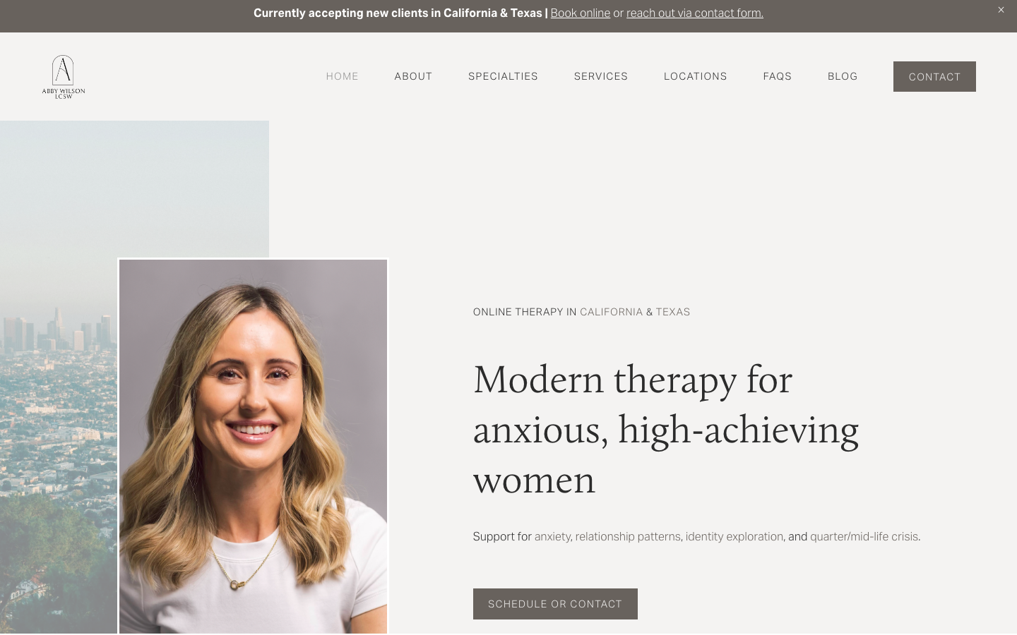
Abby Wilson Therapy
strongOther
A boutique therapist for "anxious, high-achieving women" who reassures by being polished and specific - a warm sand-and-charcoal editorial system, a Calluna serif voice, named specialties and a clearly walked process that says "I understand exactly who you are and how this works".
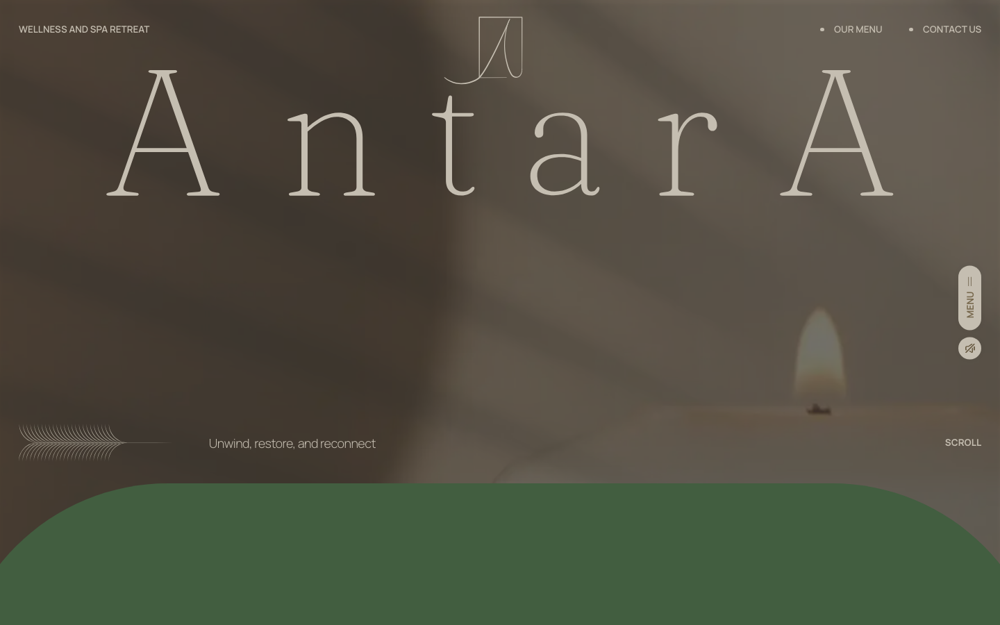
Antara Spa
strongBeauty
a Malaysian day spa that sells calm with one oversized Fraunces wordmark on a sun-warmed photographic hero, an earthy sand-brown-sage palette, and slow GSAP-and-Lenis scroll, the whole page tuned to feel like exhaling.
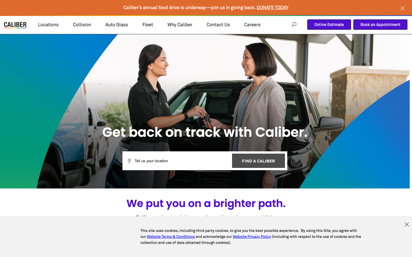
Caliber
strongTrades
a collision and auto-service chain whose site is a clean, trust-first conversion funnel, with "Online Estimate" and "Book an Appointment" front and centre, a confident dark-on-white system, and a single bold accent.
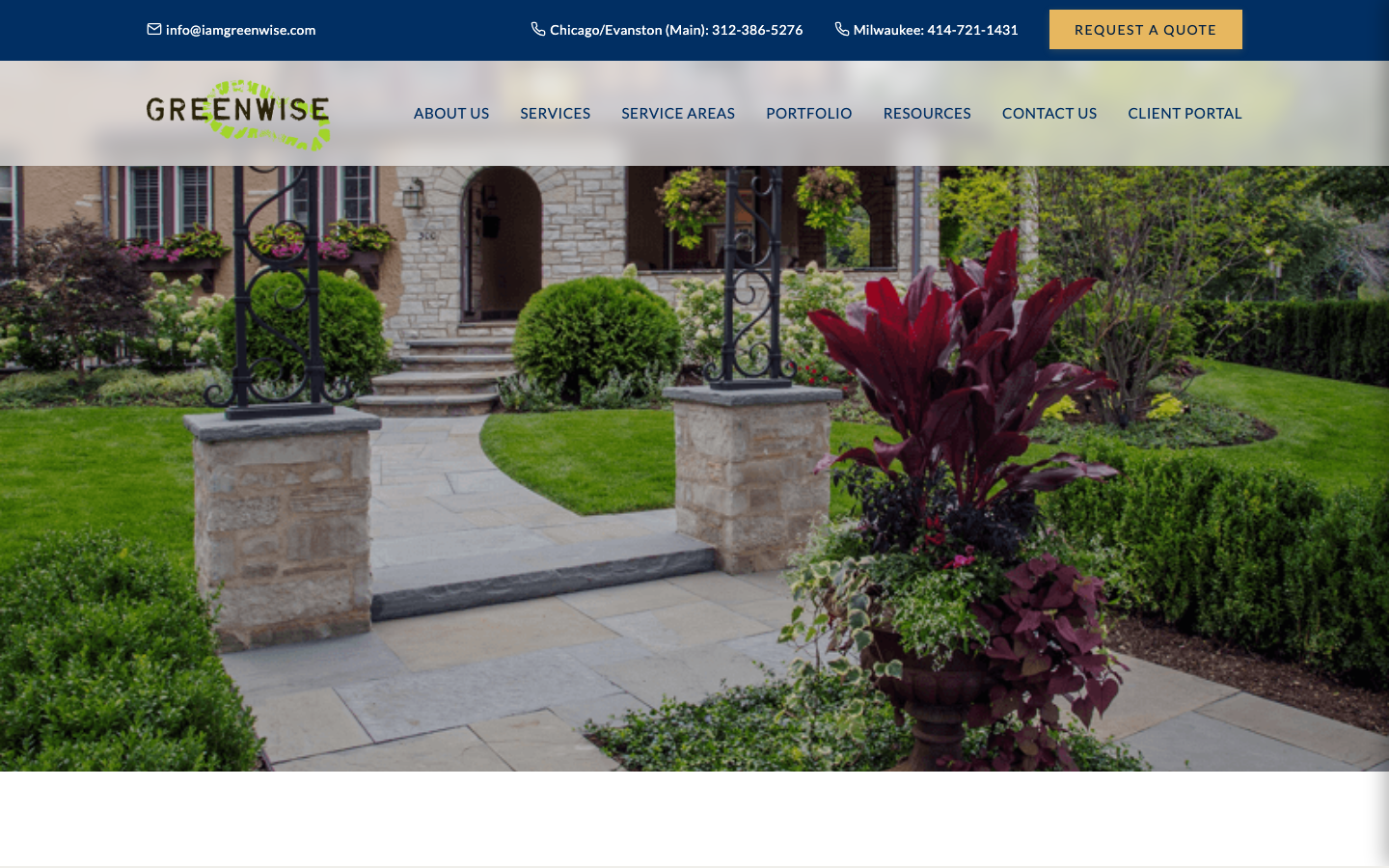
Greenwise Organic Lawn Care
strongOther
A Chicago/Milwaukee organic-forward lawn-care company that earns trust through values and locality - lush landscape photography on a warm navy-gold-cream canvas, a Cormorant Garamond serif, a "Why Choose Greenwise" reassurance band, a service-area map with an availability checker, and a sustainability commitment that makes "organic" feel credible rather than greenwashed.