The Agency Re
www.theagencyre.com/a global luxury real-estate brokerage that sells aspiration through cinematic full-bleed imagery, an italic serif headline over a coastal hero, a single confident red brand accent, and a property-search bar placed front and centre as the one job the homepage has.
Design tokens
- display
- Times (serif, italic headline)
- body
- Lato
- mono
- none
Do / Don't
Reference it for
- Cinematic full-bleed hero imagery as the entire emotional pitch for a property brand.
- An italic serif aspirational headline ("the world's finest...") set over photography.
- Single-accent restraint: a near-monochrome canvas with one confident red (#ED2127) on the logo and primary action.
- Search-bar-as-hero: a Buy/Sell/Rent tabbed search field placed front and centre as the homepage's one job.
- A quiet horizontal nav (BUY / SELL / RENT / AGENTS / REGIONS) that organises a brokerage cleanly.
Do not copy
- The red "A" monogram and "THE AGENCY" wordmark are the brand's identity; reproduce the single-accent approach with the client's own mark.
- The listings search and map experience is a heavy client-rendered app; a local agent needs a far lighter search or a link to a listings provider.
- Times and Lato here are the lean fallback stack; choose a deliberate serif-plus-sans pairing rather than copying the defaults.
Signature moves
cinematic full-bleed hero as the pitch
full-bleed coastal photography carries the entire emotional pitch, with an italic serif aspirational headline set over the image on a near-white system.
search-bar-as-hero
a Buy/Sell/Rent tabbed search field sits front and centre over the hero as the homepage's single job, under a quiet horizontal nav.
Related references
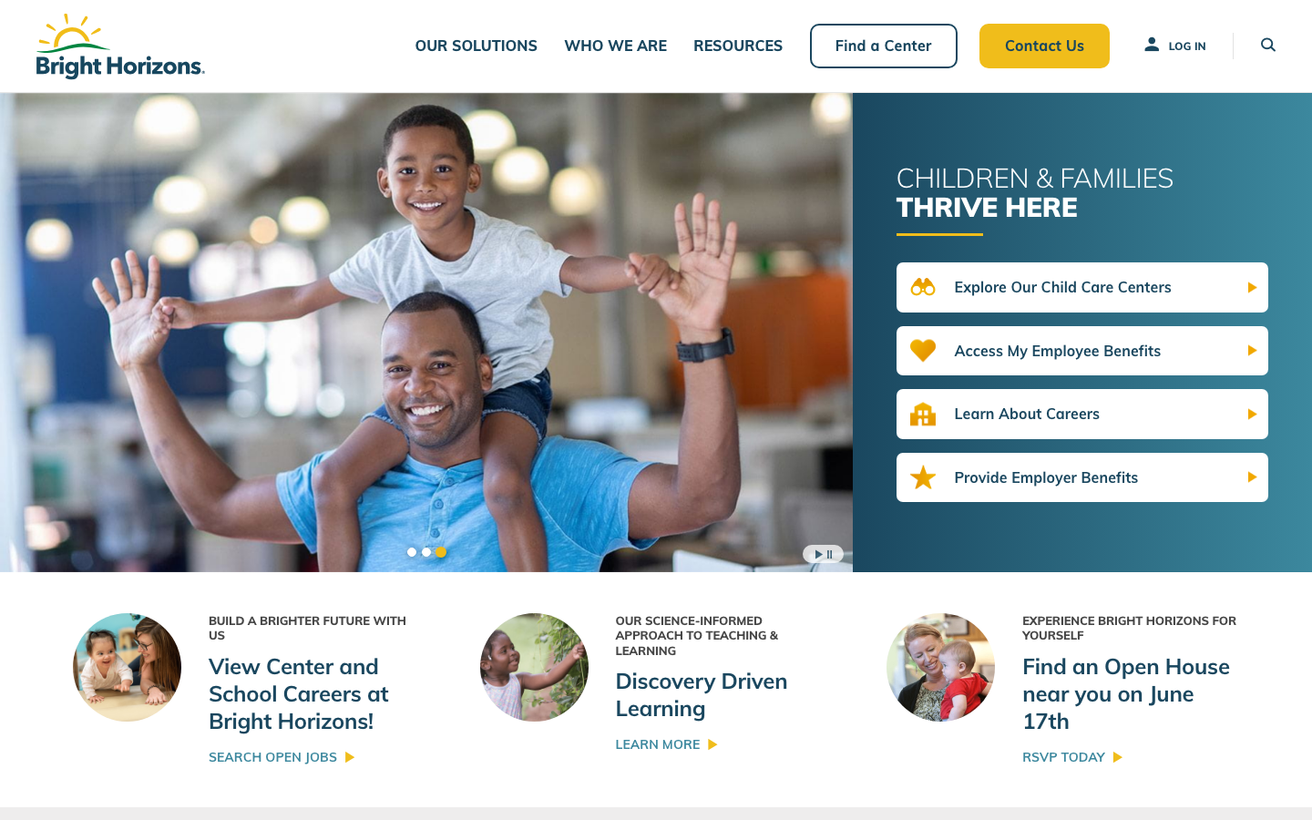
Bright Horizons
strongChildcare Education
a large early-education and childcare provider whose site leads with a warm deep-teal and sunshine-yellow palette over happy children's photography, the rounded Mulish sans throughout, a tabbed audience-routing hero, and a clear, trust-led grid of pathways for parents and employers.
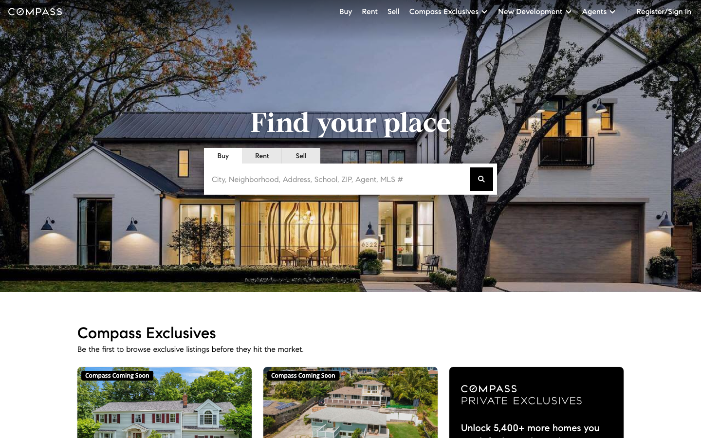
Compass Re
flagshipReal Estate
a tech-brokerage site that fronts a property search engine with one calm photographic hero and a serif headline, using a near-monochrome ink-on-white system, a custom Compass Sans plus Compass Serif pairing, and a prominent buy/rent/sell search bar as the centrepiece.
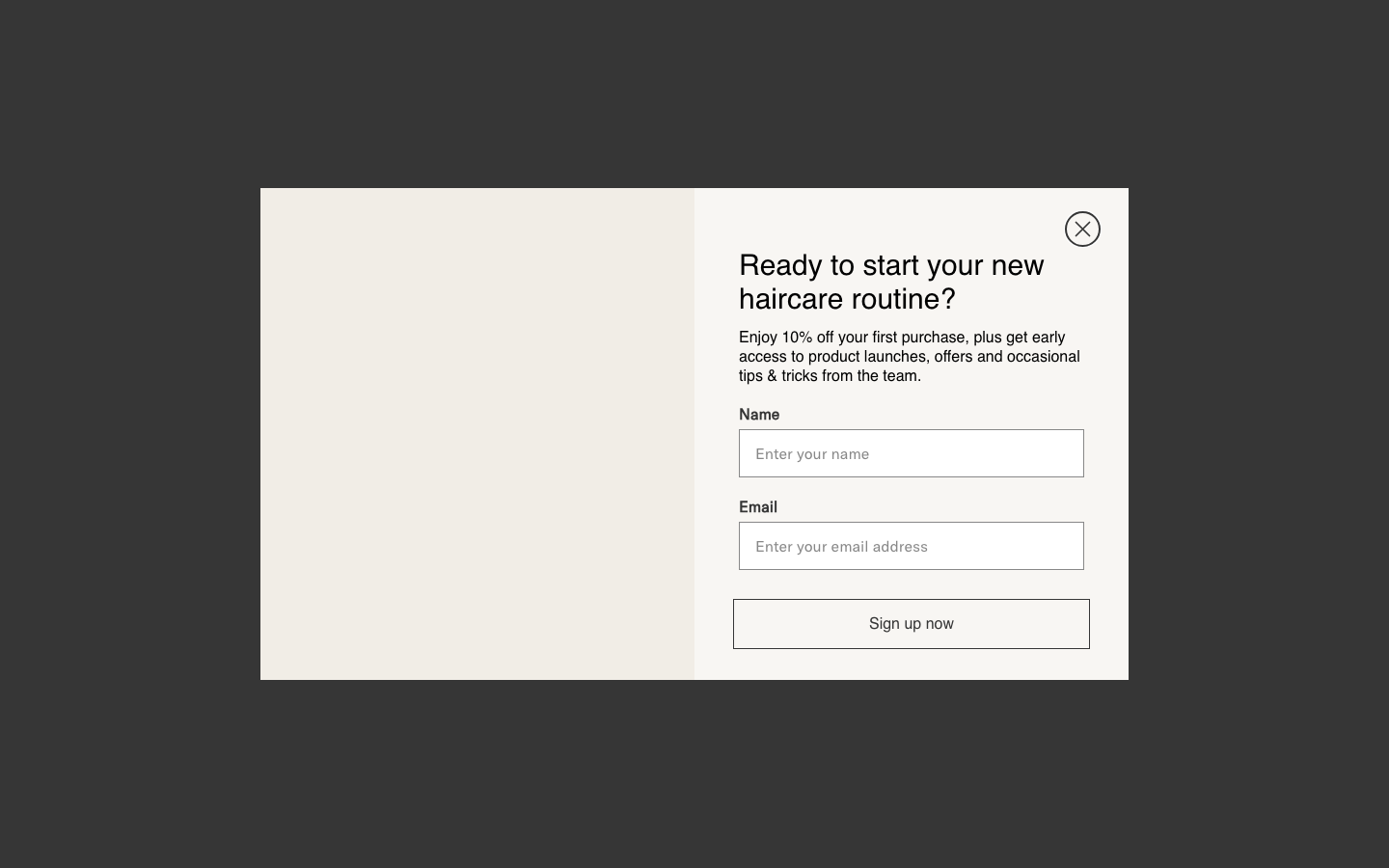
Larry King
flagshipOther
A London salon group and haircare line that fuses warm putty-cream calm with editorial fashion confidence - big half-and-half image panels, GT America, and a leopard-print swagger - so it feels both welcoming and clearly cool.
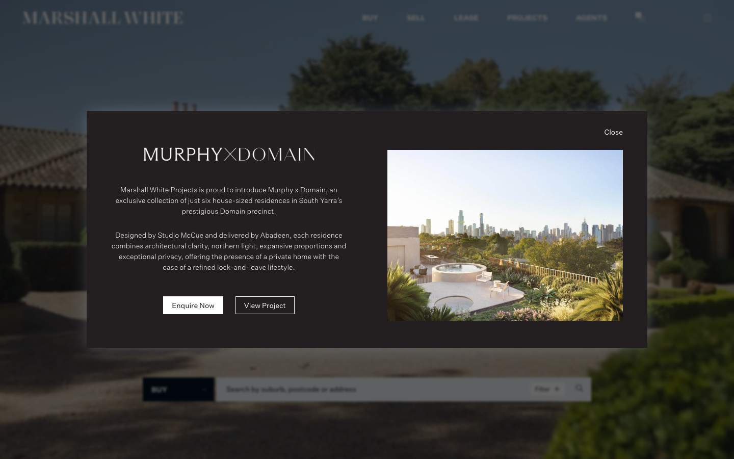
Marshall White
strongReal Estate
a premium Melbourne real estate agency rendered as a restrained editorial object: deep navy ink (#00101F) on white, a single refined sans (Untitled Sans) with a Georgia/Cigars serif accent, full-bleed property photography and almost no radius, so the work and the wealth speak quietly.