Teachable
teachable.comThe reference for course-platform brands with editorial serif + neon-yellow CTA — Ivy Presto Headline at 75px, integration illustration with portrait centre, 150,000 creators trust signal.
Design tokens
- display
- Ivyprestoheadline, Georgia, sans-serif (paid Type Network serif)
- body
- Peridotpenormvf, Arial, sans-serif (paid display sans, variable axis)
- mono
- (none)
Do / Don't
Reference it for
- Neon yellow-green #e6ff32 CTA pill — distinctive saturated colour on black/white
- Ivy Presto Headline serif for hero H1 — paid Type Network serif at 75px
- Two-family stack: Peridot Pe Norm VF (sans) + Ivy Presto Headline (serif)
- Italic-serif emphasis word ("Made to adapt *and* evolve") — italic for "and"
- Rem-math fractional type scale — responsive to root-font-size accessibility
- Pre-nav switch chips "For Educators" / "For Enterprise" — two-audience segmentation
- 17-section dense page with editorial serif H2s
- 150,000 creators trust signal appearing twice for emphasis
Do not copy
- The Peridot Pe Norm VF and Ivy Presto Headline licences (paid)
- The neon yellow-green #e6ff32 exact hue
- The Teachable logotype
- The Hotmart cookie consent platform
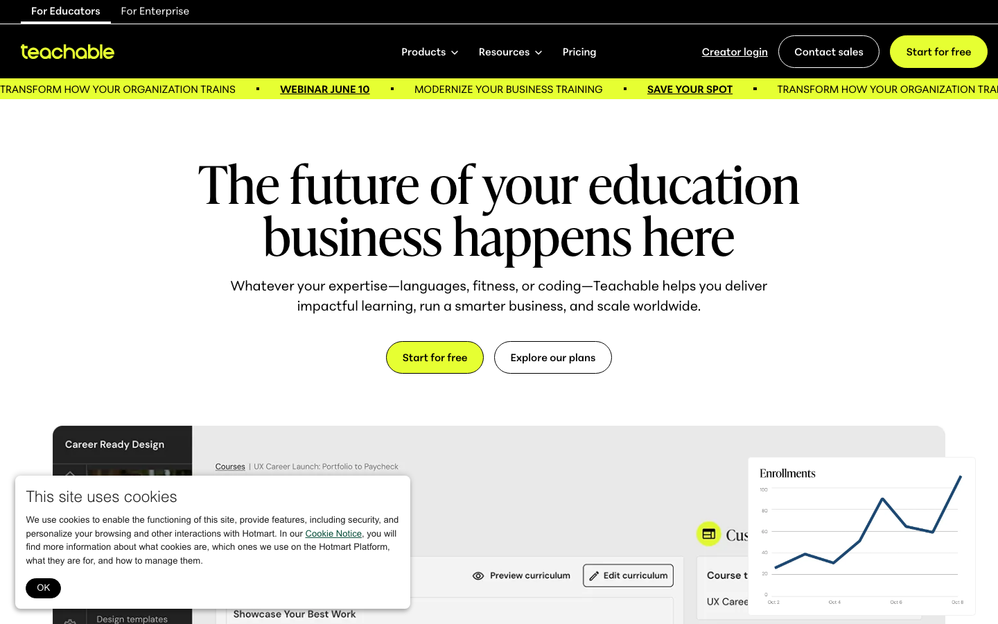
- The "Career Ready Design" example course mock
- The "150,000 industry leaders" trust signal — Teachable-specific number
- The specific portrait + integration logos (Kit, Slack, Shopify, Mailchimp, Google G)
Signature moves
editorial serif H1 plus neon pill CTA
an Ivy-Presto-class serif H1 at ~75px pairs with a single neon yellow-green (#e6ff32) pill CTA at the 900px pill radius, the only saturated colour on a white page.
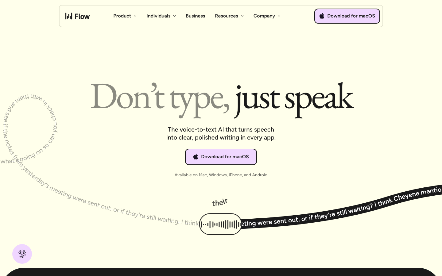
italic-serif emphasis word
a single word in the headline switches to italic serif ("Made to adapt and evolve") to add editorial warmth inside an otherwise upright line.
you-at-the-centre integration illustration
an integration graphic places a portrait at the centre with app icons arranged around it, literally visualising the customer at the hub, with a small callout chip on top.
Related references
Wispr Flow
strongSaas Product
The reference for a butter-cream voice-AI brand at peak typographic confidence — EB Garamond serif hero on lavender-and-evergreen surfaces, with curved-path transcript animations as the signature motion.

Method
nicheSaas Product
The reference for QuickBooks-niche B2B CRM — clean deep-navy + royal-blue conservative B2B design with yellow-underline accent and customer-photo-driven testimonials.
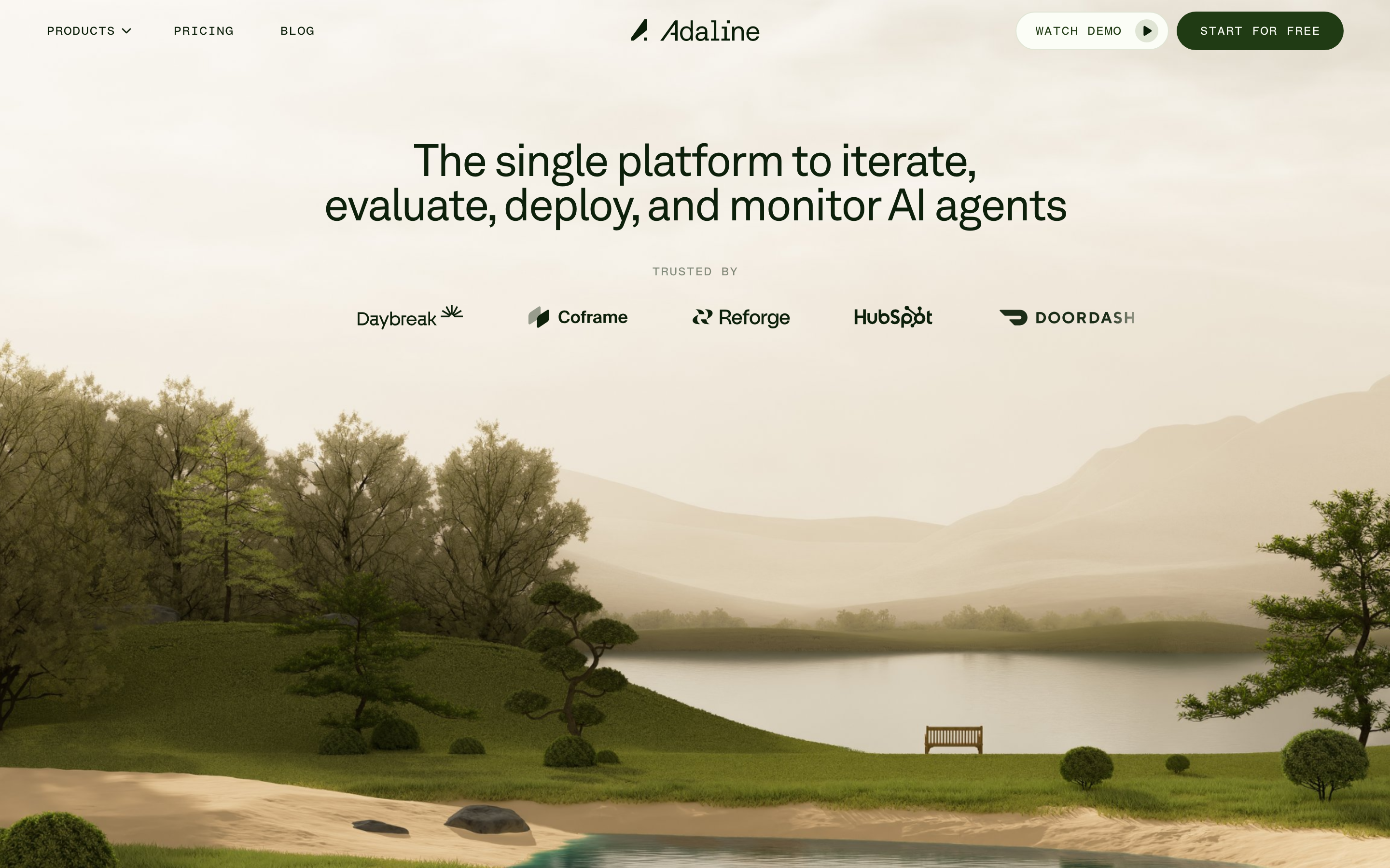
Adaline
strongDeveloper Tool
an AI-infra product site that swaps the genre's default dark-neon for a hand-built 3D Japanese-garden world, then runs warm earth tones, a grotesque/mono type pair and patient scroll-reveal motion over the top so a developer tool feels like a calm place.
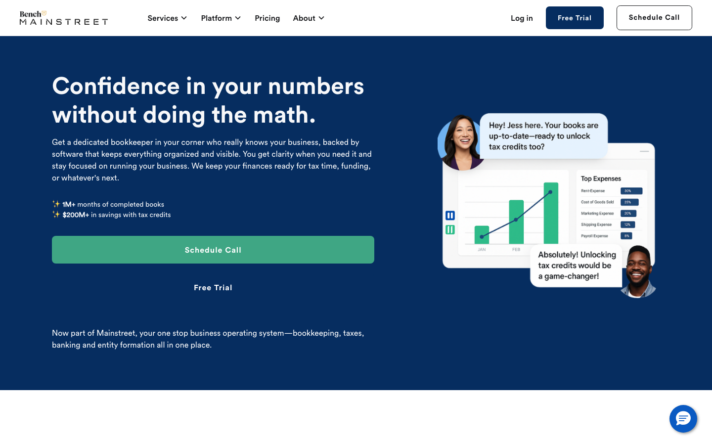
Bench Accounting
strongProfessional Services
a small-business bookkeeping service that builds trust with a deep-navy hero, friendly Circular Std type, a soft blue-teal palette and a product mock-up showing real reports and chat support, calm, credible, conversion-focused.