
Stripe Press
press.stripe.coman editorial publishing imprint site that treats each book cover as its own miniature brand - a dark #222 page hosting a grid of cream/navy/wine/olive cover-card thumbnails, all wrapped in Ivar Text/Display/Headline (a bespoke serif system) with a near-zero motion budget and just 8 CSS custom properties.
Design tokens
- body
- "Ivar Text", Georgia
- display
- "Ivar Display"
- headline
- "Ivar Headline"
- fallback
- Times
Do / Don't
Reference it for
- One-page editorial bookshelf as the entire structure. No nav, no marketing copy, no CTAs above the fold — just the book grid + a help glyph in the corner.
- A dark #222 page as the gallery wall on which each book cover provides its own colour. Single-page palette diversity from product imagery rather than brand palette.
- Ivar Text / Display / Headline as the three-cut serif system. The italic Ivar Display in the header ("*Ideas for progress*") is a tonal signature.
- 8 CSS custom properties total — the leanest design-token surface in the library. Achievable because the site has one page and one component (the cover card).
- A 380px book-cover-card width in a multi-column grid with 57.6px gaps — book-cover proportions transferable to any product-card grid.
- The "?" help glyph at the bottom-left as the only persistent UI affordance — minimal navigation chrome.
- 5 fonts, 8 images, 0 declared keyframes — among the most performance-conscious flagship sites in the library.
- A Stripe S logo in stacked-bracket form ("$S") — the imprint's mark, distinct from Stripe's parent brand.
Do not copy
- The Ivar family — Letters from Sweden's commercial licence required.
- The single-page-no-marketing structure unless the brand genuinely has a catalogue that IS the value-prop. Most service or product brands need a navigated multi-page site.
- The book-cover-grid pattern outside of editorial / catalogue contexts.
- The 8 custom properties as an aspirational target — clients with multiple page-templates will need more.
- The "?" help glyph as the only navigation affordance — works for Stripe Press because the catalogue is small. On larger sites, more chrome is needed.
- 33 stylesheets and 66 scripts — heavy for what's visually a one-page site. Likely Stripe's enterprise-grade analytics + parent-brand asset chain.
Signature moves
one-page bookshelf gallery wall
a dark #222 page acts as a gallery wall on which each cover-card supplies its own colour, a single-page editorial bookshelf with no nav, no marketing copy and just a help glyph in the corner
three-cut serif tonal system
Ivar Text / Display / Headline form a three-cut serif system where italic Ivar Display in the header ("Ideas for progress") is a tonal signature, on a lean 8-custom-property token surface
Related references
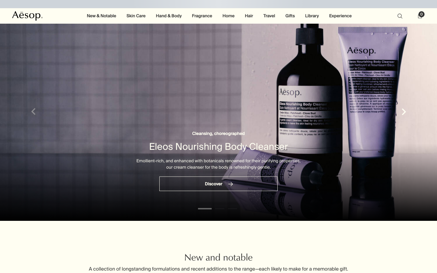
Aesop
flagshipConsumer Brand
an editorial e-commerce reference where Suisse Intl on warm-cream `#fffef2`, a modular 1.13 type ratio, and full-bleed photography do all the work - no display face, no accent colour, no motion of consequence.
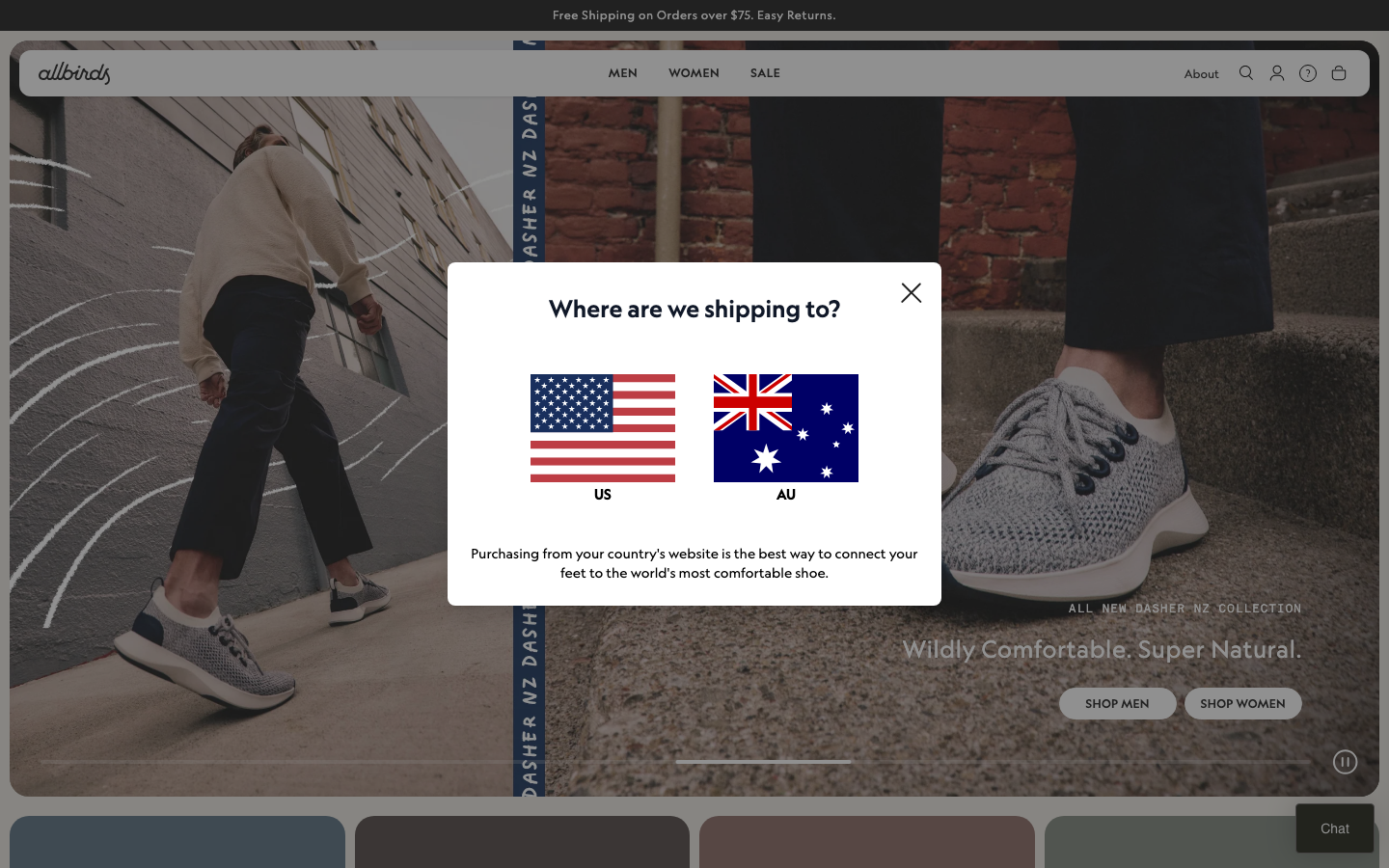
Allbirds
strongRetail
a natural-materials footwear brand whose store leads with a full-bleed lifestyle hero, a warm sand-and-oat palette over charcoal text, the Geograph sans paired with a Self Modern serif and Akkurat Mono, and a Tailwind-powered Shopify build that turns sustainability into a calm, premium retail feel.
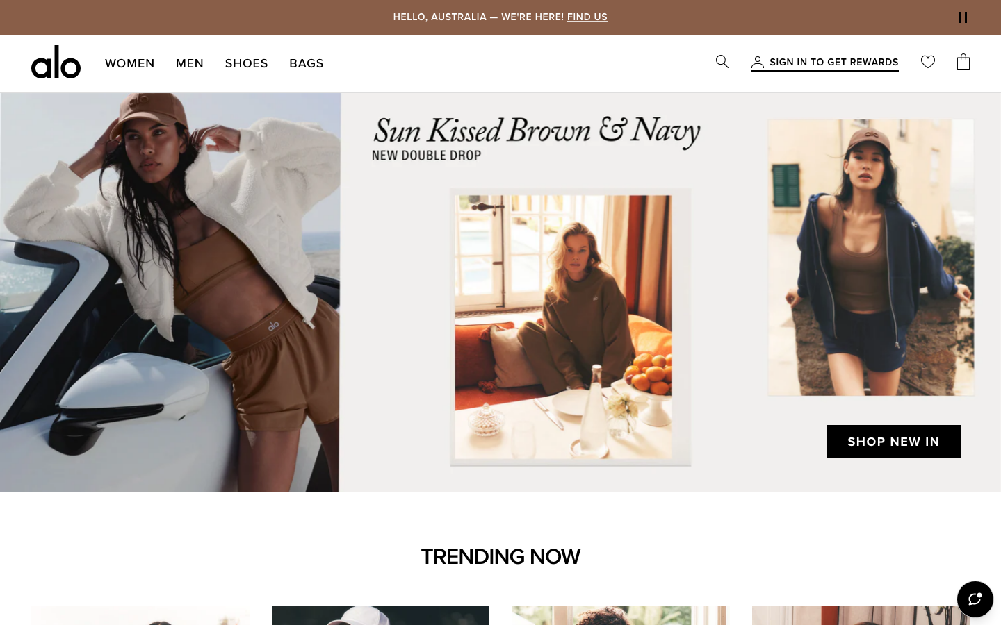
Alo Yoga
strongFitness
an aspirational activewear and yoga store that runs almost pure black-on-white, lets full-bleed editorial photography fill the frame, and adds personality through one handwritten-italic serif overlay and disciplined image-grid merchandising.
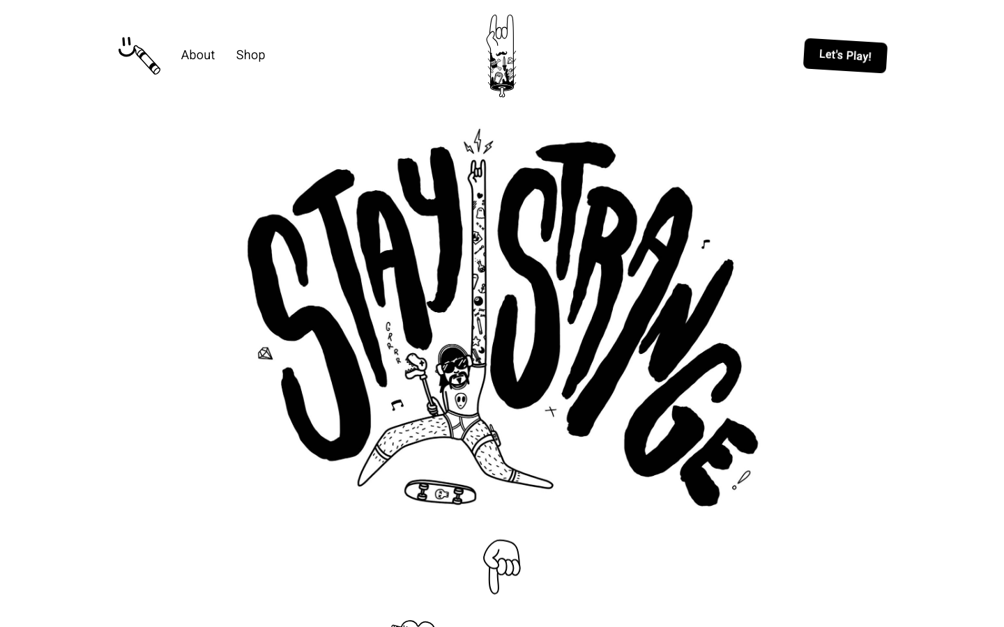
Alternative Aesthetics
nicheDesign Portfolio
The reference for solo illustrator portfolios on Webflow — hand-drawn "Stay Strange" hero typography, monochrome black/white canvas, and a 4-column thumbnail grid that lets the artwork carry the entire visual voice.