Spline
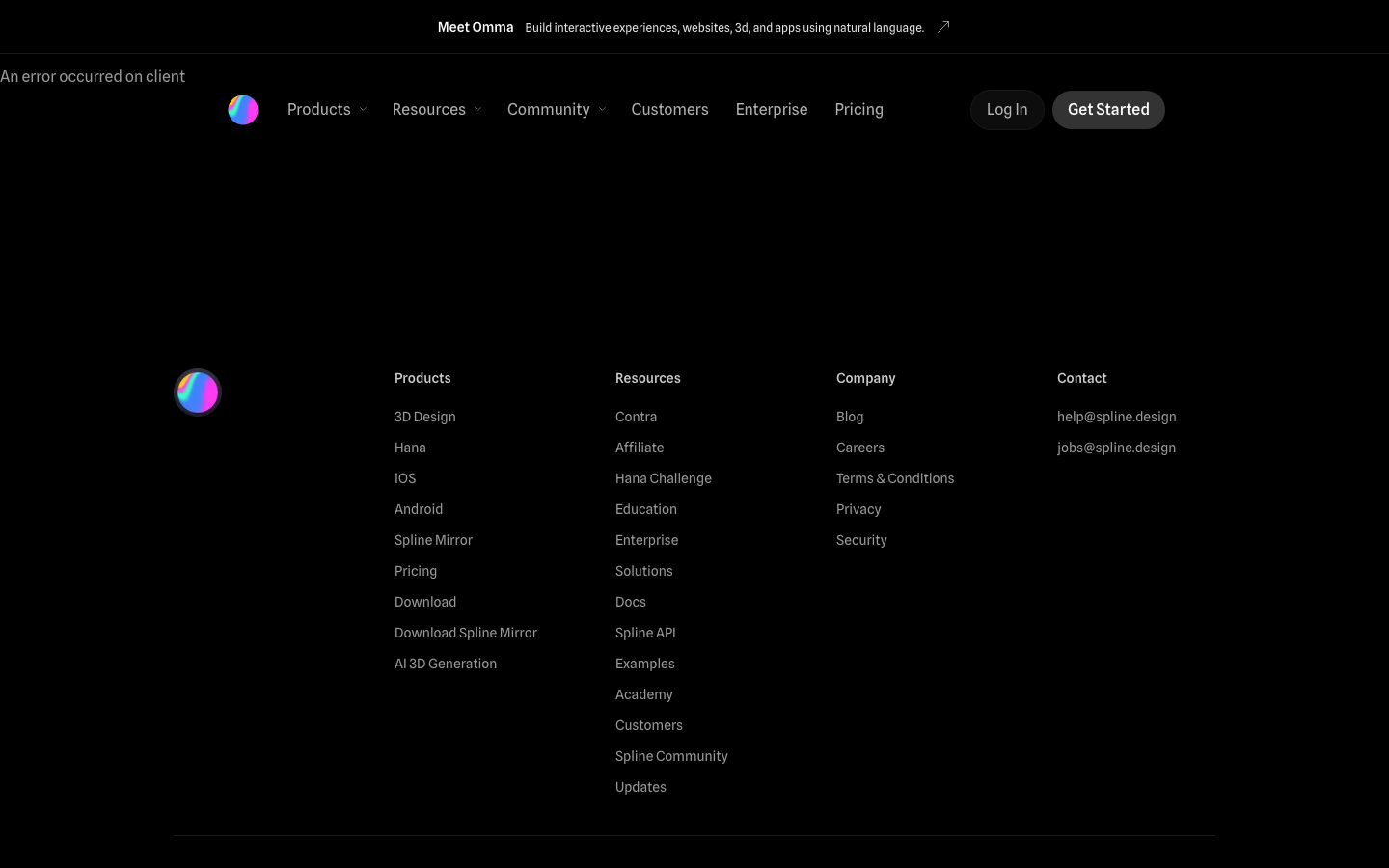
spline.designa pure-black 3D-design-tool site where everything is delegated to interactive WebGL scenes - the captured CSS is almost typographically empty (12/14/16px, 2 declared transitions, 0 shadows) because every visual moment is rendered live in Spline's own 3D engine.
Design tokens
- body
- "Spline Sans", system-ui, -apple-system, "system-ui", "Helvetica Neue", Helvetica, Arial, sans-serif
- fallback
- Times
Do / Don't
Reference it for
- A pure-black canvas with white + alpha-stepped opacities for hierarchy. No greys; just #fff at 60/70/80/90/100% alpha.
- Per-component CSS Module-scoped keyframes — every section ships its own ticker, marquee, spin, bounce animations rather than a global set. Hard to grep but visually scoped.
- Three-size type scale (12/14/16px) for sites where the visual heavy lifting is done by a 3D canvas — the typography becomes captions, not content.
- Spline Sans (free on Google Fonts) as the body face for craft-design brands; an under-used alternative to Inter/Geist.
- Just 2 declared CSS transitions (color 0.2s ease, background-color 0.2s ease) — every other motion is in JavaScript/WebGL.
- 56px and 50px pill radius on CTAs and feature panels — among the largest pill values in the library.
- An announcement bar above the nav ("Meet Omma: Build interactive experiences, websites, 3d, and apps using natural language" with ↗ external-link glyph).
- A rainbow gradient sphere logo that gently rotates — same family of 3D-blob logos as GSAP's 3D liquid forms and Linear's mark.
Do not copy
- The WebGL hero strategy unless the client genuinely ships a 3D / generative / animation product. On a static-content brand, an embedded 3D scene reads as decoration.
- The 124-script + 22-stylesheet network bill — Spline's 3D runtime is heavy. Most Jiffi builds should ship under 30 scripts.
- The 17 per-component SCSS Module keyframes wholesale — borrow the *naming discipline*, write CSS keyframes with readable global names instead.
- The 3-size type scale on brands where typography needs to do real work — only works when 3D scenes carry the visual narrative.
- The "An error occurred on client" surface state — capture caveat, not a brand position.
- The mixed framework signal (Sonner toast keyframes go2264125279, go3020080000 etc. shipped alongside SCSS Modules) — likely an artefact of multiple toast/notification libraries that should be consolidated.
Signature moves
pure-black alpha-stepped hierarchy
a pure-black canvas uses white at stepped opacities (60/70/80/90/100% alpha) for hierarchy with no greys, and a three-size type scale (12/14/16px) where a 3D canvas does the visual heavy lifting
announcement bar above the nav
an announcement bar sits above the nav with a short message and an external-link glyph (↗), introducing a new feature without cluttering the main chrome
large-pill CTA radius
CTAs and feature panels use 56px and 50px pill radii, among the largest in the library, giving a soft confident button language
Related references
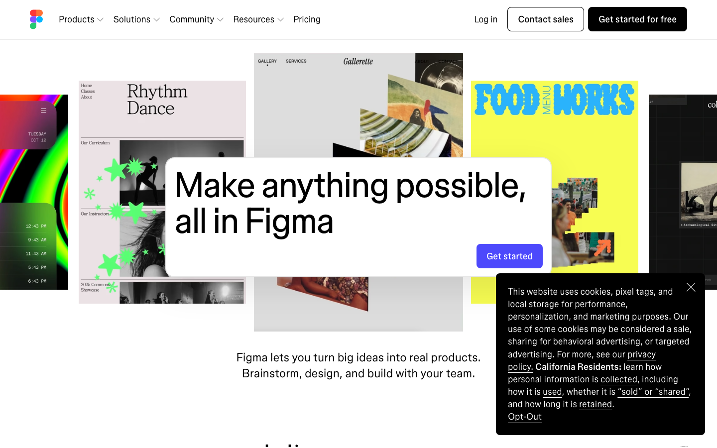
Figma
flagshipSaas Product
a white-canvas product site that uses tilted Figma file-cards as the hero imagery, the bespoke variable figmaSans + figmaMono pair at non-integer weights (340, 480, 520, 540), and a 0.16s ease-out motion contract to demonstrate breadth without showing a single screenshot of the actual Figma UI.
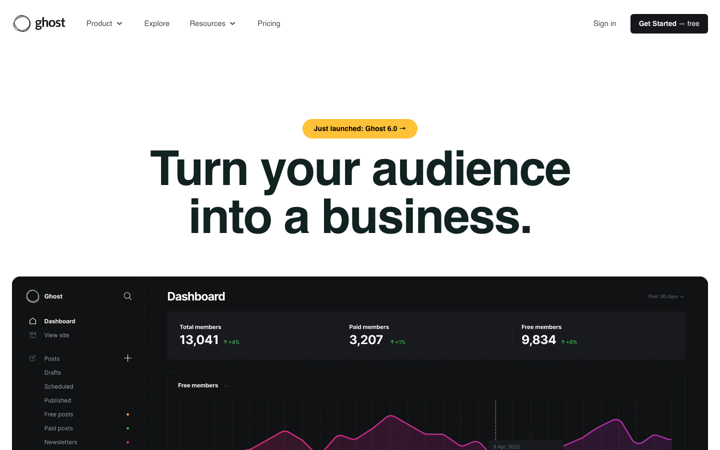
Ghost
strongMarketing Platform
The reference for a creator-platform brand at peak typographic confidence — Inter Display at 96px, real product dashboard at full fidelity, single saturated green accent on a 4-surface palette.
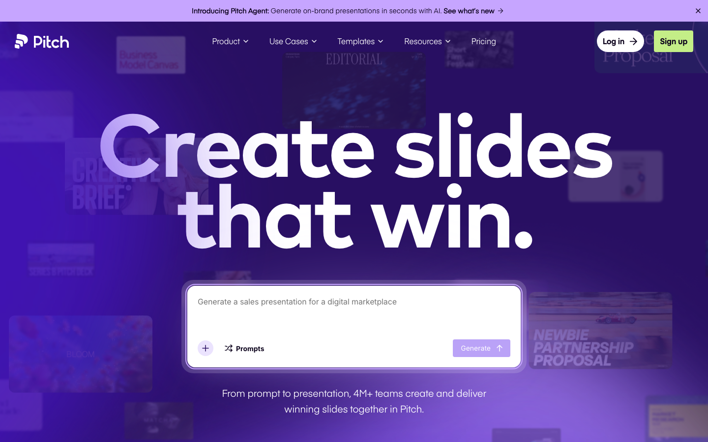
Pitch
flagshipSaas Product
a violet-and-yellow presentation-tool flagship that pairs Eina01 + Mark Pro on a warm-navy ink, sparkle keyframes (`sparkL`, `sparkM`, `sparkS`, `sparkHover`), animated cursor pointers, and a numbered four-step "Plan / Build / Pitch / Measure" walkthrough - the canonical reference for "B2B presentation software that earns playfulness."
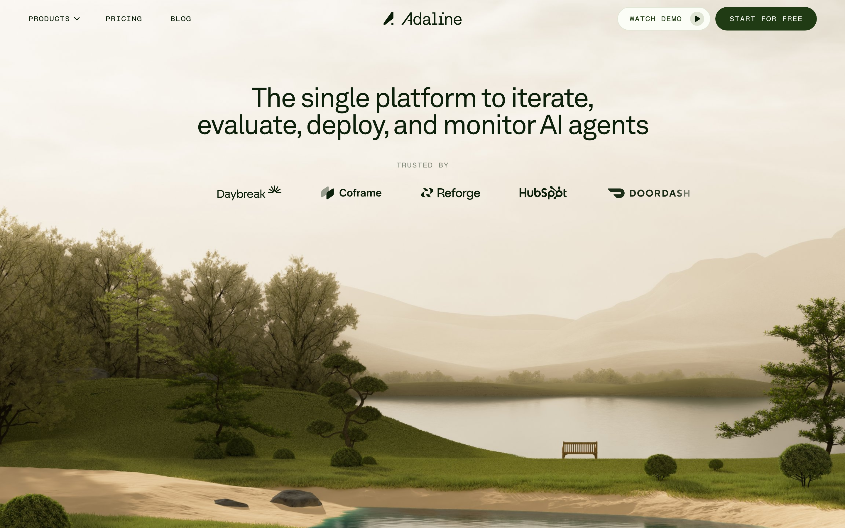
Adaline
strongDeveloper Tool
an AI-infra product site that swaps the genre's default dark-neon for a hand-built 3D Japanese-garden world, then runs warm earth tones, a grotesque/mono type pair and patient scroll-reveal motion over the top so a developer tool feels like a calm place.