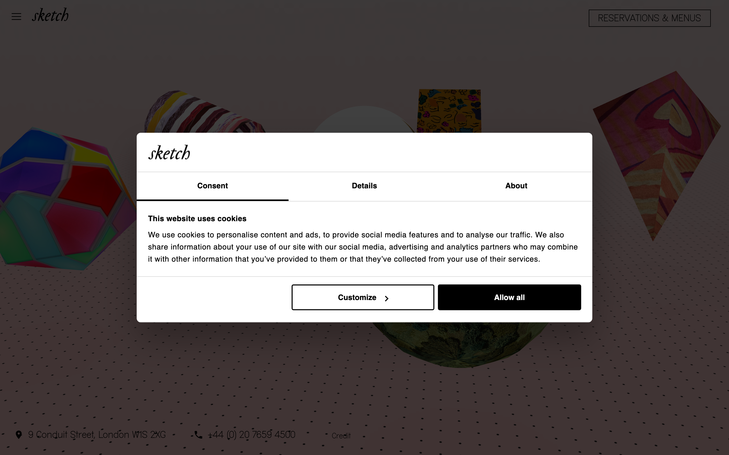
Sketch London
sketch.london/an art-and-dining destination whose site is as playful as its rooms, soft pastel gradients, a cursive serif logotype, floating rounded cards, GSAP motion, and interactive prompts that invite you to "grow the carpet" or "draw a neon", an experience masquerading as a website.
Design tokens
- display
- MAD Serif Fill (bespoke soft/cursive serif, 400)
- body
- MAD Sans Fill (bespoke sans, 400/700) with sans-serif and Times fallbacks
- mono
- none
Do / Don't
Reference it for
- Floating rounded announcement card (current happening) over a soft gradient field as the hero device.
- Pastel-on-black contrast with warm cream (#FFFAFA) surfaces and friendly rounded geometry (15 / 60 / 7.5px radii).
- A cursive/soft serif display paired with a clean sans for structure, on a hospitality brand.
- Genuine interactive games ("grow the carpet", "draw a neon") that turn marketing into play, used sparingly.
- A room-led information architecture: each space with its own hours, menu and booking.
Do not copy
- sketch's surreal illustrated world and the cursive wordmark are its identity; borrow the playful structure, not the marks.
- "MAD Sans Fill" / "MAD Serif Fill" are bespoke; map to a soft serif plus a clean grotesque.
- Wall-to-wall whimsy only works because sketch is a famous art venue; for a normal venue, keep one playful moment and let the rest be clear.
Signature moves
floating rounded announcement card over gradient
a floating rounded announcement card (current happening) sits over a soft pastel gradient field as the hero device, with warm cream #FFFAFA surfaces and friendly rounded geometry (radii 7.5 / 15 / 60px)
cursive-serif plus clean-sans pairing
a cursive/soft serif display is paired with a clean sans for structure on a hospitality brand, across a restrained 15 / 16 / 40 / 56px scale
sparing interactive-play moment
genuine interactive games (grow the carpet, draw a neon) turn marketing into play, used sparingly, powered by GSAP
Related references
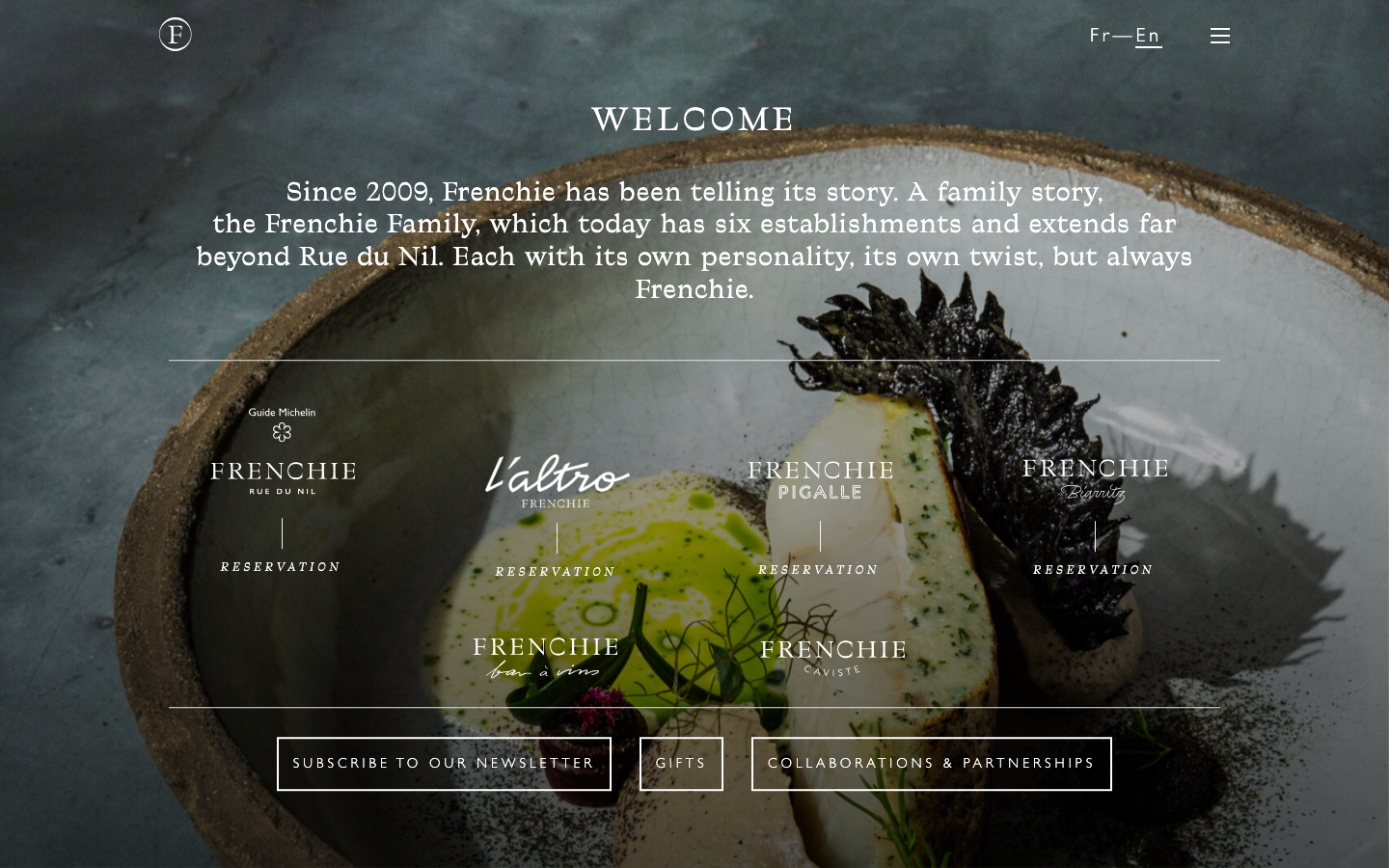
Frenchie Restaurant
strongHospitality
a Paris restaurant group telling a family story, a dark moody hero of textured produce stills, a Traulha display serif (roman and italic) over a Gill Sans body, cream type on near-black ink, and a calm row of venue cards that turns six establishments into one elegant front door.
Mun Rooftop
strongHospitality
a Rome rooftop cocktail bar built around a celestial concept, deep midnight navy (#222944) and warm cream (#F2F0DD), a Forma DJR Text body paired with a Qualettee display face, a moon-phase intro loader and Lenis-smoothed scroll, where "where drinking is out of this world" is the whole brand in one line.
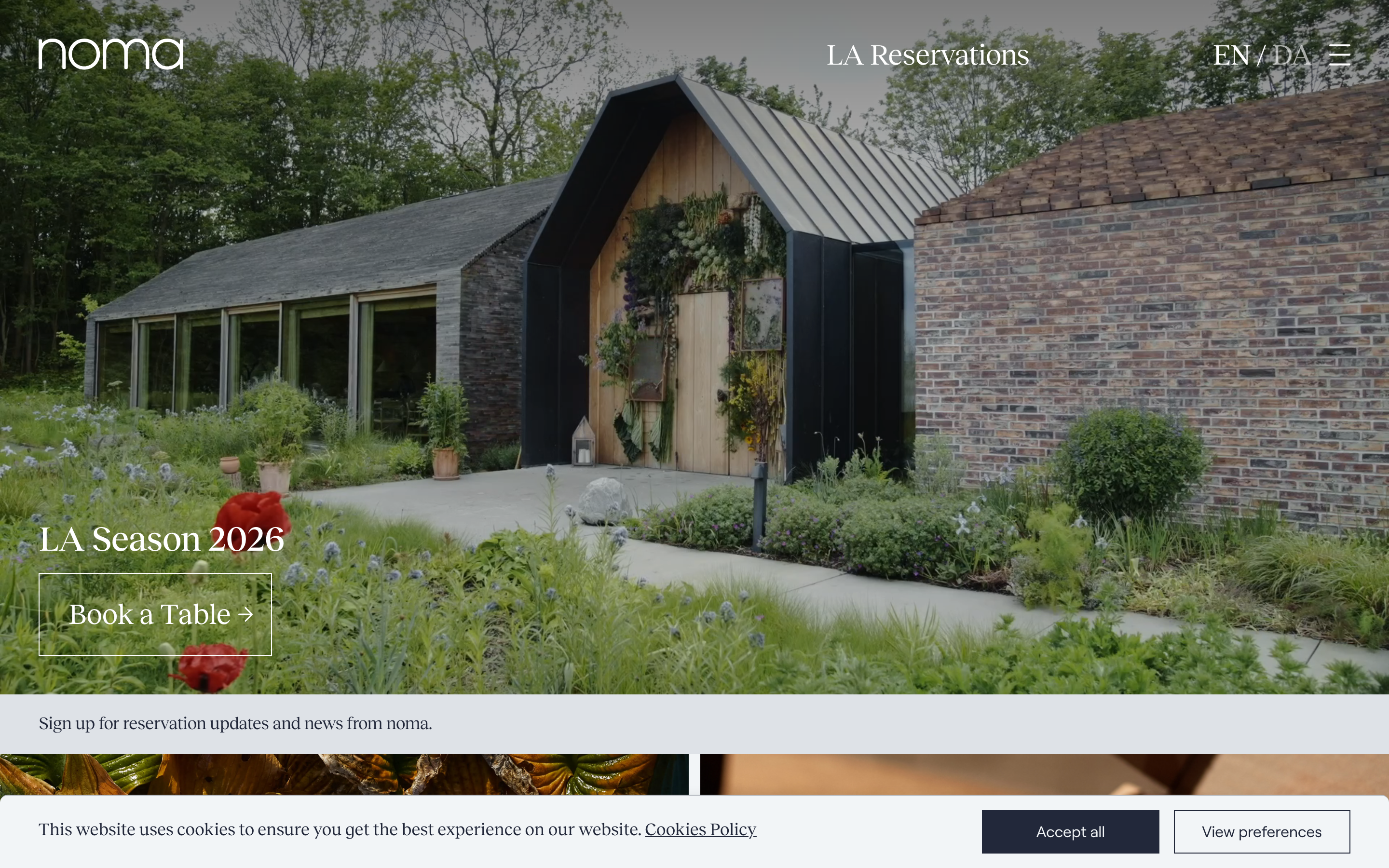
Noma
flagshipHospitality
a three-Michelin-star restaurant that sells itself through photography and a quiet serif, full-bleed seasonal imagery, a lowercase joined wordmark, and almost no chrome, so the food and the place carry the whole page.
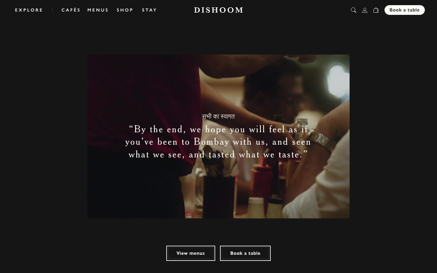
Dishoom
flagshipHospitality
a beloved restaurant group whose site is a love letter to its story, warm cream-and-charcoal editorial storytelling in a Cheltenham serif, with menus and "book a table" threaded through the narrative for each venue.