
Ragged Edge
raggededge.comThe reference for cult London branding agencies — Grit serif paired with ABC Diatype Expanded, near-black #181F1F on soft mint surfaces, fat 40-64px radii, and a video-saturated 11774px scroll that lets the work do the talking.
Design tokens
- display
- Grit-Regular, serif
- shoutHeadline
- ABCDiatypeExpanded-Bold, sans-serif
- body
- ABCDiatype-Regular, sans-serif
- fallbackSystem
- ui-sans-serif, system-ui, sans-serif
Do / Don't
Reference it for
- Near-black rgb(24, 31, 31) text as primary (429 hits) — disciplined, not pure black
- Soft mint rgba(220, 242, 235, 0.6) panel washes as section-break surface (17 hits)
- Deep mint rgb(150, 235, 235) flood-fills for accent panels (9 hits)
- rgb(31, 50, 51) inverted-section dark panel (3 hits) — slightly cool, slightly green
- Single hot rgb(245, 101, 101) salmon-red accent used surgically (1 hit only)
- rgb(255, 199, 245) candy-pink as occasional supporting tone (1 hit)
- Grit-Regular display serif with literally-ragged terminals — the type *is* the brand
- ABCDiatypeExpanded-Bold for shout-headlines and nav (Dinamo's expanded cut)
Do not copy
- The "Ragged Edge" name or the ragged-terminal logomark
- The Grit-Regular display serif (commercial licence, brand-coded)
- The ABCDiatypeExpanded-Bold / ABCDiatype-Regular Dinamo licences (or use the same combo on a non-agency brand)
- The "Never be the same again" manifesto headline
- The Wise case study or any of the named client work
- The "Partnerships / Approach / Happenings / Join" nav vocabulary verbatim
- The mint palette #DCF2EB / #96EBEB / #EBF7F3 if it would clash with brand colour
- The "ragged-edge" wordmark treatment with mixed weights / cuts
Signature moves
ragged-serif display on near-black over soft mint
a display serif with literally-ragged terminals (Grit) sets 78-82px headlines with tight negative tracking (-1.64px / -0.78px) in near-black (#181f1f) over soft mint panel washes (rgba(220,242,235,0.6)) and deep-mint flood-fills.
fat soft-only radius scale with reframed nav vocabulary
a four-step radius scale (40/54/64/9999px) keeps every corner soft with 64px dominant for monumental panels and 9999px pills for tags/CTAs, paired with reframed nav labels ('Partnerships' not 'Clients', 'Happenings' not 'News').
video-saturated long-scroll narrative
an 11774px long-scroll narrative lets autoplay case-study videos do the talking (motion is the work), with a manifesto headline doubled across two scenes.
Related references

Alche
strongCreative Studio
The reference for Japanese virtual-character + immersive experience studios — Astro v5 build, neon yellow-green accent, 5-font multi-language system, KizunaAI case study.
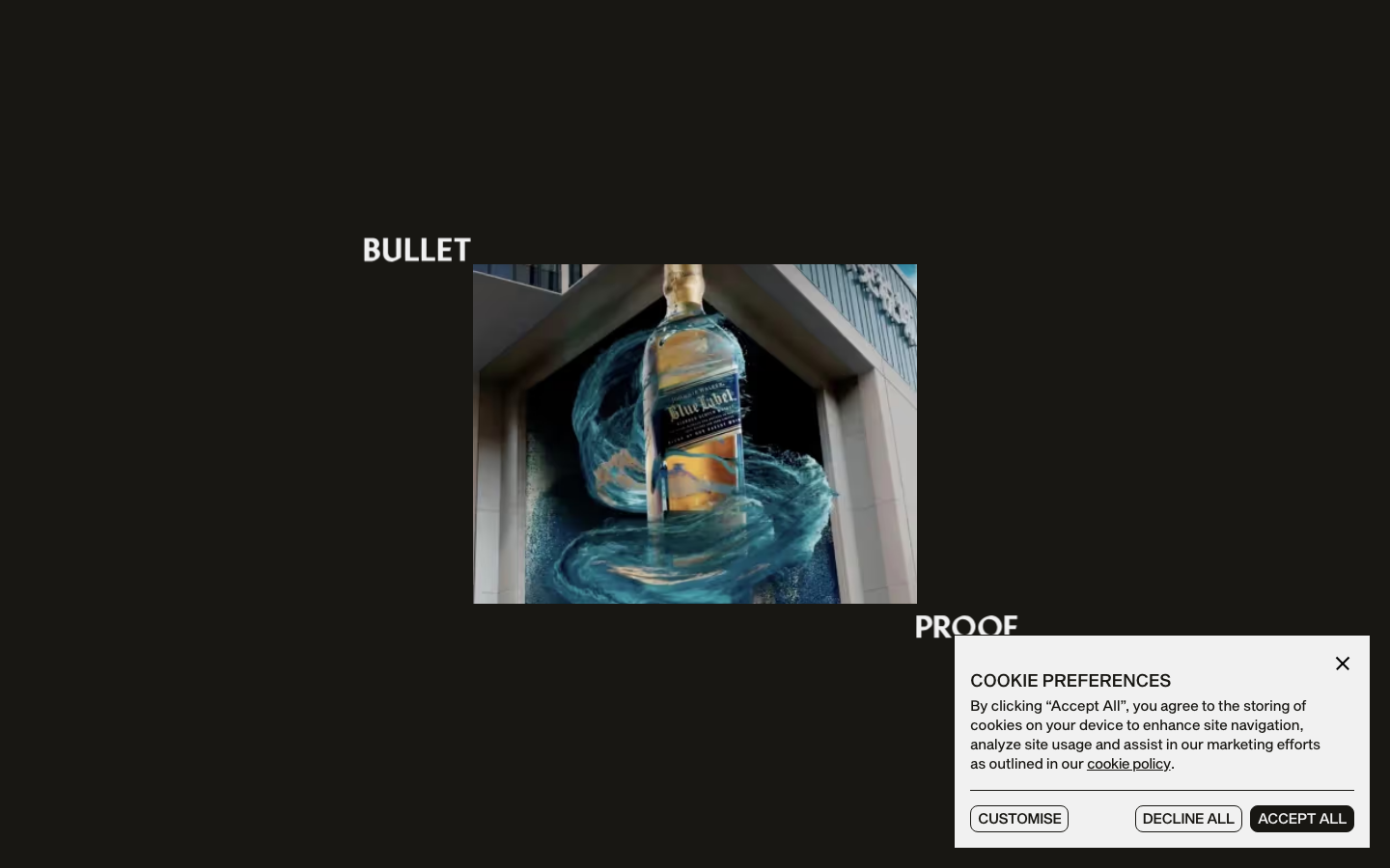
Bulletproof
strongCreative Studio
a brand-agency site that treats its own logotype as the hero, oversized "BULLET / PROOF" split type and a giant line-drawn B monogram, alternating black and bone-white acts with a Sequel-Sans-plus-Mixta-serif pairing, expo-eased motion and a single orange spark.
Burocratik
strongCreative Studio
a pure black-and-white studio site with a wicked sense of humour, full-bleed iconic photography, Graphik paired with Times, type that swings up to a 270px display, and self-deprecating copy ("18 fkn Years", "Our Accodlades") that makes monochrome restraint feel warm and human.
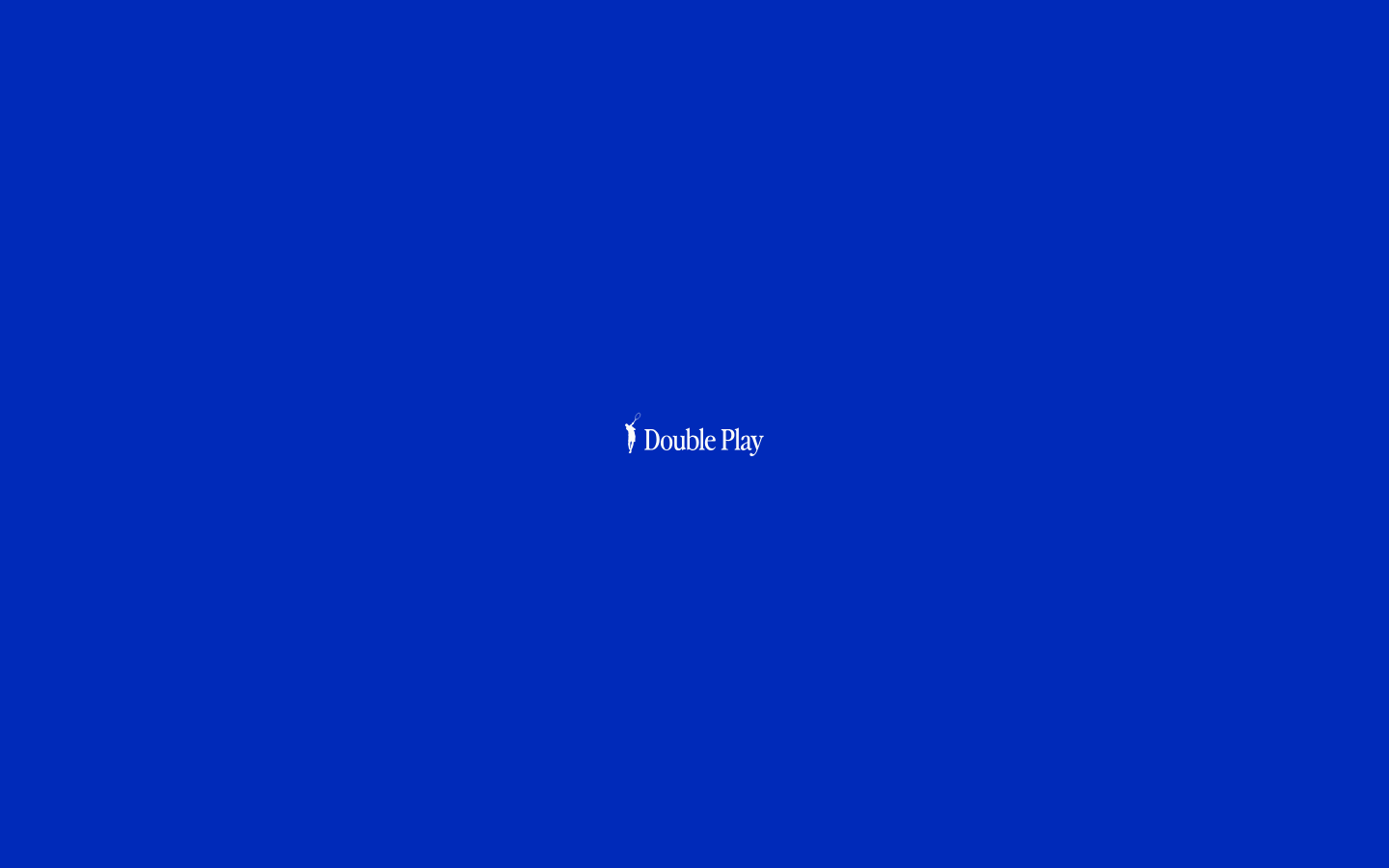
Double Play
nicheCreative Studio
The reference for tennis-themed boutique creative studios — saturated cobalt-blue `#002bba` field, oversized serif x sans display contrast, baseball-card project credentials, and a heavy GSAP + Lenis + Locomotive scroll choreography over Webflow.