Notion
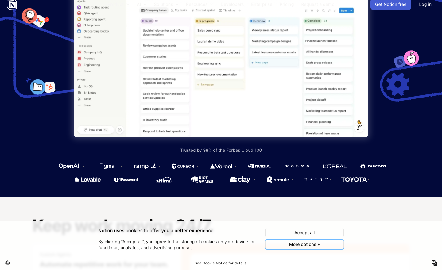
www.notion.comwarmth at scale - a vast product suite made to feel friendly and human through warm neutral colour, a customised Inter, serif editorial accents and approachable copy.
Design tokens
- display
- NotionInter (customised Inter)
- body
- NotionInter / Inter
- serif
- Lyon Text
- mono
- -
Do / Don't
Reference it for
- Warm neutral palette - off-white #f6f5f4, soft near-black text - as the route to an approachable feel.
- Mixing a workhorse sans (customised Inter) with a serif (Lyon Text) for editorial warmth.
- A deep mega-navigation carrying a large product suite while the homepage stays simple.
- Large bold display headings at tight tracking, balanced by friendly colour and imagery.
Do not copy
- NotionInter and Lyon Text (proprietary / licensed) - borrow the sans+serif pairing strategy.
- The current campaign palette (a dark "night shift" AI theme) - it is a campaign skin, not the enduring brand.
- The mega-nav scale unless the client genuinely has a suite to fill it.
Signature moves
warm-neutral approachable palette
an off-white (#f6f5f4) base with soft near-black text and large bold display headings at tight tracking are balanced by friendly colour and imagery to feel human at scale.
workhorse-sans + editorial-serif pairing
a customised workhorse Inter is mixed with a serif (Lyon Text) for editorial warmth across a wide scale (12-64px).
deep mega-nav over a simple homepage
a deep mega-navigation carries a large product suite while the homepage stays simple.
Related references
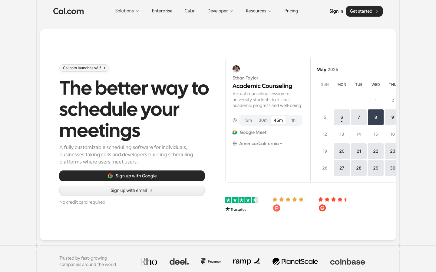
Cal Com
strongDeveloper Tool
The reference for open-source dev-tools brand at peak typographic confidence — Cal Sans 64px H1 on pure white, real booking widget in hero, prestige customer logos.
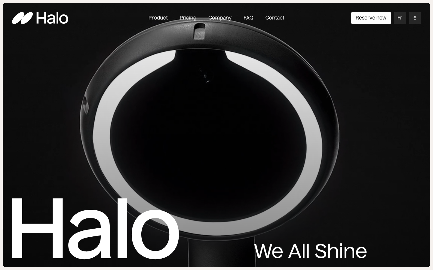
Halo Dental
flagshipOther
A dental-tech hardware brand (the Halo "digital mirror") that opens on a black stage with its glowing ring-lit device, a 100px "Halo" wordmark and "We All Shine", then proves capability with a calm bento grid - Apple-product confidence aimed at clinicians.
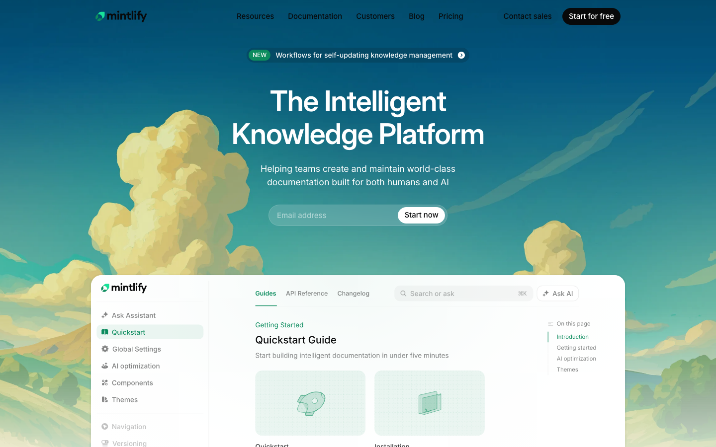
Mintlify
strongMarketing Platform
The reference for AI-documentation platform — cloud-gradient sky hero, mint-green CTA, modern lab()/oklab() colour science, real docs mockup with AI assistant chat.
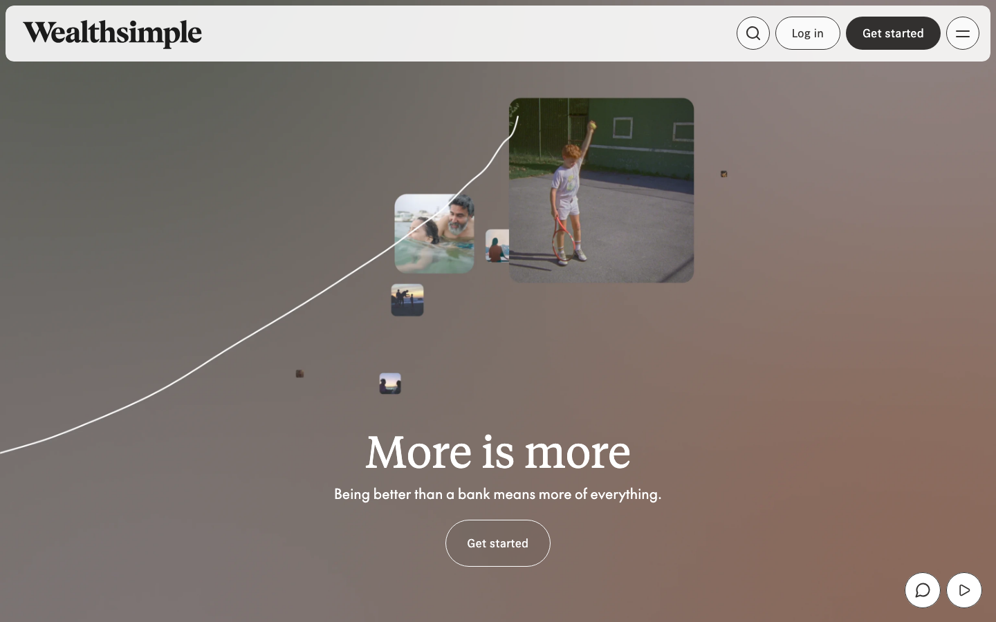
Wealthsimple
flagshipProfessional Services
a Canadian money app dressed as a warm editorial magazine, oversized Tiempos serif headlines over soft sand backgrounds, candid lifestyle photography that floats in on scroll, and a calm custom-eased motion system that makes a fintech feel human rather than clinical.