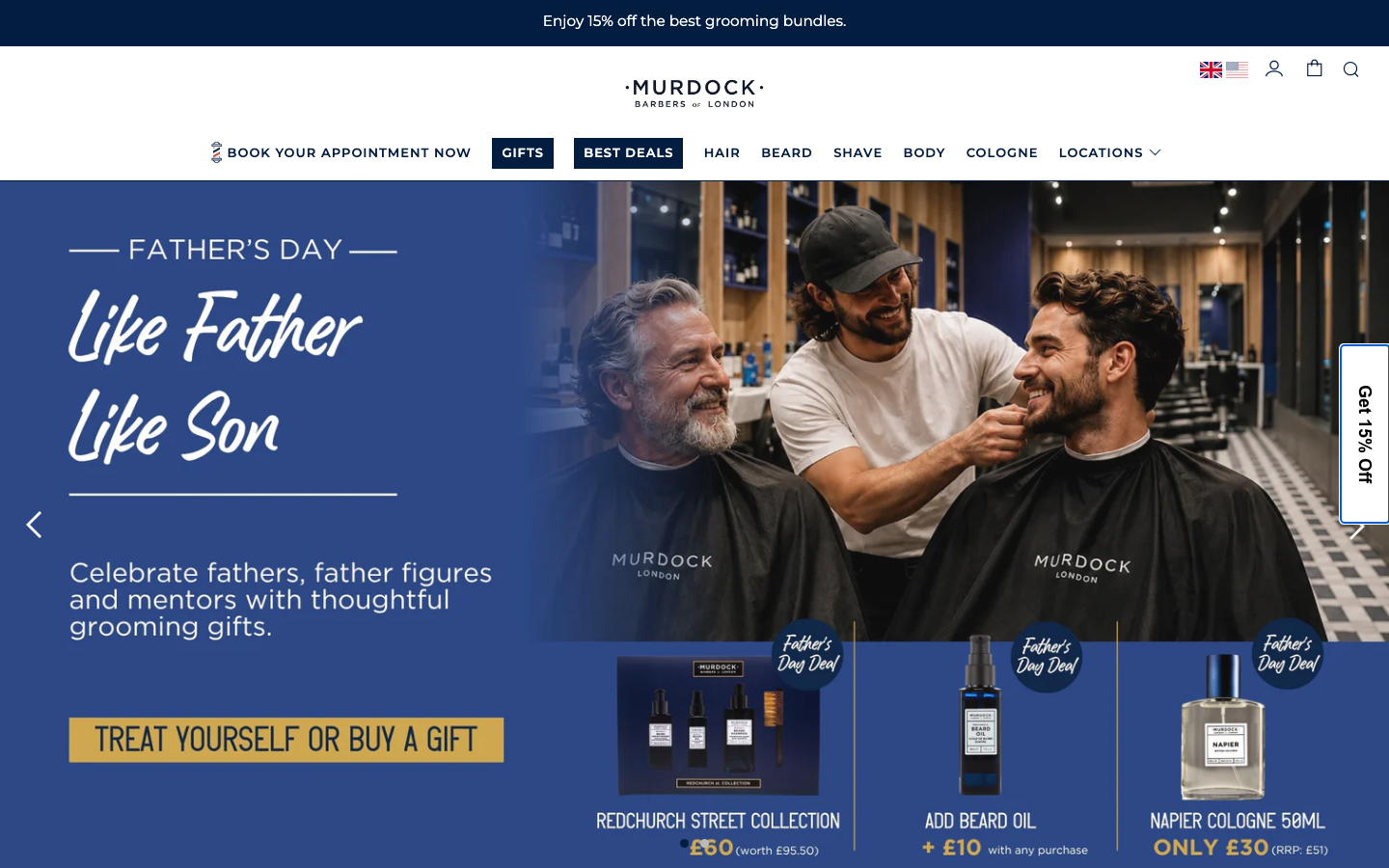
Murdock London
www.murdocklondon.com/a heritage British barbershop and grooming brand run as a polished Shopify storefront, deep ink-navy on warm off-white, Montserrat throughout, a hand-script accent for warmth, and a calm 0.3s ease-in-out motion language that keeps the commerce furniture quiet.
Design tokens
- display
- Montserrat
- body
- Montserrat
- mono
- none
Do / Don't
Reference it for
- Single-colour brand discipline: one deep ink navy (#031D40) doing almost all the work on a warm off-white (#F2F3F5), with black and white as support only.
- Booking-first navigation: "Book Your Appointment Now" as the first nav item, locations surfaced directly in the menu (Soho, Covent Garden, Shoreditch, Broadgate).
- A clean all-caps Montserrat plus hand-script pairing that reads as heritage and craft without fuss.
- A calm, retail-appropriate motion language (0.3s ease-in-out) that keeps a busy commerce stack feeling quiet.
- A well-tuned Shopify storefront as a realistic reference for a local business that actually sells online.
Do not copy
- The third-party stack is heavy (Klaviyo, Bazaarvoice, Feefo, Salesfire, BOGOS and more, 418 requests). Borrow the calm surface, not the script load.
- Montserrat is free, but the exact navy-on-bone palette is Murdock's identity; remap the hue to the client's brand.
- The hand-script accent only works in small doses (one hero line, the wordmark flourish). Do not set body or nav in script.
Signature moves
single ink-navy retail discipline
one deep ink navy (#031D40) does almost all the work on a warm off-white (#F2F3F5), with black and white as support only, keeping a busy commerce surface calm.
booking-first navigation
Book Your Appointment Now is the first nav item, with locations surfaced directly in the menu rather than buried.
all-caps sans + hand-script heritage pairing
a clean all-caps Montserrat is paired with a hand-script accent (one hero line, the wordmark flourish) reading as heritage and craft, on a calm 0.3s ease-in-out motion language.
Related references
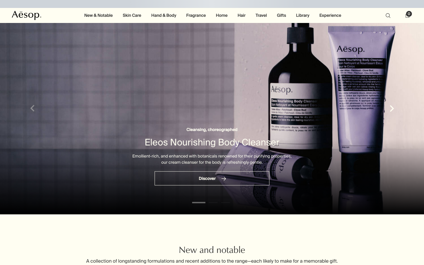
Aesop
flagshipConsumer Brand
an editorial e-commerce reference where Suisse Intl on warm-cream `#fffef2`, a modular 1.13 type ratio, and full-bleed photography do all the work - no display face, no accent colour, no motion of consequence.
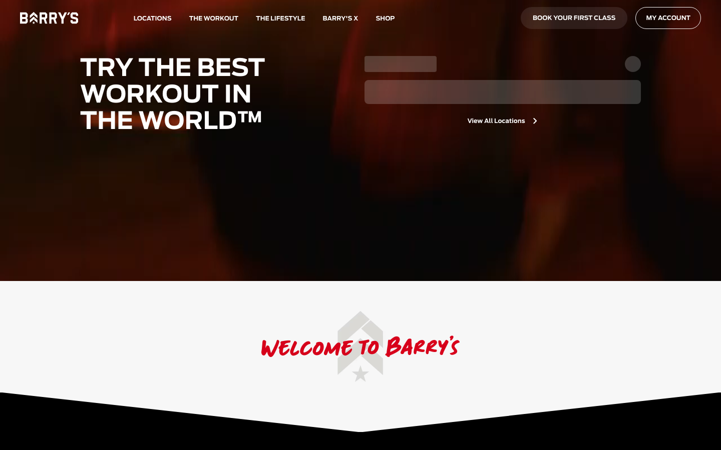
Barrys
flagshipFitness
the original HIIT studio brand selling "the best workout in the world", a dark, cinematic Webflow site built on near-black and the Red Room red, condensed athletic display type, a hand-painted script signature, and a booking-first hero that puts "find a studio" above everything.
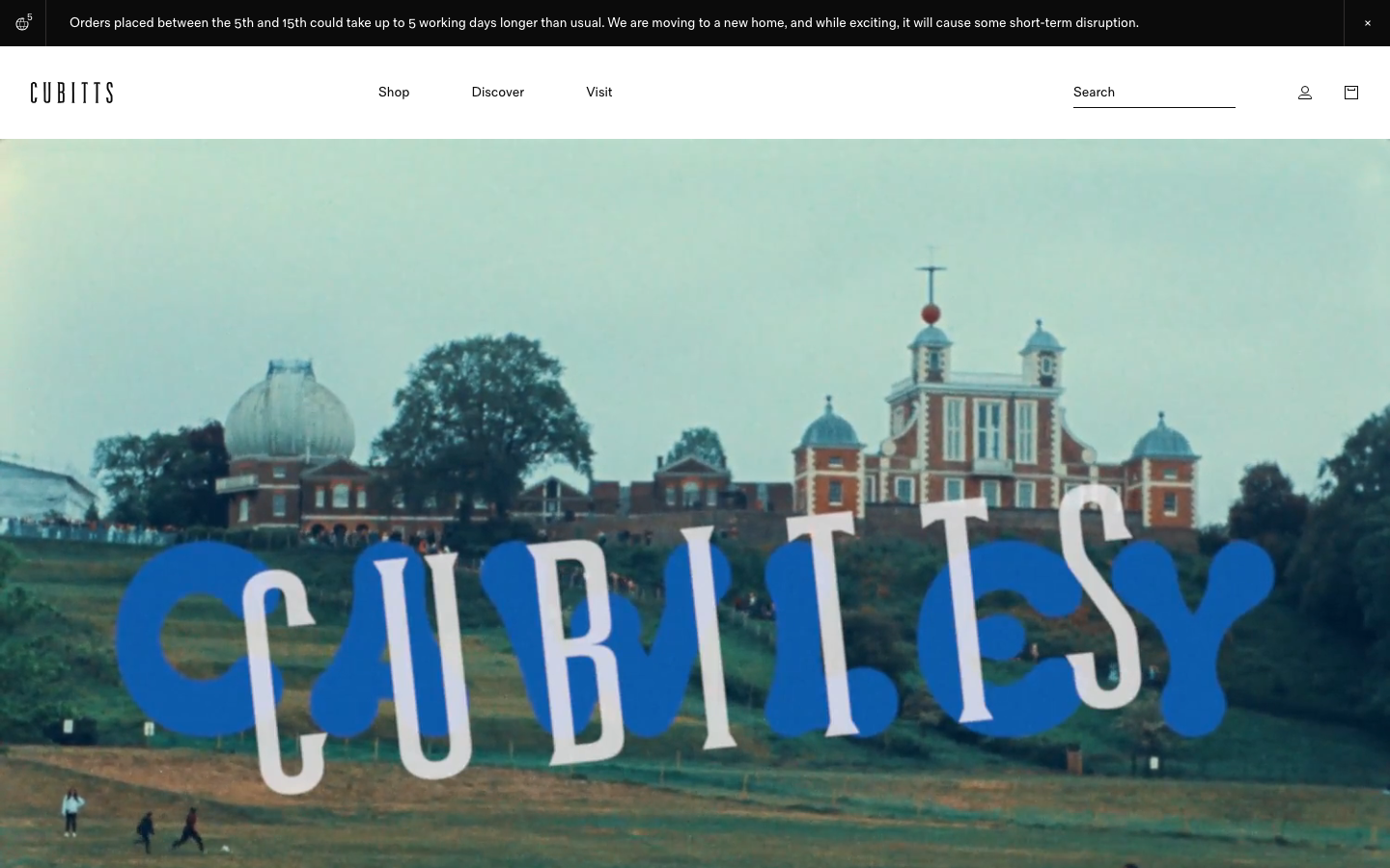
Cubitts
nicheHealth
a London bespoke-spectacle maker treating its Shopify storefront like a design museum, near-black ink on white, a tiny precise type scale in its own Fold Grotesque, generous 16px-radius media tiles, and a giant "CUBITTS" wordmark laid behind a Greenwich Observatory photograph.
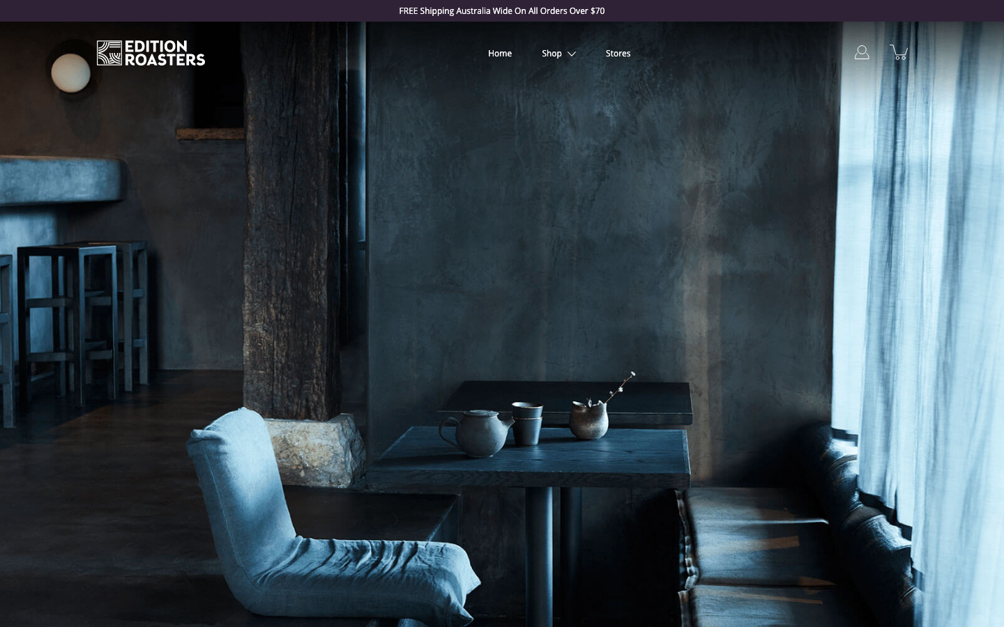
Edition Roasters
strongOther
A speciality roaster whose homepage is mostly hushed, moody photography of an empty cafe at dawn - serenity sold through atmosphere and almost no copy, with a single deep-plum accent doing all the colour work.