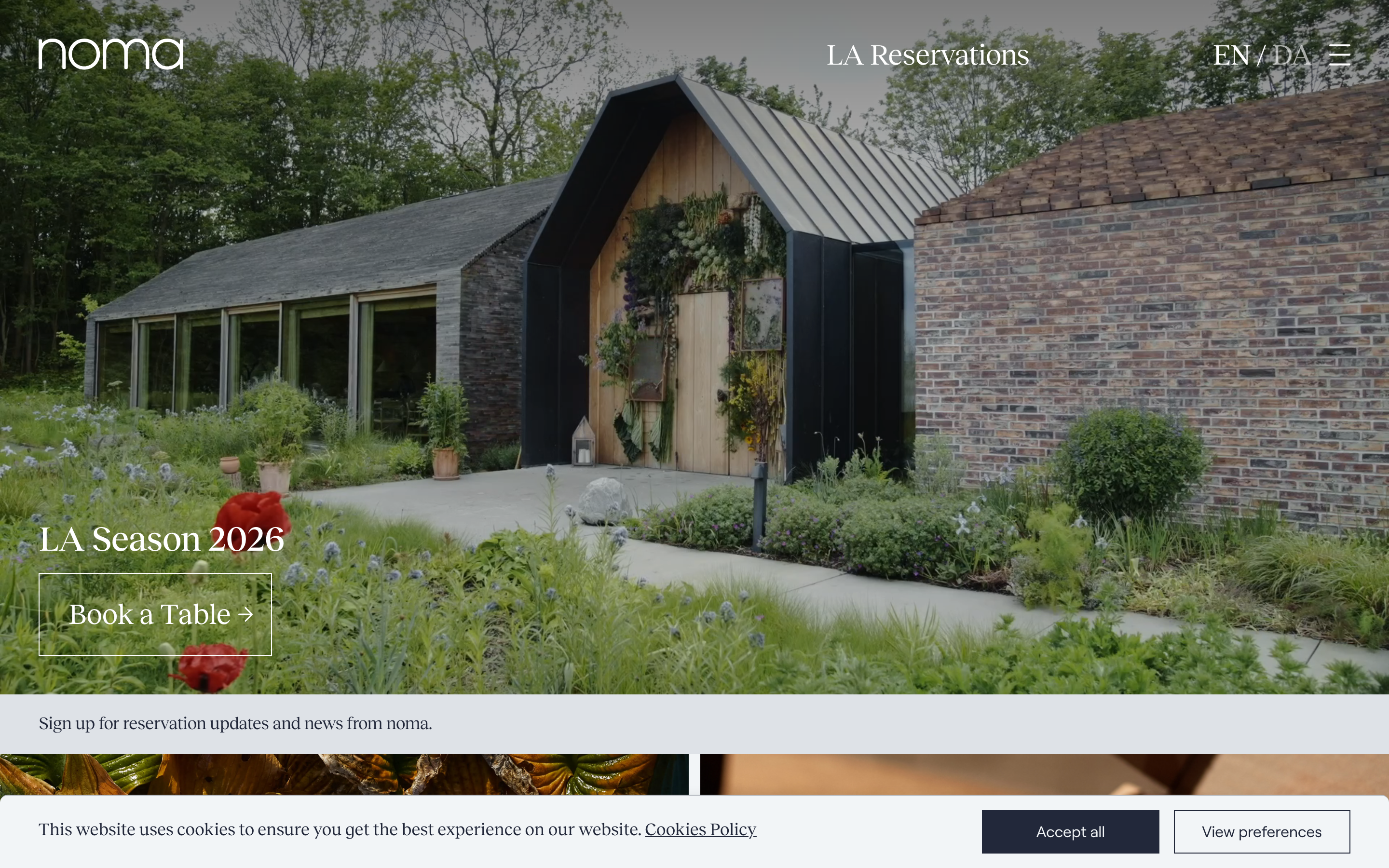
Mun Rooftop
munrooftoprome.com/a Rome rooftop cocktail bar built around a celestial concept, deep midnight navy (#222944) and warm cream (#F2F0DD), a Forma DJR Text body paired with a Qualettee display face, a moon-phase intro loader and Lenis-smoothed scroll, where "where drinking is out of this world" is the whole brand in one line.
Design tokens
- display
- Qualettee
- body
- Forma DJR Text
- mono
- none
Do / Don't
Reference it for
- A cocktail bar or rooftop venue selling mood and elevation: dark, atmospheric, concept-led rather than menu-led.
- A moody two-tone palette (midnight navy #222944, warm cream #F2F0DD, sage #92ABA0) that reads as night without going pure black.
- A grotesque-plus-display pairing (Forma DJR Text + Qualettee) with a wide scale for evocative headlines.
- A branded intro loader and Lenis-smoothed scroll as inexpensive ways to make a small venue site feel premium.
- Concept storytelling: "ten districts, ten cocktails" turns a drinks list into a narrative.
Do not copy
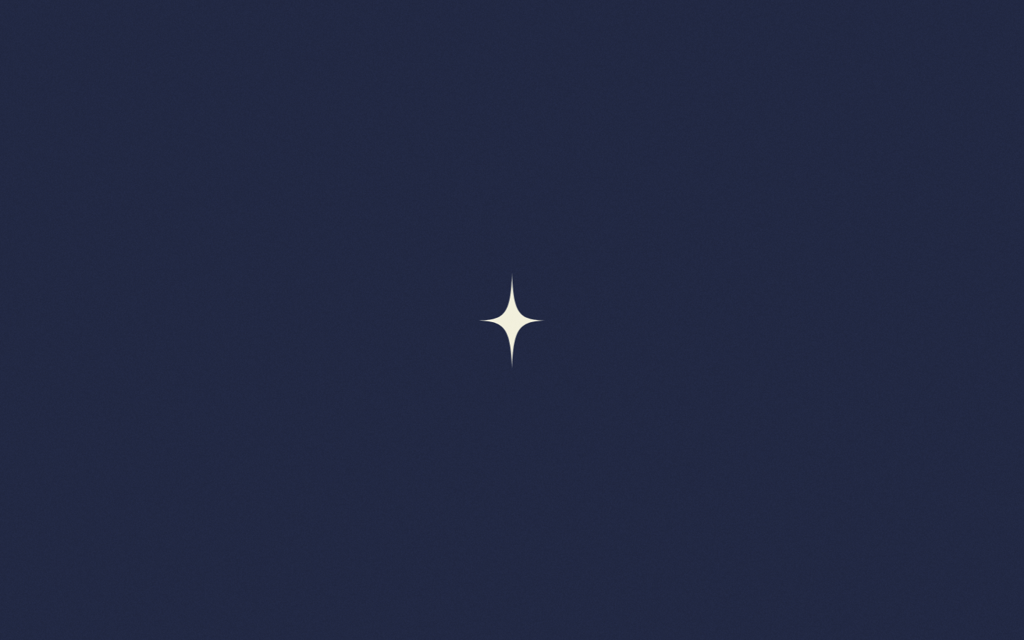
- The lunar "out of this world" concept and the star mark are Mun's identity; borrow the technique of a single committed concept, not this one.
- Forma DJR and Qualettee are licensed; map to a precise grotesque plus an expressive display face.
- An intro loader and heavy smooth scroll suit an atmospheric venue, not a business where users need information fast; gate both and keep them short.
Signature moves
committed concept-led atmospheric hero
a dark, atmospheric, concept-led hero (the celestial idea, with a branded intro loader) sells mood and elevation rather than a menu, on near-full-bleed acts.
moody two-tone night palette + display pairing
a moody palette of midnight navy (#222944), warm cream (#F2F0DD) and sage (#92ABA0) reads as night without pure black, paired with a precise grotesque body (Forma DJR Text) and an expressive display (Qualettee) across a wide scale (to 97.5px).
Related references
Noma
flagshipHospitality
a three-Michelin-star restaurant that sells itself through photography and a quiet serif, full-bleed seasonal imagery, a lowercase joined wordmark, and almost no chrome, so the food and the place carry the whole page.
Sketch London
flagshipHospitality
an art-and-dining destination whose site is as playful as its rooms, soft pastel gradients, a cursive serif logotype, floating rounded cards, GSAP motion, and interactive prompts that invite you to "grow the carpet" or "draw a neon", an experience masquerading as a website.
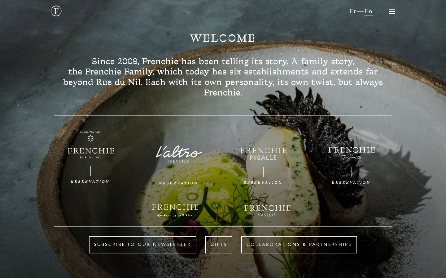
Frenchie Restaurant
strongHospitality
a Paris restaurant group telling a family story, a dark moody hero of textured produce stills, a Traulha display serif (roman and italic) over a Gill Sans body, cream type on near-black ink, and a calm row of venue cards that turns six establishments into one elegant front door.
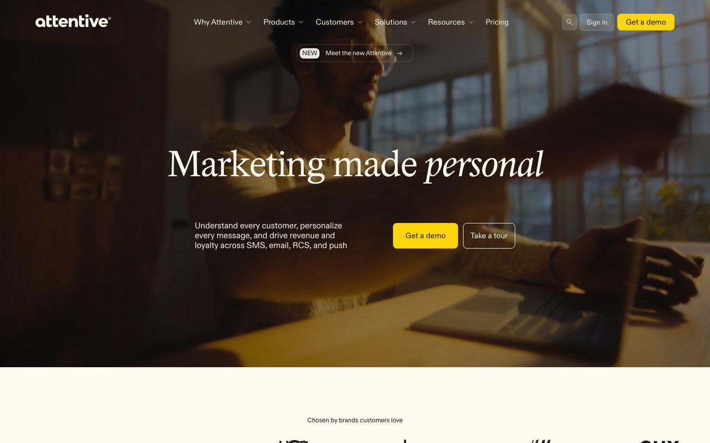
Attentive
strongMarketing Platform
The reference for warm-cream SMS/email marketing brands — Diatype + italic-serif accent, signature yellow CTA, real-people photography hero with italic-serif H1.