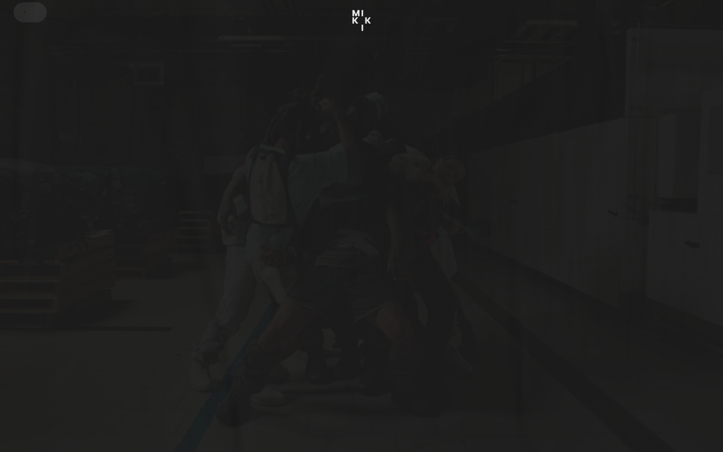
Mikki Sindhunata
mikkisindhunata.comDirector portfolio that splits the brand name into two giant ANTON SC slabs flanking a central video reel, with a tiny stacked MI/KK/I cross-logo, mono metadata column, and GSAP-driven scroll choreography on near-black.
Design tokens
- display
- Anton SC, sans-serif
- body
- B612 Mono, monospace
- mono
- B612 Mono, monospace
- secondary
- Poppins, sans-serif
- fallback
- Arial
- icon
- icomoon (self-hosted, glyphs only)
Do / Don't
Reference it for
- Flanking-name layout — display headline split as left-word + central-content + right-word
- Tiny stacked monogram as logomark (2-row × 3-col MI/KK/I letter grid in tiny ANTON SC)
- Near-black rgb(30, 30, 30) page with rgb(232, 232, 232) off-white text (not pure white)
- Two-font opposing-slab system — ANTON SC compressed display + B612 Mono micro-chrome
- B612 Mono at 9-12px for every system label (nav, metadata, footer, eyebrow)
- ANTON SC at 72px UPPERCASE as the only display weight
- Director-credit metadata block in mono — "DIRECTOR / [credit list] / READ MORE"
- Reel duration + format + DOLBY ATMOS tag as bottom-right chrome
Do not copy
- The Mikki Sindhunata name (obviously)
- The MI/KK/I stacked-monogram exact composition (it's literal letter-grid spelling)
- The "DIRECTOR" eyebrow + specific film credits in the bottom-left block
- The WordPress 7.0 + autoptimize + Complianz stack (this is just the underlying CMS, not the design)
- The parking-garage-grey video reel (it's a specific Mikki film clip)
- The DOLBY ATMOS tag unless the actual reel ships with Atmos audio
- The icomoon font (private icon set — pick your own)
- The Google Fonts loader if the brand wants self-hosted control (substitute @fontsource)
Signature moves
flanking-name reel composition
the display headline is split as left-word + central video reel + right-word in 72px uppercase ANTON SC, with a tiny circular play-button overlay (~28-31px radius) and bottom-right reel chrome.
compressed-display + mono-micro-chrome two-font system
an opposing-slab system pairs ANTON SC (72px uppercase, the only display weight) with B612 Mono at 9-12px for every system label (nav, metadata, footer, eyebrow) on near-black (rgb(30,30,30)) with off-white (rgb(232,232,232)) text.
GSAP scramble + split choreography
GSAP + ScrollTrigger + Lenis drive scroll choreography, with ScrambleTextPlugin for scramble reveals and SplitText for word/character animation, on 0.3s ease-out opacity/colour workhorse transitions (and 0.5s for heavier reveals).
Related references

First Frame
nicheFilm Production
Paris production and post-production studio whose own site is the canonical example of full-bleed black + IBM Plex Mono micro-type + reel-as-hero — the cinematic-craft posture for a portfolio-led service business.
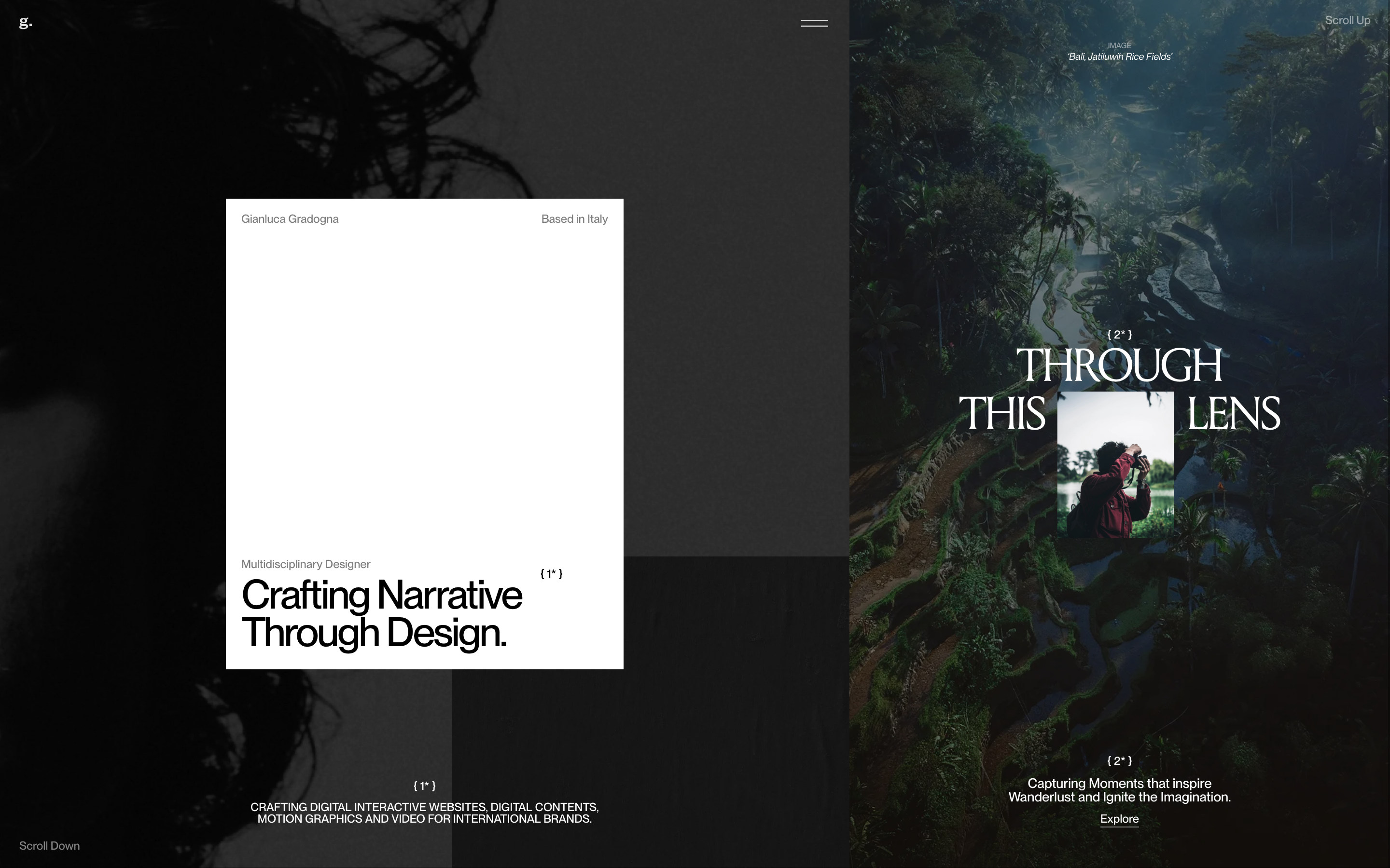
Gianluca Gradogna
nicheDesign Portfolio
a multidisciplinary designer's portfolio that floats a crisp white intro card over a dark, full-bleed photographic world, pairing a clean Neue Montreal grotesque with a high-contrast Times display serif and one slow in-out-sine colour fade.
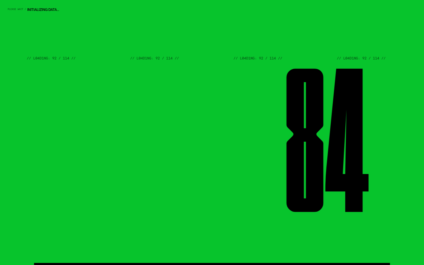
Hugo Baron
nicheDesign Portfolio
The reference for solo motion-design portfolios that lean on a single brand colour, a giant condensed display face, and a "loading-screen-as-hero" gimmick to read as confident and craft-forward without an agency budget.
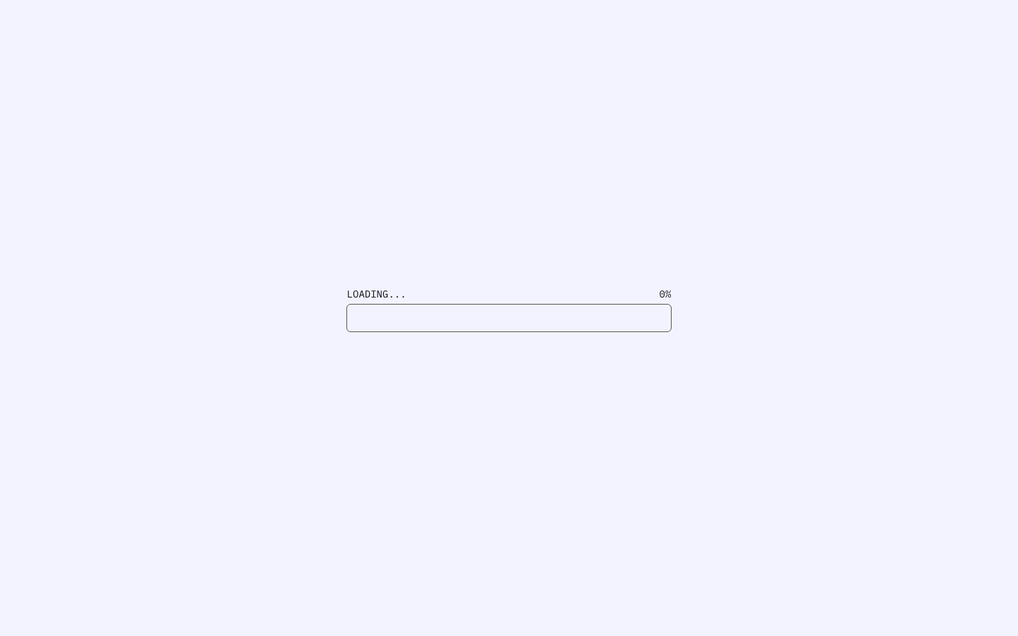
Ichiki 109
nicheDesign Portfolio
The reference for Japanese illustrator portfolios — Astro v5 build, IBM Plex Mono + Hiragino + barcode font, off-white blue-tint background, percentage-progress preloader.