Maven Clinic
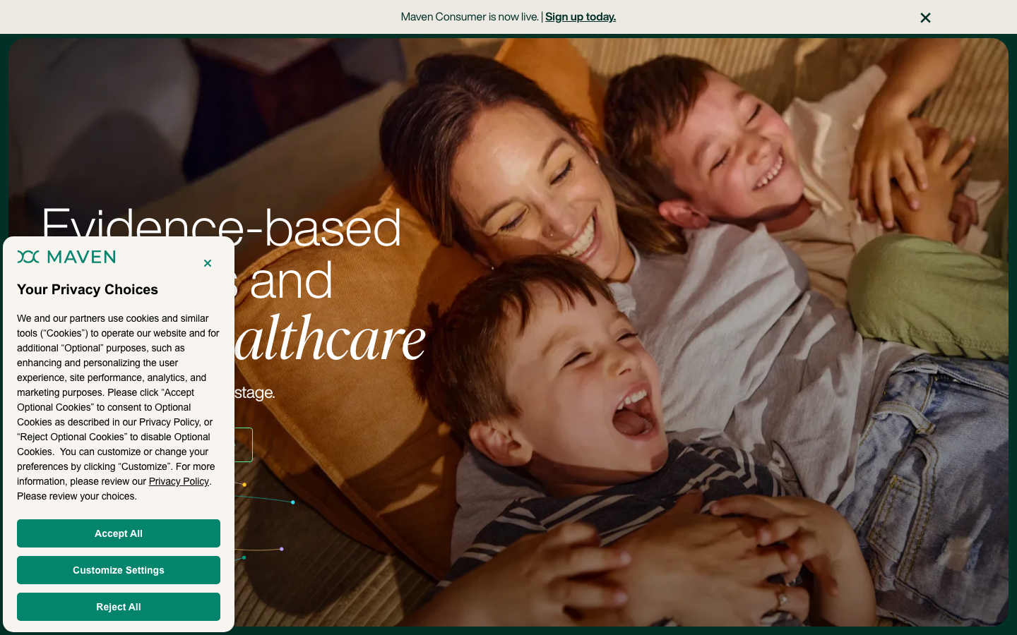
www.mavenclinic.com/a women's and family telehealth brand that wraps clinical credibility in warmth, a deep forest green base lit by an electric mint accent, Helvetica Now Display set huge with Ivar Display serif italics for the emotional words, and warm candid family photography carried full-bleed.
Design tokens
- display
- Helvetica Now Display
- serifAccent
- Ivar Display
- body
- Helvetica Now Text / Helvetica Now Display
- mono
- Basis Grotesque Mono Pro
Do / Don't
Reference it for
- A local medical or allied-health clinic (GP, women's health, fertility, physiotherapy) that wants to look clinically credible and genuinely warm at once.
- Deep-green-plus-one-bright-accent palette as a trust-led alternative to clinical blue.
- A neutral grotesque (Helvetica Now Display) with a serif italic (Ivar Display) reserved for the emotional words in a headline.
- Per-vertical accent theming: one base system, each service area tinted with its own supporting colour.
- Member-story carousels and stat-backed claim cards as proof devices for a care service.
Do not copy
- The Maven wordmark, the exact green-and-mint pairing and the family photography are brand-coded; borrow the structure, re-shoot and re-tint for the client.
- The 906-property Webflow token sprawl is a vendor artefact, not a model to reproduce; distil to a small clean set.
- The employer-benefit framing and the heavy third-party analytics stack are Maven's business, not design worth copying.
Signature moves
deep-green-plus-bright-accent trust palette
a deep forest-green base (#013126) lit by one electric mint accent (#58eda2) as a warm, trust-led alternative to clinical blue for a care service.
grotesque + reserved serif-italic for emotion
a neutral grotesque (Helvetica Now Display, huge to ~88px) carries the voice while a serif italic (Ivar Display) is reserved only for the emotional words in a headline.
per-vertical accent theming + proof devices
one base system where each service area is tinted with its own supporting colour, backed by member-story carousels and stat-backed claim cards as proof.
Related references
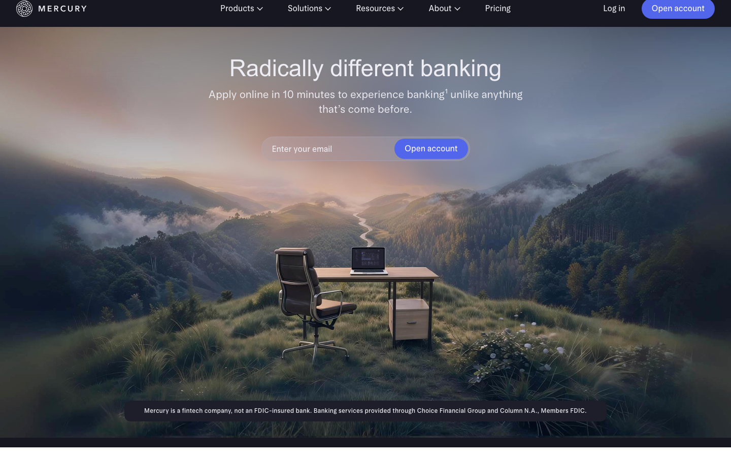
Mercury
flagshipFintech
a banking site that turns scale and aspiration into the brand - bespoke variable Arcadia/ArcadiaDisplay typography at intermediate weights (420/480), a glass-blur dark nav over a 1952px-wide light page, atmospheric mountain/space photography, and one electric-indigo CTA in a sea of refined neutrals.
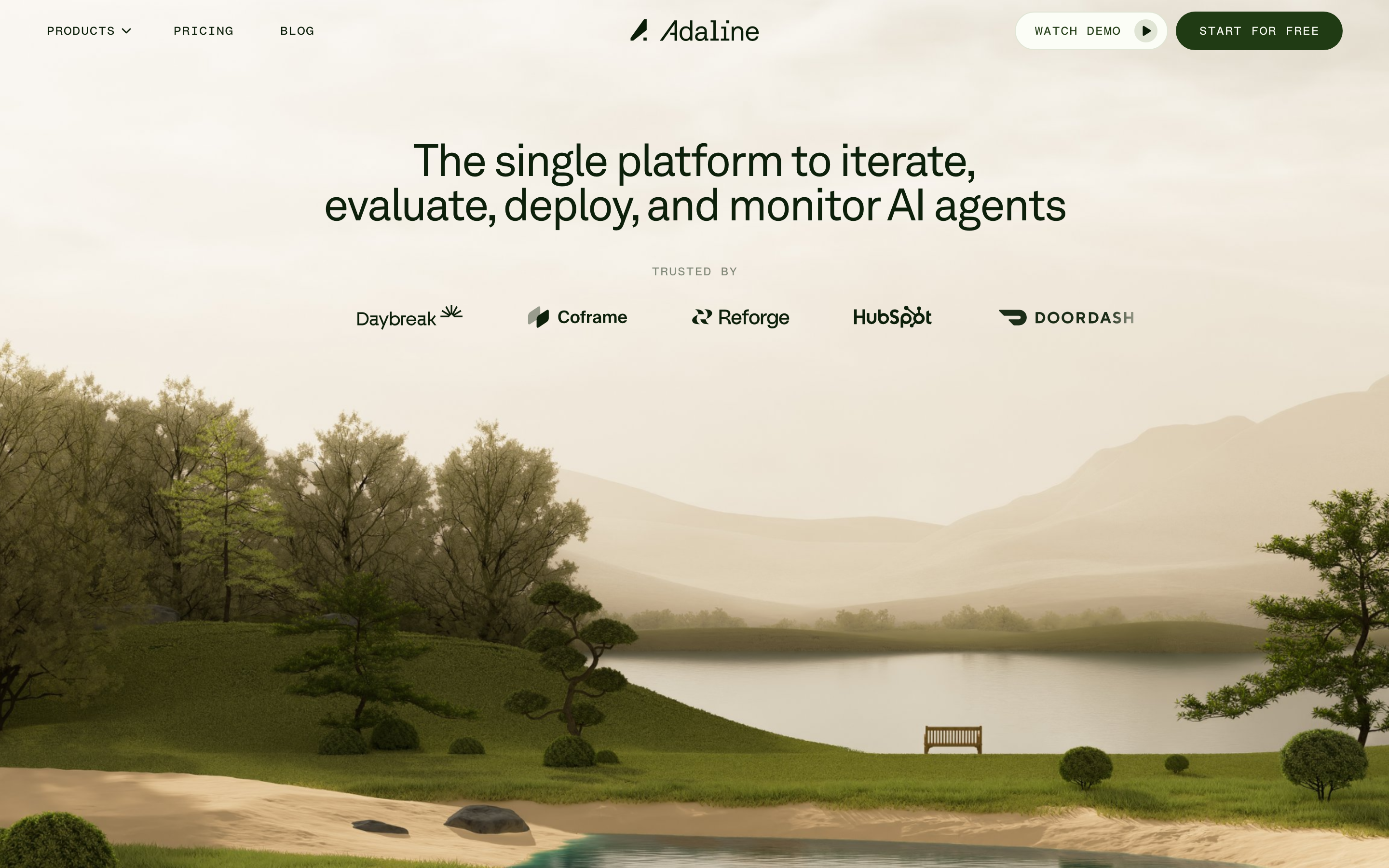
Adaline
strongDeveloper Tool
an AI-infra product site that swaps the genre's default dark-neon for a hand-built 3D Japanese-garden world, then runs warm earth tones, a grotesque/mono type pair and patient scroll-reveal motion over the top so a developer tool feels like a calm place.
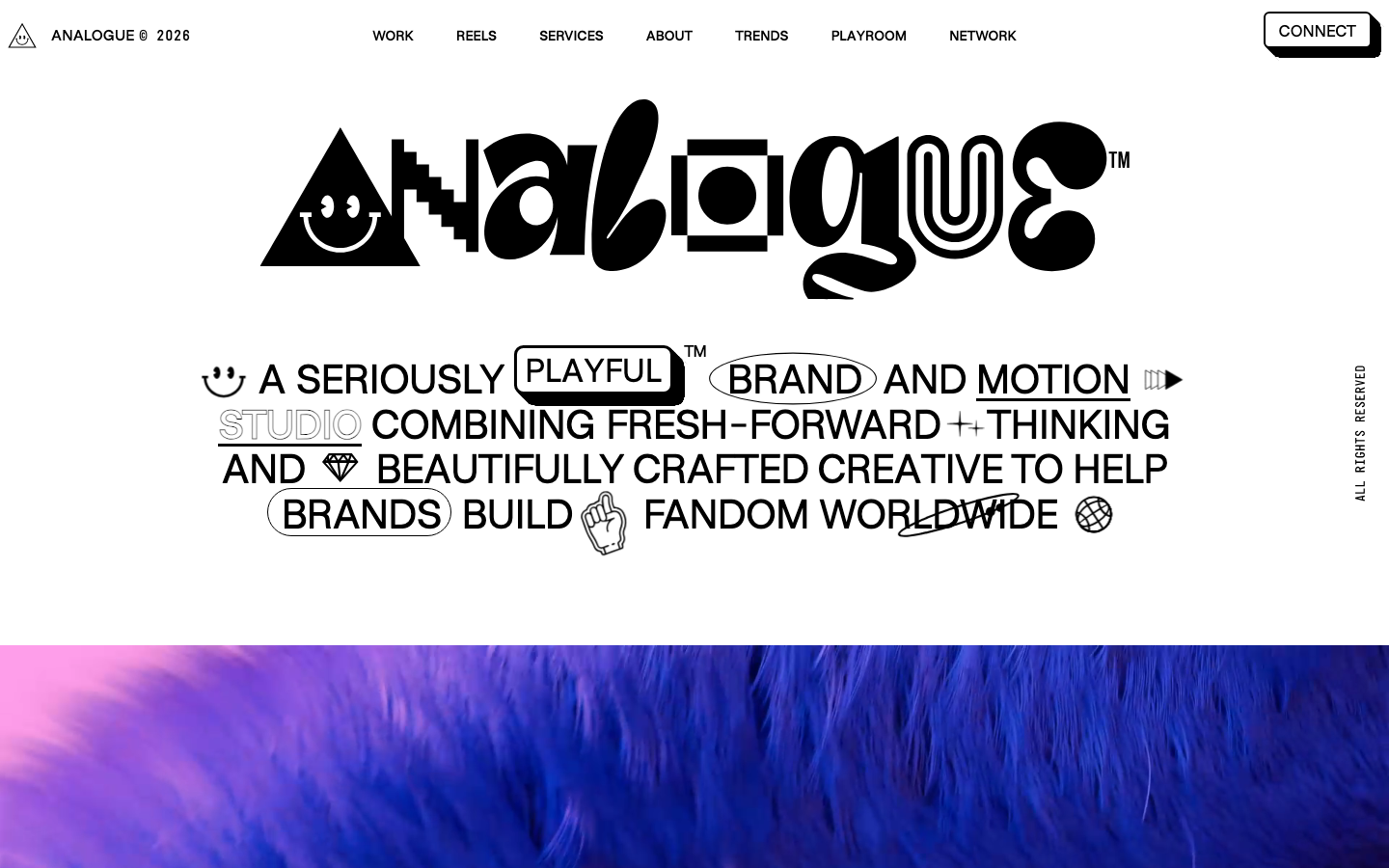
Analogue
strongCreative Studio
a "seriously playful" brand-and-motion studio that wears its personality as type, a wonky multi-alternate ANALOGUE wordmark, emoji and icon glyphs set inline in the copy, a candy-pink accent on white, and a GSAP-driven box of tricks (mexican-wave letters, glitches, bounce, float) kept just on the right side of chaos.
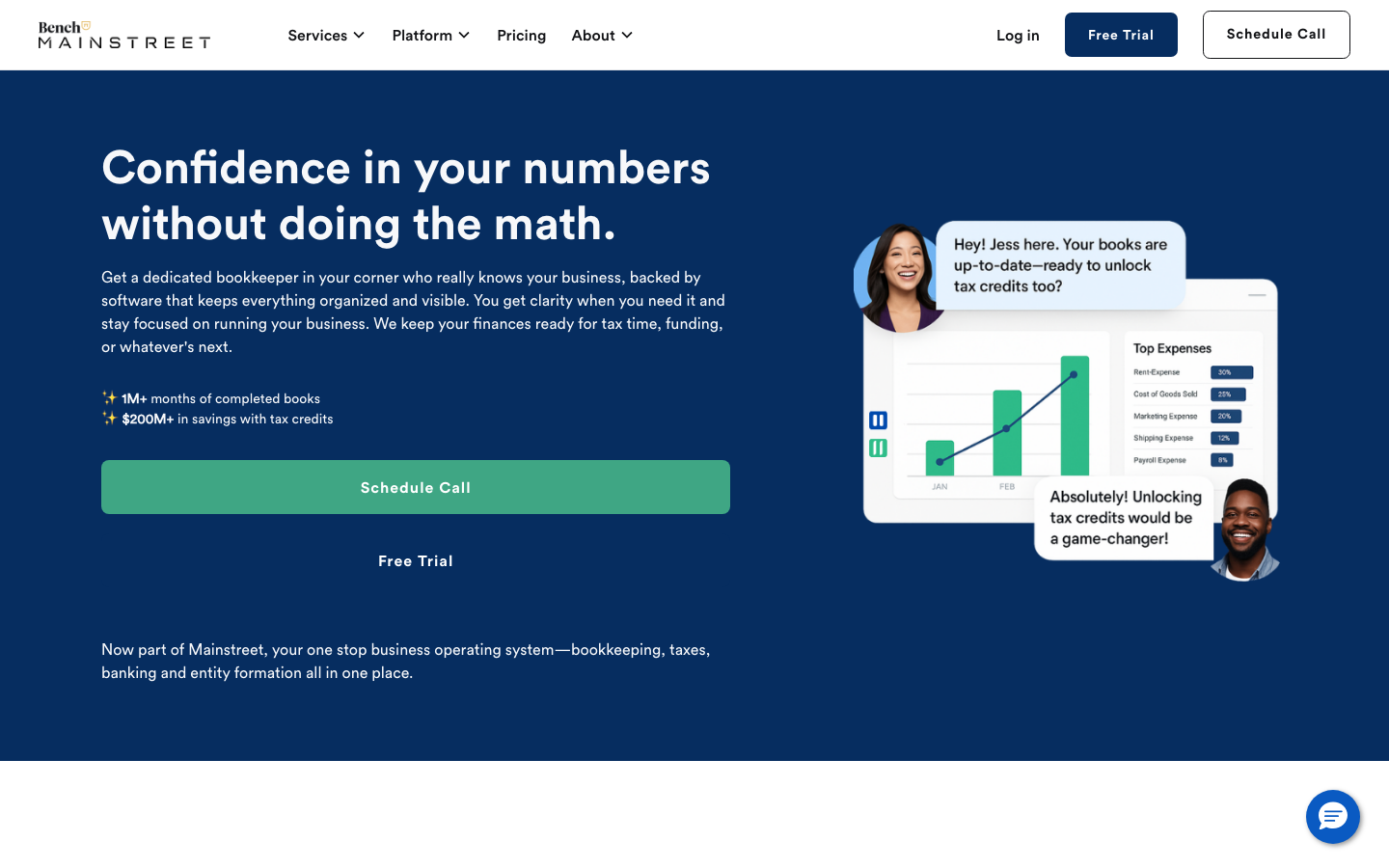
Bench Accounting
strongProfessional Services
a small-business bookkeeping service that builds trust with a deep-navy hero, friendly Circular Std type, a soft blue-teal palette and a product mock-up showing real reports and chat support, calm, credible, conversion-focused.