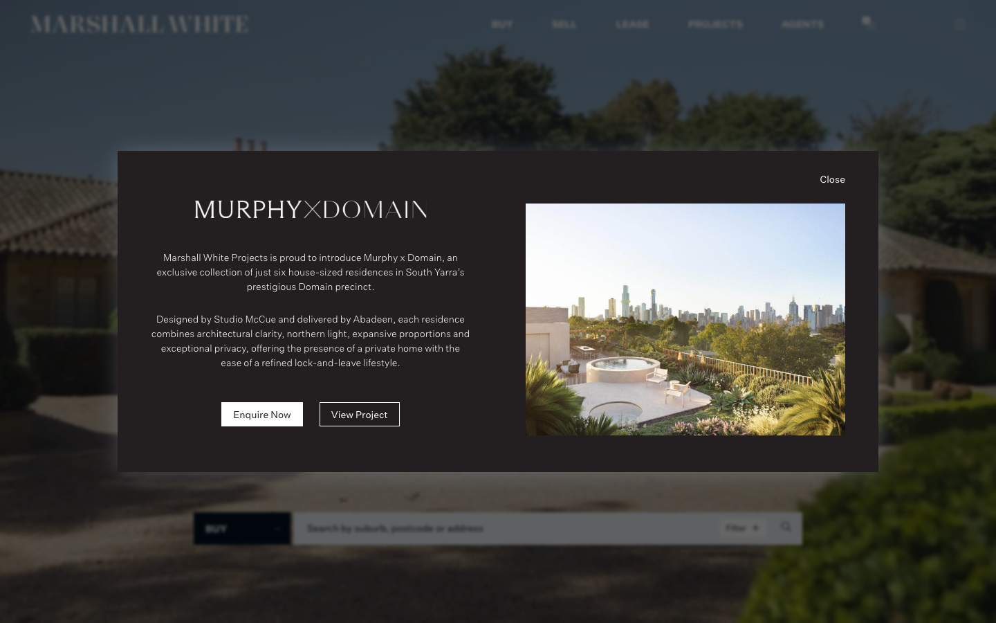
Marshall White
www.marshallwhite.com.au/a premium Melbourne real estate agency rendered as a restrained editorial object: deep navy ink (#00101F) on white, a single refined sans (Untitled Sans) with a Georgia/Cigars serif accent, full-bleed property photography and almost no radius, so the work and the wealth speak quietly.
Design tokens
- display
- georgia, serif (with HW Cigars licensed serif for display)
- body
- Untitled Sans
- mono
- none
Do / Don't
Reference it for
- Signalling premium through restraint: a near-monochrome navy/white palette, zero radius, big calm photography, no decorative noise.
- A refined neutral sans (Untitled Sans) paired with a serif for editorial headings, the classic luxury-real-estate pairing.
- Wide-tracked small-caps section labels as quiet structural markers.
- Treating a flagship listing as an editorial modal/spread rather than a card in a grid.
Do not copy
- Untitled Sans and HW Cigars are licensed; substitute a comparable neutral grotesque + a refined serif.
- The exact navy #00101F and the Marshall White wordmark are brand identity; borrow the monochrome-plus-one-dark approach, choose the client's own ink.
- The very wide container maxima (up to 3100px) suit ultra-wide hero photography; only adopt if the client has equally strong imagery.
Signature moves
restraint-as-luxury monochrome system
a near-monochrome dark-ink-on-white palette with zero radius (sharp 0px, xs 4px only) and big calm photography, signalling premium through restraint rather than decoration.
neutral-sans + editorial-serif luxury pairing
a refined neutral grotesque body paired with a serif for editorial headings, with wide-tracked small-caps section labels as quiet structural markers across a 10-38px scale.
listing-as-editorial-spread
a flagship listing is treated as an editorial modal/spread rather than a card in a grid, using ultra-wide containers (1638px up to 3100/2440px) with 805px reading columns.
Related references
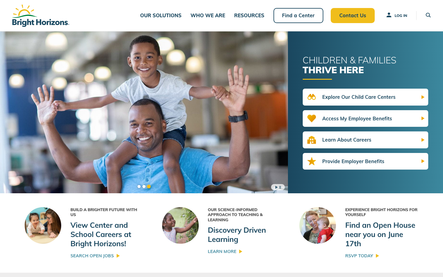
Bright Horizons
strongChildcare Education
a large early-education and childcare provider whose site leads with a warm deep-teal and sunshine-yellow palette over happy children's photography, the rounded Mulish sans throughout, a tabbed audience-routing hero, and a clear, trust-led grid of pathways for parents and employers.
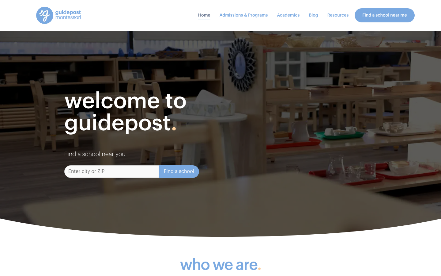
Guidepost Montessori
strongChildcare Education
a warm, parent-facing Montessori network site built in WordPress and Elementor, lowercase Graphik headings each ending in a coloured full-stop, a soft cornflower-blue (#7AA9E1) and coral (#ED4944) palette on slate-blue body text, pill buttons and rounded-bottom image cards, gentle and trustworthy rather than clever.
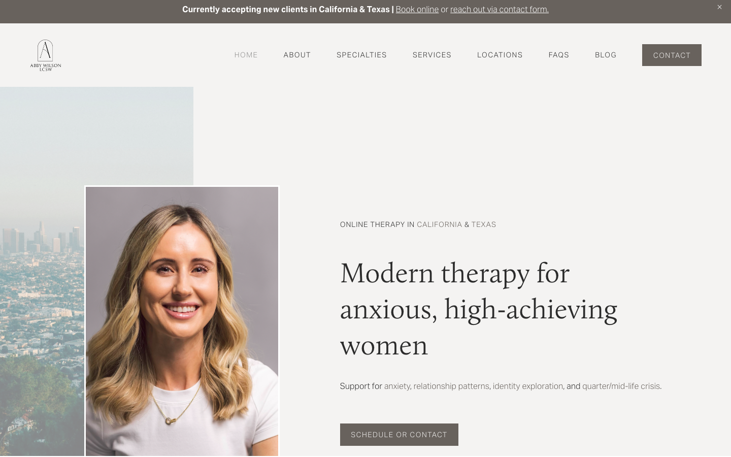
Abby Wilson Therapy
strongOther
A boutique therapist for "anxious, high-achieving women" who reassures by being polished and specific - a warm sand-and-charcoal editorial system, a Calluna serif voice, named specialties and a clearly walked process that says "I understand exactly who you are and how this works".
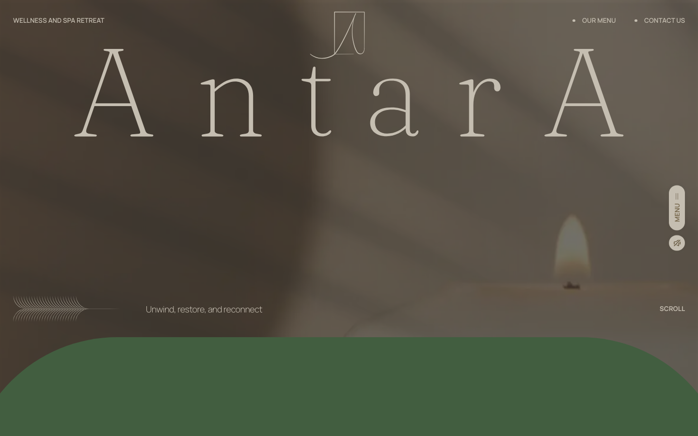
Antara Spa
strongBeauty
a Malaysian day spa that sells calm with one oversized Fraunces wordmark on a sun-warmed photographic hero, an earthy sand-brown-sage palette, and slow GSAP-and-Lenis scroll, the whole page tuned to feel like exhaling.