Mark Clennon
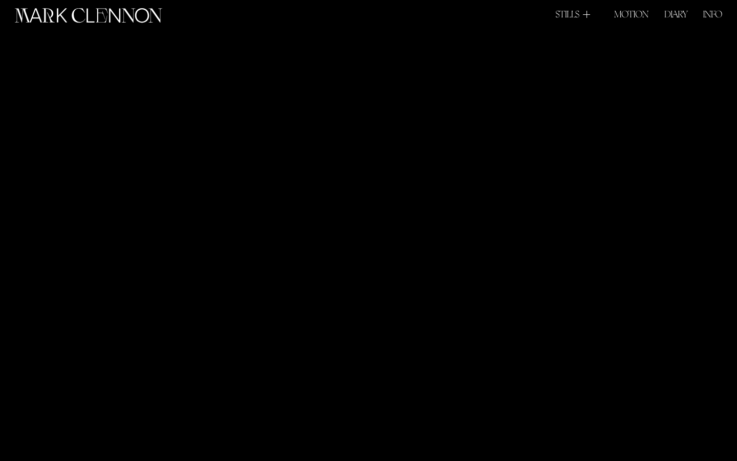
www.markclennon.comA near-black photographer-portfolio built on Webflow, where the wordmark itself, set in the distinctive Boogy Brut Poster display, does almost all the brand work — and the rest of the canvas gets out of the way so the imagery can land.
Design tokens
- display
- "Boogy Brut Poster Web White", sans-serif
- body
- "Boogy Brut Poster Web White", sans-serif
- mono
Do / Don't
Reference it for
- Pure #000000 page, no near-black flinch, no rgb(20,20,20) softening
- Light grey rgb(217, 217, 217) body text (the --grey custom property, 196 hits, the dominant text colour, not pure white)
- White-only nav and logomark on the black canvas
- Single warm accent #D18221 declared as --main-light, a reserved copper-orange not used in the main canvas
- Boogy Brut Poster Web White display family, 400 weight, including the Italic and Wild cuts, character-led display type carrying the entire brand
- Three-foundry type system on standby (Boogy Brut, T1 Korium 3Kg, Lunchtype 22/23) for inner-page variety
- Six-item all-caps horizontal nav with disclosure indicator on STILLS (+)
- Two-level disclosure pattern (STILLS revealing Commissioned / Personal)
Do not copy
- The Mark Clennon wordmark or Boogy Brut Poster Web White font commission, this is the brand's signature and is licensed for one site
- The bio voice verbatim (the Caribbean grandmother line in particular)
- The Whitney / Phillips name-drops unless they're true for the client
- The Apple / Spotify / Nike / Vogue client list as evidence
- The markclennon.com URL pattern (firstname-lastname.com) unless the brand is a personal one
- The exact #D18221 copper accent, pick the client's brand colour
- The home-cc-list-wrapper Webflow class naming
- The MARK CLENNON upper-case wordmark composition with the floating-glyph treatment unless the brand has a similarly hand-cut display face
Signature moves
Lottie wordmark hero on pure black
a Lottie-driven wordmark intro animation occupies a 900px-tall home-lottie-wrapper as the hero on a pure #000000 page, where the distinctive Boogy Brut Poster display wordmark does almost all the brand work
viewport-relative padding with flat hard-edge chrome
--main-space: 10vw is the canonical horizontal page padding (a viewport-relative rhythm token), with a fixed 110px header spanning the 1440 viewport, light-grey rgb(217,217,217) body text and zero border-radius plus zero shadow
Related references
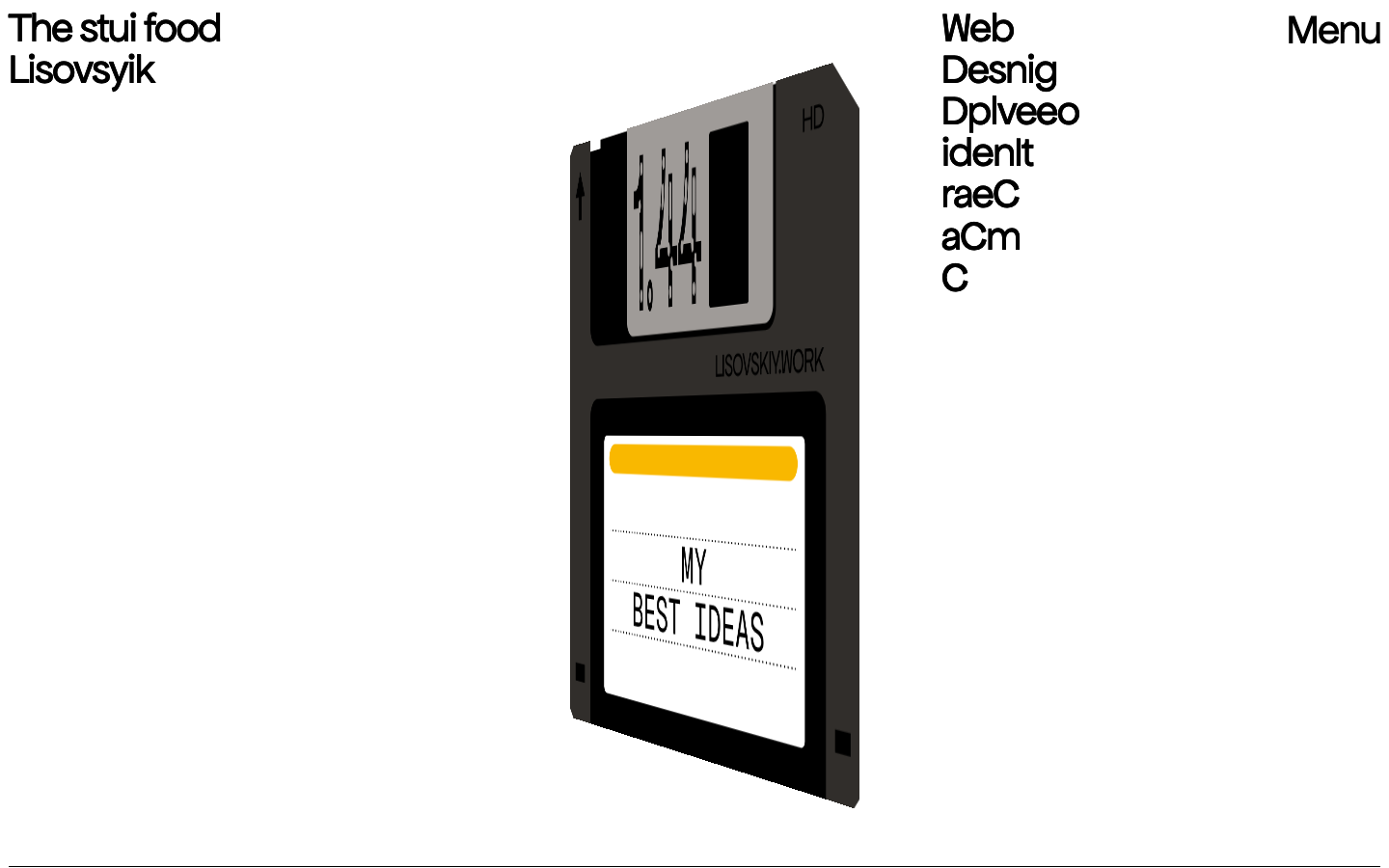
Lisovskiy
nicheDesign Portfolio
Sergey Lisovskiy's personal designer site — floppy-disk hero illustration + intentionally scrambled-letter headlines + single 43.2px Apfel Grotezk + SvelteKit.

Alche
strongCreative Studio
The reference for Japanese virtual-character + immersive experience studios — Astro v5 build, neon yellow-green accent, 5-font multi-language system, KizunaAI case study.
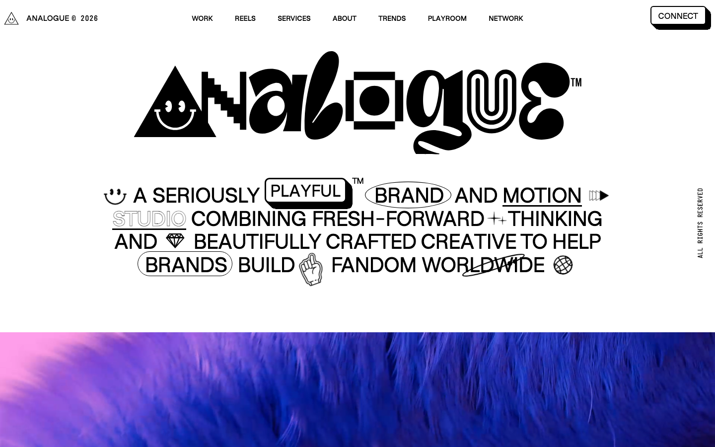
Analogue
strongCreative Studio
a "seriously playful" brand-and-motion studio that wears its personality as type, a wonky multi-alternate ANALOGUE wordmark, emoji and icon glyphs set inline in the copy, a candy-pink accent on white, and a GSAP-driven box of tricks (mexican-wave letters, glitches, bounce, float) kept just on the right side of chaos.
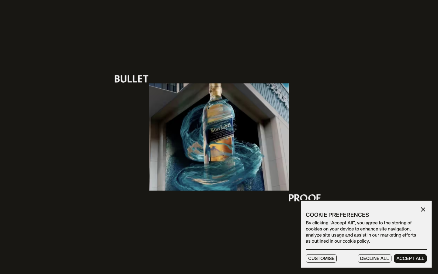
Bulletproof
strongCreative Studio
a brand-agency site that treats its own logotype as the hero, oversized "BULLET / PROOF" split type and a giant line-drawn B monogram, alternating black and bone-white acts with a Sequel-Sans-plus-Mixta-serif pairing, expo-eased motion and a single orange spark.