Madrone Construction
www.madroneconstruction.com/A family-owned Central Oregon custom-home builder that wins trust through warmth and calm - full-bleed photography of light-filled finished homes, a "Built On Trust" promise, and a quiet values narrative (Quality, Integrity, Experience) that feels like a handshake, not a pitch.
Design tokens
- display
- Gotham Bold
- body
- Montserrat / Poppins
- mono
Do / Don't
Reference it for
- Trust-through-warmth architecture for a high-touch relationship trade (custom homes, renovations, bespoke services): a values narrative (Quality, Integrity, Experience) over a feature list.
- Photography-led calm: a single warm finished-home photo carrying the hero, photos paired with each value.
- Relationship framing in copy: "open communication", "fewer clients at a time", "family-owned for 30 years" - selling the experience of working together.
- Deep restraint (near-zero motion, minimal palette) as a serenity/reassurance signal for an anxious, high-stakes purchase.
- A warm-grey + single-slate-blue + white palette that lets the home photography be the only colour.
Do not copy
- The exact warm-grey #464646 + slate-blue #647c90 palette and the literal Madrone home photography (re-skin to the client's palette and use their own project photos).
- The "30 years", "family-owned" and specific Central Oregon claims - these are Madrone's genuine credentials; a rebuild must use the client's own real story.
- The Webflow DOM. Rebuild lean on Astro (it is already light, so this is easy).
Signature moves
feeling-first finished-home hero
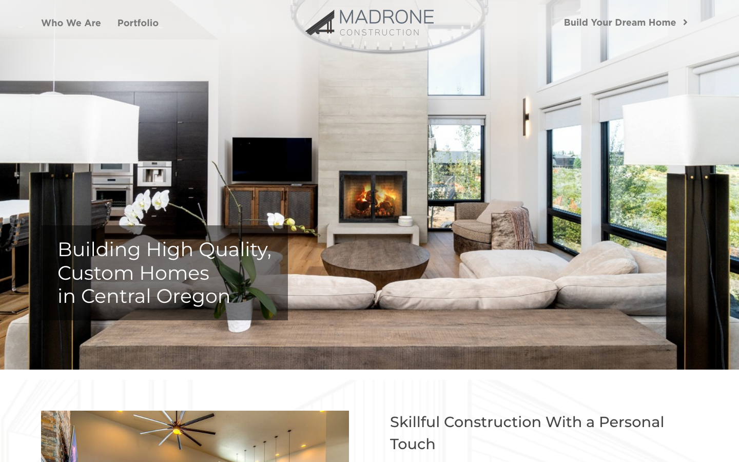
the hero is a single warm photograph of a light-filled finished interior under one quiet line ('Building High Quality, Custom Homes in Central Oregon'), leading with the FEELING of the finished home rather than the construction process - the right opening for an anxious, aspirational purchase.
photo-paired values spine
a 'Why Choose Madrone?' sequence runs Quality -> Integrity -> Experience, each value paired with a framed photo of finished work and one honest concrete detail (fewer clients at a time, family-owned 30 years), selling the experience of working together over a feature list.
calm-as-reassurance restraint
near-zero motion (a single 0.2s transition, 0 keyframes), an almost-monochrome warm-grey/white palette with one soft slate-blue band, and only 7 short sections create a serene, unhurried feel that reassures where animation would feel salesy.
Related references
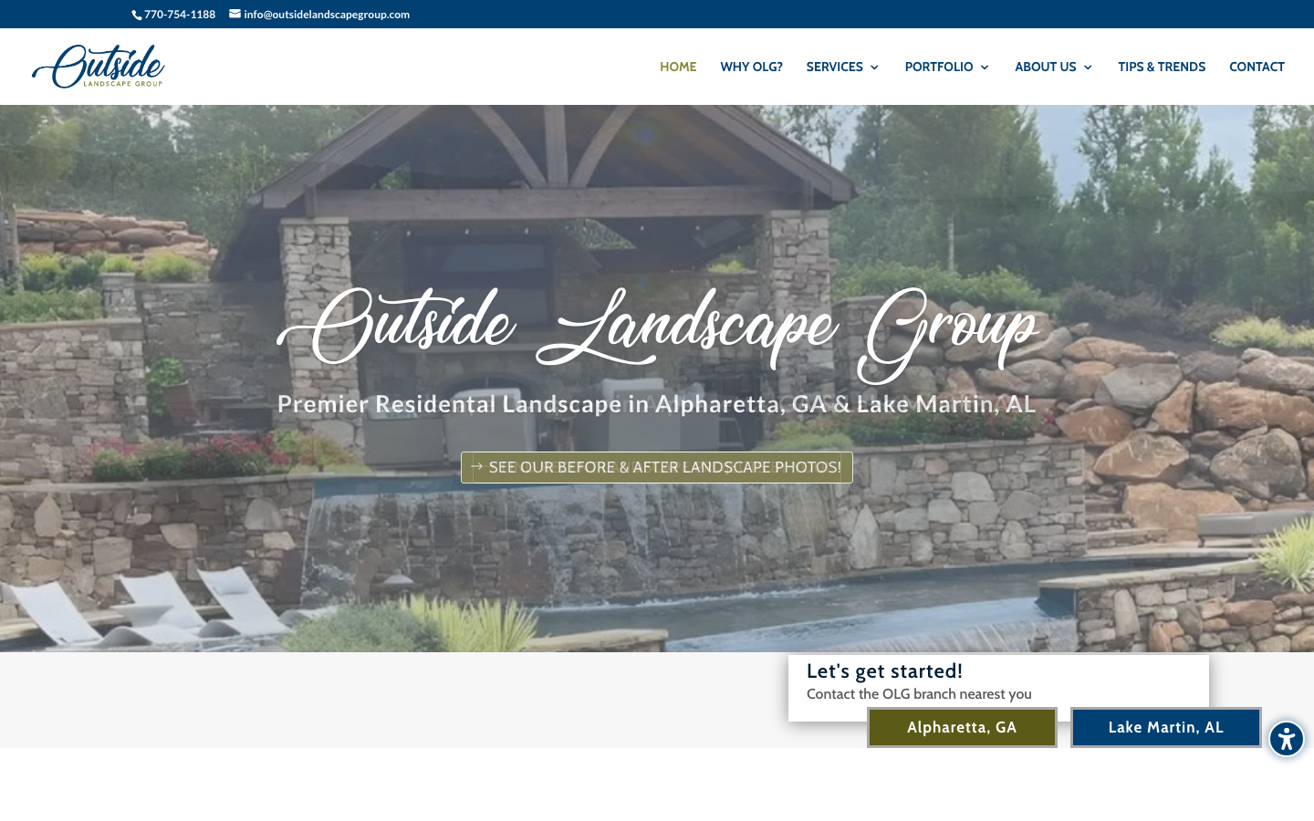
Outside Landscape Group
flagshipOther
A high-end Alpharetta / North Metro Atlanta landscape design-build firm that makes competence feel measured, not boasted - lush portfolio photography on a navy-and-olive canvas, "Best Pick" and "Guild Quality" award language, and a calm proof-led narrative that earns a luxury outdoor-living budget.
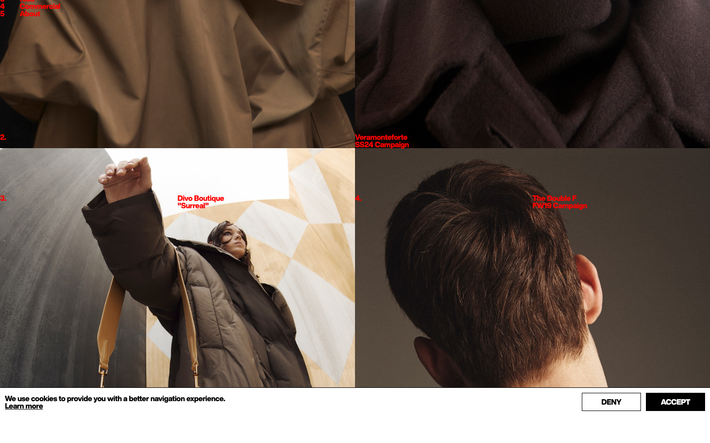
Roberta Ungaro
nichePhotography
a fashion photographer's portfolio where the entire interface is small red type scattered across a white page, every label, category and caption set in tiny bold red Helvetica, floating over and between full-bleed images so the navigation reads like annotations on a contact sheet.
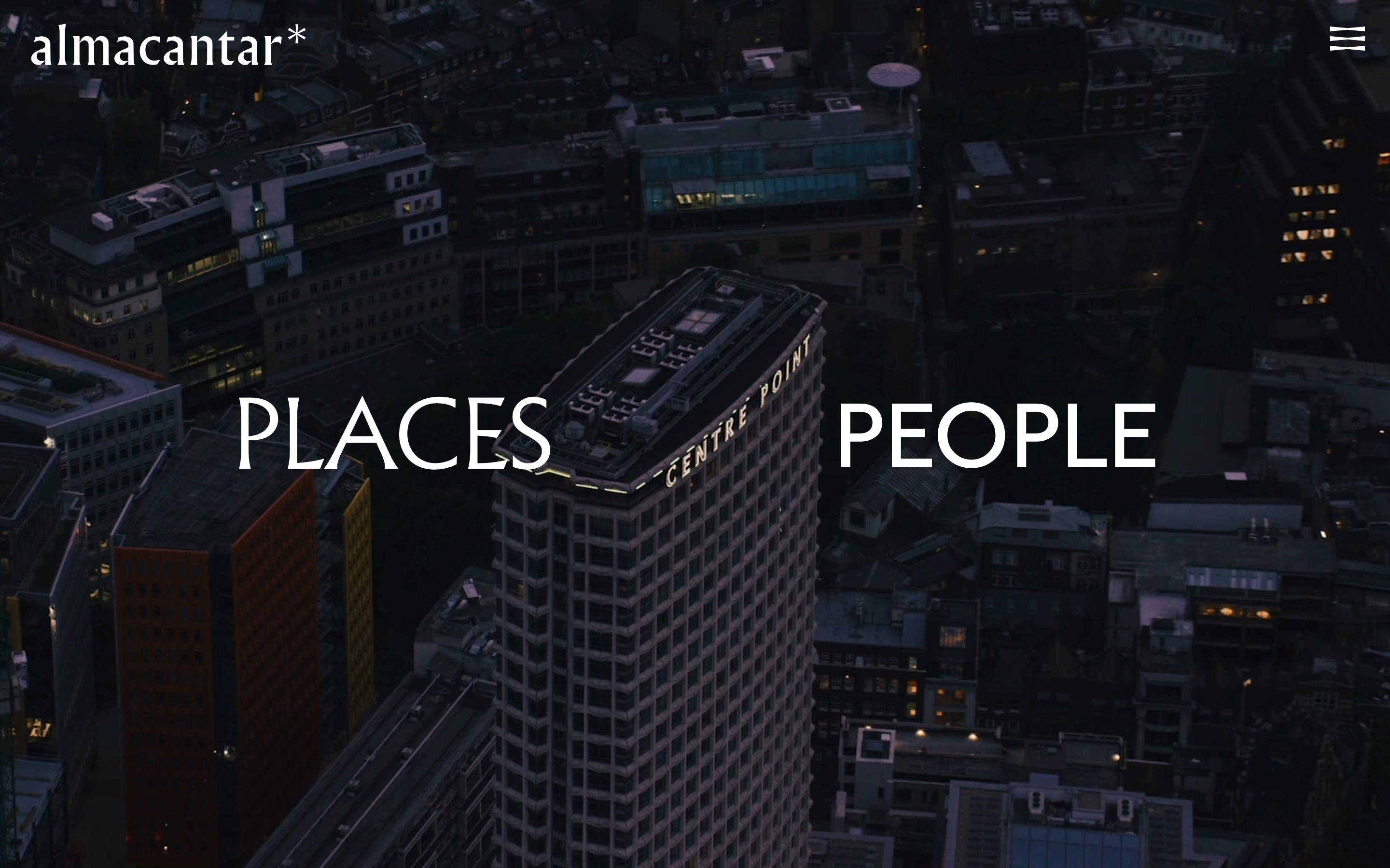
Almacantar
nicheReal Estate
an architecture-led property developer reduced to its barest, most confident form, full-bleed aerial London video on near-black, a single Albertus serif word-pair ("PLACES / PEOPLE"), almost no chrome, and a quiet fade-and-rise motion that lets the buildings carry everything.
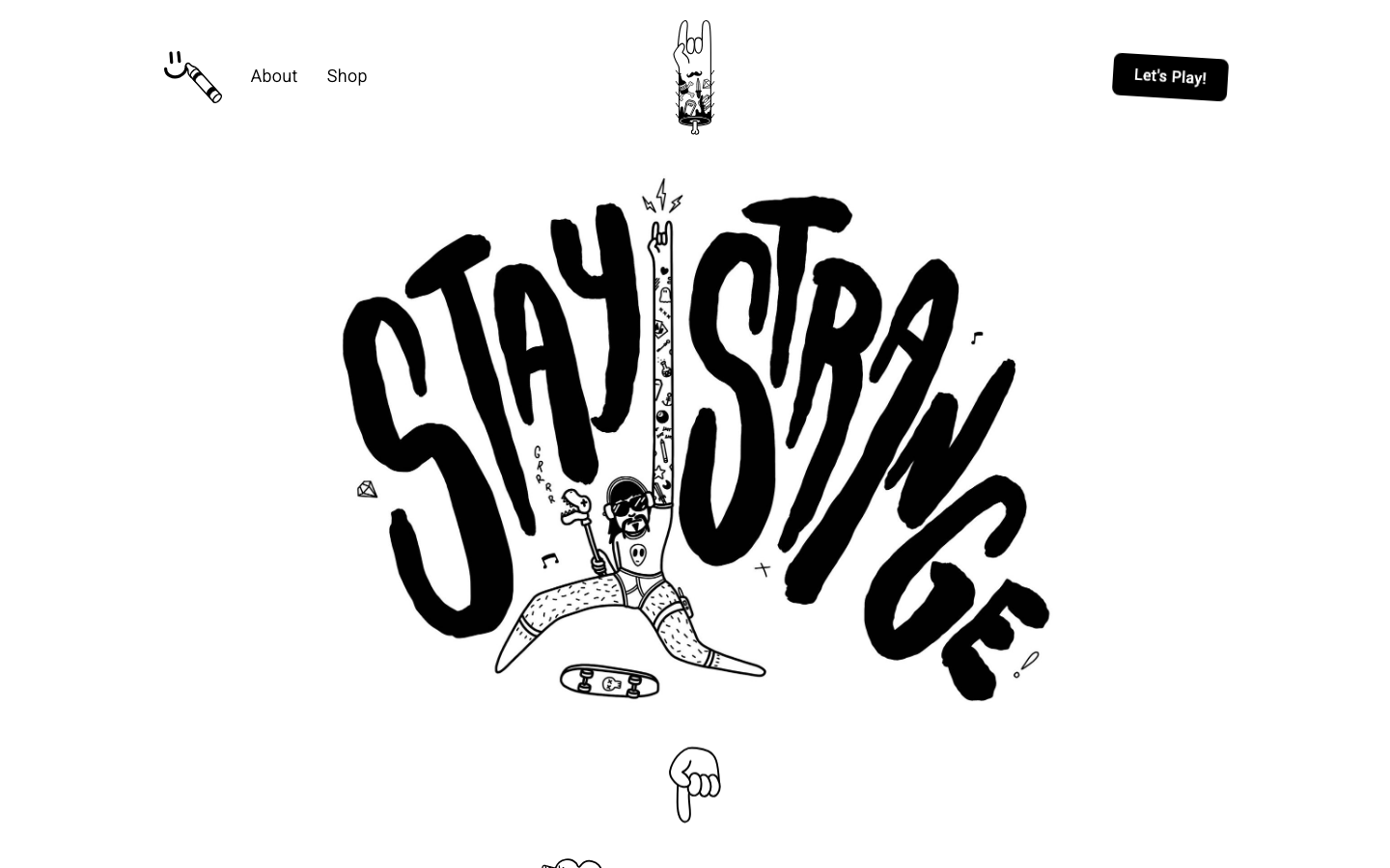
Alternative Aesthetics
nicheDesign Portfolio
The reference for solo illustrator portfolios on Webflow — hand-drawn "Stay Strange" hero typography, monochrome black/white canvas, and a 4-column thumbnail grid that lets the artwork carry the entire visual voice.