
Lune Croissanterie
lunecroissanterie.com/A cult croissanterie that treats pastry like cinema - a near-black canvas, full-bleed video, oversized DIN display type that splits and reveals on scroll, turning a bakery into an object of desire.
Design tokens
- display
- DIN Next LT W01 (Regular + Bold)
- body
- Untitled Sans
- mono
Do / Don't
Reference it for
- A dark cinematic food/product system: #000 canvas, monochrome type, full-bleed video doing the seducing.
- Kinetic display type: oversized DIN at ~115px, split into characters and revealed on scroll (the kinetic-type device).
- Unhurried scroll-reveal timing: 1.2-1.6s transform, opacity reveals on slow easing - patience as luxury.
- Severe nav restraint (four links + a vertical Menu label) letting motion and imagery carry the whole brand.
- stroke-dashoffset line-draw for marks/dividers as a quiet signature.
Do not copy
- The literal DIN Next + Untitled Sans pairing and the LUNE diamond mark (brand-coded). Swap the display face and mark.
- The all-black canvas as a default - it suits Lune's cinematic ambition; only use it where the client's photography/video can fill it.
- The WordPress + OptiMonk + Klaviyo stack and the 75-script load. Rebuild lean on Astro with native video.
Signature moves
full-bleed video stage descent
the homepage is a stack of full-viewport black video stages, one immersive moment per scroll (laminated dough, the cube croissant shot like a perfume film), so an everyday pastry feels rare and desirable.
kinetic split-display headline
oversized DIN display lines (to ~115px) split into characters and reveal letter by letter on scroll, the type itself becoming the hero event against vast black space.
unhurried 1.2-1.6s scroll reveals + line-draw marks
whole stages rise and fade over a full 1.2-1.6 seconds on slow easing while thin marks draw themselves via stroke-dashoffset over 2.4s - patience presented as luxury.
Related references
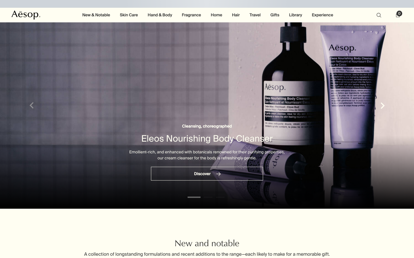
Aesop
flagshipConsumer Brand
an editorial e-commerce reference where Suisse Intl on warm-cream `#fffef2`, a modular 1.13 type ratio, and full-bleed photography do all the work - no display face, no accent colour, no motion of consequence.
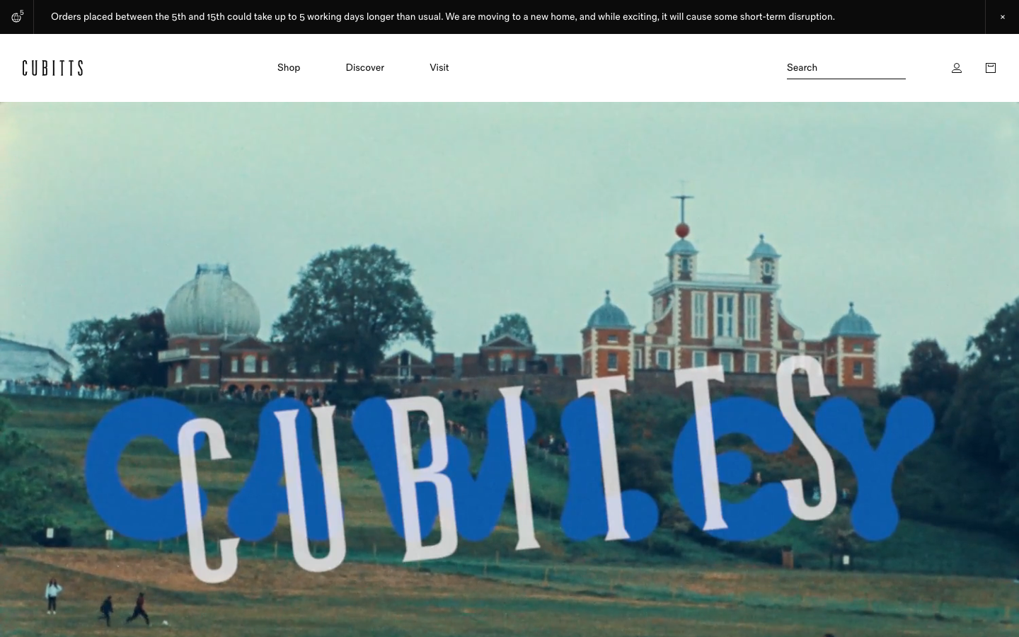
Cubitts
nicheHealth
a London bespoke-spectacle maker treating its Shopify storefront like a design museum, near-black ink on white, a tiny precise type scale in its own Fold Grotesque, generous 16px-radius media tiles, and a giant "CUBITTS" wordmark laid behind a Greenwich Observatory photograph.
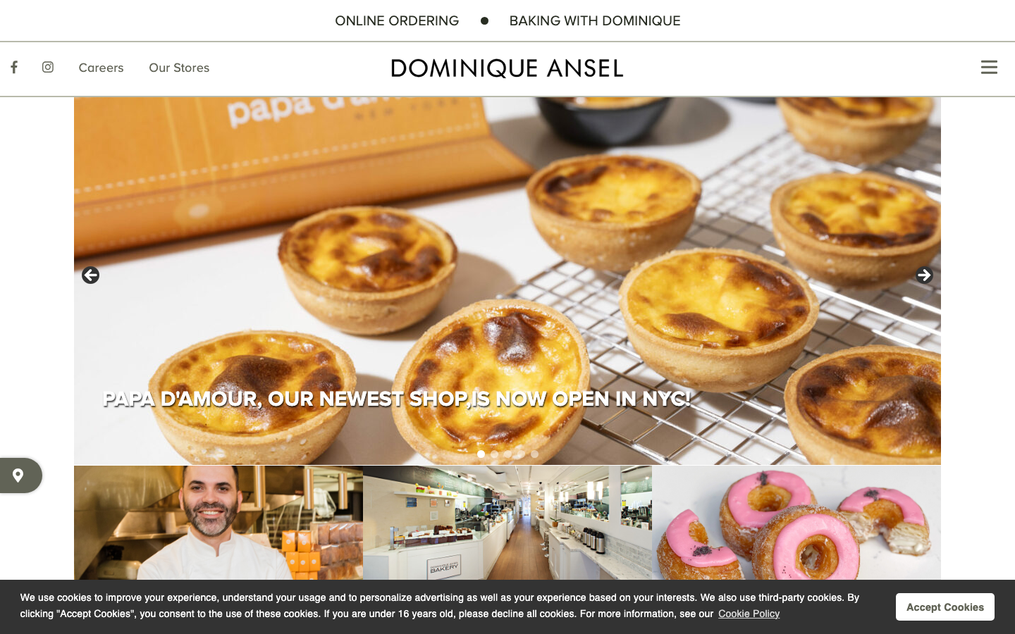
Dominique Ansel
strongHospitality
a world-famous pastry chef's bakery group on WordPress that leads entirely with product photography, a sage-and-olive neutral palette (#B8BAAB sage, #282D22 deep olive ink), all-caps Proxima Nova labels over a full-bleed image carousel of viennoiserie, and a gentle ease-driven motion that lets the food do the talking.
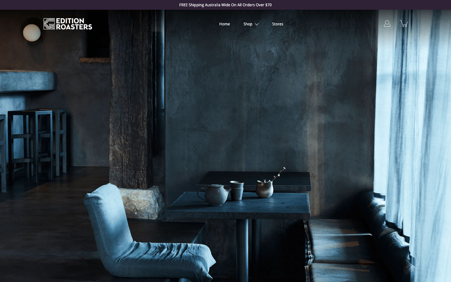
Edition Roasters
strongOther
A speciality roaster whose homepage is mostly hushed, moody photography of an empty cafe at dawn - serenity sold through atmosphere and almost no copy, with a single deep-plum accent doing all the colour work.