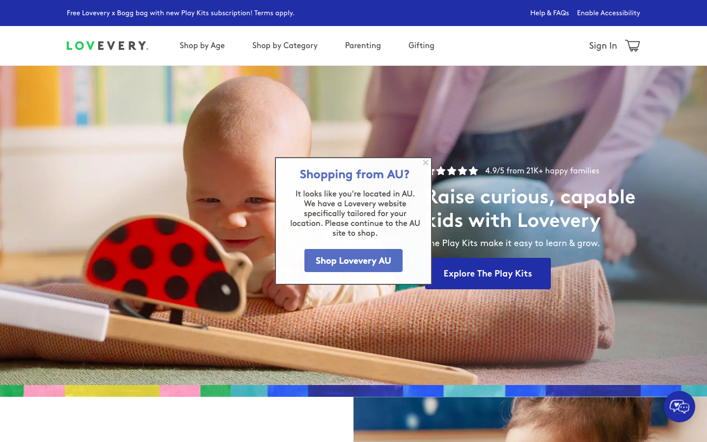
Lovevery
lovevery.com/a warm, research-led children's product brand that pairs a soft cream/off-white ground and warm-grey body text with a confident royal-blue accent, BrownPro geometric headings, a Bradford italic serif for editorial warmth, and a rainbow age-stage colour strip that doubles as the brand signature.
Design tokens
- display
- BrownPro
- body
- BrownPro
- mono
- none
- accent
- BradfordLLWeb-MediumItalic
Do / Don't
Reference it for
- A family, baby, parenting or educational-product brand that needs to feel warm, premium and research-credible at the same time.
- A calm neutral base (cream / warm off-white) with warm-grey body text and a single confident accent colour doing all the work.
- A geometric-sans-plus-italic-serif pairing (BrownPro + Bradford) where the serif italic adds editorial warmth without losing structure.
- A recognisable brand device (the rainbow age-stage strip) used as a wayfinding and identity element.
- For a Jiffi childcare, parenting or kids'-product client, this is the reference for tender-but-expert: soft photography, warm neutrals, one strong action colour.
Do not copy
- BrownPro and Bradford are licensed/self-hosted; map to a warm geometric sans (Brown alternative, or Hanken Grotesk) plus an editorial italic serif (Reckless Italic, Editorial New).
- The rainbow age-stage strip is Lovevery's signature; recreate the idea (a brand colour-band for wayfinding) with the client's own palette.
- The heavy commerce/analytics stack (Klaviyo, Yotpo, Rudderstack, LaunchDarkly, TikTok) is retail plumbing, not a design pattern.
Signature moves
rainbow age-stage colour strip as wayfinding
a rainbow age-stage colour strip doubles as the brand signature and a wayfinding device, against a calm cream/off-white ground with warm-grey body text and a single confident royal-blue #202ea8 accent
geometric-sans plus italic-serif warmth pairing
BrownPro geometric sans headings pair with a Bradford italic serif accent for editorial warmth without losing structure, across a 14-68px scale on white
Related references
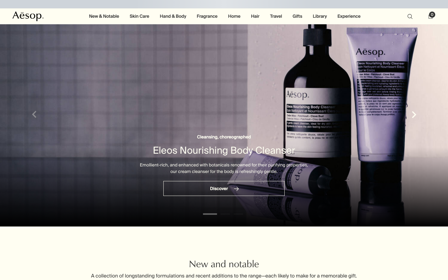
Aesop
flagshipConsumer Brand
an editorial e-commerce reference where Suisse Intl on warm-cream `#fffef2`, a modular 1.13 type ratio, and full-bleed photography do all the work - no display face, no accent colour, no motion of consequence.
Form Nutrition
strongFitness
a UK supplements DTC that pairs a warm off-white editorial base with a single mustard-yellow accent and a terracotta brand block, a geometric-sans-plus-Silka heading system, big oversized logo graphics and a calm, recipe-and-ritual voice.
Hay
strongRetail
a Danish designer-furniture house whose store reads like a quiet gallery, near-black ink on a single light-grey field, Neue Helvetica paired with an ITC New Baskerville serif, almost no UI chrome, and a slow editorial scroll where the products and photography are the only colour.
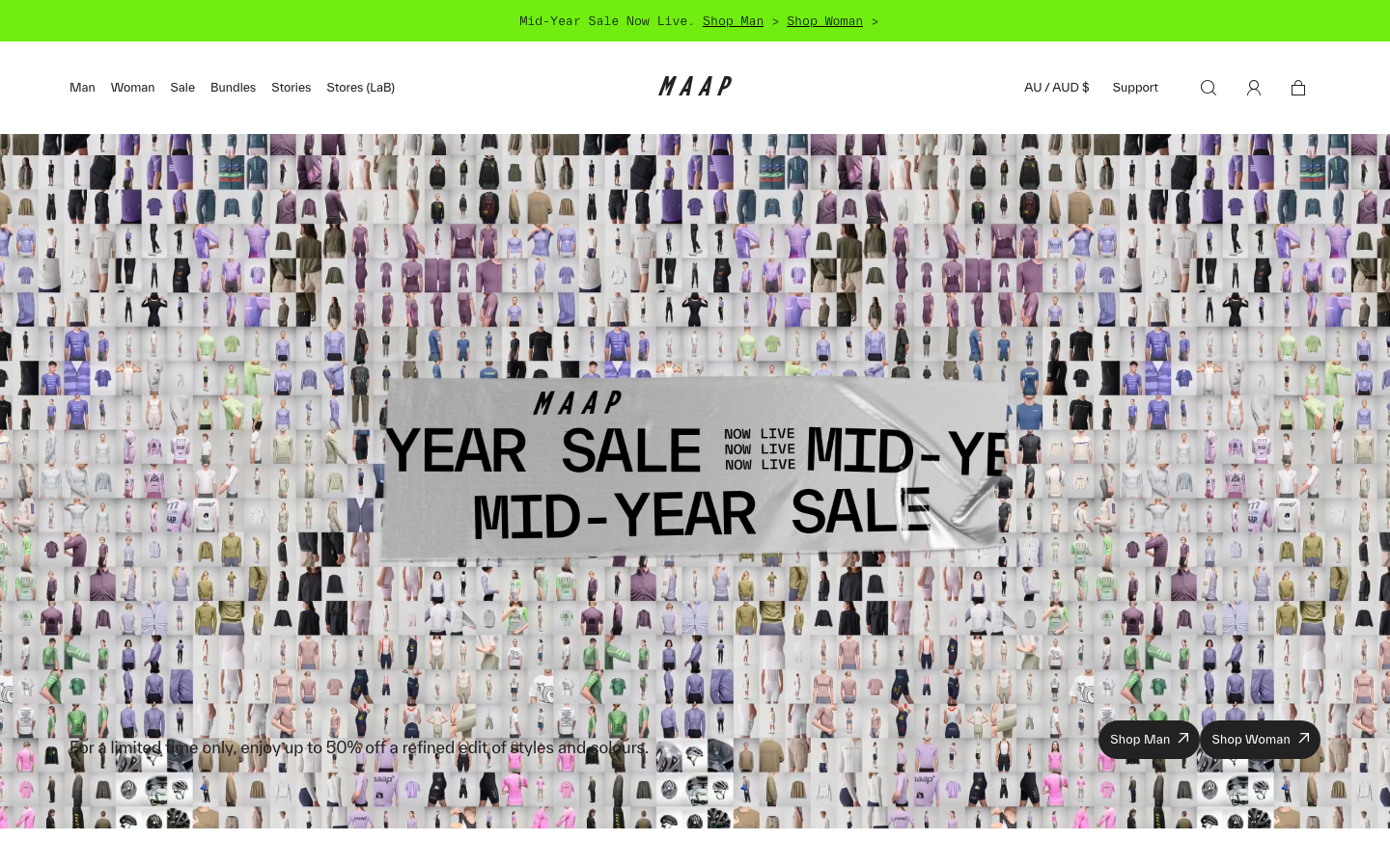
Maap
strongRetail
an Australian premium-cycling-apparel store that reads like a design studio, a near-monochrome #222-on-white system with a single chartreuse spark, a TWK Everett grotesque paired against a Times Now display-serif italic, a full-bleed autoplay-video hero and a token system deep enough (134 custom properties, a fluid clamp scale) to feel engineered rather than themed.