Larry King
larrykinghair.com/A London salon group and haircare line that fuses warm putty-cream calm with editorial fashion confidence - big half-and-half image panels, GT America, and a leopard-print swagger - so it feels both welcoming and clearly cool.
Design tokens
- display
- GT America
- body
- GT America
- mono
Do / Don't
Reference it for
- Warm putty-cream canvas + single charcoal ink + one clean grotesque (GT America) as a calm, confident baseline under loud editorial photography.
- The half-and-half split panel: image on one side, a cream block with one heading + one outlined CTA on the other (used for heroes, features and the signup modal alike).
- A multi-location service brand fused with an e-commerce product line: salons (Marylebone, South Kensington, Notting Hill, Monaco) + a shop, navigated cleanly.
- Thin-outline rectangular buttons and tiny radii (2-6px) - quiet UI under bold imagery.
- A restrained marquee + flip for a hint of editorial motion without noise.
Do not copy
- The leopard-print and the specific salon photography (brand-coded fashion identity). Use the client's own imagery.
- GT America if licence-bound - substitute a comparable clean grotesque.
- The Shopify + Klaviyo + Yotpo + Phorest 117-script stack. Rebuild lean; integrate only the booking/commerce the client actually needs.
- The aggressive on-load email modal - keep the split layout, lose the interruptive popup (or delay/soften it).
Signature moves
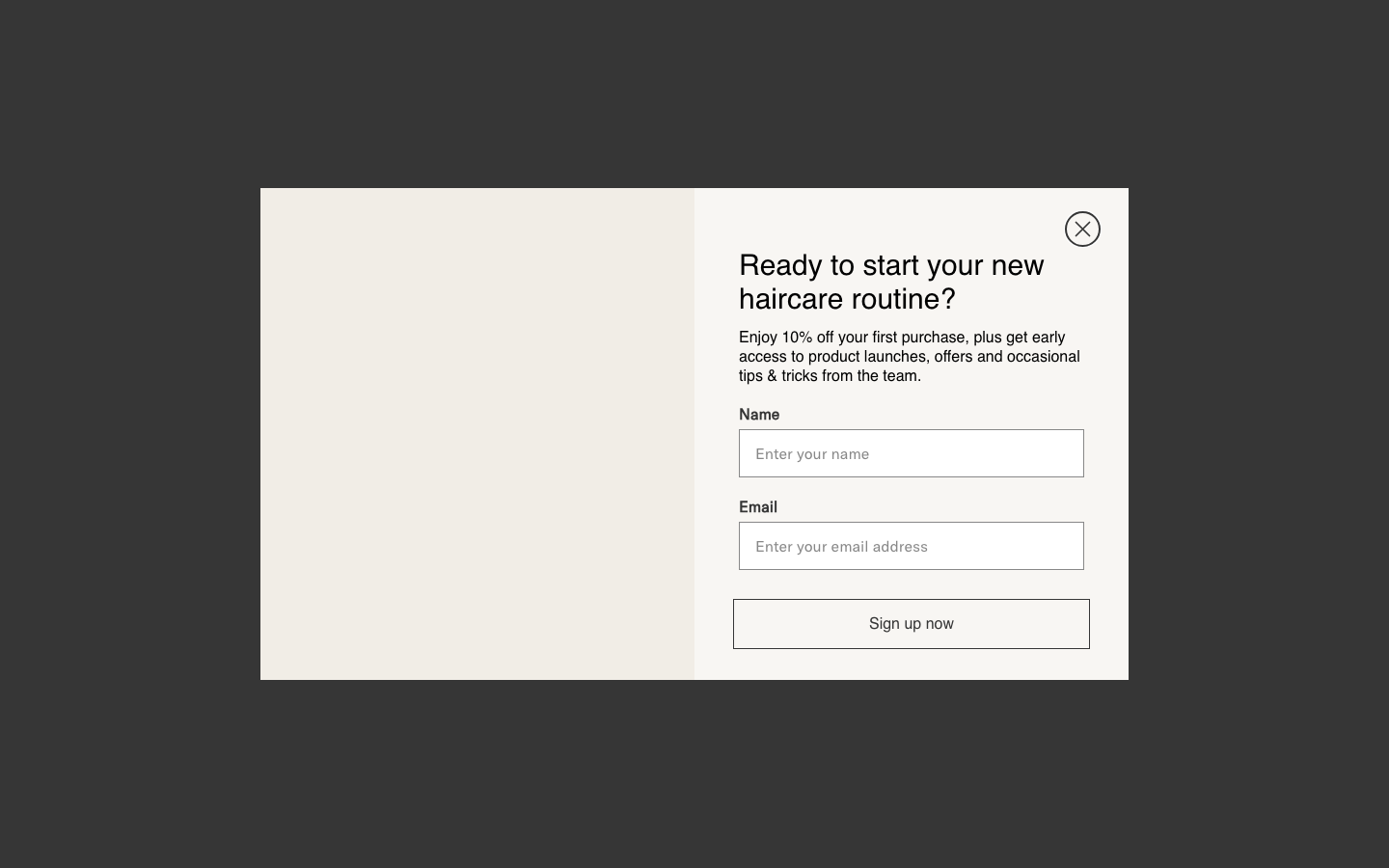
50/50 split panel
the recurring section is a half-and-half panel - editorial photography on one side, a flat warm-cream block holding a single heading and one thin-outline CTA on the other - reused for heroes, feature blocks and even the email signup modal, so the whole site reads as one editorial spread.
calm system under loud imagery
charcoal GT America at a single 400 weight on warm putty/cream, with no chromatic accent and tiny 2-6px radii, deliberately stays quiet so editorial fashion photography carries all the confidence and swagger - making the brand feel both welcoming and cool.
service-and-shop editorial weave
a multi-location salon business (four salons + booking) and an e-commerce product line are presented as one coherent feed of alternating image/cream/charcoal panels, with the nav cleanly grouping Salons vs Shop.
Related references
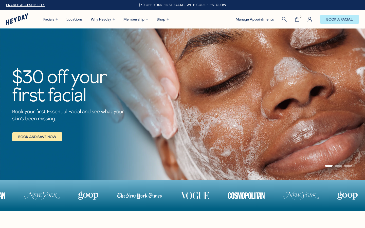
Heyday Skincare
strongBeauty
a facial-membership skincare chain that feels friendly and trustworthy, deep navy ink on warm cream, soft powder-blue and butter-yellow accent panels, the Sunset Gothic grotesque, close-up facial photography and lots of proof (press logos, big stats, reviews).
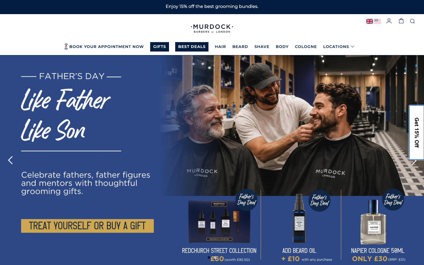
Murdock London
flagshipBeauty
a heritage British barbershop and grooming brand run as a polished Shopify storefront, deep ink-navy on warm off-white, Montserrat throughout, a hand-script accent for warmth, and a calm 0.3s ease-in-out motion language that keeps the commerce furniture quiet.

Myodetox
strongHealth
a modern physical-therapy and bodywork clinic that reframes physio as proactive "future-proofing", a confident deep-blue-and-warm-neutral system, big rounded forms, a bespoke sans, and a book-by-location, assessment-led structure.
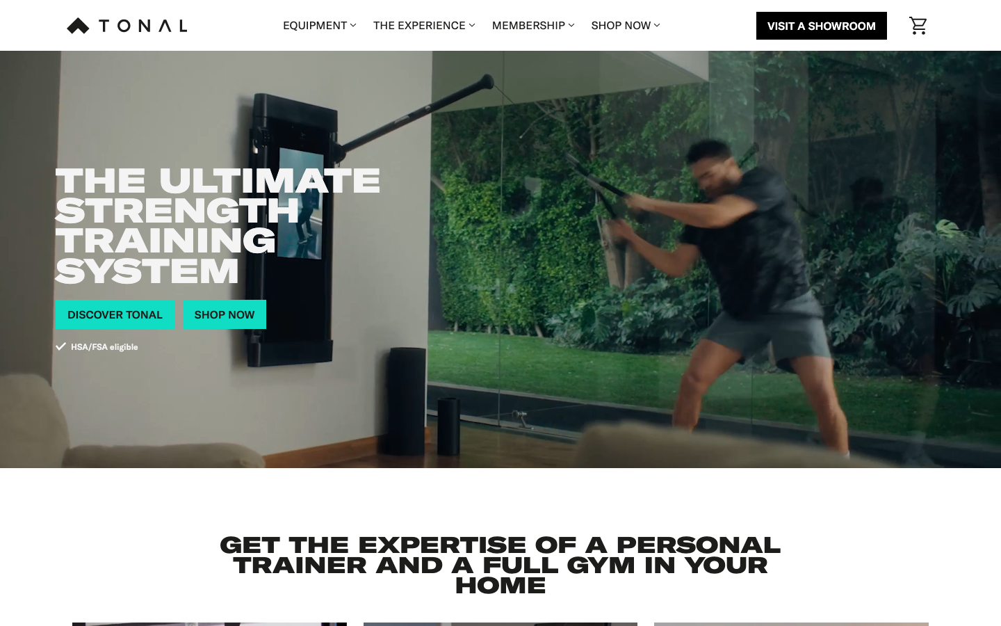
Tonal
flagshipFitness
a connected-fitness hardware brand selling a wall-mounted smart gym, a clean editorial system in near-black on warm bone, GT America plus a GT Expanded display cut, one electric teal accent, and Tailwind-driven cubic-bezier(0.4,0,0.2,1) transitions that keep a Vue app feeling like a premium product site.