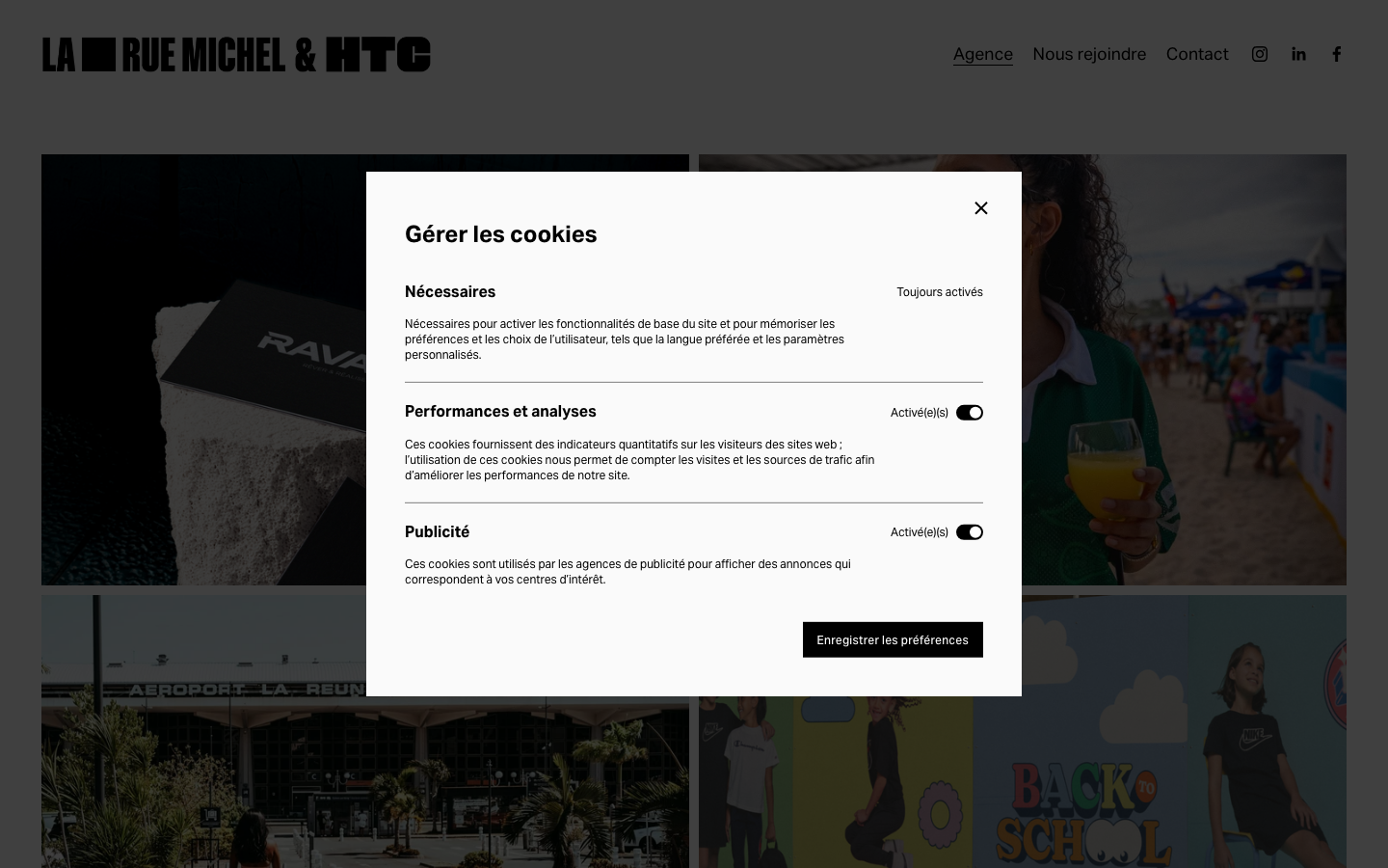
La Rue Michel
laruemichel.rea French advertising agency from La Réunion and Mayotte that runs an almost pure black-and-white system, sets everything in one weight-contrasted grotesque (aktiv-grotesk), and builds its whole personality from running marquee strips of service words and slow opacity fade-ins over edge-to-edge portfolio imagery.
Design tokens
- display
- aktiv-grotesk
- body
- aktiv-grotesk
- mono
- none
Do / Don't
Reference it for
- Strict near-monochrome discipline: black (#000) on near-white (#FAFAFA), white only over imagery, no accent colour at all.
- One-typeface, weight-contrast hierarchy: aktiv-grotesk at 400 vs 700 carrying everything from 12px labels to a 67.84px marquee.
- A running marquee of service words as the main brand-energy device on an otherwise still page.
- Slow, calm opacity fade-ins (opacity 1.5s ease) as the dominant entrance, the opposite of a snappy transform reveal.
- Edge-to-edge full-bleed portfolio blocks with subtle fluid image effects (parallax, film grain) instead of hard cards.
Do not copy
- The marquee word list and the "La rue Michel & HTC" lockup are the agency's identity; borrow the device, not the words.
- aktiv-grotesk is an Adobe Fonts (Typekit) licence; map to a similar neutral grotesque rather than embedding their kit ID.
- The Squarespace image effects (refracted circles, liquid) are platform features; on Astro they need a deliberate, lighter reimplementation, not a like-for-like copy.
- Pure-black-on-white with zero accent only works because the photography carries all the colour; do not strip a brand to monochrome if its imagery cannot hold the page.
Signature moves
running service-word marquee band
a running marquee of service words is the main brand-energy device on an otherwise still page, set in one weight-contrasted grotesque (aktiv-grotesk 400 vs 700) up to a 67.84px marquee
slow opacity fade-ins over full-bleed imagery
slow calm opacity 1.5s ease fade-ins are the dominant entrance (opposite of a snappy transform reveal), layered over edge-to-edge full-bleed portfolio blocks rather than hard cards
near-monochrome image-carried palette
strict black #000 on near-white #FAFAFA with white only over imagery and no accent colour at all, so the photography supplies all the colour
Related references
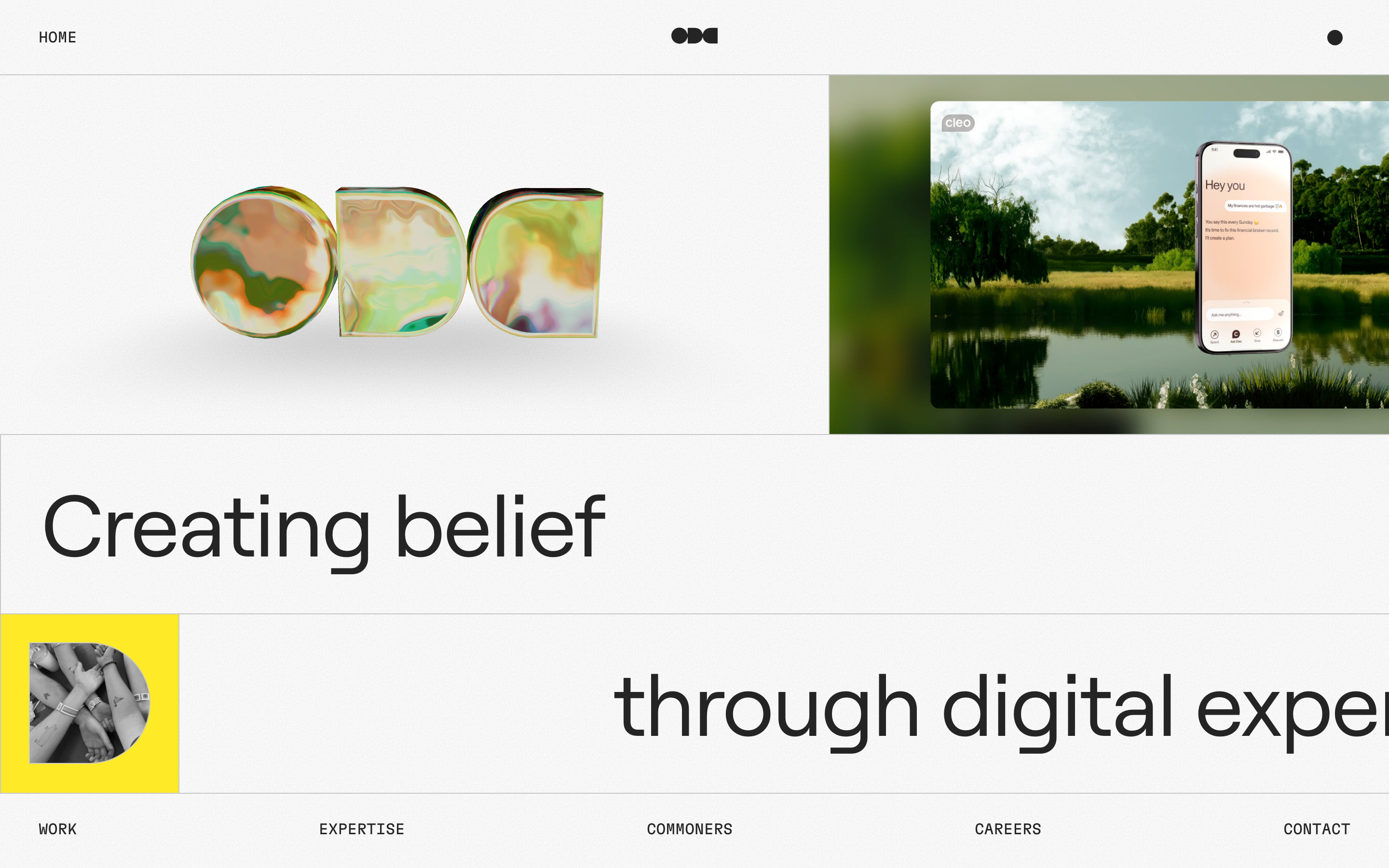
Oddcommon
strongCreative Studio
a digital-experience studio that builds its homepage like one of its products, a fixed, gridded "operating system" screen on an off-white grain canvas, where an iridescent 3D ODC logo, a big Roobert headline, a single yellow block and live Mux video tiles sit inside hairline-ruled frames and move with spring physics.

Alche
strongCreative Studio
The reference for Japanese virtual-character + immersive experience studios — Astro v5 build, neon yellow-green accent, 5-font multi-language system, KizunaAI case study.
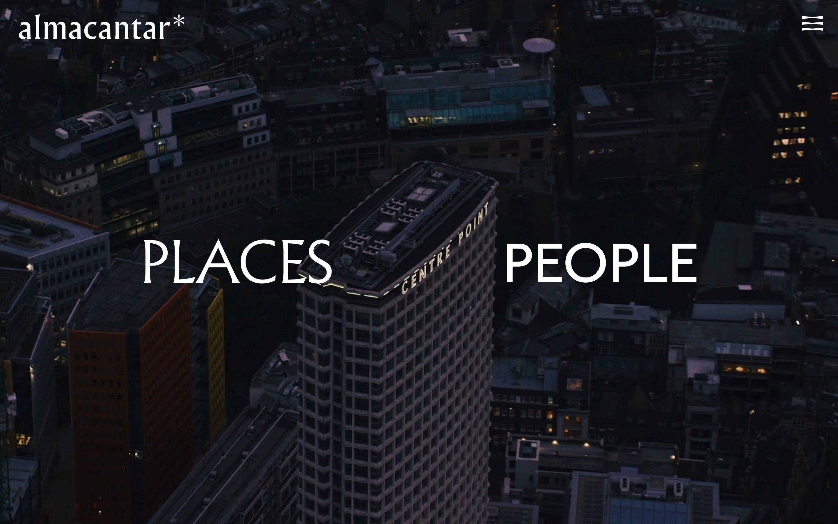
Almacantar
nicheReal Estate
an architecture-led property developer reduced to its barest, most confident form, full-bleed aerial London video on near-black, a single Albertus serif word-pair ("PLACES / PEOPLE"), almost no chrome, and a quiet fade-and-rise motion that lets the buildings carry everything.
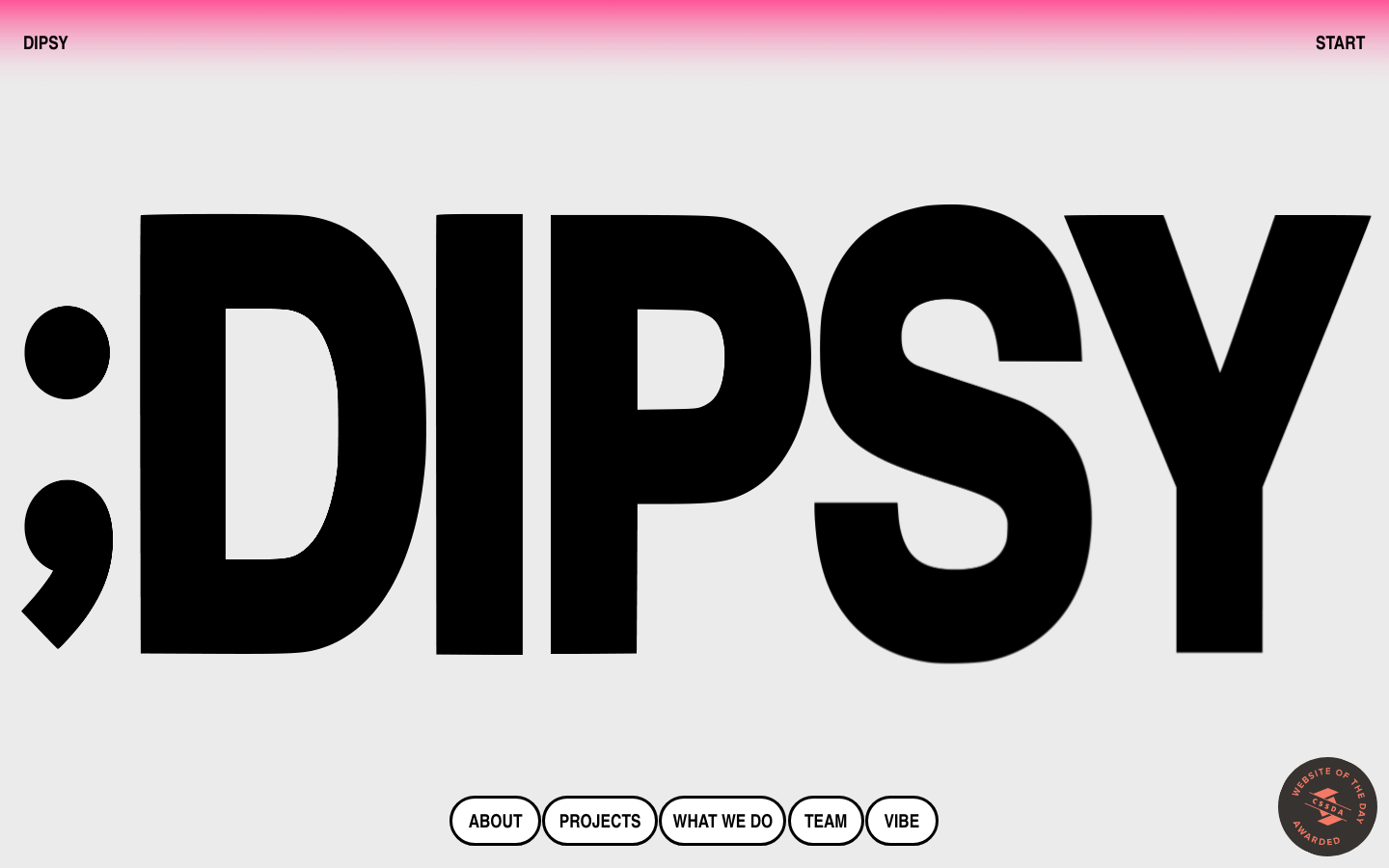
Dipsy
nicheCreative Studio
a family-run design studio that turns its own name into the hero, a screen-filling black ";DIPSY" set in a heavy condensed grotesque on warm grey, a pink gradient bleeding down from the top edge, pill-outlined nav and pill form fields, and a playful run of cookie-dough photography toward the end.