
Hnine
interaction.hnine.comA Seoul interaction-design studio's experimental subsite, built as a React SPA on a viewport-scaled (calc(100vw/1920)) coordinate system, where almost everything lives behind interaction so the initial DOM is intentionally empty.
Design tokens
- display
- Pretendard Variable
- body
- Pretendard Variable
- mono
Do / Don't
Reference it for
- Viewport-scaled coordinate system via --px-to-vw: calc(100vw / 1920) and --base-width: 1920, every layout dimension is computed in vw against a fixed reference, so the app rendition stays pixel-faithful across viewports without media-query breakpoint thrash.
- Pretendard Variable as the Korean-aware system font, loaded from jsDelivr (cdn.jsdelivr.net/gh/orioncactus/pretendard@v1.3.9) at the variable axis (weight 45-920, single woff2 file), the standard choice when Hangul rendering matters and Inter / Geist won't do.
- SPA-canvas-first interaction model: a deliberately empty initial DOM (no headings, no nav, no images) where the React bundle assembles the experience client-side, accepting the SEO and social-preview cost in exchange for full creative control.
- Pure black on pure white as the entire chromatic system, no surface tiers, no muted greys, no accents. One CSS-declared text colour (rgb(0,0,0), 18 hits) and a white background. The colour discipline is "monochrome, period".
- The single-page-app immersive subsite pattern itself: a creative agency runs its serious marketing on a main domain (hnine.com) and uses a subdomain (interaction.hnine.com) as a craft showcase that doesn't have to also recruit, sell, or convert.
- Very small production budget: 9 total network requests, 1 image, 1 font, 2 stylesheets, 2 scripts. The whole experience is engineered to load fast, then do everything client-side.
- Pretendard from jsDelivr GitHub CDN as a real-world example of CDN-hosted variable fonts, useful when self-hosting isn't worth the build complexity.
- Single @font-face declaration (Pretendard Variable with the woff2-variations format hint), clean variable-font loading.
Do not copy
- The "render-nothing-server-side" SPA pattern unless the brand has genuinely no SEO requirement and a real reason to do everything in canvas / WebGL / pointer-driven layout.
- The 1920px reference width unsupplemented by responsive design, the --px-to-vw trick works when content is the layout, not when text needs to reflow.
- The create-react-app build target, CRA is now an unmaintained tooling chain in 2026. The equivalent move is Vite + React or, for the Jiffi stack, Astro with React islands.
- Pretendard if the brand is not Korean or multi-script, Inter Variable is a better default for Latin-only brands.
- The "I'm a studio so my site can be a studio experiment" stance for any client whose visitors need to actually find product information.
- The empty body and zero metadata configuration (no description, no og:image, no og:title, single empty <h1>), a paying brand needs at minimum a proper meta description and open-graph card.
Signature moves
viewport-scaled coordinate system
every layout dimension is computed in vw against a fixed 1920 reference via --px-to-vw: calc(100vw/1920), so the design stays pixel-faithful across viewports without breakpoint thrash.
monochrome-period colour discipline
pure black on pure white is the entire chromatic system with no surface tiers, muted greys or accents, one declared text colour and a white background.
lean immersive subsite pattern
a craft showcase runs as a separate immersive subsite (interaction.hnine.com) on a tiny budget (9 requests, 1 image, 1 font), freeing it from selling or converting, with a single variable @font-face from a CDN.
Related references

First Frame
nicheFilm Production
Paris production and post-production studio whose own site is the canonical example of full-bleed black + IBM Plex Mono micro-type + reel-as-hero — the cinematic-craft posture for a portfolio-led service business.
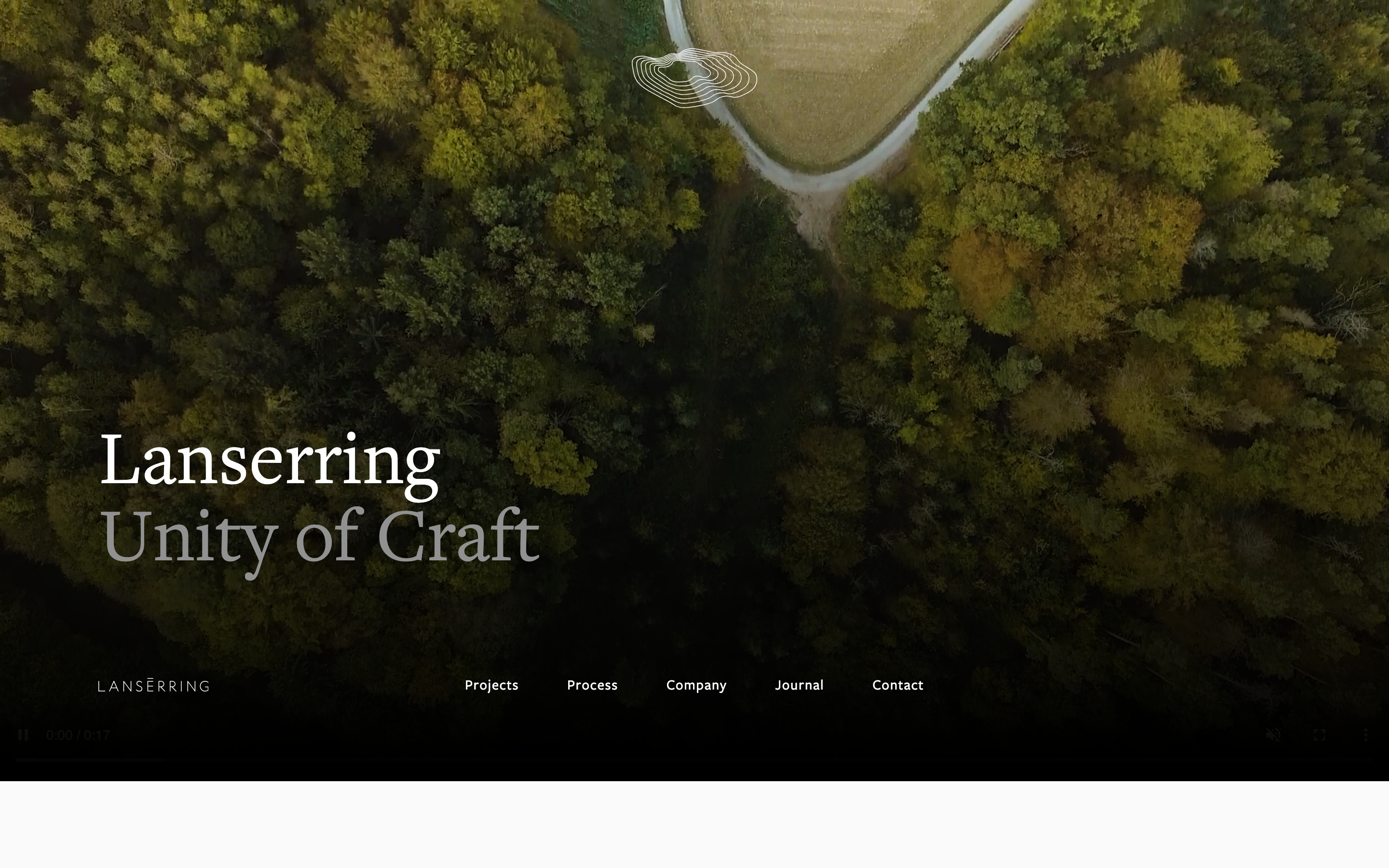
Lanserring
flagshipTrades
a bespoke-joinery house that sells craft as heritage, warm sepia interiors and meadow photography under a high-contrast transitional serif, the brand reduced to a single fine line-drawn ring, with quiet WordPress structure and almost no visible motion furniture.
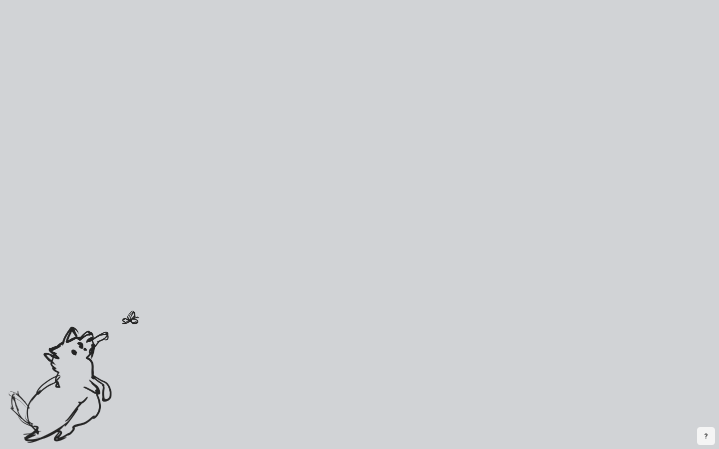
Marga Navarro
nicheDesign Portfolio
The reference for a one-screen craft-software-design portfolio — a hand-drawn corgi-and-butterfly sketch as the entire hero canvas, with a tiny rounded mono-typeface "shortcut card" floating top-left as the only chrome.
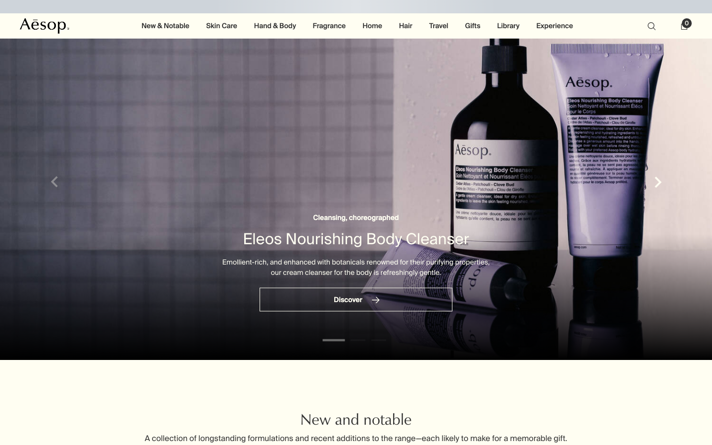
Aesop
flagshipConsumer Brand
an editorial e-commerce reference where Suisse Intl on warm-cream `#fffef2`, a modular 1.13 type ratio, and full-bleed photography do all the work - no display face, no accent colour, no motion of consequence.