
Hims Hers
www.hims.com/a telehealth brand that makes prescription medicine feel like a lifestyle product, a big tight-set geometric sans headline, a warm cream-and-brown palette, and a grid of large rounded entry cards with floating product photography that route you straight into "find your Rx match".
Design tokens
- display
- sofia-pro (SofiaProWeb), a geometric sans, weights 300-700
- body
- sofia-pro at text sizes
- accent
- IvarSoft serif (accent only)
- support
- CareSans
- mono
- none
Do / Don't
Reference it for
- Making a clinical category feel premium and warm: a large tight-set geometric sans on a cream/brown palette instead of clinical white-and-blue.
- A grid of large rounded entry cards as the primary navigation, each a category door with floating photography and a chevron.
- Two-tone headlines (one line ink, one line gold-peach) over full-bleed brown sections, one product story at a time.
- A slim top promo banner for the launch-of-the-moment above the main nav.
- Calm, dignified handling of sensitive health topics (sex, weight, hair) through confident copy and tasteful imagery.
Do not copy
- The "hims" wordmark and the exact cream-and-brown brand palette are hims-hers' identity; map to the client's own warm system.
- The category set (weight loss, sex, hair, testosterone) is product-specific; reuse the card pattern, not the contents.
- Floating pharmaceutical product photography is theirs and heavily art-directed; commission the client's own imagery.
Signature moves
warm geometric-sans clinical-to-lifestyle palette
a large tight-set geometric sans on a cream/brown palette (cream #fbf8f5, gold-peach accent #ffc671) makes a clinical category feel premium and warm instead of clinical white-and-blue.
rounded entry-card navigation grid
a grid of large rounded entry cards (radius 24-48px) acts as primary navigation, each a category door with floating photography and a chevron.
two-tone headline over full-bleed section
two-tone headlines (one line ink, one line gold-peach) sit over full-bleed brown sections, telling one product story at a time, with a slim top promo banner above the nav.
Related references
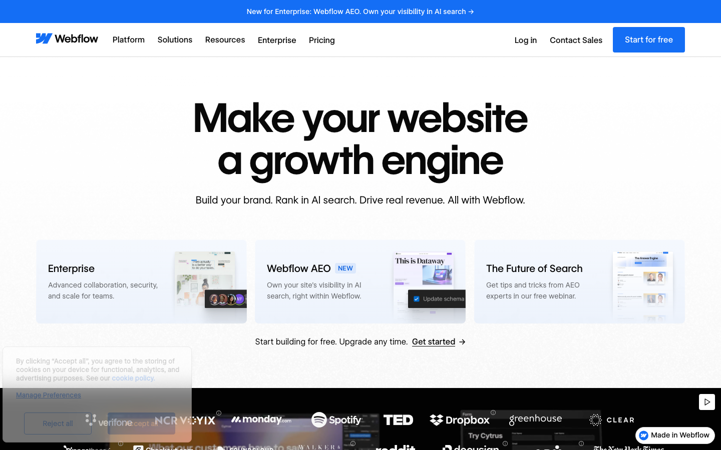
Webflow
flagshipSaas Product
a white-canvas product flagship that is itself built in Webflow - using the bespoke WF Visual Sans Variable + WF Visual Sans Mono, a Webflow-blue `#146ef5` primary, GSAP + ScrollTrigger + Three.js + Swiper all bundled, and a three-card "AI / Template / Scratch" entry hero that mirrors the actual product's onboarding paths.
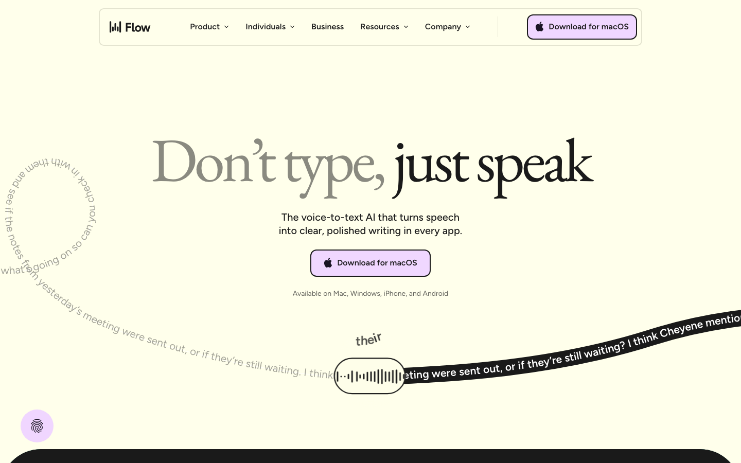
Wispr Flow
strongSaas Product
The reference for a butter-cream voice-AI brand at peak typographic confidence — EB Garamond serif hero on lavender-and-evergreen surfaces, with curved-path transcript animations as the signature motion.
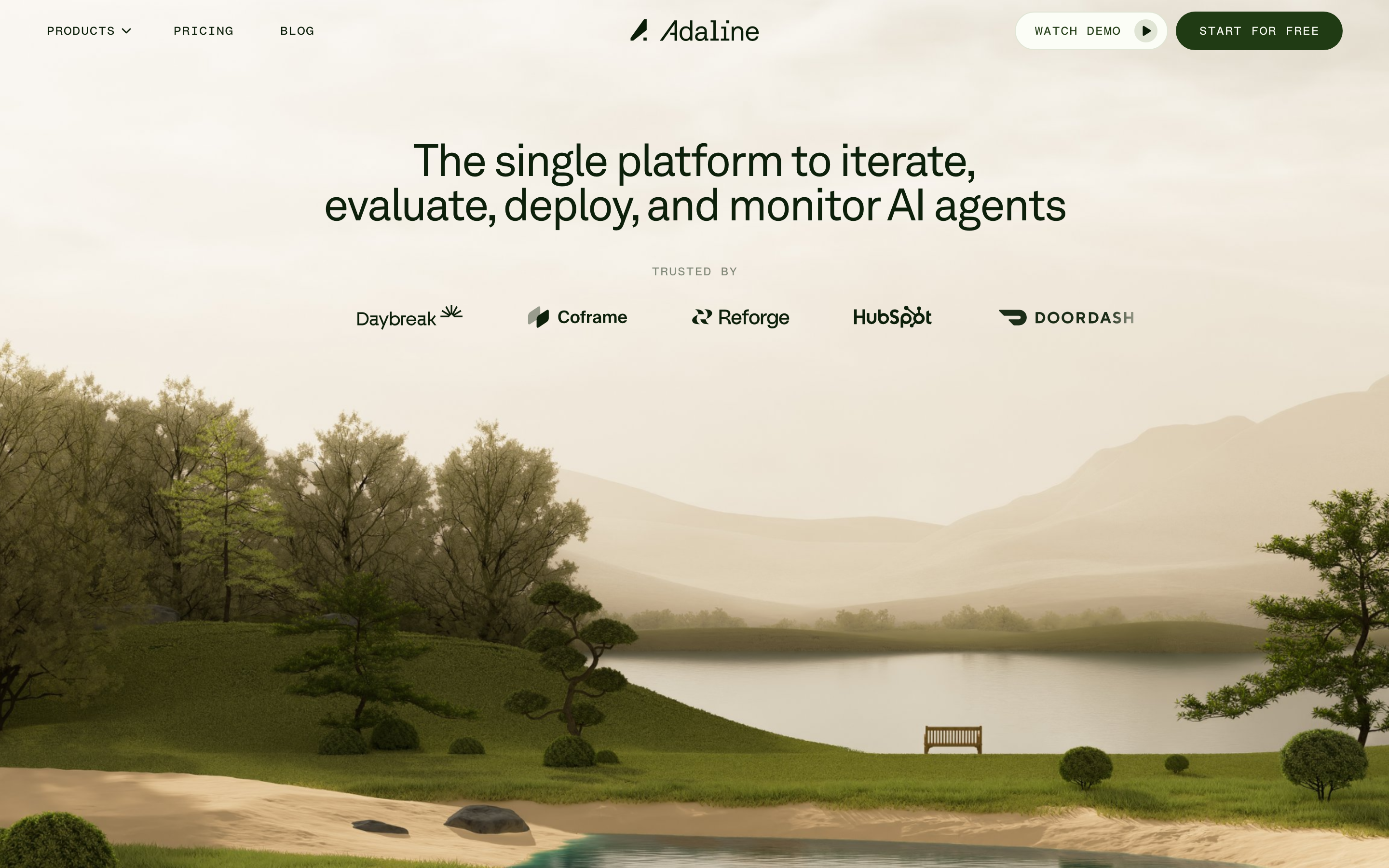
Adaline
strongDeveloper Tool
an AI-infra product site that swaps the genre's default dark-neon for a hand-built 3D Japanese-garden world, then runs warm earth tones, a grotesque/mono type pair and patient scroll-reveal motion over the top so a developer tool feels like a calm place.
Assembly
strongHr Platform
The reference for clean-corporate B2B HR-tech with illustrated character imagery and a dotted-grid texture — Inter at every weight, single blue accent, friendly illustrations carrying the visual personality.