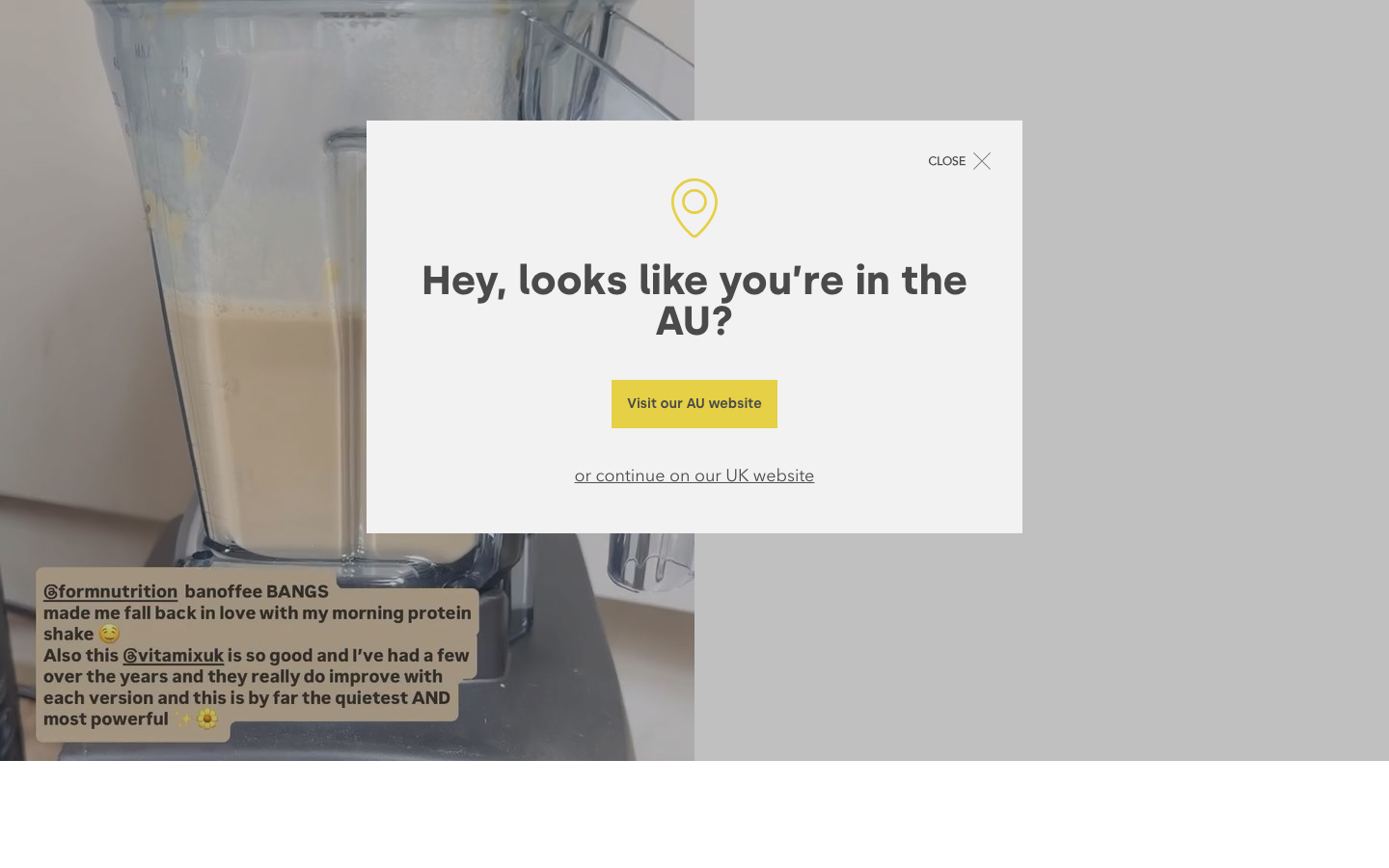
Form Nutrition
formnutrition.coma UK supplements DTC that pairs a warm off-white editorial base with a single mustard-yellow accent and a terracotta brand block, a geometric-sans-plus-Silka heading system, big oversized logo graphics and a calm, recipe-and-ritual voice.
Design tokens
- display
- Silka (SemiBold / Bold)
- body
- Avenir Next (Regular / Demi)
- serif
- Freight Display W01 Book
- mono
- none
Do / Don't
Reference it for
- A supplements / nutrition / natural-health shop that wants warmth and credibility: an off-white editorial base, charcoal text, one confident accent colour.
- A single-accent system (here mustard #E6D046) carried across buttons, highlights, and a brand block, plus one supporting brand colour (terracotta) for a feature act.
- A geometric-sans body plus a heavier sans heading (Silka), with a serif reserved for a few editorial touches.
- Content-as-trust: a recipes section and an "inForm" journal woven into a commerce site.
- Gentle AOS fade-and-rise reveals and a marquee brand strip as tasteful, low-cost motion.
Do not copy
- The mustard/terracotta palette, the Form logo graphics, and Silka / Avenir Next / Freight are the brand's identity; map to a comparable warm neutral, one accent, and a sans+serif pair.
- The WordPress/WooCommerce plugin stack (Refersion, RevenueHunt, Richpanel, many fonts) is heavy; borrow the look, not the apparatus.
- The AU/UK/US region modal is a multi-store need; skip it for a single-region client.
Signature moves
off-white editorial base with one accent plus feature colour
a warm off-white editorial base with charcoal text carries a single mustard #E6D046 accent across buttons and highlights, plus one supporting terracotta block for a feature act.
AOS fade-rise reveals with marquee brand strip
gentle AOS fade-and-rise reveals plus a marquee brand strip provide tasteful low-cost motion alongside a geometric-sans body and heavier Silka-class heading.
Related references
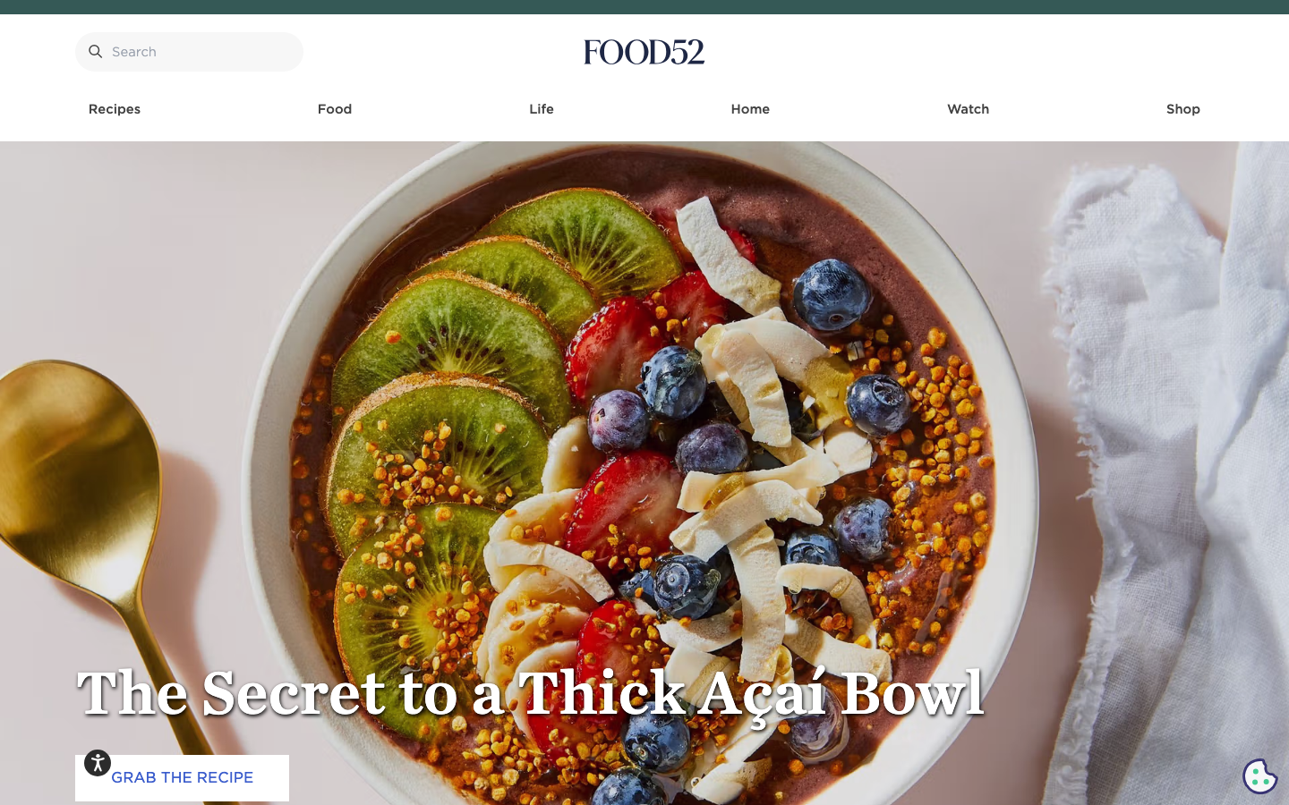
Food52
strongRetail
a food-and-home brand that fused editorial content with commerce, recipes and stories draw you in, a clean serif-and-sans system on white, and a shop (cookware, gifts, homewares) is always one tap away.
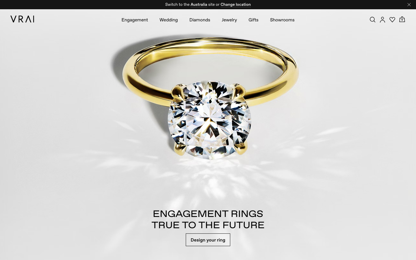
Vrai
strongRetail
a lab-grown fine-jewellery house whose homepage is a near-empty white gallery, a single yellow-gold solitaire ring floating in bright caustic light above a quiet centred serif headline, set in a black-on-white system with metal-named gradient tokens (white-gold, yellow-gold, rose-gold, platinum) and slow, refined cubic-bezier transitions.
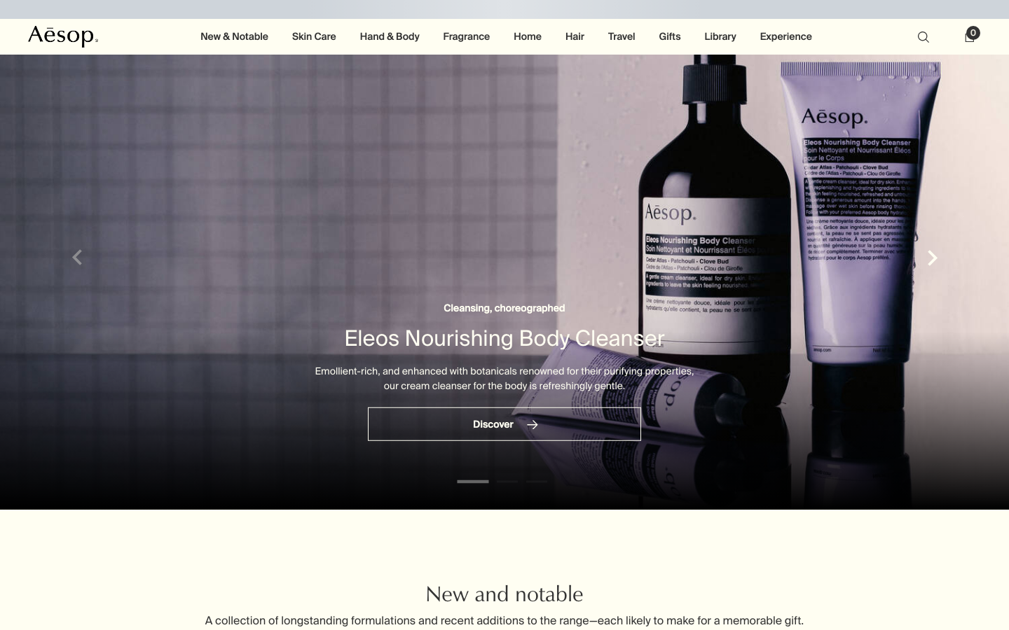
Aesop
flagshipConsumer Brand
an editorial e-commerce reference where Suisse Intl on warm-cream `#fffef2`, a modular 1.13 type ratio, and full-bleed photography do all the work - no display face, no accent colour, no motion of consequence.
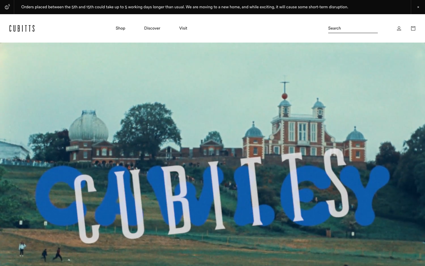
Cubitts
nicheHealth
a London bespoke-spectacle maker treating its Shopify storefront like a design museum, near-black ink on white, a tiny precise type scale in its own Fold Grotesque, generous 16px-radius media tiles, and a giant "CUBITTS" wordmark laid behind a Greenwich Observatory photograph.