Drybar
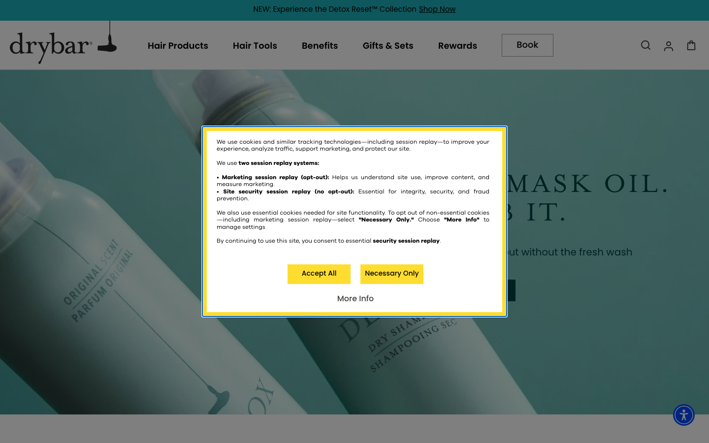
www.thedrybar.coma blow-dry bar that turned one service into a polished lifestyle brand, a cheerful yellow-on-warm-grey identity, big confident display type, and a site that runs a booking funnel and a serious product retail line side by side.
Design tokens
- display
- Korolev / Galano Grotesque Bold
- body
- Poppins
- sans
- Poppins
- serif
- Mrs Eaves
- mono
Do / Don't
Reference it for
- A salon that brands a single hero service into a lifestyle, rather than listing everything it does.
- Running a booking funnel and a product e-commerce store as two clear, equal paths from one site.
- A warm, cheerful identity: soft grey ink on white with one bright signature accent (yellow) for personality.
- Loud editorial display type (up to ~90px) over a clean sans body, for a confident, branded feel.
- Clean shapes and light motion (pills, a simple carousel) that stay polished, not gimmicky.
Do not copy
- The sunshine-yellow palette, the Korolev/Galano/Mrs Eaves type, and the "blowout" positioning are drybar's brand; build the client's own single-service angle and colourway.
- drybar's product range justifies a full store; a salon with a small retail shelf should scale the commerce down, not fake a catalogue.
- The national-chain tone suits drybar; a single local salon should keep the confidence but ground it in its real chairs, stylists and suburb.
Signature moves
dual booking + retail paths
a booking funnel and a product e-commerce store run as two clear, equal paths from one site for a single-service lifestyle brand
loud editorial display over clean sans
loud editorial display type to ~90px sits over a clean Poppins body for a confident, branded feel, with one bright signature accent on white
Related references
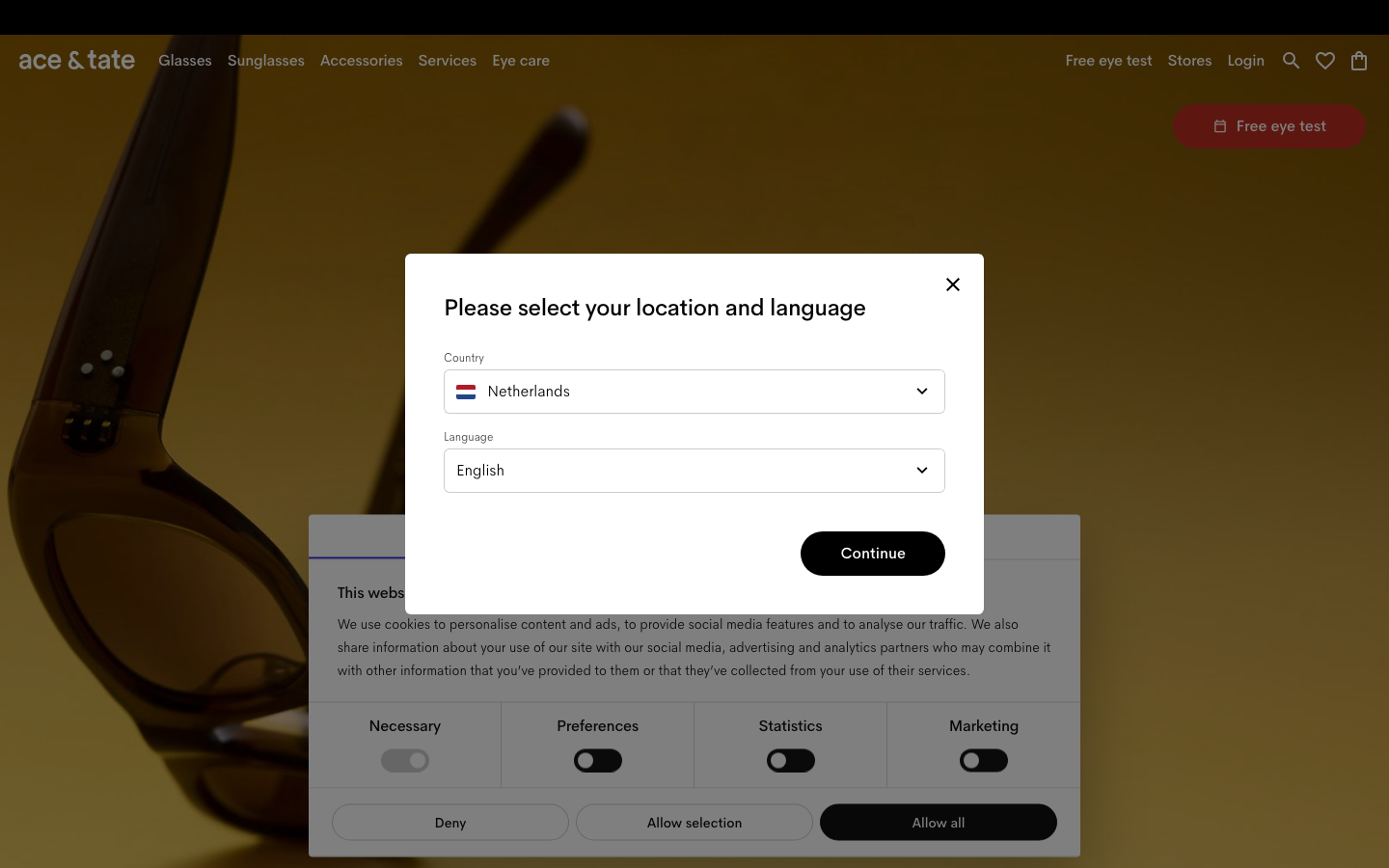
Ace And Tate
strongHealth
a near-monochrome Amsterdam eyewear store that lets warm product photography and one editorial serif carry all the personality, set on a soft grey field with ink-black type, calm spacing and almost no decoration.
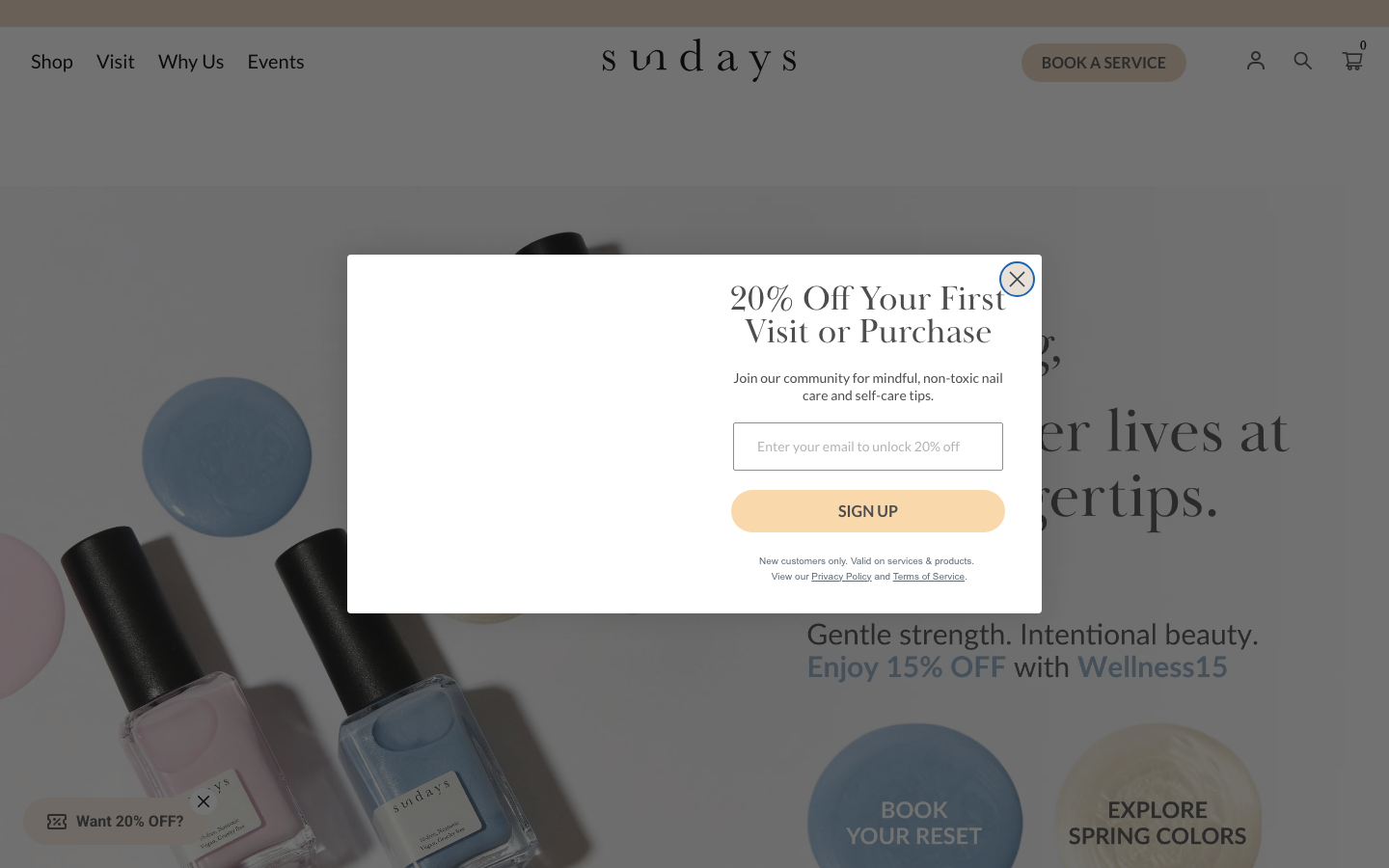
Dear Sundays
strongBeauty
a non-toxic nail studio and polish brand that reads like a calm wellness ritual, warm sand-beige surfaces, Baskerville serif headings over Lato body, soft 40px pill buttons, line-drawn "promise" icons and product-led editorial photography.
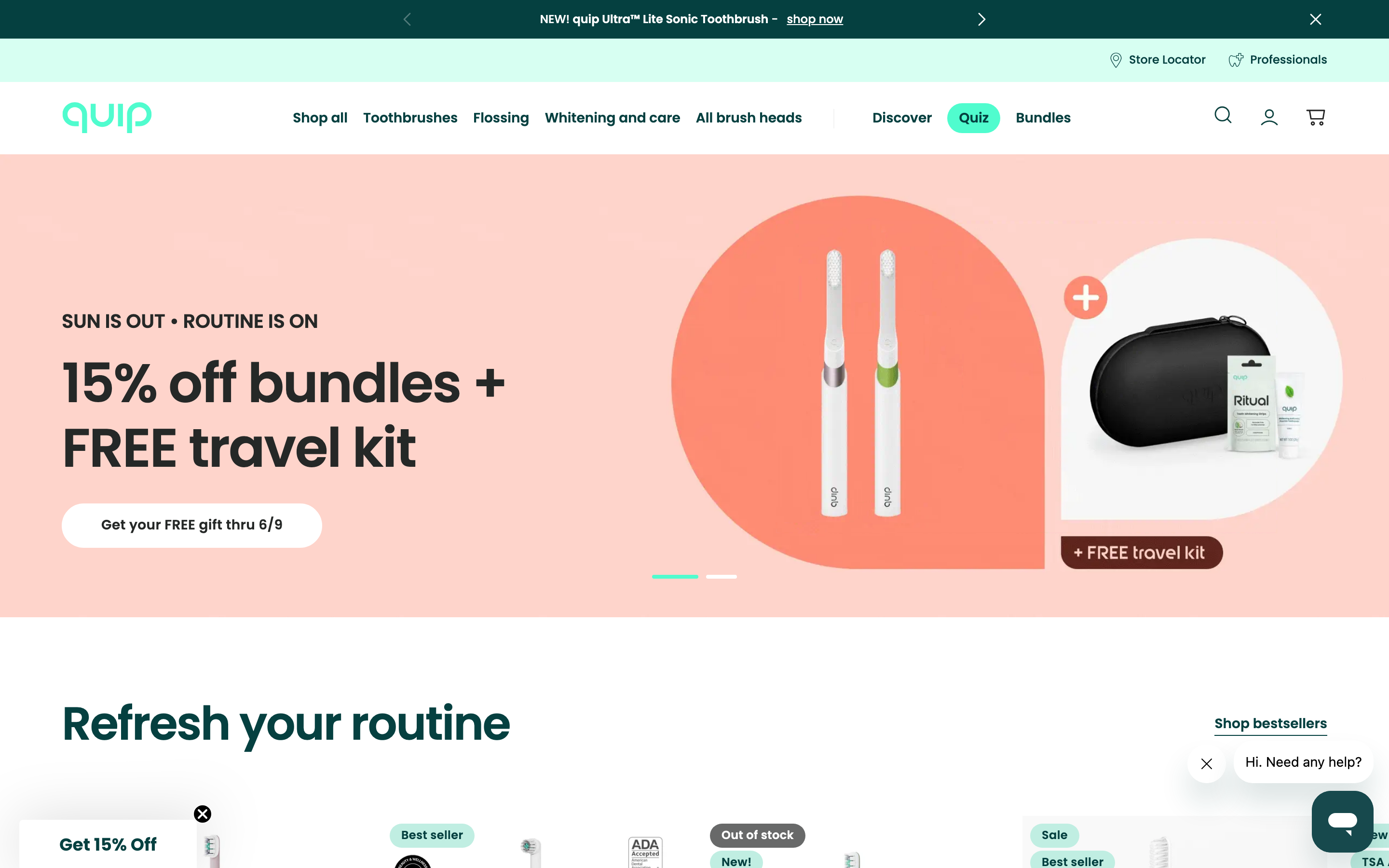
Quip
strongHealth
an oral-care brand that makes dental health feel friendly and modern rather than clinical, a clean mint-and-teal system, Poppins, soft pill shapes, with a shop, a store locator and a "find a professional" dentist network.
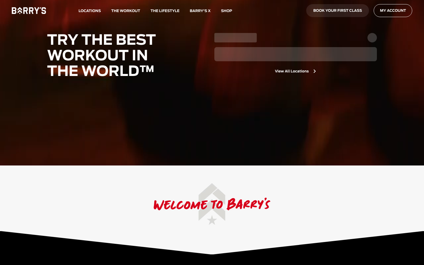
Barrys
flagshipFitness
the original HIIT studio brand selling "the best workout in the world", a dark, cinematic Webflow site built on near-black and the Red Room red, condensed athletic display type, a hand-painted script signature, and a booking-first hero that puts "find a studio" above everything.