Drunk Elephant
www.drunkelephant.coma playful clean-skincare DTC store built on a charcoal-on-white base lit up by candy pastels, mint and neon-lime, with bouncy float-and-wink micro-motion, rounded product cards and a chatty, ingredient-led voice.
Design tokens
- display
- Sainte Colombe / Sentinel (serif)
- body
- Brown (Lineto grotesque)
- mono
- none
Do / Don't
Reference it for
- A clean-beauty or skincare DTC that wants a sober base (charcoal on white) energised by product-keyed pastel accents rather than a single brand colour.
- Playful but restrained micro-motion: slow floats, a wink, subtle drifts, used as personality, not spectacle.
- Rounded product cards (~5px radius) in swipeable carousels for bestsellers and lifestyle ("drunk life") content.
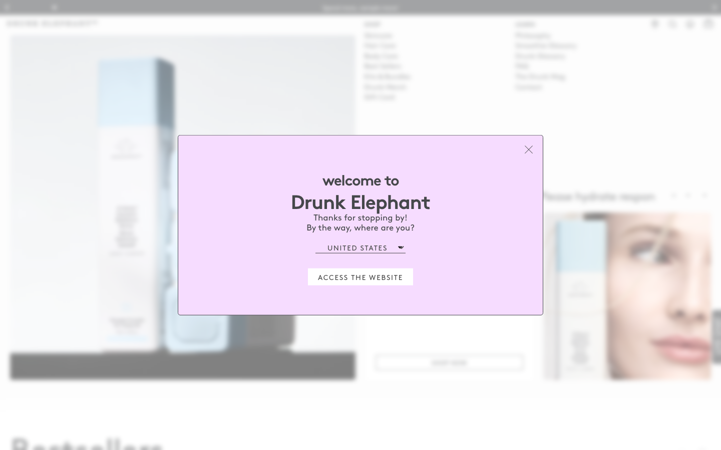
- A coloured welcome / region modal that sets a warm tone (here lilac, "welcome to Drunk Elephant").
- Ingredient-led, friendly retail voice that teaches while it sells.
Do not copy
- The pastel-per-product colour coding and the elephant/"drunk" naming are the brand's identity; borrow the sober-base-plus-pastel-accent structure, not the specific hues or puns.
- Brown, Sentinel and Sainte Colombe are licensed; map to a comparable geometric-ish grotesque plus an editorial serif.
- The float/wink motion suits a playful beauty brand; on a clinical or trust-led product it would undercut credibility.
Signature moves
sober base lifted by product-keyed pastels
a charcoal-on-white base is energised by candy-pastel accents keyed per product rather than one brand colour, with rounded ~5px product cards in swipeable carousels.
playful float-and-wink micro-motion
slow floats, a wink and subtle drifts act as restrained personality (GSAP plus Swiper), motion as character not spectacle.
Related references
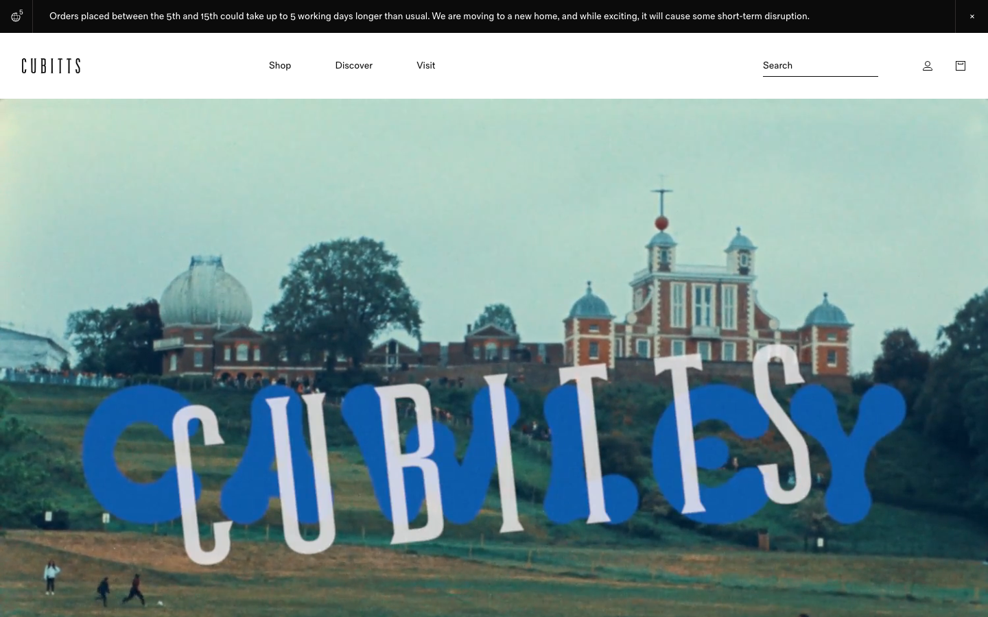
Cubitts
nicheHealth
a London bespoke-spectacle maker treating its Shopify storefront like a design museum, near-black ink on white, a tiny precise type scale in its own Fold Grotesque, generous 16px-radius media tiles, and a giant "CUBITTS" wordmark laid behind a Greenwich Observatory photograph.
Form Nutrition
strongFitness
a UK supplements DTC that pairs a warm off-white editorial base with a single mustard-yellow accent and a terracotta brand block, a geometric-sans-plus-Silka heading system, big oversized logo graphics and a calm, recipe-and-ritual voice.
Gantri
strongRetail
a direct-to-consumer lighting brand that runs its whole store on a quiet Sohne-grotesque-plus-Roboto-Mono system, near-black editorial photography, a single forest-green accent (#00855B) and a calm 1440px product grid, so the lamps carry all the colour and the chrome stays out of the way.
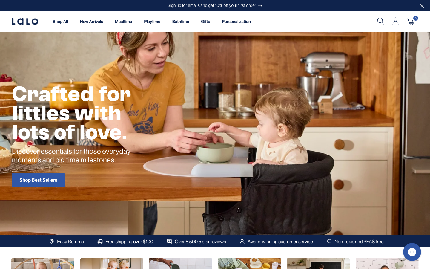
Lalo
strongChildcare Education
a baby-and-toddler products store on Shopify that reads as premium rather than cutesy, deep navy (#0F234C) on white, a GT Alpina serif paired with Neue Haas Grotesk, warm real-family kitchen photography, full navy feature panels with a warm CTA, and GSAP-plus-Swiper product carousels.