Double Play
www.doubleplay.studioThe reference for tennis-themed boutique creative studios — saturated cobalt-blue #002bba field, oversized serif x sans display contrast, baseball-card project credentials, and a heavy GSAP + Lenis + Locomotive scroll choreography over Webflow.
Design tokens
- display
- Perfectly Nineties
- displayFallback
- "Times New Roman", serif
- body
- Neue Montreal
- bodyFallback
- Arial, sans-serif
- mono
Do / Don't
Reference it for
- Single saturated brand colour as field, not accent — cobalt rgb(0, 43, 186) / #002bba carries hero + footer + buttons + headline text
- Near-white rgb(251, 251, 251) page for content sections, never pure white
- Dark grey rgb(51, 51, 51) body text rather than pure black
- Two-family display + body contrast — high-contrast serif (Perfectly Nineties) for editorial-display + neo-grotesque (Neue Montreal) for body / UI
- Perfectly Nineties italic inline emphasis mid-sentence ("clear *strategy*", "award-winning *design*") — italic-as-emphasis-in-running-prose pattern
- 12-step type scale with monumental top steps (120 / 576 / 1150px) for hero + scroll transformations
- Bottom-anchored hero on full-bleed brand colour with eyebrow + stacked serif headlines
- Top-centre wordmark with superscript year stamp (DP²⁵) — boutique-studio "we curate by vintage" signal
Do not copy
- The Double Play wordmark with the racket-silhouette logomark
- The Perfectly Nineties font (Pangram Pangram-owned, commercial licence required)
- The exact cobalt #002bba — pick the client brand colour
- The "Era of Arc" / "Bloomfield" / "Era of Arc + Bloomfield" client case study names
- The "Game-changing" H1 + the "From baseline to breakthrough" copy
- The tennis-sport metaphor (racket, baseline, grand slam, double play) unless the brand is genuinely in sports
- The "DP²⁵" wordmark + year stamp construction
- The German cookie consent copy (Akzeptieren / Ablehnen / Preferences) unless the brand is German-market
Signature moves
single saturated colour as field, not accent
cobalt #002bba carries hero, footer, buttons and headline text as a full field on a never-pure-white #fbfbfb page with #333 body text.
serif-display x grotesque-body with italic-as-emphasis
high-contrast serif (Perfectly Nineties) for editorial display plus neo-grotesque (Neue Montreal) body, with serif italic inline emphasis mid-sentence ('clear *strategy*'), across a 12-step scale topping at 120/576/1150px.
tilted baseball-card credentials badge
a tilted card badge lists Requested / Project / Timeline / Services rows with a real barcode and serial number, a signature borrowable component.
Related references
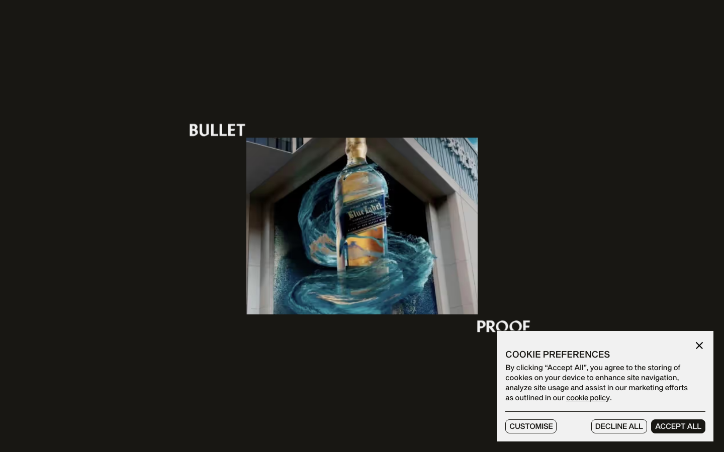
Bulletproof
strongCreative Studio
a brand-agency site that treats its own logotype as the hero, oversized "BULLET / PROOF" split type and a giant line-drawn B monogram, alternating black and bone-white acts with a Sequel-Sans-plus-Mixta-serif pairing, expo-eased motion and a single orange spark.
Burocratik
strongCreative Studio
a pure black-and-white studio site with a wicked sense of humour, full-bleed iconic photography, Graphik paired with Times, type that swings up to a 270px display, and self-deprecating copy ("18 fkn Years", "Our Accodlades") that makes monochrome restraint feel warm and human.

Ragged Edge
nicheCreative Studio
The reference for cult London branding agencies — Grit serif paired with ABC Diatype Expanded, near-black `#181F1F` on soft mint surfaces, fat 40-64px radii, and a video-saturated 11774px scroll that lets the work do the talking.
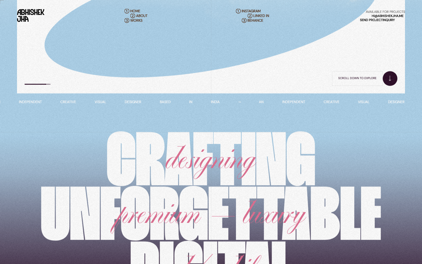
Abhishek Jha
nicheDesign Portfolio
Indian designer personal portfolio — 4-font system (DM Sans + thunder + editorial + playground), 17-step scale up to 288px, dark plum + pink palette, 9-keyframe marquee/cloud motion.