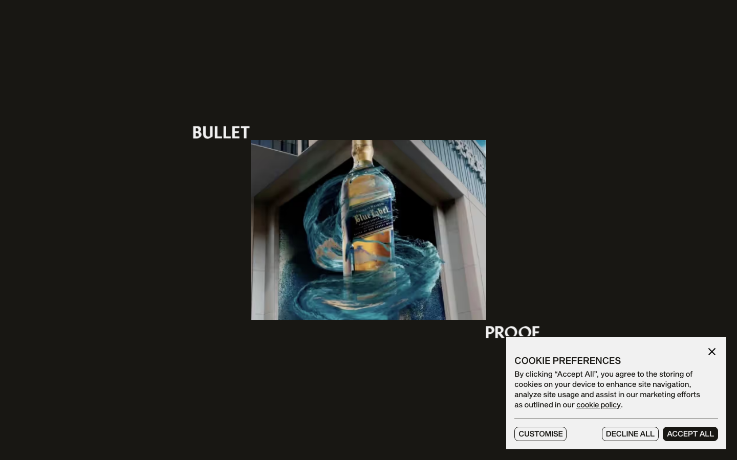
Bulletproof
www.wearebulletproof.coma brand-agency site that treats its own logotype as the hero, oversized "BULLET / PROOF" split type and a giant line-drawn B monogram, alternating black and bone-white acts with a Sequel-Sans-plus-Mixta-serif pairing, expo-eased motion and a single orange spark.
Design tokens
- display
- Mixta Pro Light
- body
- Sequel Sans Book
- mono
- none
Do / Don't
Reference it for
- Logotype-as-hero: splitting a wordmark to frame content, and using an oversized outlined monogram as a recurring graphic device.
- Black ⇄ bone-white act alternation for pace, with one warm orange accent (#ED7700) used sparingly.
- A grotesque + display-serif pairing (Sequel Sans + Mixta Pro) that mixes structure and personality.
- Expo-out motion (cubic-bezier(0.19,1,0.22,1), ~0.8s) for entrances that feel snappy then settle.
- A clean, well-built Webflow stack (Lenis + Swiper + Splitting) as a reference for non-Next agency sites.
Do not copy
- The B monogram and the split-wordmark hero are Bulletproof's identity; borrow the technique, not the marks.
- Mixta Pro and Sequel Sans are licensed; map to a similar grotesque + display-serif pair.
- Per-character Splitting reveals everywhere can tip into showreel territory; use them on one or two moments, not every heading.
Signature moves
logotype-as-hero with split wordmark and oversized outlined monogram
the studio splits its own wordmark to frame content and reuses an oversized outlined monogram as a recurring graphic device, with display type up to 115px.
black-to-bone act alternation with one orange spark
the page alternates pure-black and bone-white acts for pace, with a single warm orange accent (#ED7700) used sparingly.
grotesque + display-serif pairing on expo-out entrances
a grotesque body (Sequel Sans) plus a display serif (Mixta Pro) mixes structure and personality, with expo-out entrances (cubic-bezier(0.19,1,0.22,1), ~0.8s) that feel snappy then settle, on a Lenis + Swiper + Splitting stack.
Related references

Alche
strongCreative Studio
The reference for Japanese virtual-character + immersive experience studios — Astro v5 build, neon yellow-green accent, 5-font multi-language system, KizunaAI case study.
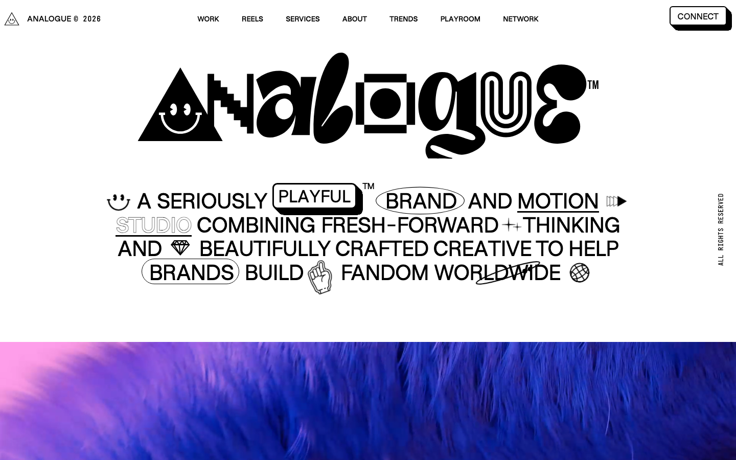
Analogue
strongCreative Studio
a "seriously playful" brand-and-motion studio that wears its personality as type, a wonky multi-alternate ANALOGUE wordmark, emoji and icon glyphs set inline in the copy, a candy-pink accent on white, and a GSAP-driven box of tricks (mexican-wave letters, glitches, bounce, float) kept just on the right side of chaos.
Burocratik
strongCreative Studio
a pure black-and-white studio site with a wicked sense of humour, full-bleed iconic photography, Graphik paired with Times, type that swings up to a 270px display, and self-deprecating copy ("18 fkn Years", "Our Accodlades") that makes monochrome restraint feel warm and human.
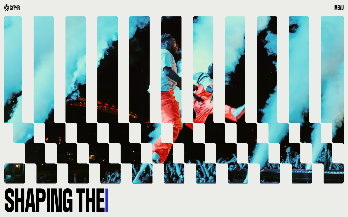
Cyphr
strongCreative Studio
The reference for venture-studio portfolios that flex through monumental condensed type, a single blue I-beam cursor accent, and a venetian-blind slat hero that fragments a single image into a column-rhythmic curtain.