Belle Property
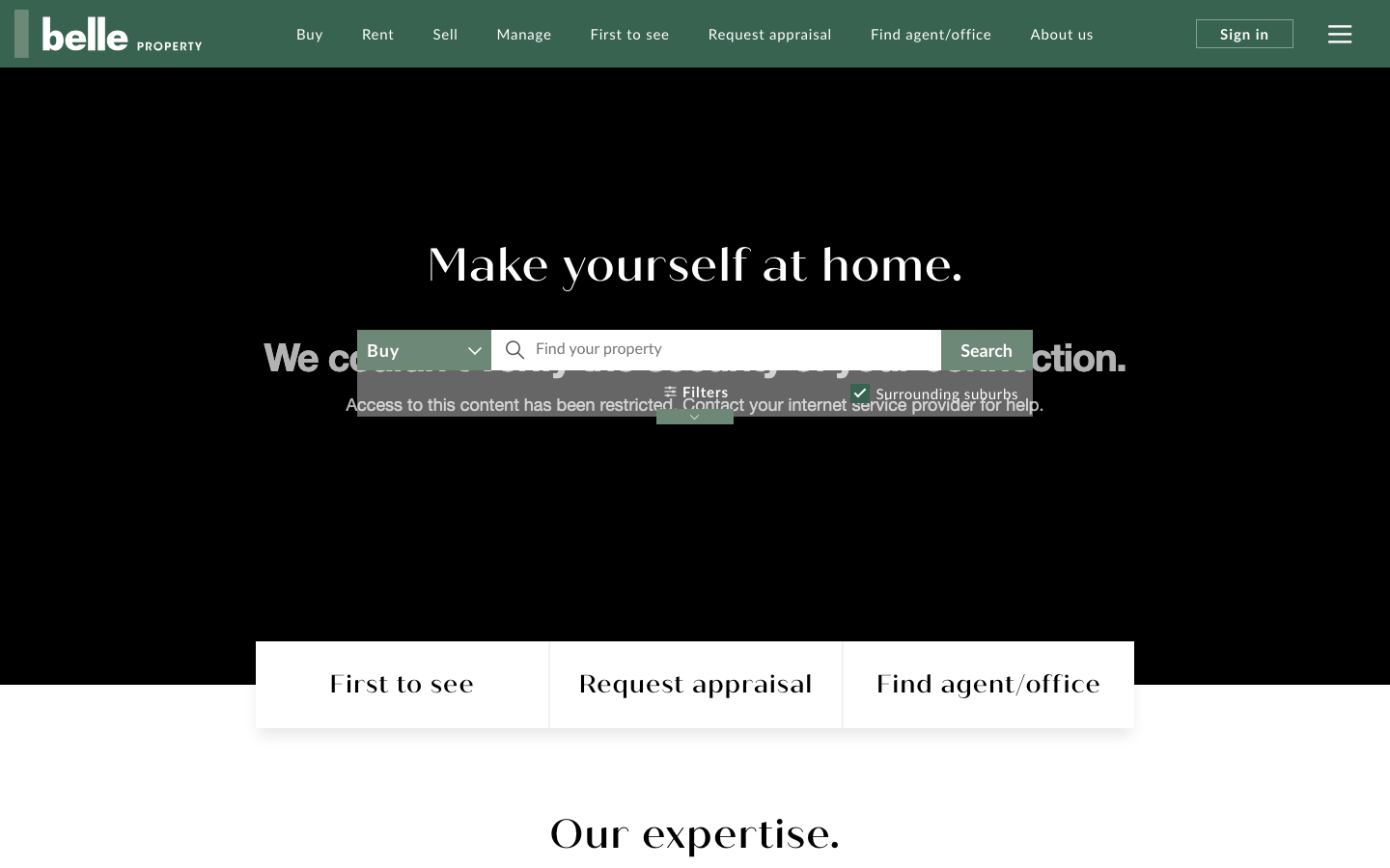
belleproperty.coma premium Australian real estate agency that leads with a wide property-search hero over a warm interior photograph, a muted forest-green and bone palette, Lato paired with the quiche-sans display serif, and a calm editorial scroll through expertise, featured listings and suburb guides.
Design tokens
- display
- quiche-sans (Typekit display serif)
- body
- Lato
- mono
- none
Do / Don't
Reference it for
- A property-search hero: a full-bleed lifestyle photograph with a wide Buy/Rent search bar and filter chips dropped over it, the single most reusable pattern for a local real estate agency.
- A premium agency palette: muted forest green plus pale sage on bone-grey panels, warm and calm rather than corporate blue.
- A display-serif plus humanist-sans pairing (quiche-sans plus Lato) that signals lifestyle, not transaction.
- An editorial homepage sequence (expertise, featured listings, testimonials, suburb guides, report, careers) that frames a service as a brand.
- Restrained 0.4s ease-in-out motion that keeps a content-heavy property site feeling composed.
Do not copy
- The "belle" circular badge and wordmark are Belle Property's identity. Rebuild the badge idea with the client's own mark.
- quiche-sans is a Typekit-licensed display face. Map to a comparable warm display serif.
- The Bootstrap-era utility palette under the hood (--blue #007bff and friends) is framework default, not the brand. Only the green, sage and bone roles matter.
Signature moves
full-bleed property-search hero
a full-bleed warm interior photograph carries a wide Buy/Rent search bar with filter chips dropped over it, the most reusable pattern for a local real estate agency.
premium green-and-bone agency palette with serif/sans pairing
muted forest green #386351 plus pale sage on bone-grey panels read warm and calm, with a display-serif (quiche-sans) + humanist-sans (Lato) pairing signalling lifestyle not transaction.
editorial homepage service-as-brand sequence
an editorial sequence (expertise, featured listings, testimonials, suburb guides, report, careers) frames a service as a brand.
Related references
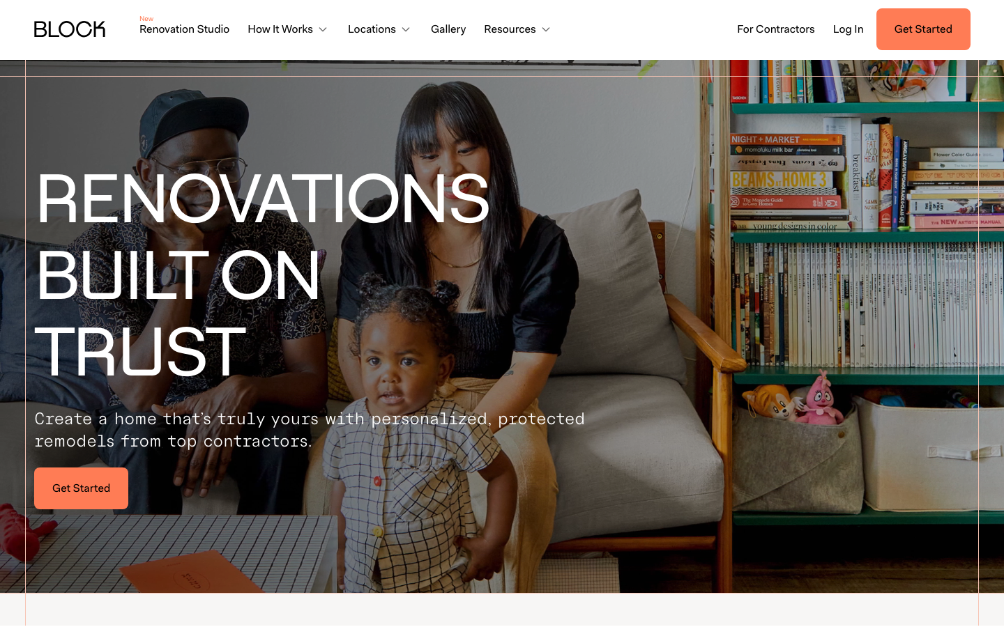
Block Renovation
flagshipTrades
a US renovation marketplace that sells trust through warmth, big bold Fakt sans headlines over real renovated-room photography, a calm black-on-bone palette with one warm orange call to action, on a Next.js + Contentful stack with restrained spring-eased motion.
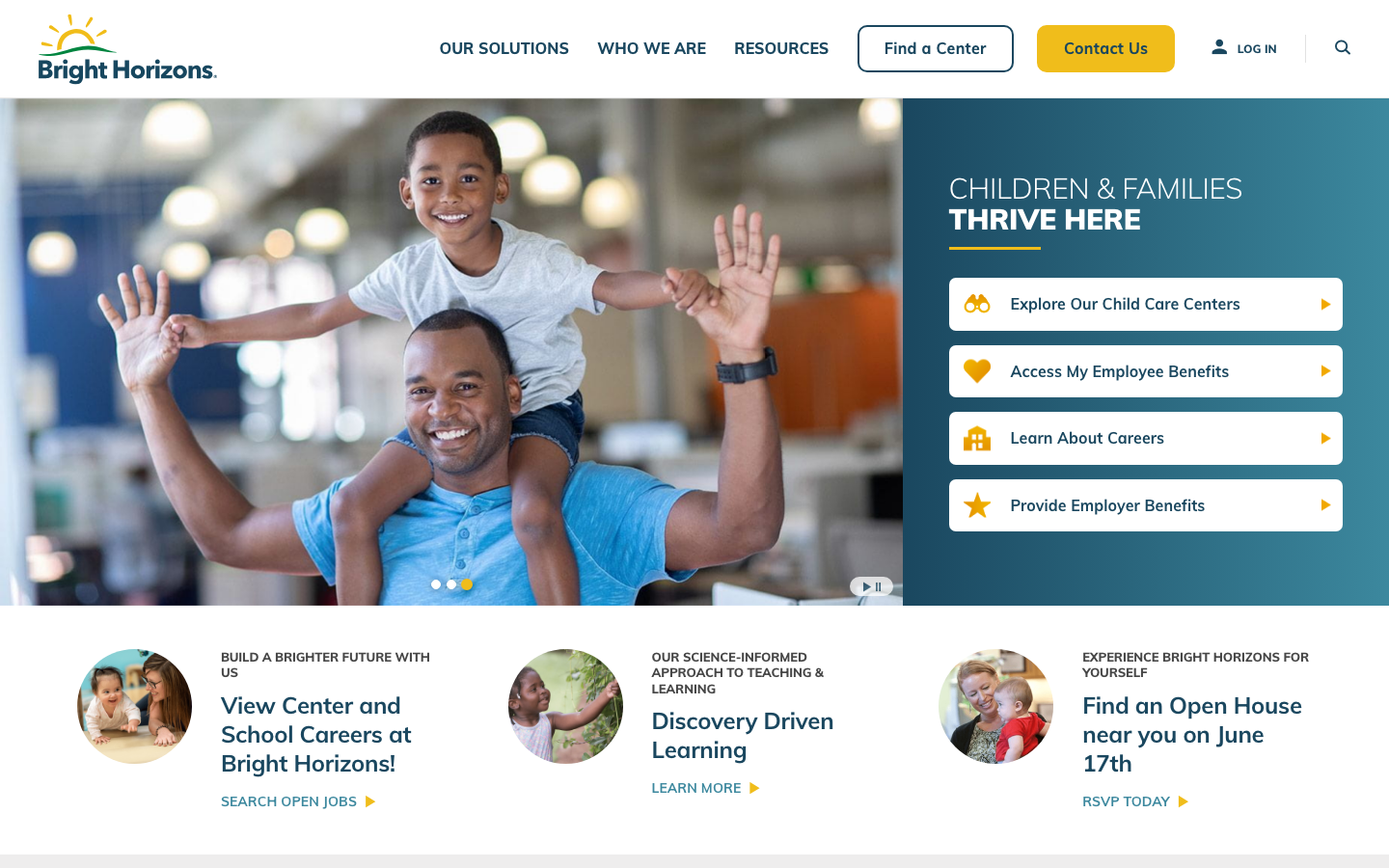
Bright Horizons
strongChildcare Education
a large early-education and childcare provider whose site leads with a warm deep-teal and sunshine-yellow palette over happy children's photography, the rounded Mulish sans throughout, a tabbed audience-routing hero, and a clear, trust-led grid of pathways for parents and employers.
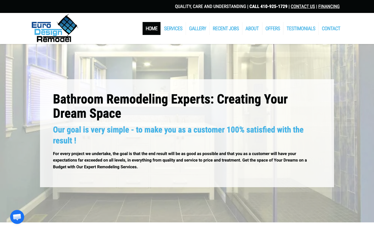
Euro Design Remodel
strongOther
A Bay Area bathroom/kitchen design-remodel firm that earns trust through a wall of third-party proof - a star-rated testimonials carousel, a full badge row (Houzz, EPA Lead-Safe, BBB, Angie's List, Yelp), financing reassurance and a "100% satisfied" promise, all on a clean white-and-blue canvas.
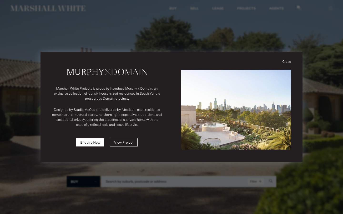
Marshall White
strongReal Estate
a premium Melbourne real estate agency rendered as a restrained editorial object: deep navy ink (#00101F) on white, a single refined sans (Untitled Sans) with a Georgia/Cigars serif accent, full-bleed property photography and almost no radius, so the work and the wealth speak quietly.