Basement
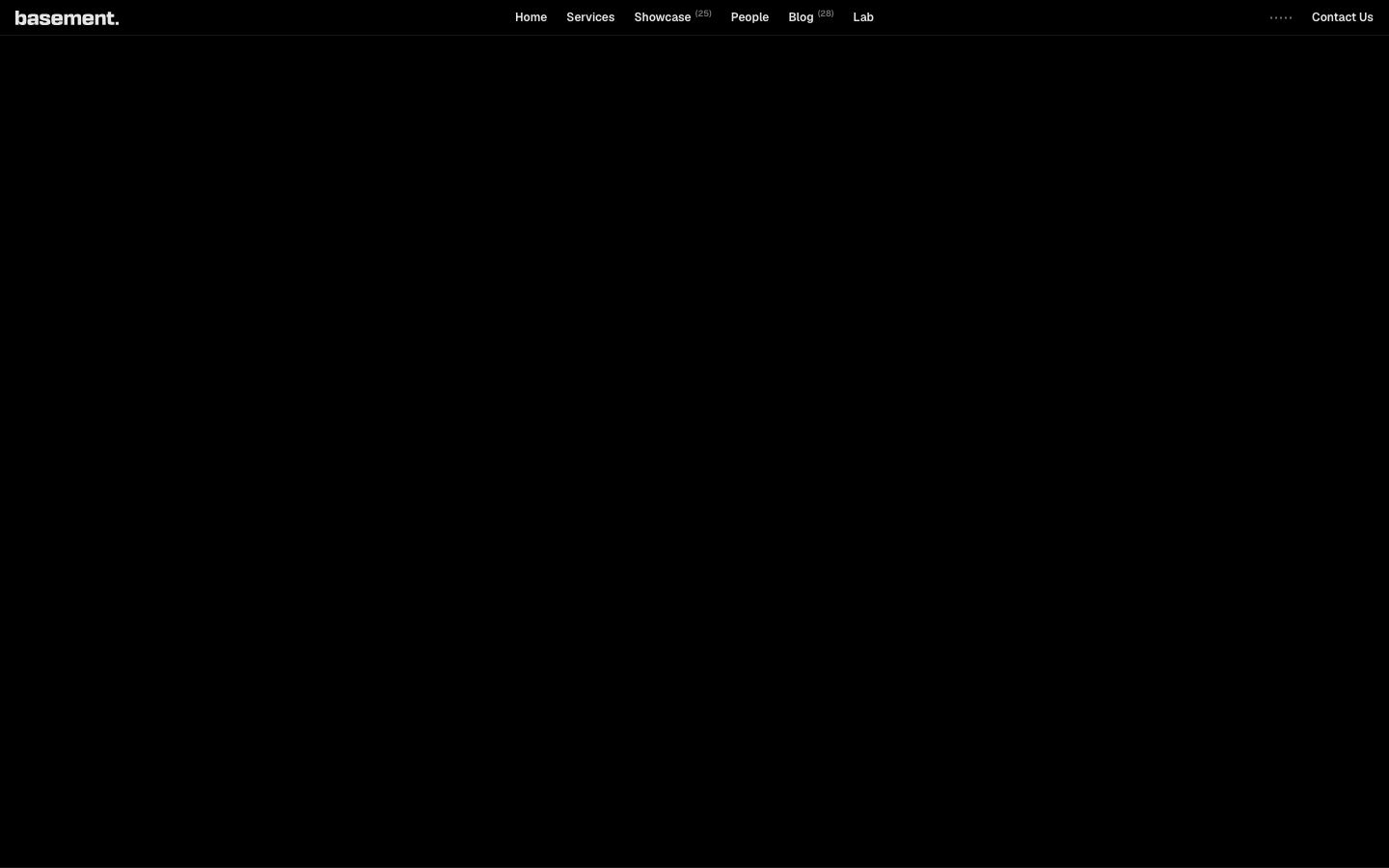
basement.studioa digital studio's portfolio rendered as a black-canvas magazine - Geist for body, the bespoke "flauta" for display moments, 1920px full-bleed project tiles with no border-radius and no shadows, and a 7-transition motion budget that prioritises bold typography over interaction polish.
Design tokens
- body
- Geist, "Geist Fallback"
- display
- flauta, "flauta Fallback"
- fallback
- Times
Do / Don't
Reference it for
- Geist + flauta as the body+display pairing. Geist is free and ubiquitous; flauta (or substitute with a distinctive paid display face) gives the brand its tonal signature.
- A pure black #000000 page with no border-radius anywhere. The sharpness IS the brand position.
- One declared box-shadow across the entire homepage — basement refuses elevation as a visual tool.
- 1920px content cap (47 hits) used at full-bleed — project tiles span the viewport.
- Project tiles as the page's structural primitive: header in display face + brand colour + oversize visual + capability-tag list + 3-line description.
- Capability tags in tiny mono / sans (Websites & Features / Marketing Execution / IRL Experience Design).
- Superscript count tags in nav (Showcase (25), Blog (28)) — small typographic detail that signals "active studio".
- Bold project copy with first-person plural ("Partnering with Vercel means pushing the limits…", "We crafted a high-performance, story-driven website").
Do not copy
- flauta — bespoke (possibly commissioned for basement). Substitute with another distinctive display face the client owns.
- The exact "cool shit" tone — basement-coded; a more corporate brand can't carry it.
- The 1920px full-bleed project tile layout on briefs without a strong project library.
- The 0-radius discipline on consumer brands that need to feel warm — sharpness reads as commercial confidence.
- 23 named keyframes for what is essentially a black-and-grey page — most are unused. Subset.
Signature moves
pure-black no-radius no-shadow magazine canvas
a pure black #000000 page with no border-radius anywhere and one declared box-shadow across the homepage makes sharpness the brand position.
full-bleed project tile as structural primitive
1920px full-bleed project tiles (display-face header + brand colour + oversize visual + capability-tag list + 3-line description) are the page's structural primitive, with superscript count tags in nav (Showcase (25)).
Related references
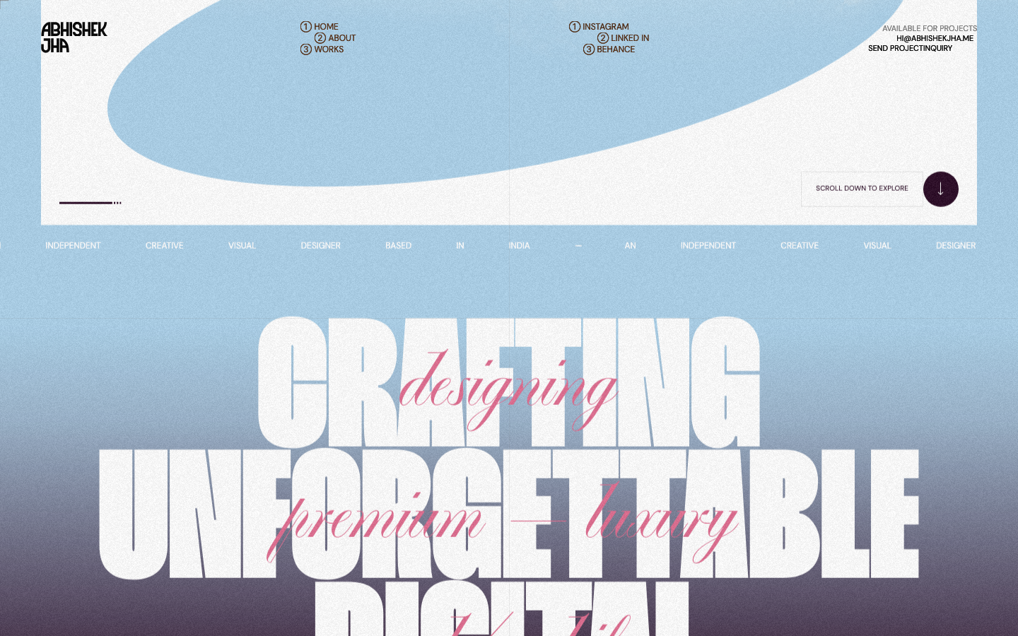
Abhishek Jha
nicheDesign Portfolio
Indian designer personal portfolio — 4-font system (DM Sans + thunder + editorial + playground), 17-step scale up to 288px, dark plum + pink palette, 9-keyframe marquee/cloud motion.

Alche
strongCreative Studio
The reference for Japanese virtual-character + immersive experience studios — Astro v5 build, neon yellow-green accent, 5-font multi-language system, KizunaAI case study.
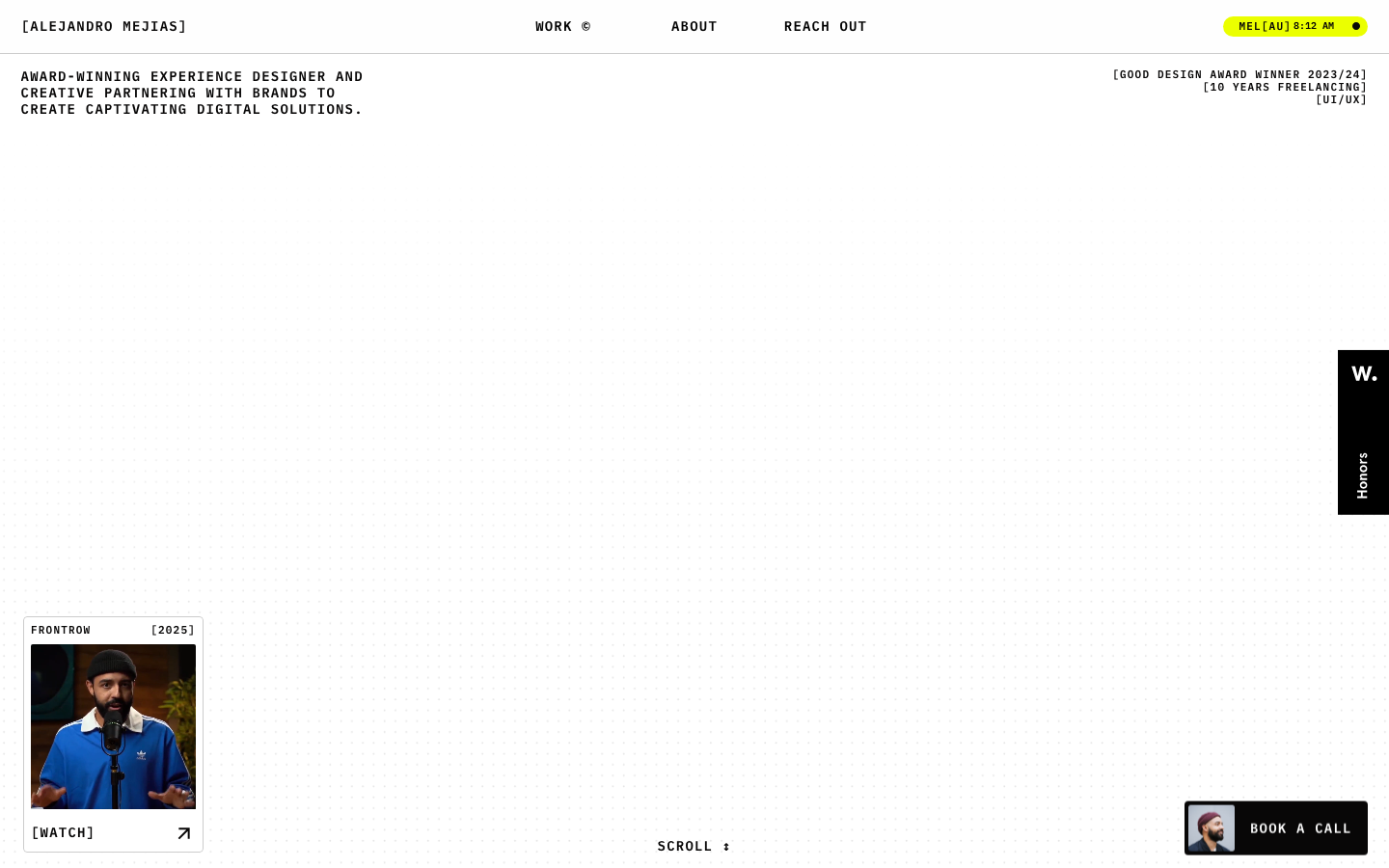
Alejandro Mejias
nicheDesign Portfolio
A Melbourne solo UX designer's Framer-built portfolio in a brutalist bracket-wrapped monospace voice — black-on-white chrome punctuated by a single neon-yellow accent, dotted-grid hero, and full-bleed yellow about page.
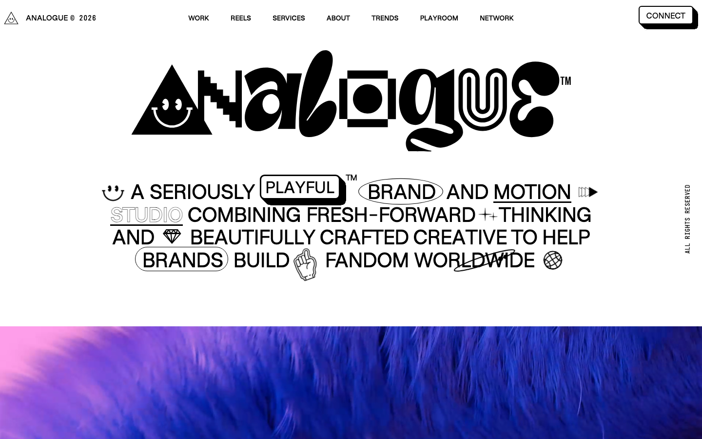
Analogue
strongCreative Studio
a "seriously playful" brand-and-motion studio that wears its personality as type, a wonky multi-alternate ANALOGUE wordmark, emoji and icon glyphs set inline in the copy, a candy-pink accent on white, and a GSAP-driven box of tricks (mexican-wave letters, glitches, bounce, float) kept just on the right side of chaos.