Assembly
www.joinassembly.comThe reference for clean-corporate B2B HR-tech with illustrated character imagery and a dotted-grid texture — Inter at every weight, single blue accent, friendly illustrations carrying the visual personality.
Design tokens
- display
- Inter, system-ui, -apple-system, sans-serif
- body
- Inter, -apple-system, system-ui, sans-serif
- mono
- ui-monospace, system fallback
Do / Don't
Reference it for
- Illustrated character imagery (children's-book / flat illustration style) as the visual personality — replaces both photography and isometric mockups
- Pure white with dotted-grid texture as the page background — the dotted texture adds subtle depth without distracting
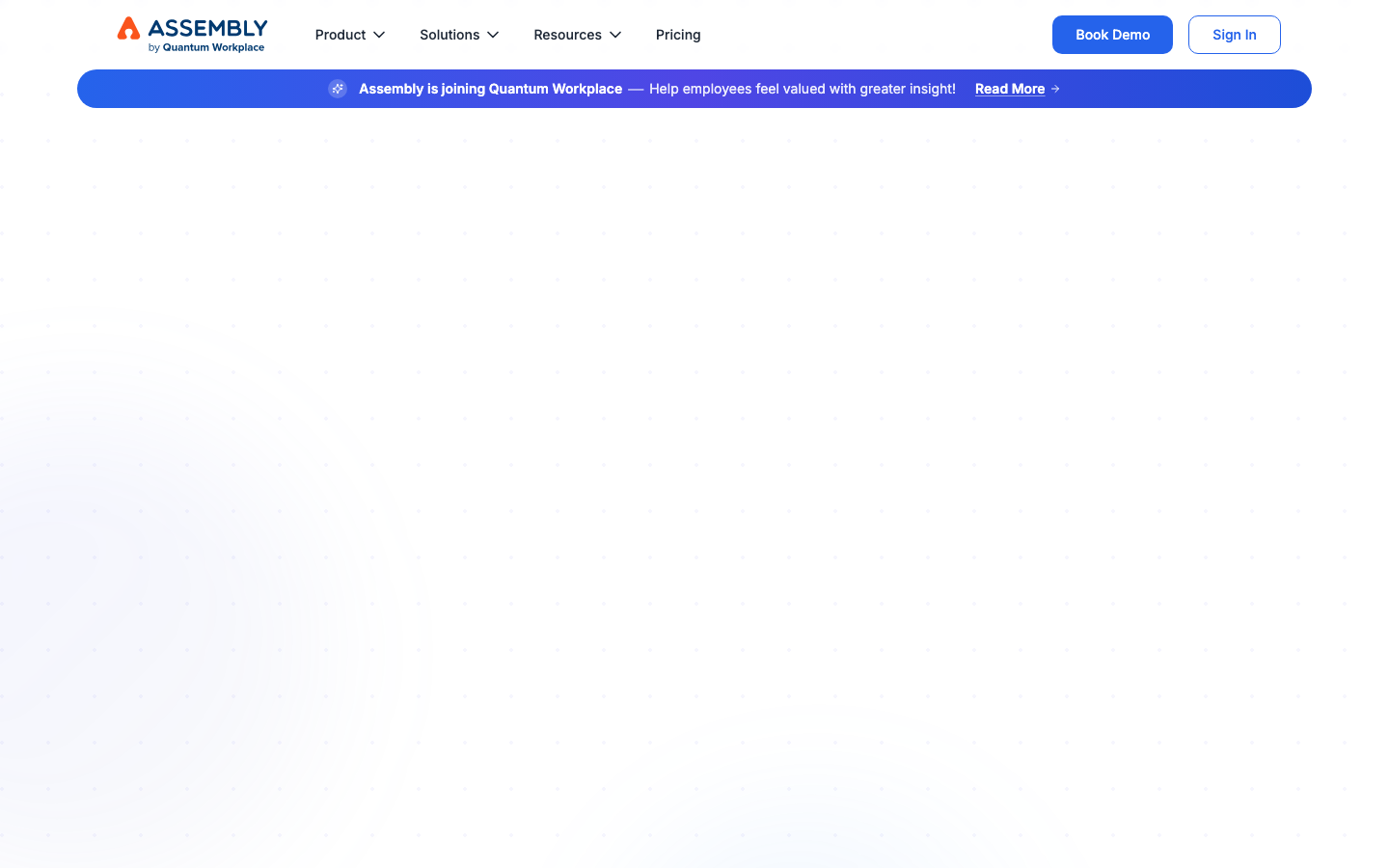
- Single Tailwind blue #2563eb as the only brand accent — used on CTAs, link colour, and inline emphasis ("Missing", "Perform Better" coloured words in H2s)
- Inter at every weight — only 2 @font-face declarations (variable axis WOFF2), the leanest font setup in the library
- Section-level coloured-word emphasis — "Recognition Is Still Missing Where It Matters Most" and "Engaged Teams Stay Longer - and Perform Better" — selectively colouring 1-2 words in each H2 with the brand blue
- Stat-first problem framing — "Nearly 7 in 10 employees say they don't get the recognition they deserve" + cited source ("*Data from Gallup")
- 4-section dense page rhythm — shorter than typical, each section doing heavier work
- Real customer testimonials with photos + name + role + company (4 cards in a 2×2 grid)
Do not copy
- The orange-triangle "ASSEMBLY by Quantum Workplace" wordmark — brand-specific
- The Gallup stat citation pattern — only use real data sources
- The illustrated character style (children's-book) — needs to match the brand's tone; reads as twee on enterprise brands
- The "Recognition" specific copy — Assembly's positioning
- The Quantum Workplace parent-brand framing — Assembly's specific context
Signature moves
illustrated-character personality on dotted-grid white
flat children's-book illustration carries the visual personality (replacing photography and isometric mockups) on a pure white page with a subtle dotted-grid texture.
single-blue coloured-word emphasis
one Tailwind blue #2563eb is the only accent, used on CTAs, links and to selectively colour 1-2 emphasis words in each H2 (Missing, Perform Better).
paired-card asymmetric radius with pill CTAs
vertically-paired card surfaces use asymmetric radii (16px 16px 0 0 and 0 0 16px 16px) and CTAs use a 9999px pill workhorse.
Related references
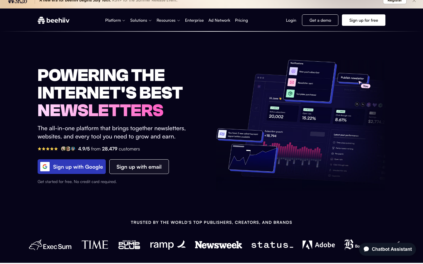
Beehiiv
strongMarketing Platform
The reference for newsletter / creator-platform brands with all-caps section H2 discipline — dark navy + magenta accent + ClashGrotesk display, real publisher logos from TIME / Newsweek / Adobe.
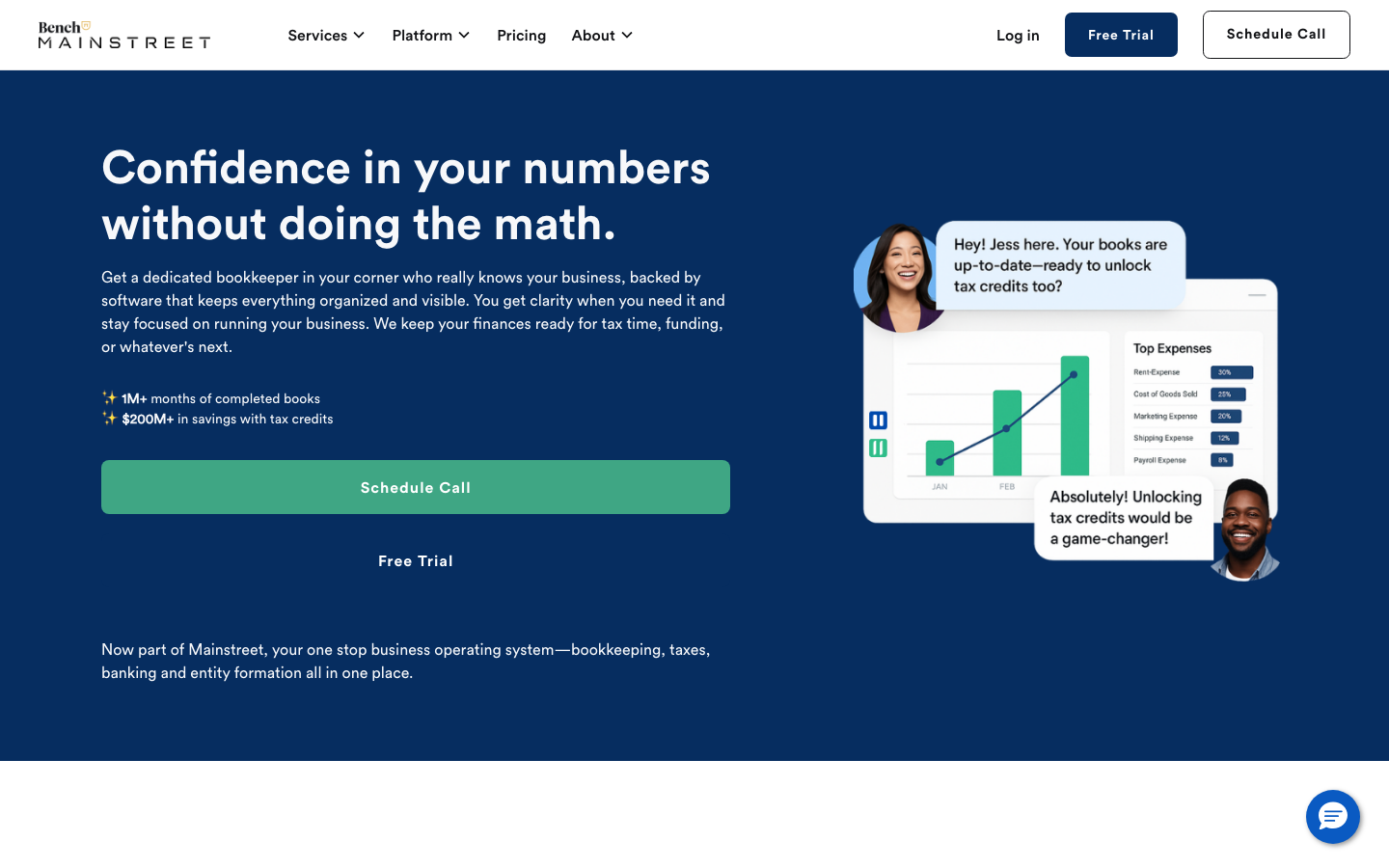
Bench Accounting
strongProfessional Services
a small-business bookkeeping service that builds trust with a deep-navy hero, friendly Circular Std type, a soft blue-teal palette and a product mock-up showing real reports and chat support, calm, credible, conversion-focused.
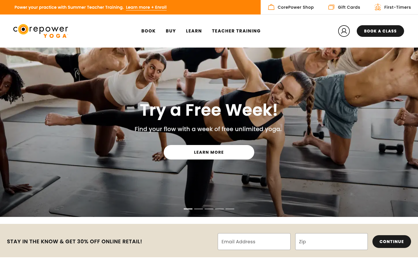
Corepower Yoga
strongFitness
a yoga studio chain whose site runs entirely on the class timetable, Book / Studio Schedule / On Demand sit at the front of the nav, in a warm sunset-orange-and-cream palette with friendly Poppins, so finding and booking a class is the whole experience.
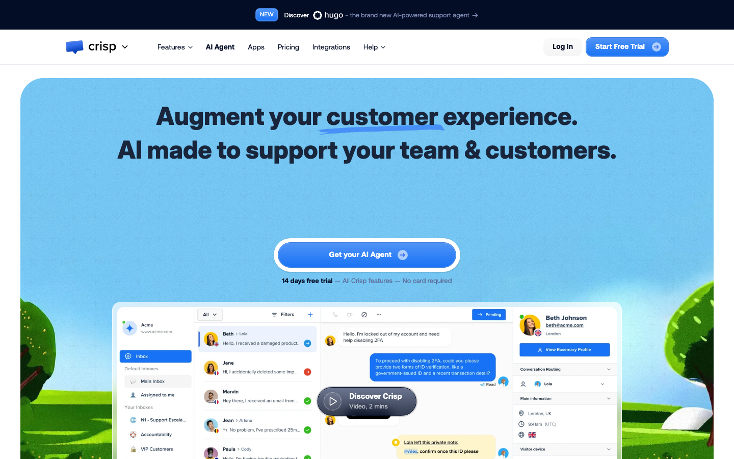
Crisp
strongSaas Product
The reference for AI customer-support brand — bespoke Crisp Aeonik Pro, real chat dashboard hero, link-blue underline emphasis, dark navy announcement banner promoting AI agent.