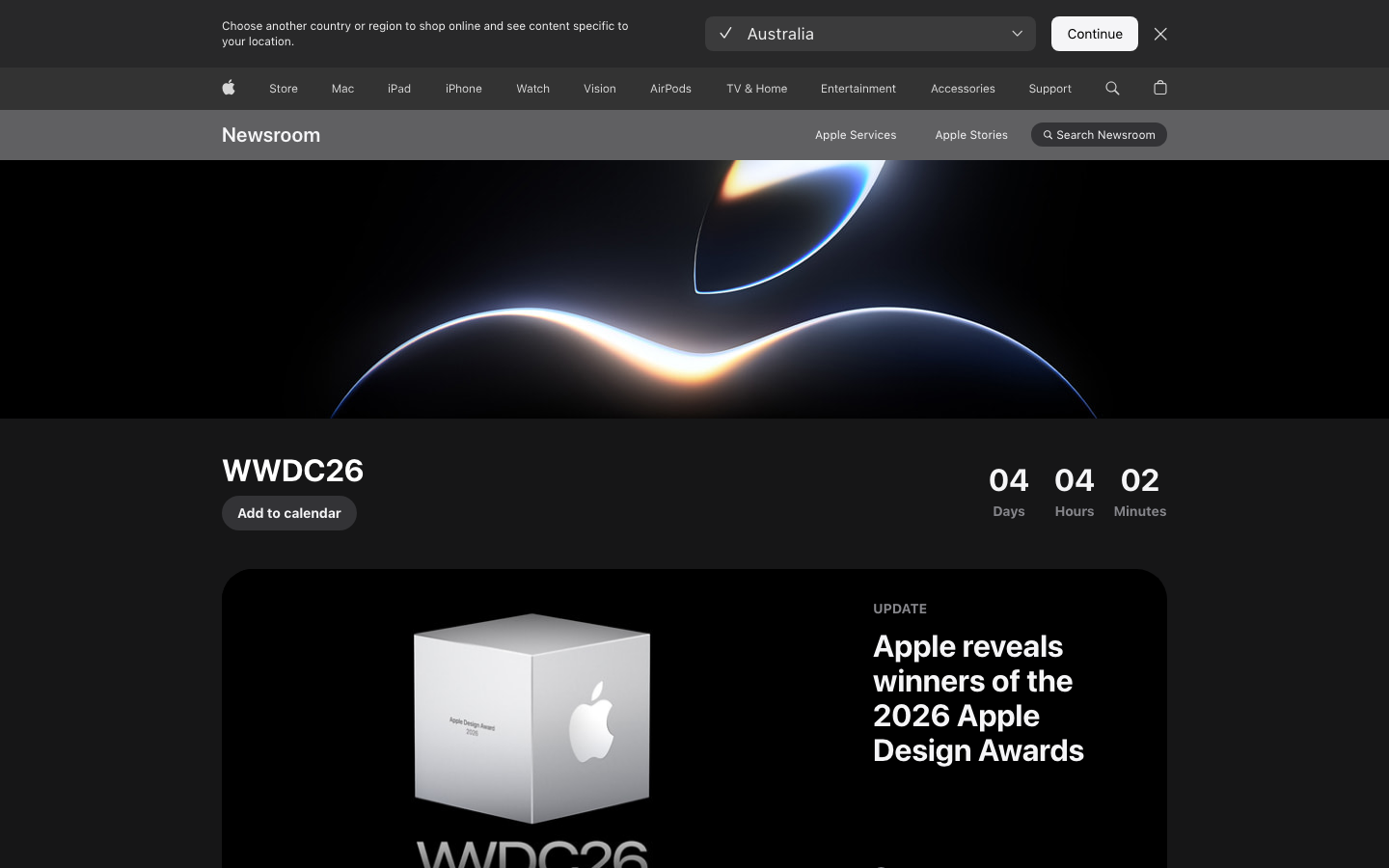
Apple Newsroom
www.apple.com/newsroom/the editorial corner of apple.com - SF Pro on Apple's signature #f5f5f7 light-grey page, rounded 24-32px news cards with white surfaces, and a 21-keyframe globalnav animation library that defines the bar at the top of every Apple page on the internet.
Design tokens
- body
- "SF Pro Text", "SF Pro Icons", "Helvetica Neue", Helvetica, Arial, sans-serif
- body-with-myriad
- "SF Pro Text", "Myriad Set Pro", "SF Pro Icons", "Apple Legacy Chevron", "Helvetica Neue", Helvetica, Arial, sans-serif
- display
- "SF Pro Display", "SF Pro Icons", "Helvetica Neue", Helvetica, Arial, sans-serif
- system-fallback
- "SF Pro Text", "Myriad Set Pro", system-ui, -apple-system, "system-ui", "Segoe UI", "SF Pro Icons", "Apple Legacy Icons", "Helvetica Neue", Helvetica, Arial, sans-serif
Do / Don't
Reference it for
- The white-card-on-light-grey news-list pattern (24-32px radius, no border, no shadow) — the canonical editorial card primitive.
- Apple's globalnav animation system — 21 named keyframes with globalnav- prefix, two signature curves (cubic-bezier(0.4, 0, 0.25, 1) for transforms, cubic-bezier(0.4, 0, 0.6, 1) for opacity). Worth studying as the gold-standard nav animation.
- #f5f5f7 page background as the warm-neutral wash between cards — softer than #fff, sharper than #eee.
- #1d1d1f text colour (warm near-black, not pure #000) — Apple's signature text colour, more legible at scale.
- #0066cc Apple blue for links — high-contrast and instantly recognisable.
- A + glyph in a circular hit-area as the "read more" affordance — denser than "Read more →" arrows, more universal than localised text labels.
- SF Pro Text + SF Pro Display for any content with editorial typography (NOTE: SF Pro is Apple-licensed and only usable on Apple platforms — substitute with Inter or system-ui on other clients).
- 1024px content cap with 980px inner — narrow enough to keep editorial reading width comfortable.
Do not copy
- SF Pro — licensed for use on Apple platforms only. Substitute with Inter (free, near-identical metrics), system-ui (free, native), or SFR (paid alternative).
- The exact #f5f5f7 page background — strongly Apple-coded. Pick a different warm-neutral.
- The global nav strip wholesale — it has to be re-engineered for any non-Apple brand. Borrow the *animation pattern*, not the literal nav.
- 107 @font-face declarations. Apple ships SF Pro across many weights and subsets; most Jiffi builds ship 4-6.
- The +-in-circle affordance on brands where it doesn't read as "expand" — works on Apple because users are conditioned to the iOS UI vocabulary.
- 13 stylesheets + 11 fonts + 14 scripts — Apple's enterprise-grade chrome. A Jiffi rebuild should ship far fewer.
Signature moves
white-card-on-light-grey editorial primitive
rounded 24-32px white news cards with no border and no shadow sit on the #f5f5f7 warm-neutral page with #1d1d1f warm near-black text and #0066cc link blue.
globalnav two-curve animation system
a 21-keyframe globalnav animation library uses two signature curves, cubic-bezier(0.4, 0, 0.25, 1) for transforms and cubic-bezier(0.4, 0, 0.6, 1) for opacity, as the gold-standard nav motion.
circular-plus read-more affordance with typed eyebrow pills
a + glyph in a circular hit-area is the read-more affordance, with QUICK READ and UPDATE typed eyebrow pills classifying content.
Related references
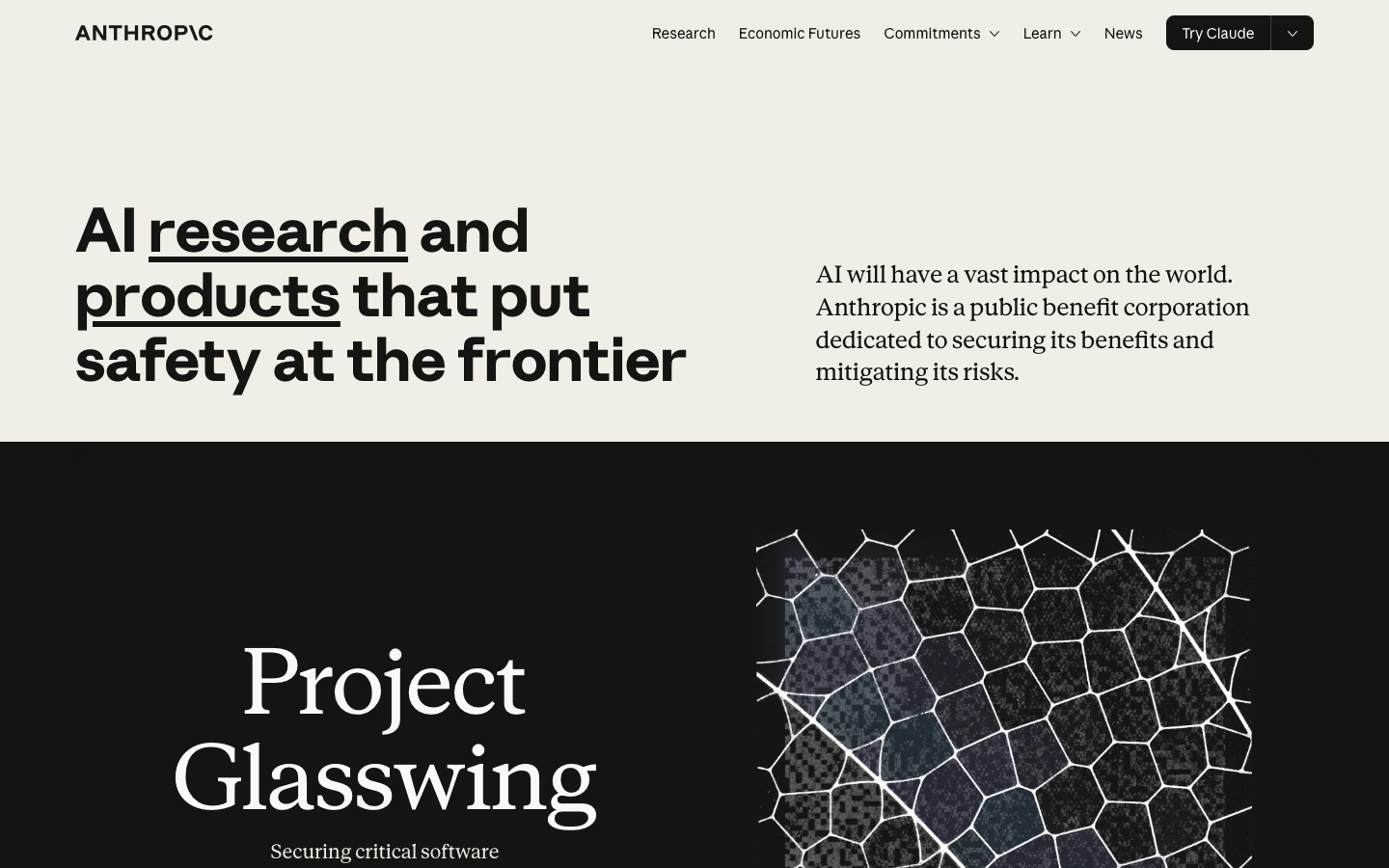
Anthropic
flagshipDeveloper Tool
a warm ivory-and-slate site where editorial serif typography, a single clay accent, and unhurried 0.8s expo reveals reframe AI as a humanist research practice rather than a product to sell.
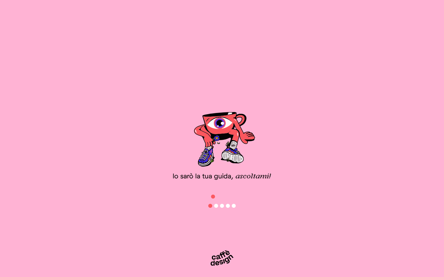
Caffe Design
nicheEditorial Publishing
An Italian "design gang" community-magazine fronted by a hand-drawn one-eyed coffee-cup mascot — bubblegum-pink canvas, a literal animated preloader as the brand voice, GT Haptik sans paired with Argent Pixel CF italic for headline accents.
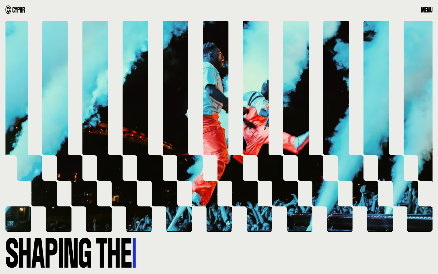
Cyphr
strongCreative Studio
The reference for venture-studio portfolios that flex through monumental condensed type, a single blue I-beam cursor accent, and a venetian-blind slat hero that fragments a single image into a column-rhythmic curtain.
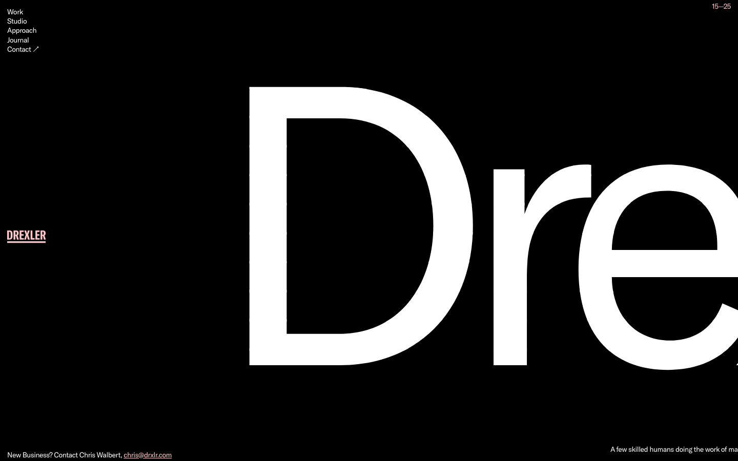
Drexler
nicheCreative Studio
A Baltimore studio that uses a single 765px-tall wordmark as the entire homepage, with a warm pink-on-black palette and 5-link nav, signalling small-shop confidence through wordmark-as-canvas restraint.