
Alche
alche.studioThe reference for Japanese virtual-character + immersive experience studios — Astro v5 build, neon yellow-green accent, 5-font multi-language system, KizunaAI case study.
Design tokens
- display
- acumin-pro
- body
- ibm-plex-sans-jp
- japanese
- Hiragino Kaku Gothic ProN
- mono
- Google Sans Code
- monoSecondary
- IBM Plex Mono
Do / Don't
Reference it for
- Astro v5.13.3 build (Jiffi's stack — direct technique transfer)
- Pure black + pure white extreme monochrome
- rgb(215, 255, 0) neon yellow-green / Acid Pop accent (single hit chromatic — rare and signature)
- 5-font multi-language system: Acumin Pro + Hiragino Kaku Gothic ProN + IBM Plex Sans JP + IBM Plex Mono + Google Sans Code
- Japanese system font fallback (Hiragino Kaku Gothic ProN, メイリオ)
- IBM Plex Sans JP for Japanese body — Adobe-hosted Japanese variant
- Acumin Pro for Latin display
- Google Sans Code + IBM Plex Mono for chrome metadata
Do not copy
- The Alche studio brand identity
- The KizunaAI case study
- The Stellla sub-brand name
- The Acumin Pro + IBM Plex licences unless Adobe Fonts subscription
- The Hiragino Kaku Gothic ProN system-font path unless the brand has Japanese content
- The 795 @font-face budget for non-Japanese brands (most don't need this)
- The neon yellow-green rgb(215, 255, 0) exact hue unless the brand is comparably bold
- The lowercase sub-brand "stellla" naming pattern
Signature moves
extreme monochrome with single acid-pop accent
pure black #000000 and pure white with one rgb(215, 255, 0) neon yellow-green used as a single rare chromatic hit.
multi-language font system with refined micro-radius
a 5-font multi-language system (Acumin Pro Latin display + IBM Plex Sans JP body + Hiragino fallback + IBM Plex Mono / Google Sans Code chrome) on a 12-step fluid scale (10-43.2px) with a non-standard 3.6px workhorse radius.
cinematic preloader + padding-driven hover
a heavy preloader animation opens the experience and a distinctive padding-left 0.3s ease hover shifts elements, with all 0.3s ease as the workhorse transition.
Related references

Mccarthy Building Companies
flagshipOther
A 100+ year, employee-owned national commercial builder that projects quiet authority at scale - full-bleed video and aerial photography of real megaprojects, oversized condensed type ("SUPERIOR RESULTS", "WE CAN BUILD IT"), a single bold red accent, and clip-path scroll reveals that feel cinematic but never showy.
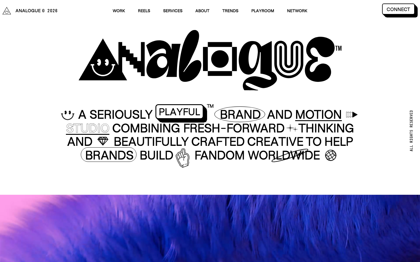
Analogue
strongCreative Studio
a "seriously playful" brand-and-motion studio that wears its personality as type, a wonky multi-alternate ANALOGUE wordmark, emoji and icon glyphs set inline in the copy, a candy-pink accent on white, and a GSAP-driven box of tricks (mexican-wave letters, glitches, bounce, float) kept just on the right side of chaos.
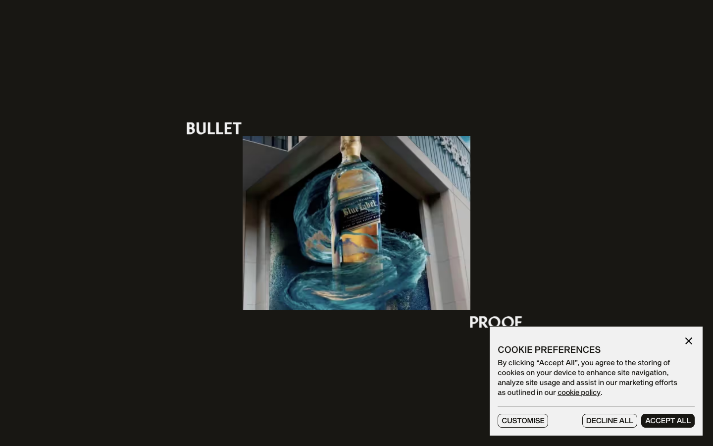
Bulletproof
strongCreative Studio
a brand-agency site that treats its own logotype as the hero, oversized "BULLET / PROOF" split type and a giant line-drawn B monogram, alternating black and bone-white acts with a Sequel-Sans-plus-Mixta-serif pairing, expo-eased motion and a single orange spark.
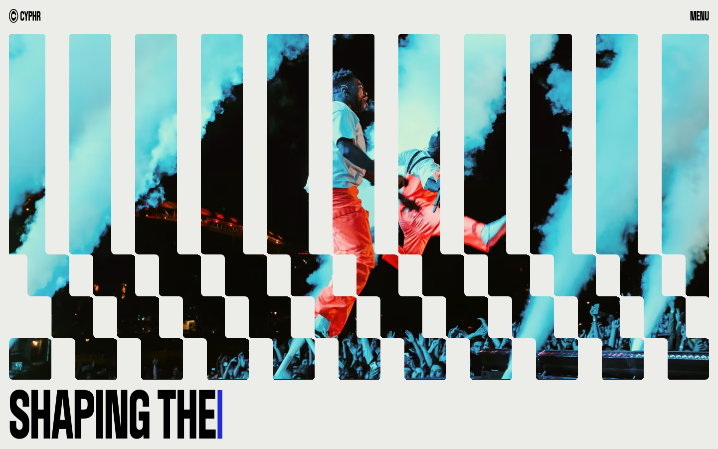
Cyphr
strongCreative Studio
The reference for venture-studio portfolios that flex through monumental condensed type, a single blue I-beam cursor accent, and a venetian-blind slat hero that fragments a single image into a column-rhythmic curtain.