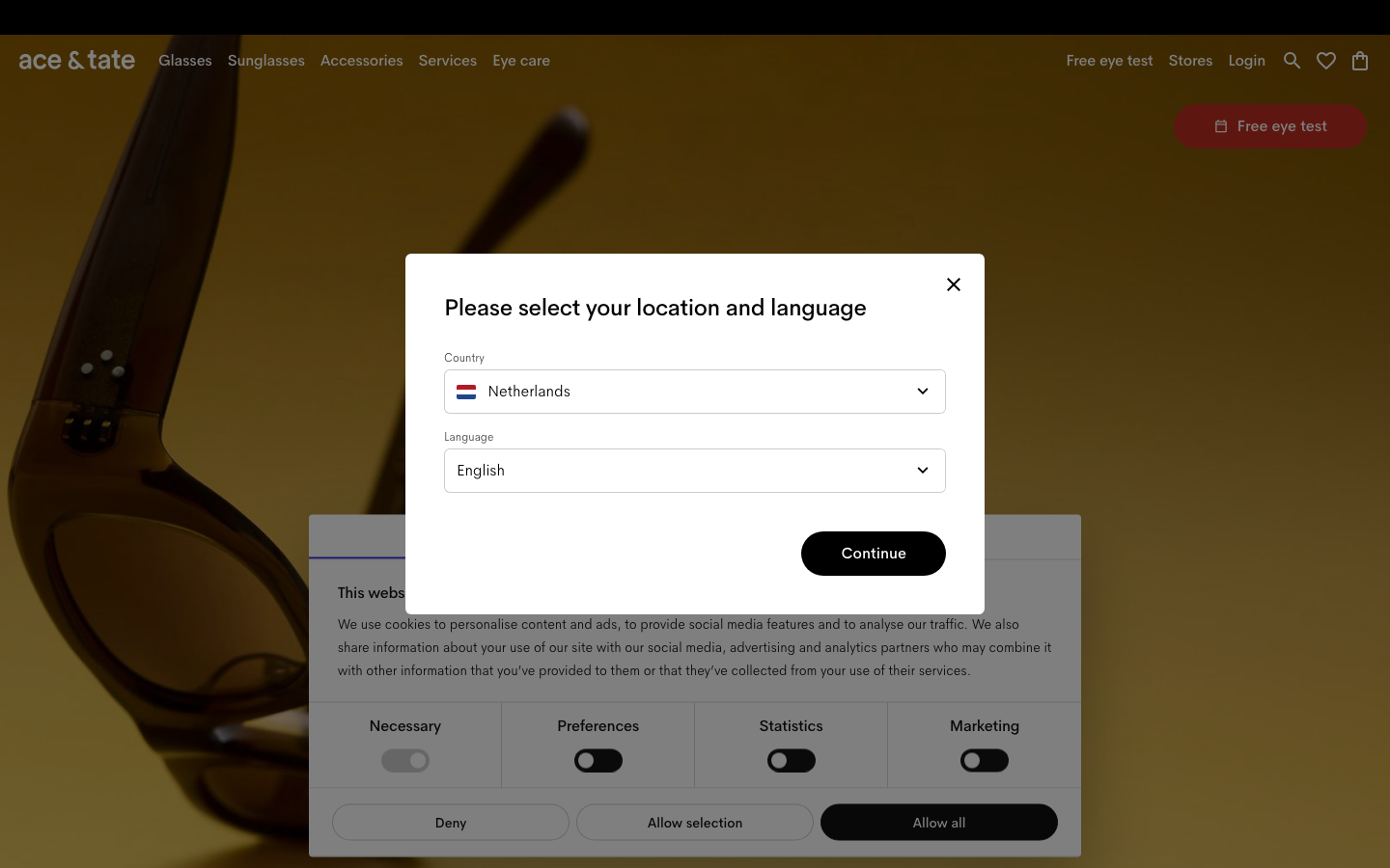
Ace And Tate
www.aceandtate.coma near-monochrome Amsterdam eyewear store that lets warm product photography and one editorial serif carry all the personality, set on a soft grey field with ink-black type, calm spacing and almost no decoration.
Design tokens
- display
- ATArizonaSerif
- body
- AmperSans
- mono
- none
Do / Don't
Reference it for
- An optometrist or eyewear retailer that wants to read premium and calm: ink type on a soft grey field, product photography as the only colour.
- A sans-plus-editorial-serif pairing where the serif appears only at section-heading scale, never in body, as the single personality move.
- Restrained motion as a craft signal: 0.15s opacity fades and colour transitions, nothing more.
- Named-product rows with prices (here, named frames like "Neil Large / Satin Gold") as a tidy, browsable retail pattern.
- A footer that doubles as a brand statement: oversized outlined wordmark plus trust marks (B Corp, opening hours, contact).
Do not copy
- The "ace & tate" wordmark and AmperSans / ATArizonaSerif are the brand's own; map to a comparable grotesque plus an editorial serif.
- The location-and-language modal on entry is an enterprise i18n need; do not bolt it onto a single-region clinic.
- Keep the palette this bare only if the photography can carry it; weak imagery on a grey field reads as unfinished.
Signature moves
serif-as-personality over a near-monochrome field
ink-black type on a soft grey #f4f4f4 field with one editorial serif (ATArizonaSerif) appearing only at section-heading scale (24-43px), never in body, as the single personality move.
restrained 0.15s fade as the craft signal
motion is limited to 0.15s opacity fades and colour transitions, nothing more, signalling premium calm.
oversized outlined-wordmark footer with trust marks
a footer that doubles as a brand statement with an oversized outlined wordmark plus trust marks (B Corp, opening hours, contact).
Related references
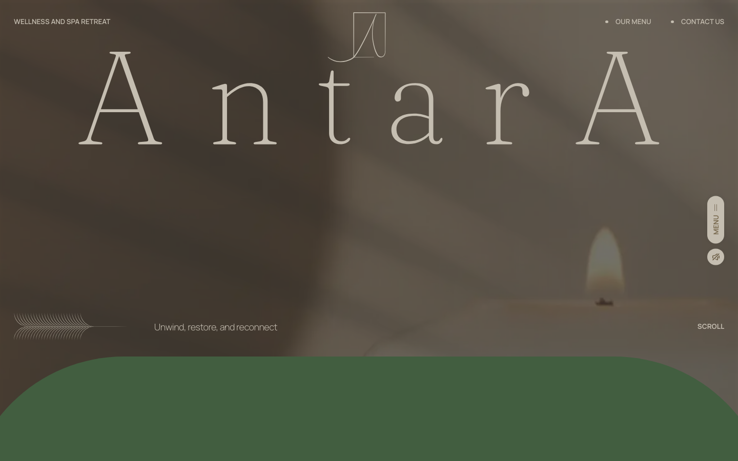
Antara Spa
strongBeauty
a Malaysian day spa that sells calm with one oversized Fraunces wordmark on a sun-warmed photographic hero, an earthy sand-brown-sage palette, and slow GSAP-and-Lenis scroll, the whole page tuned to feel like exhaling.
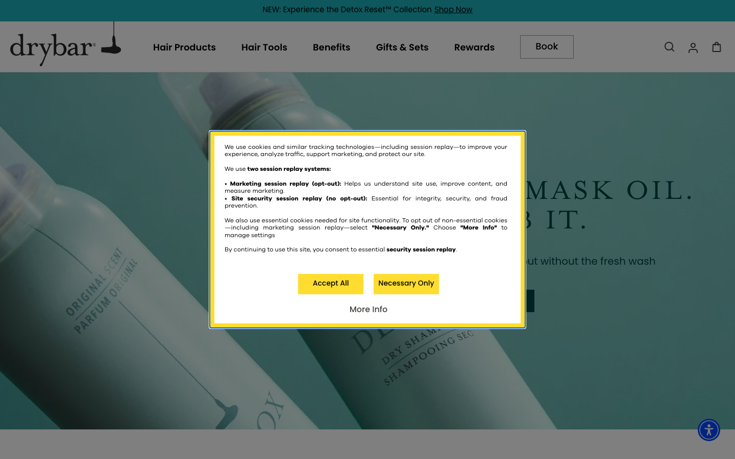
Drybar
flagshipBeauty
a blow-dry bar that turned one service into a polished lifestyle brand, a cheerful yellow-on-warm-grey identity, big confident display type, and a site that runs a booking funnel and a serious product retail line side by side.
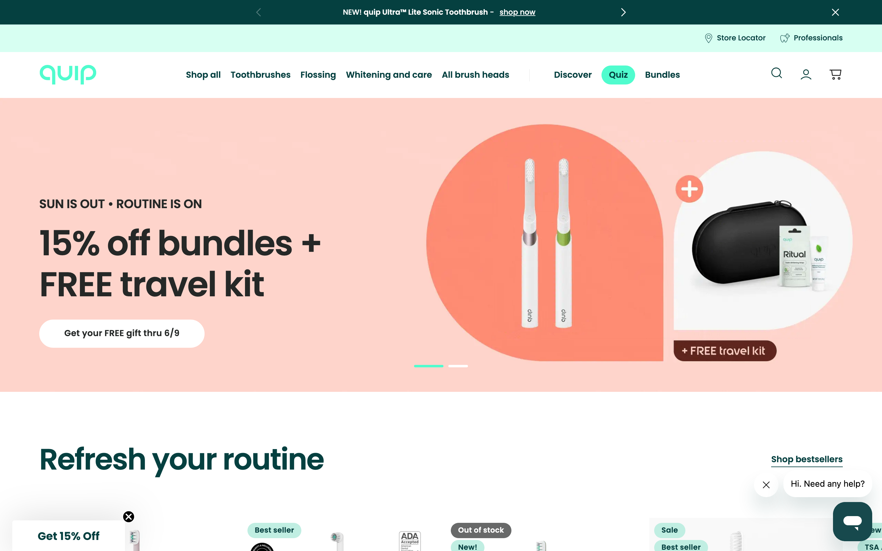
Quip
strongHealth
an oral-care brand that makes dental health feel friendly and modern rather than clinical, a clean mint-and-teal system, Poppins, soft pill shapes, with a shop, a store locator and a "find a professional" dentist network.
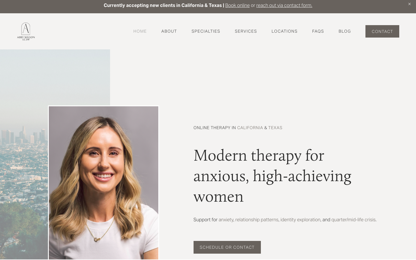
Abby Wilson Therapy
strongOther
A boutique therapist for "anxious, high-achieving women" who reassures by being polished and specific - a warm sand-and-charcoal editorial system, a Calluna serif voice, named specialties and a clearly walked process that says "I understand exactly who you are and how this works".